LogoLogo
HomeDocumentationLoginTry for free
  • CARTO Academy
  • Working with geospatial data
    • Geospatial data: the basics
      • What is location data?
      • Types of location data
      • Changing between types of geographical support
    • Optimizing your data for spatial analysis
    • Introduction to Spatial Indexes
      • Spatial Index support in CARTO
      • Create or enrich an index
      • Work with unique Spatial Index properties
      • Scaling common geoprocessing tasks with Spatial Indexes
      • Using Spatial Indexes for analysis
        • Calculating traffic accident rates
        • Which cell phone towers serve the most people?
    • The modern geospatial analysis stack
      • Spatial data management and analytics with CARTO QGIS Plugin
      • Using data from a REST API for real-time updates
  • Building interactive maps
    • Introduction to CARTO Builder
    • Data sources & map layers
    • Widgets & SQL Parameters
    • AI Agents
    • Data visualization
      • Build a dashboard with styled point locations
      • Style qualitative data using hex color codes
      • Create an animated visualization with time series
      • Visualize administrative regions by defined zoom levels
      • Build a dashboard to understand historic weather events
      • Customize your visualization with tailored-made basemaps
      • Visualize static geometries with attributes varying over time
      • Mapping the precipitation impact of Hurricane Milton with raster data
    • Data analysis
      • Filtering multiple data sources simultaneously with SQL Parameters
      • Generate a dynamic index based on user-defined weighted variables
      • Create a dashboard with user-defined analysis using SQL Parameters
      • Analyzing multiple drive-time catchment areas dynamically
      • Extract insights from your maps with AI Agents
    • Sharing and collaborating
      • Dynamically control your maps using URL parameters
      • Embedding maps in BI platforms
    • Solving geospatial use-cases
      • Build a store performance monitoring dashboard for retail stores in the USA
      • Analyzing Airbnb ratings in Los Angeles
      • Assessing the damages of La Palma Volcano
    • CARTO Map Gallery
  • Creating workflows
    • Introduction to CARTO Workflows
    • Step-by-step tutorials
      • Creating a composite score for fire risk
      • Spatial Scoring: Measuring merchant attractiveness and performance
      • Using crime data & spatial analysis to assess home insurance risk
      • Identify the best billboards and stores for a multi-channel product launch campaign
      • Estimate the population covered by LTE cells
      • A no-code approach to optimizing OOH advertising locations
      • Optimizing site selection for EV charging stations
      • How to optimize location planning for wind turbines
      • Calculate population living around top retail locations
      • Identifying customers potentially affected by an active fire in California
      • Finding stores in areas with weather risks
      • How to run scalable routing analysis the easy way
      • Geomarketing techniques for targeting sportswear consumers
      • How to use GenAI to optimize your spatial analysis
      • Analyzing origin and destination patterns
      • Understanding accident hotspots
      • Real-Time Flood Claims Analysis
      • Train a classification model to estimate customer churn
      • Space-time anomaly detection for real-time portfolio management
      • Identify buildings in areas with a deficit of cell network antennas
    • Workflow templates
      • Data Preparation
      • Data Enrichment
      • Spatial Indexes
      • Spatial Analysis
      • Generating new spatial data
      • Statistics
      • Retail and CPG
      • Telco
      • Insurance
      • Out Of Home Advertising
      • BigQuery ML
      • Snowflake ML
  • Advanced spatial analytics
    • Introduction to the Analytics Toolbox
    • Spatial Analytics for BigQuery
      • Step-by-step tutorials
        • How to create a composite score with your spatial data
        • Space-time hotspot analysis: Identifying traffic accident hotspots
        • Spacetime hotspot classification: Understanding collision patterns
        • Time series clustering: Identifying areas with similar traffic accident patterns
        • Detecting space-time anomalous regions to improve real estate portfolio management (quick start)
        • Detecting space-time anomalous regions to improve real estate portfolio management
        • Computing the spatial autocorrelation of POIs locations in Berlin
        • Identifying amenity hotspots in Stockholm
        • Applying GWR to understand Airbnb listings prices
        • Analyzing signal coverage with line-of-sight calculation and path loss estimation
        • Generating trade areas based on drive/walk-time isolines
        • Geocoding your address data
        • Find similar locations based on their trade areas
        • Calculating market penetration in CPG with merchant universe matching
        • Measuring merchant attractiveness and performance in CPG with spatial scores
        • Segmenting CPG merchants using trade areas characteristics
        • Store cannibalization: quantifying the effect of opening new stores on your existing network
        • Find Twin Areas of top-performing stores
        • Opening a new Pizza Hut location in Honolulu
        • An H3 grid of Starbucks locations and simple cannibalization analysis
        • Data enrichment using the Data Observatory
        • New police stations based on Chicago crime location clusters
        • Interpolating elevation along a road using kriging
        • Analyzing weather stations coverage using a Voronoi diagram
        • A NYC subway connection graph using Delaunay triangulation
        • Computing US airport connections and route interpolations
        • Identifying earthquake-prone areas in the state of California
        • Bikeshare stations within a San Francisco buffer
        • Census areas in the UK within tiles of multiple resolutions
        • Creating simple tilesets
        • Creating spatial index tilesets
        • Creating aggregation tilesets
        • Using raster and vector data to calculate total rooftop PV potential in the US
        • Using the routing module
      • About Analytics Toolbox regions
    • Spatial Analytics for Snowflake
      • Step-by-step tutorials
        • How to create a composite score with your spatial data
        • Space-time hotspot analysis: Identifying traffic accident hotspots
        • Computing the spatial autocorrelation of POIs locations in Berlin
        • Identifying amenity hotspots in Stockholm
        • Applying GWR to understand Airbnb listings prices
        • Opening a new Pizza Hut location in Honolulu
        • Generating trade areas based on drive/walk-time isolines
        • Geocoding your address data
        • Creating spatial index tilesets
        • A Quadkey grid of stores locations and simple cannibalization analysis
        • Minkowski distance to perform cannibalization analysis
        • Computing US airport connections and route interpolations
        • New supplier offices based on store locations clusters
        • Analyzing store location coverage using a Voronoi diagram
        • Enrichment of catchment areas for store characterization
        • Data enrichment using the Data Observatory
    • Spatial Analytics for Redshift
      • Step-by-step tutorials
        • Generating trade areas based on drive/walk-time isolines
        • Geocoding your address data
        • Creating spatial index tilesets
Powered by GitBook
On this page
  • Telco Customer Churn Dataset
  • Installing the BigQuery ML Extension Package
  • Learning How Telecom Providers Can Leverage BigQuery ML to Predict Customer Churn using Workflows

Was this helpful?

Export as PDF
  1. Creating workflows
  2. Step-by-step tutorials

Train a classification model to estimate customer churn

Last updated 3 months ago

Was this helpful?

In this tutorial, we’ll dive into telecom customer churn data to uncover the key reasons behind customer departures and develop targeted strategies to boost retention and satisfaction. Specifically, we will learn how to predict customer churn for a telecom provider offering telephony and internet services using . You can access the full template .

Telco Customer Churn Dataset

Installing the BigQuery ML Extension Package

To install the Extension Package from the Workflows gallery, follow the next steps:

  1. Go to the Components tab, on the left-side menu, then click on Manage Extension Packages.

  1. You have successfully installed the Extension Package! Now you can click on it to navigate through the components. You can also go to the Components section and see the components from there, ready to be drag-and-droped into the canvas.

Alternatively, one can manually install the extension following the next steps:

  1. Go to Components and select Manage Extension Packages > Upload > Upload extension and upload the .zip file.

  2. Click on Install Extension.

This type of installation is required for custom extensions and for Self-hosted users not having access to the Workflows gallery from their environment.

Learning How Telecom Providers Can Leverage BigQuery ML to Predict Customer Churn using Workflows

Now, let's add components to our Workflow to predict customer churn. We will load the telco dataset, from which we’ve pre-selected some interesting features (e.g. those correlated with churn), and we will train a classification model to estimate which customers are prone to churn and which are not.

Now, we will use the training data to create a classification model, whose output will be the probability of churn (i.e. 0 means no churn, 1 means churn) for a customer given specific socio-demographic, contract type and sentiment characteristics.

As we can see, two new columns appear on our data:

  • predicted_churn_label_probs: indicates the probability that a customer will churn.

  • predicted_churn_label: indicates whether the customer will or won't potentially churn based on the probability of churning using a threshold of 0,5.

Lastly, to better understand our model, we can take a look at the model’s explainability. This gives an estimate of each feature’s importance when it comes to churn.

From the results for the overall feature importances, we can see that the most important features when it comes to estimating churn are the customer’s overall satisfaction rating of the company (satisfaction_score), the customer’s current contract type (contract), the number of referrals the customer has made (number_of_referrals), and whether or not the customer has subscribed to an additional online security service (online_security).

For this use case, we will be using , which contains information about a fictional telco company that provides home phone and Internet services to 7043 customers in California. This dataset provides essential insights into each customer's profile, covering everything from subscribed services and tenure to socio-demographic information and sentiment data.

Before stating, let’s take a look at the data. From the widget’s section, we can see that 26,54% of customers churned this quarter, resulting in a $3,68M revenue loss. Regions like Los Angeles and San Diego are characterized by having both a large number of customers and a higher number of lost customers, positioning them as high-priority areas for improving customer retention.

For this tutorial, we will be using CARTO's , a powerful tool that allows users to exploit directly from Workflows, enabling seamless integration of machine learning models into automated pipelines.

Log into the , then head to Workflows and Create a new workflow; use the CARTO Data Warehouse connection.

In the Explore tab, you will see a set of that CARTO has developed. Click on the BigQuery ML for Workflows box, then on Install extension.

Go to documentation.

Download the .zip file by clicking on .

Log into the , then head to Workflows and Create a new workflow; use the CARTO Data Warehouse connection.

Please refer to the documentation for more details about .

Drag the component to the canvas and import the cartobq.docs.telco_churn_ca_template dataset. This data is publicly available in BigQuery (remember that we are using a connection to the , a fully-managed, default Google BigQuery project for the organization).

Use the component to select only those rows for which the churn_label is available (churn_label IS NOT NULL). This will be the data we will split for training (70%) and evaluating (30%) our model through random sampling (RAND() < 0.7) using another component. Once our model is ready, we will predict the churn_label for those customers which we do not know whether they will churn or not.

Use the component to remove unnecessary columns that won't be used for training: geom (GEOMETRY type columns are not valid).

Connect the component to the input data and set up the model’s parameters: we will train a model and we will not further split the data (we have done so in step 2).

Note: You will need to give the model a Fully Qualified Name (FQN), which is where the model will be stored. In this way, it would also be possible to call the model from a different workflow using the component. To find the FQN of your CARTO DW, go to the SQL tab in the lower menu and copy the project name as seen in the image below. Your FQN should look something like: carto-dw-ac-<id>.shared.telco_churn_ca_predicted.

Next, we will the performance of our model using the test data.

Based on the , the results seem very promising. The high accuracy indicates that the model correctly predicts the majority of instances, and the low log loss suggests that our model's probability estimates are close to the actual values. With precision and recall both performing well, we can be confident that the model is making correct positive predictions, and the F1 score further reassures us that the balance between precision and recall is optimal. Additionally, the ROC AUC score shows that our model has a strong ability to distinguish between clients churning and not churning. Overall, these metrics highlight that our model is well-tuned and capable of handling the classification task effectively.

Having a model that performs good, we can then run predictions and obtain estimates to check which customers are prone to churn. To do so, connect the component and the data with no churn_label to the component.

Connect the component to the component. The latter provides the feature importance of the model predictors to each class (churn vs no churn). If the Class level explain option is not clicked, the overall feature importances are given, rather than per class.

For further details, we can also use the component, that provides feature attributions that indicate how much each feature in your model contributed to the final prediction for each given customer. You can select how many features you want to use to retrieve their attributions.

We can visualize the results in the following , where we can see which customers are prone to churn, and with which probability this will happen.

IBM’s Telco Customer Churn Dataset
map
BigQuery ML Extension Package
BigQuery’s ML capabilities
CARTO Workspace
Extension Packages
BigQuery ML Extension Package
Download the BigQuery ML extension package
CARTO Workspace
managing Extension Packages
Get Table by Name
CARTO DW
Where
Where
Drop Columns
Create Classification Model
Logistic Regression
Get Model by Name
Evaluate
classification metrics
Create Classification Model
Predict
Create Classification Model
Global Explain
Explain Predict
map
CARTO Workflows
here
A selection of extension packages developed by CARTO.
Installation of the BigQuery ML for Workflows Extension Package.
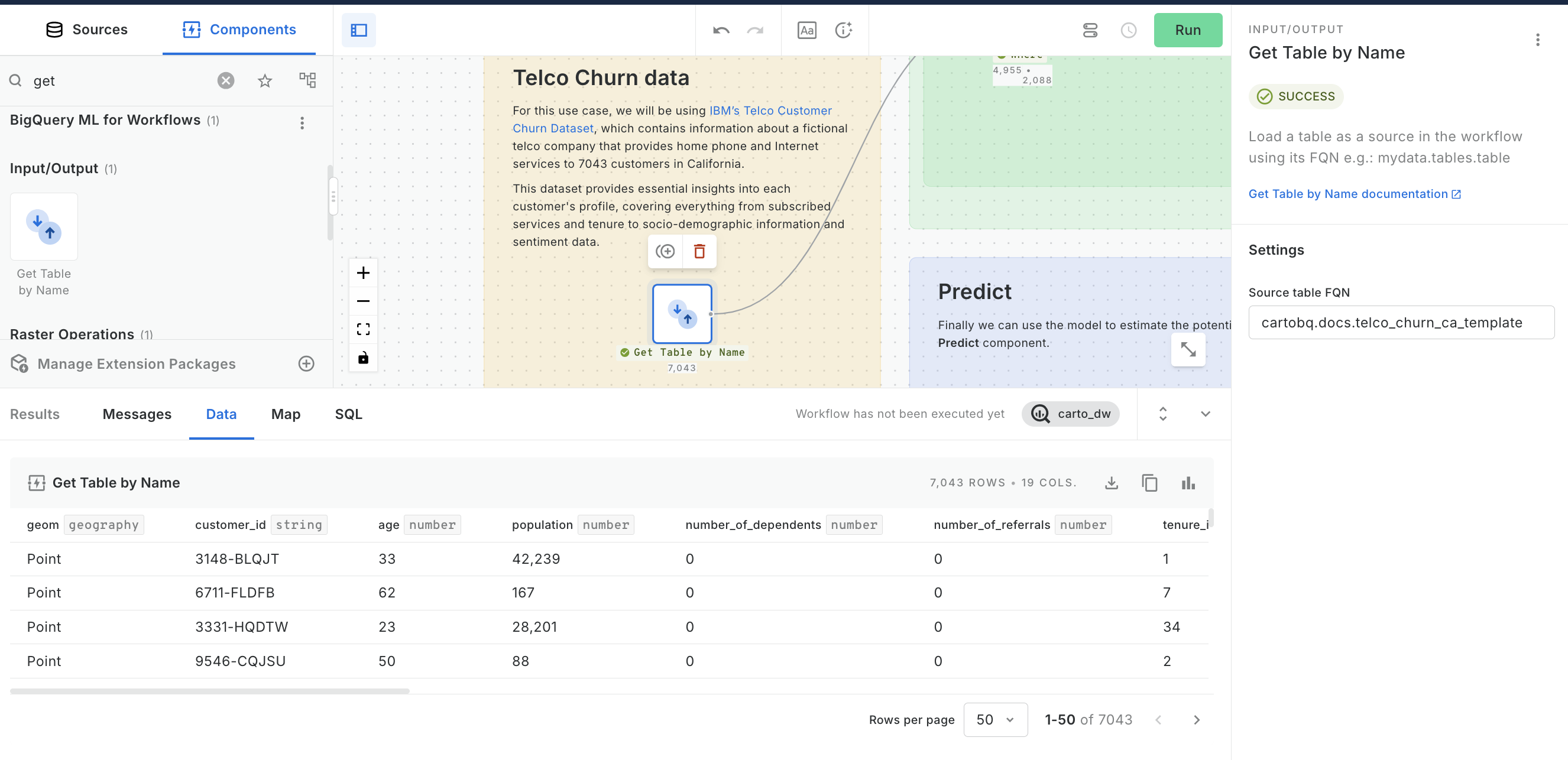
Import telco's data source into Workflows.
Select data for training and prediction. Then, split the data into train and test sets.
Get your CARTO DW's project name to build the FQN of your model.
Create a classification model.
Model evaluation.
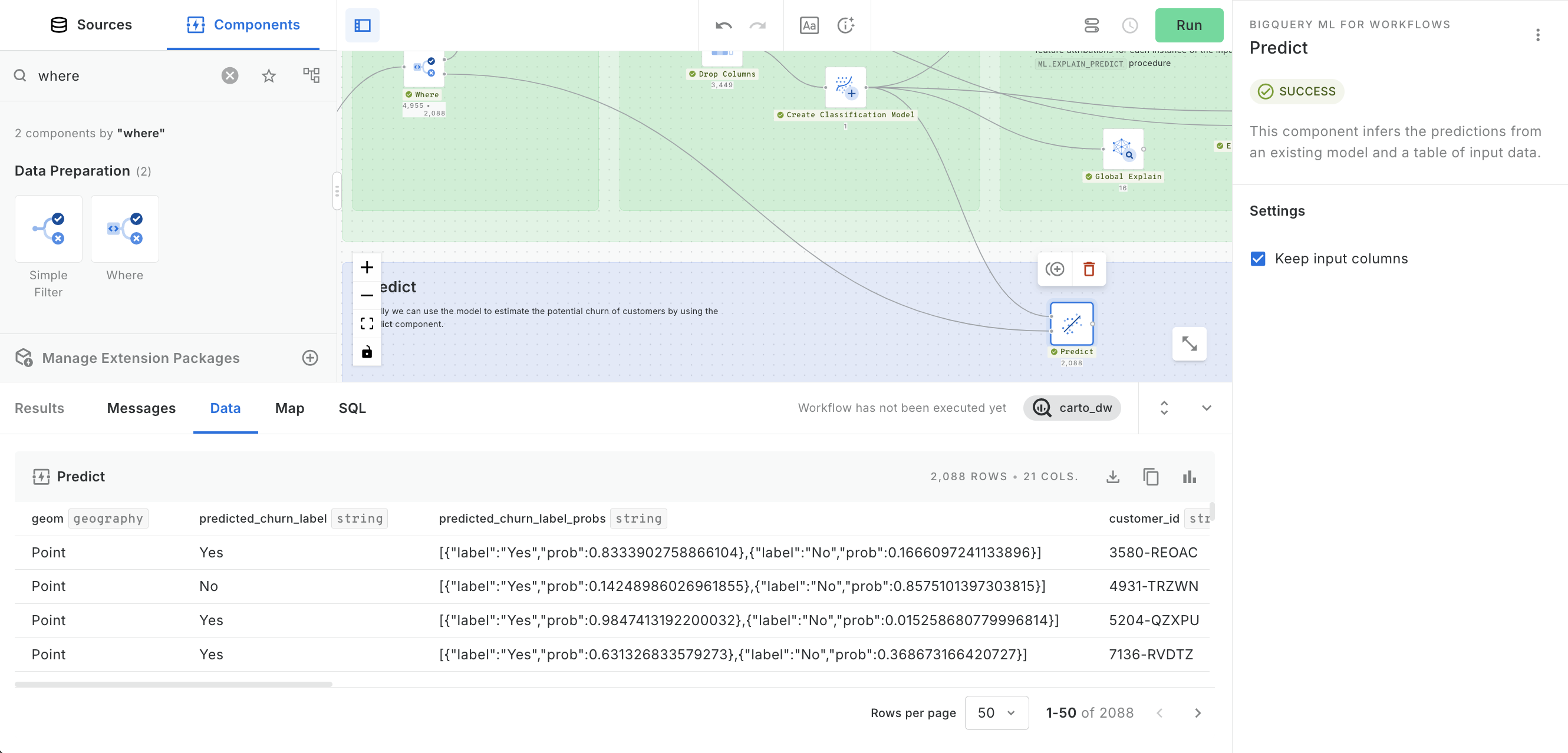
Run predictions.
Get feature importances of the model predictors.
Get festure importances for each prediction.