Analyzing Airbnb ratings in Los Angeles
Context

Founded in 2008, Airbnb has quickly gained global popularity among travelers. To elevate this service, identifying the determinants of listing success and their role in drawing tourism is pivotal. The users' property ratings focus on criteria such as accuracy, communication, cleanliness, location, check-in, and value.
This tutorial aim to extract insights into Airbnb users' overall impressions, connecting the overall rating score with distinct variables while taking into account the geographical neighbors behavior through a Geographically Weighted Regression model.
We'll also dive into the regions where location ratings significantly influence the overall score and enrich this analysis with sociodemographic data from CARTO's Data Observatory.
This tutorial will take you through the following sections:
Step-by-Step Guide:
Visualizing Airbnb listings
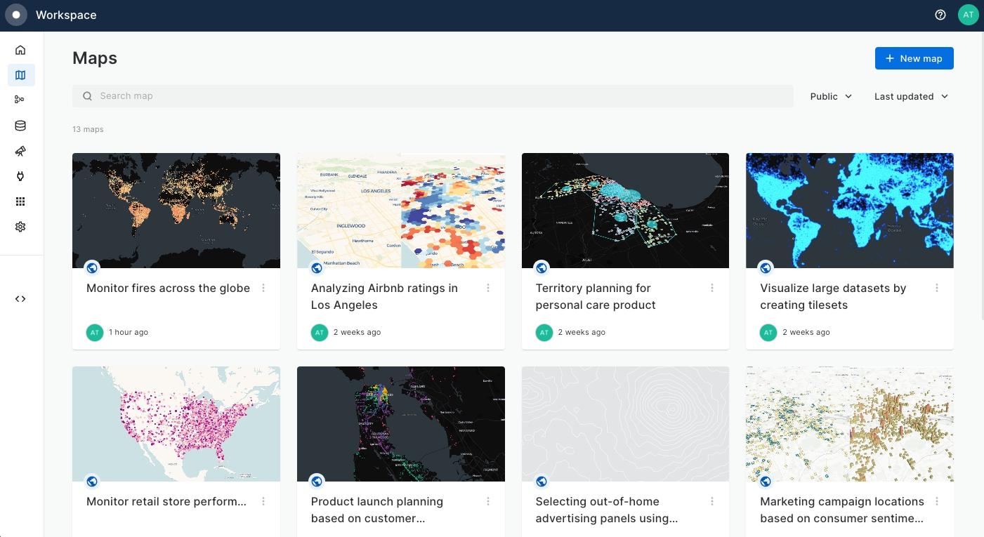
Access the Maps section from your CARTO Workspace using the navigation menu and create a New Map.
Add Los Angeles Airbnb data from CARTO Data Warehouse.
Select the Add source from button at the bottom left on the page.
Click on the CARTO Data Warehouse connection.
Navigate through demo data > demo tables to losangeles_airbnb_data and select Add source.
Let's add some basic styling! Rename the map to
Map 1 Airbnb initial data exploration. Then click on Layer 1 in the Layers panel and apply the following:Name (select the three dots next to the layer name):
Airbnb listingsColor: your pick!
Outline: white, 1px stroke
Radius: 3
Switch from Layers to Interactions at the top left of the UI. Enable interactions for the layer.
Select a style for the pop-up window; we'll use light.
From the drop-down menu, select the variable price_num.
Select # to format the numbers as dollars. In the box to the right, rename the field Price per night.
You should have something that looks a little like this 👇

We will now inspect how Airbnb listings are distributed across Los Angeles and aggregate the raw data to have a better understanding on how different variables vary geographically within the city.
Now let's add a new data source to visualize the airbnb listings using an H3 grid.
Aggregating data to a H3 grid
Now let's aggregate this data to a H3 Spatial Index grid. This approach has multiple advantages:
Ease of interpreting spatial trends on your map
Ability to easily enrich that grid with multiple data sources
Suitability for spatial modelling like Geographically Weighted Regression...
...all of which we'll be covering in this tutorial!
In the CARTO Workspace, head to Workflows and select + New Workflow, using the CARTO Data Warehouse connection.
At the top left of the new workflow, rename the workflow "Airbnb analysis."
In the Sources panel (left of the window), navigate to Connection Data > demo data > demo_tables and drag losangeles_airbnb_data onto the canvas.
Switch from Sources to Components, and locate H3 from GeoPoint. Drag this onto the canvas to the right of losangeles_airbnb_data and connect the two together. Set the H3 resolution to 8. This will create a H3 grid cell for every Airbnb location.
Back in Components, locate Group by. Drag this to the right of H3 from GeoPoint, connecting the two. We'll use this to create a frequency grid and aggregate the input numeric variables:
Set the Group by field to H3.
For the aggregation columns, set review_scores_cleanliness, review_scores_location, review_scores_value, review_scores_rating and price_num to AVG. Add a final aggregation column which is H3 - COUNT (see below).

Connect this Group by component to a Rename column component, renaming h3_count to airbnb_count.
Finally, connect the Rename column count to a Save as Table component, saving this to CARTO Data Warehouse > Organization > Private and calling it airbnb_h3r8. If you haven't already, run your workflow!
Now, head back to the CARTO Builder map that we created earlier. Add the H3 aggregation table that you just created to the map (Sources > Add source from > Data Explorer > CARTO Data Warehouse > Organization > Private).
Let's style the new layer:
Name:
H3 Airbnb aggregationOrder in display: 2
Fill color: 6 steps blue-yellow ramp based on column
price_num_avgusing Quantile color scale.No stroke
Do you notice how it's difficult to see the grid beneath the Airbnb point layer? Let's enable zoom-based visibility to fix that, so we only see the points as we zoom in further. Go into the layer options for each layer, and set the Visibility by zoom layer to 11-21 for Airbnb listings.
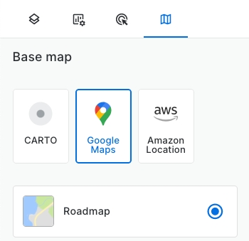
You might also find the basemap more difficult to read now we have a grid layer covering it. Head to the basemaps panel (to the right of Layers) and switch to Google Maps > Positron. You'll now notice some of the labels sit on top of your grid data.
Now, let's try looking at this in 3D! At the center-top of the whole screen, switch to 3D view - then in H3 Airbnb aggregation:
Toggle the Height button and style this parameter using:
Column: airbnb_count (SUM)
Height scale: sqrt
Value: 50
Inspect the map results carefully. Notice where most listings are located and where the areas with highest prices are. Optionally, play with different variables and color ramps.
Now let's start to dig a little deeper into our data!
Enriching the grid with demographic data
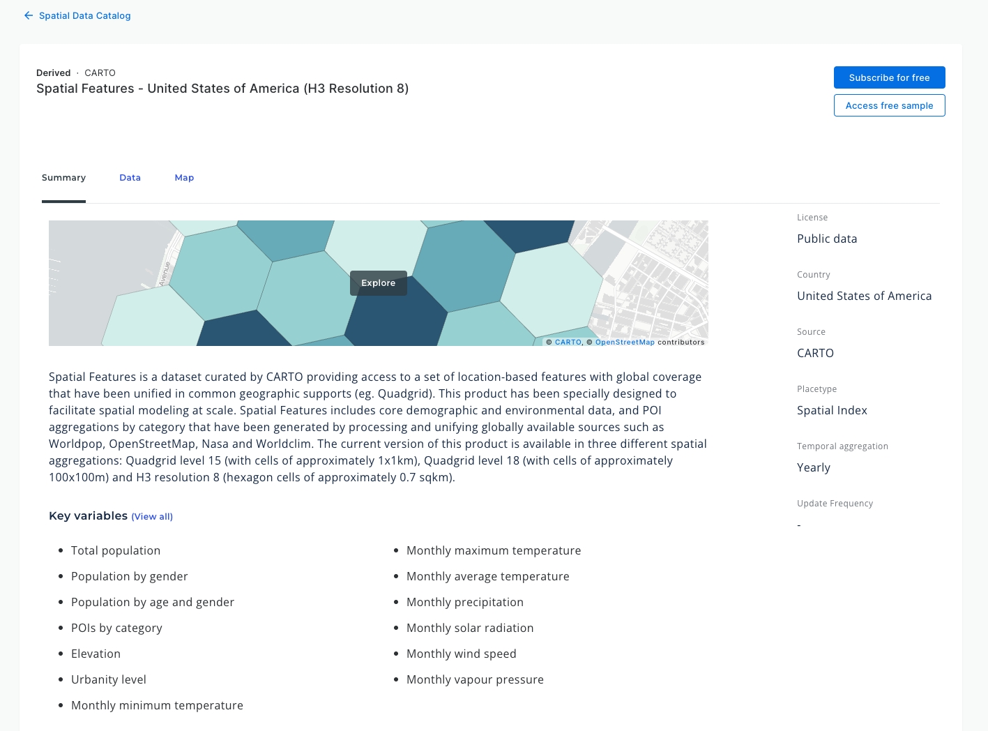
So far we have seen how the Airbnb listings locations and its main variables are distributed across the city of Los Angeles. Next, we will enrich our visualization by adding CARTO Spatial Features H3 at resolution 8 dataset from CARTO Data Observatory.
This dataset holds information that can be useful to explore the influence of different factors, including variables such as the total population, the urbanity level or the presence of certain type of points of interests in different areas.
In the CARTO Workspace, click on ‘Data Observatory’ to browse the Spatial Data Catalog and apply these filters:
Countries:
United States of AmericaLicenses:
Public dataSources:
CARTO
Select the
Spatial Features - United States of America (H3 Resolution 8)dataset and click on Subscribe for free. This action will redirect us to the subscription level at the Data Explorer menu.
Head back into the workflow you created earlier.
Navigate to Sources > Data Observatory > CARTO and find the table you just subscribed to and drag it onto the canvas, just below the final Save as Table component. Can't find it? Try refreshing your page.
Using a Join component, connect the output of Save as Table to the top input, and of Spatial Features to the bottom. Set the join columns from each table to H3, and the join type to left - meaning that all features from the first input (Save as Table) will be retained. Run!
We now have a huge amount of contextual data to help our analysis - in fact, far more than we want! Connect the output of the join to an Edit schema component, selecting only the columns from your original Airbnb grid, plus population and urbanity.

From here, you can save this as a table and explore it on a map - or move on to the final stage of this tutorial.
Estimating the influence of variables on the score
Next we will apply a Geospatially Weighted Regression (GWR) model using the GWR_GRID function to our Airbnb H3 aggregated data. We’ve already seen where different variables rate higher on our previous map.
This model will allow us to extract insights of what the overall impression of Airbnb users depends on, by relating the overall rating score with different variables (specifically we will use: value, cleanliness and location)
We will also visualize where the location score variable significantly influences the ‘Overall rating’ result.
We will now proceed to calculate the GWR model leveraging CARTO Analytics Toolbox for BigQuery. You can do so using CARTO Workflows or your data warehouse console.
In your workflow, connect a GWR component to the Edit schema component from earlier. The parameters used in GWR model will be as follows:
Index column:
h3Feature Variables:
review_scores_value_avg,review_scores_cleanliness_avgreview_scores_location_avg
Target variable:
review_scores_rating_avg
Kring Size:
3Kernel function:
gaussianFit intercept:
True
Finally, let's add another join to rejoin Edit Schema to the results of the GWR analysis so we have all of the contextual information in one table ready to start building our map.
Run!

Feel free to use another Save as Table component to materialise it, otherwise it will be stored as a temporary table and deleted after 30 days.
In the CARTO Workspace under the Map tab, click on the three dots next to your original map and duplicate it, calling it
Map 2 GWR Model map.Add your GWR layer in the same way you had added previous layers, and turn off the layer
H3 Airbnb aggregation.Style the new layer (you may find it easier to turn the other layers off as you do this - you can just toggle the eye to the right of their names in the layer panel to do this):
Name:
Location relevance (Model)Layer order:
3 (the bottom)Fill Color: 5 step diverging Colorbrewer blue-red ramp based on
review_scores_location_avg_coef_estimate. Here, negative values depict a negative relationship between the location score and overall score, and positive values depict a positive relationship (i.e. location plays an important role in the overall ranking). A good way of visualizing this is to begin with a Quantile color scale, and then switch to Custom and play around with the color bands until they reflect the same values moving away from a neutral band around zero (see below, where we have bands which diverage from -0.05 to 0.05).No stroke
In the Legend panel (to the right of Layers), change the Color based on text to Location - Overall rating coefficient so it's easier for the user to understand.

In the Basemaps panel (to the right of Layers) change the basemap to Google Maps Roadmap basemap.
Click on the Dual map view button at the top of the screen (next to 3D mode) to toggle the split map option.

Left map: disable the
Location relevance (Model)Right map: disable the
H3 AirBnB aggregation
Inspect the model results in detail to understand where the location matters the most for users' overall rating score and how the location rating values are distributed.
Now let's start adding some more elements to our map to help our users better navigate our analysis.
Head to the Widgets panel, to the left of the Layers panel. Add the following widgets to the map:
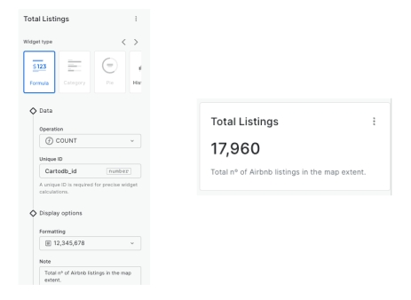
Total listings
Layer:
Airbnb listingsType:
FormulaOperation:
COUNTFormatting:
Integers with thousand separatorsNote:
Total nº of Airbnb listings in the map extent.
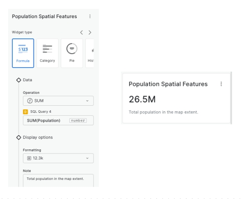
Population near Airbnbs
Layer:
H3 Airbnb aggregationType:
FormulaOperation:
SUMFormatting:
Decimal summarized (12.3K)Aggregation column:
populationNotes:
Population in cells with Airbnbs
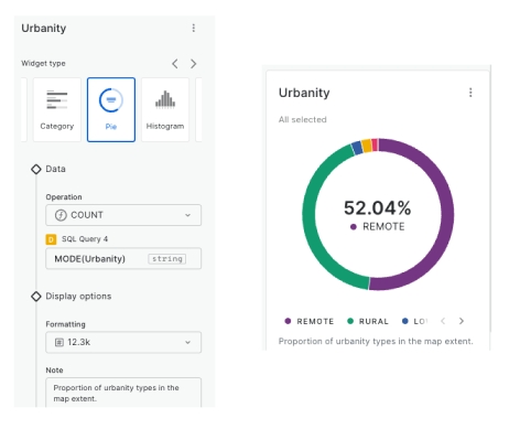
Urbanity
Layer:
H3 Airbnb aggregationType:
PieOperation:
COUNTColumn:
urbanity_joined_joined (MODE)
In the Interactions tab (to the right of Widgets), add an interaction to H3 Airbnb aggregation so users can review attributes while navigating the map. Switch from Click to Hover and choose the style Light. Select the attributes population_joined_joined (sum), urbanity_joined_joined (mode) and airbnb_count_joined. Click on the variable options (#) to choose a more appropriate format and more readable field names. Your map should now be looking a bit like the below:

Navigate the map and observe how widget values vary depending on the viewport area. Check out specific areas by hovering over them and review pop-up attributes.
Now let's add a rich description of our map so users can have more context - we'll be using Markdown syntax. At the top right of the screen, select the "i" icon to bring up the Map Description tab (you can switch between this and widgets). You can copy and paste the below example or create your own.
If you click on the "eye" icon, you can preview what this looks like...

Finally we can make the map public and share the link to anybody in the organization. For that you should go to “Share” on the top right corner and set the map as Public. For more details, see Publishing and sharing maps.
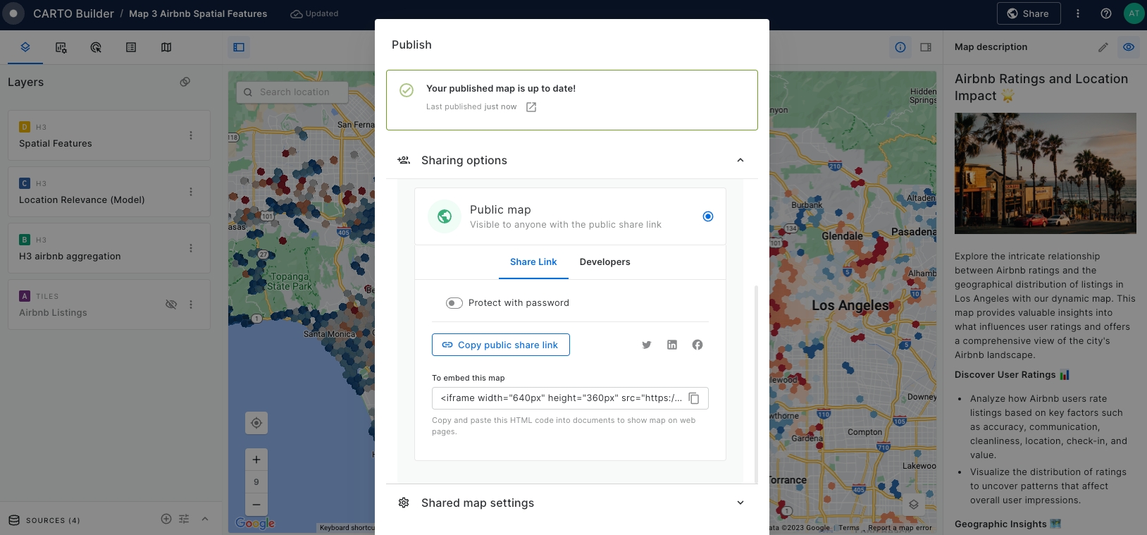
Now we are ready to share the results! 👇
Last updated
Was this helpful?

