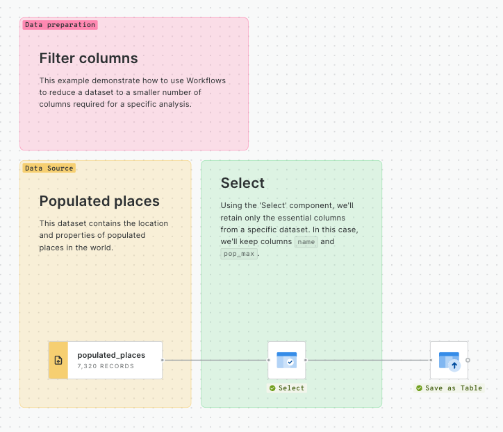
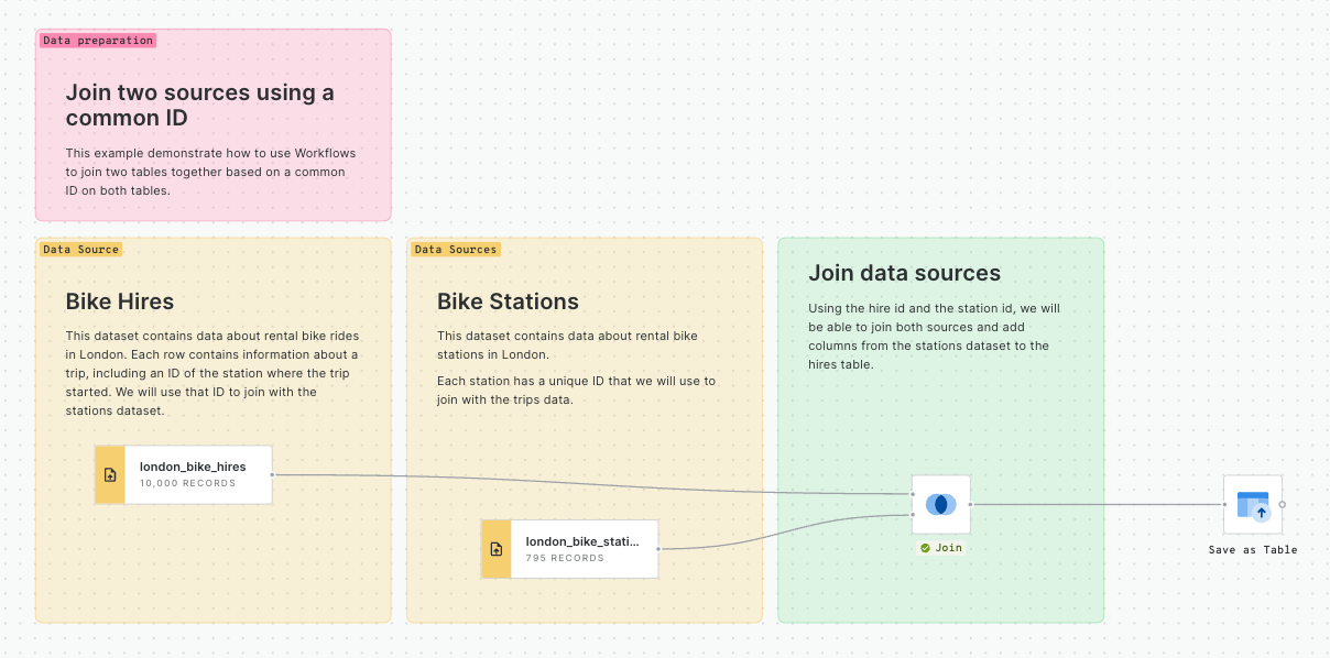
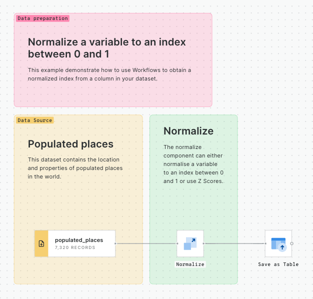
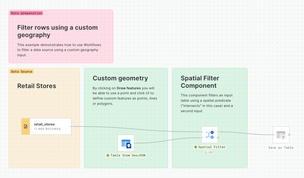
This section of CARTO Academy explores the essential foundations of handling spatial data in the modern geospatial tech stack.
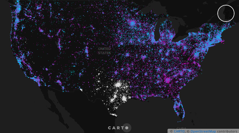
Spatial data encompasses a wide range of information that is associated with geographical locations. This data can represent anything from points on a map to complex geographic features, and it plays a central role in a multitude of applications.
In the past few years, geospatial technology has fundamentally changed. Data is getting bigger, faster, and more complex. User needs are changing too, with an increasing number of organizations and business functions adopting data-centric decision making, leading to a broader range of users undertaking this kind of work. Geospatial cannot any longer be left on a silo.
In this rapidly evolving landscape, the traditional desktop-based Geographic Information Systems (GIS) of the past have given way to a new way of doing spatial analysis, focused on openness and scalability over proprietary software and desktop analytics. This new way of working with geospatial data is supported by a suite of cloud-native tools and technologies designed to handle the demands of contemporary data workflows - this is what we call the modern geospatial analysis stack.
This shift to more open and scalable geospatial technology offers a range of benefits for analysts, data scientists and the organizations they work for:
Interoperability between different data analysis teams working on a single source of truth database in the cloud.
Scalability to analyze and visualize very large datasets.
Data security backed by the leading cloud platforms.
However, while the modern geospatial analysis stack excels in offering scalable and advanced analytical and visualization capabilities for your geospatial big data, there are some data management tasks - like geometry editing over georeferenced images - for which traditional open-source desktop GIS tools are great solutions for.
This section of the CARTO Academy will share how you can complement your modern geospatial analysis stack - based on CARTO and your cloud data warehouse of choice - with other GIS tools to ensure all your geospatial needs and use-cases are covered, from geometry editing to advanced spatial analytics and app development.
What is location data?
Getting to know the basics
Platforms which deal with spatial data - like CARTO - are able to translate encoded location data into a geographic location on a map, allowing you to visualize and analyze data based on location. This includes mapping where something is, and the space it occupies.
There are two main ways that "location" is encoded.
Geographic Coordinates (Geography): Geographic coordinates, also known as geographic or unprojected coordinates, use latitude and longitude to specify a location on the Earth's curved surface. Geographic coordinates are based on a spherical or ellipsoidal model of the Earth and provide a global reference system.
Projected Coordinates (Geometry): Projected coordinates, also referred to as geometriesy or projected coordinates, utilize a two-dimensional Cartesian coordinate system to represent locations on a flat surface, such as a map or a plane. Projected coordinates result from applying a mathematical transformation to geographic coordinates, projecting them onto a flat surface. This projection aims to minimize distortion and provide accurate distance, direction, and area measurements within a specific geographic region or map projection.
The choice between geographic or projected coordinates depends on the purpose and scale of the analysis. Geographic coordinates are commonly used for global or large-scale analysis, while projected coordinates are more suitable for local or regional analysis where accurate distance, area, and shape measurements are required. Furthermore, web mapping systems may often require your data to be a geography, as these systems often use a global, geographic coordinate system.
Data sources & map layers
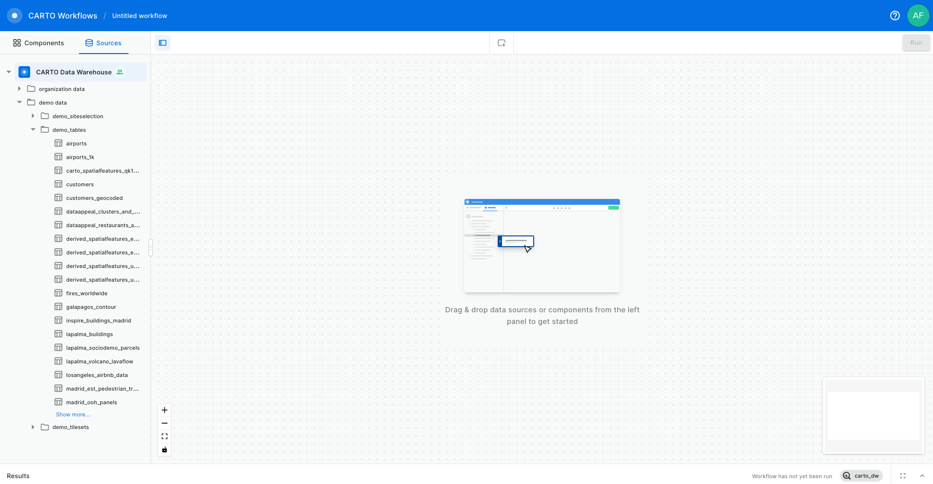
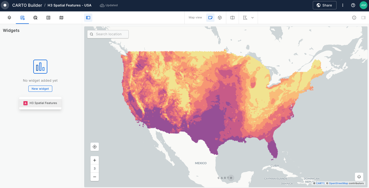
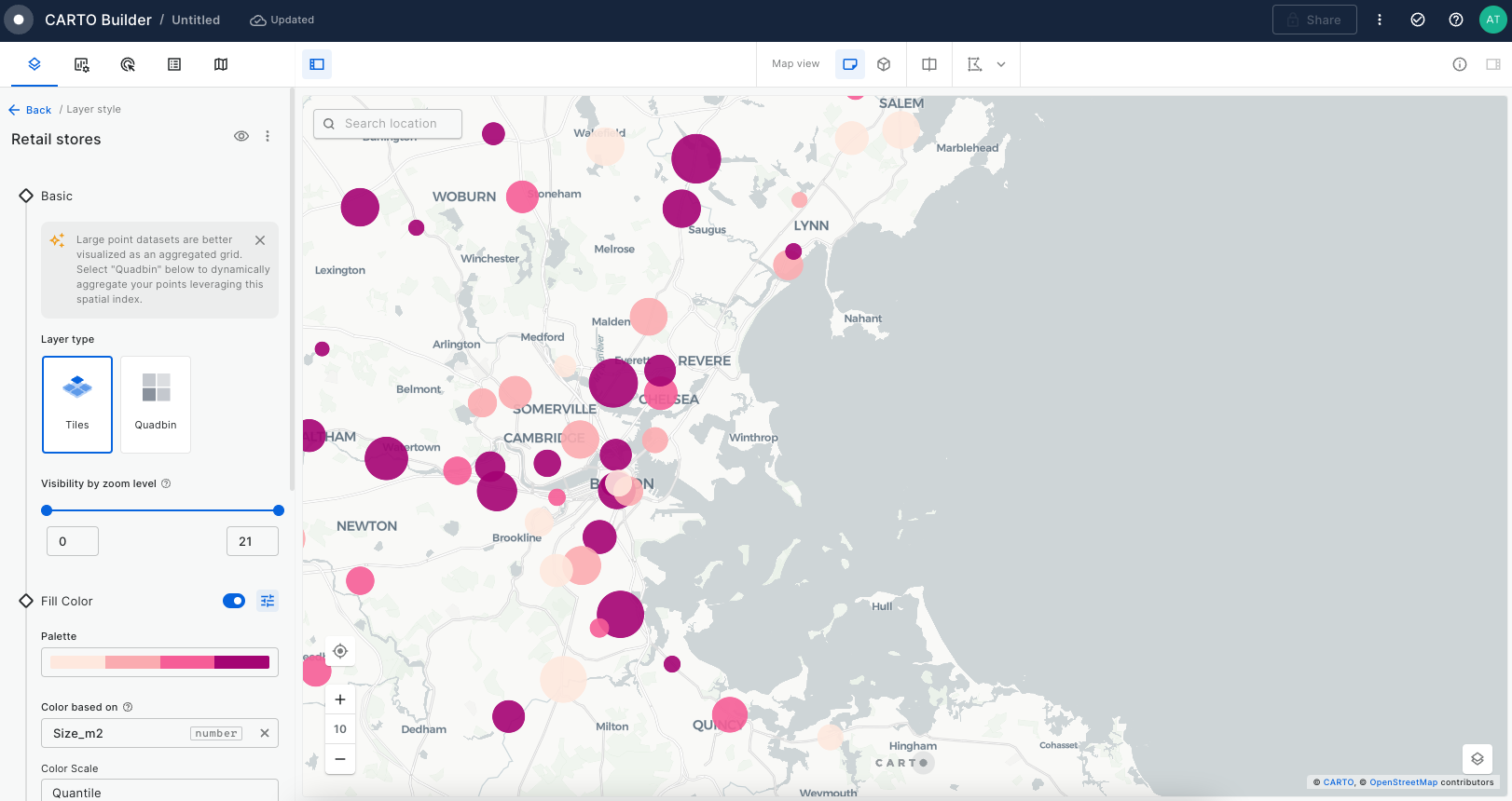
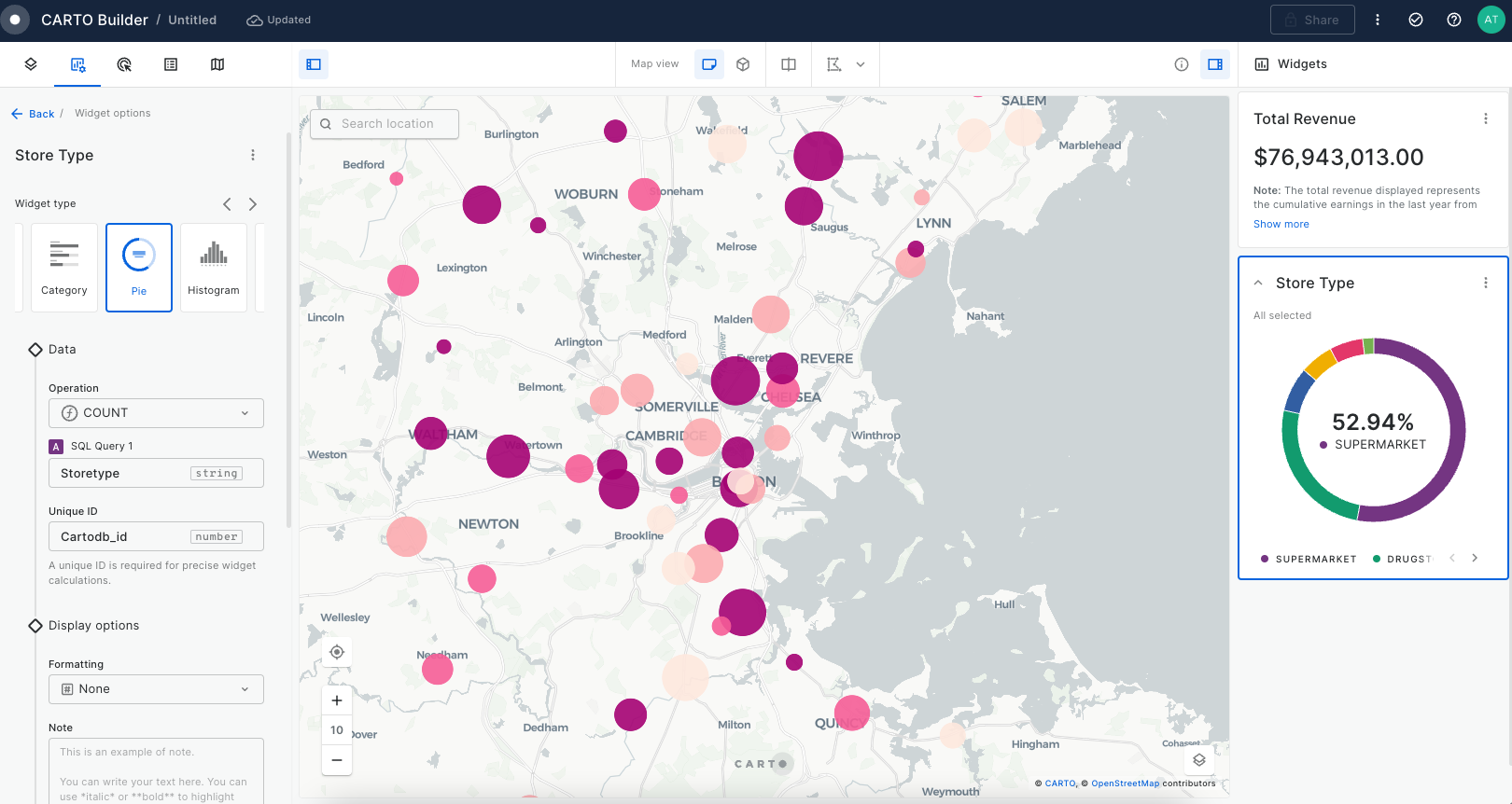
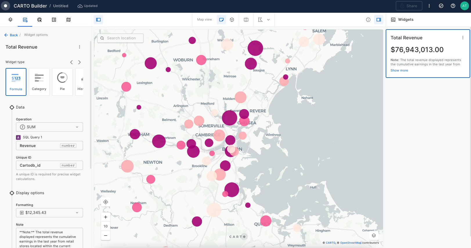
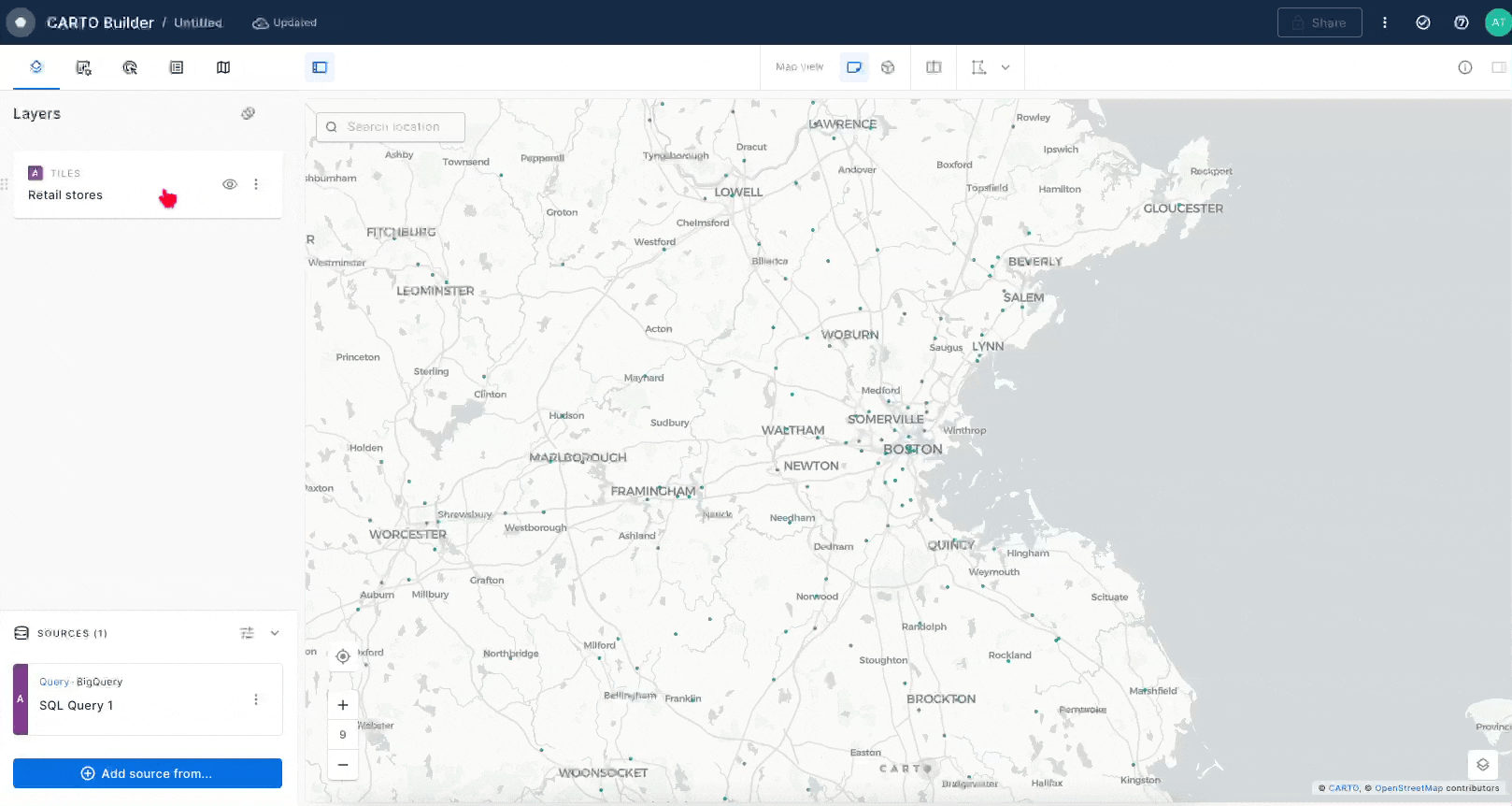
When you begin a new map in CARTO Builder, the left panel is your starting point, providing the tools to add data sources that will be visualized as layers on your map. In Builder, each data source creates a direct connection to your data warehouse, allowing you to access your data without the need to move or copy it. This cloud-native approach ensures efficient and seamless integration of large datasets.
Once a data source is added, CARTO's advanced technology renders a map layer that visually represents your data, offering smooth and scalable visualization, even with extensive datasets.
In this section, we'll take you through the various data source formats that CARTO Builder supports. We'll also explore the different types of map layers that can be rendered in Builder, enhancing your understanding of how to effectively visualize and interact with your geospatial data.
CARTO Academy
Welcome to CARTO Academy! In this site you will find a catalog of tutorials, quick start guides and videos to structure your learning path towards becoming an advanced CARTO user.
Not sure where to start? Check out our recommended learning path !
Working with geospatial data
Democratization & Collaboration with tools that have been esigned to lower the skills barrier for spatial analysis.
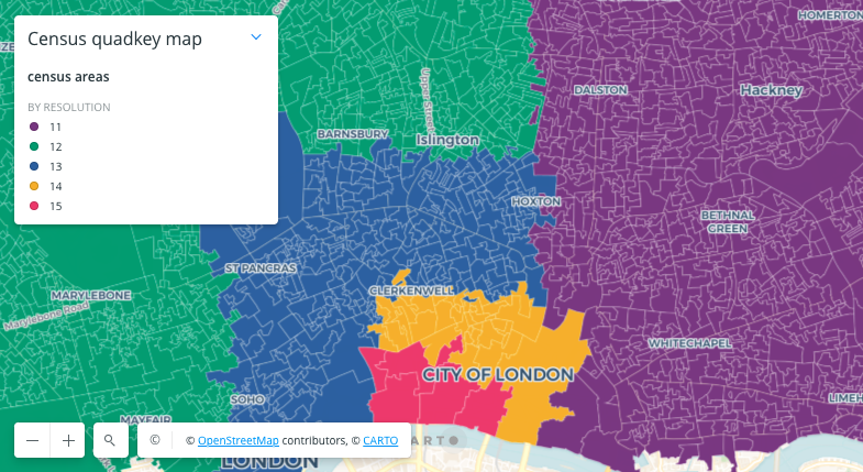
Builder data sources can be differentiated in the following geospatial data types:
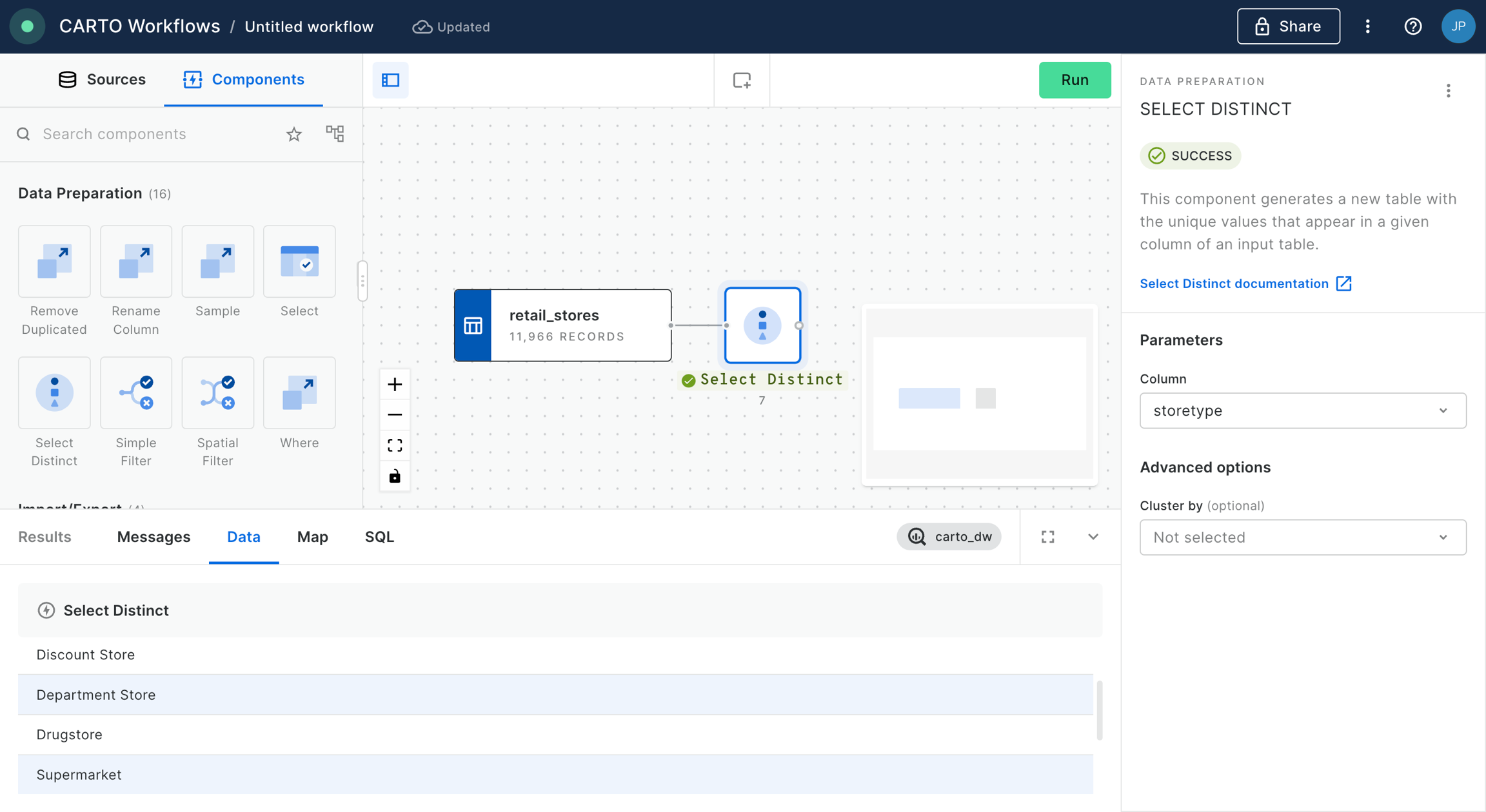
Simple features: These are unaggregated features using standard geometry (point, line or polygon) and attributes, ready for use in Builder. These spatial and non-spatial attributes are ready to be used in Builder.
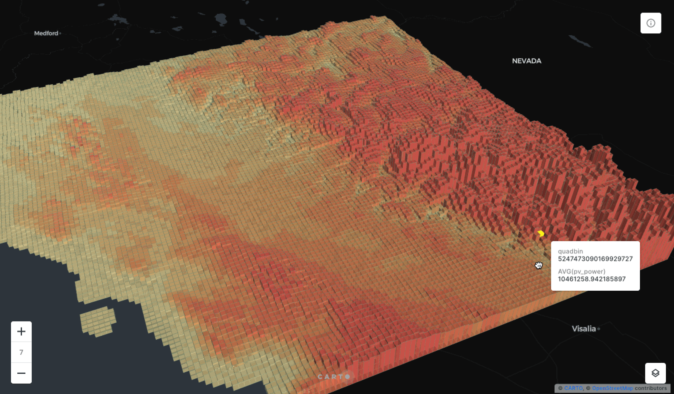
Aggregated features based on Spatial Indexes: These data sources are aggregated for improved performance or specific use cases. The properties of these features are aggregated according to the chosen aggregation type in Builder. CARTO currently supports two different types of utilize a spatial indexes, Quadbin and H3.
Pre-generated tilesets: These are tilesets that have been previously pre-generated using CARTO Analytics Toolbox procedure and stored directly in your data warehouse. Ideal for handling very large, static datasets, these tilesets ensure efficient and high-performance visualizations.
Raster: Raster sources uploaded to your data warehouse using CARTO raster-loader, allowing both analytics and visualization capabilities.
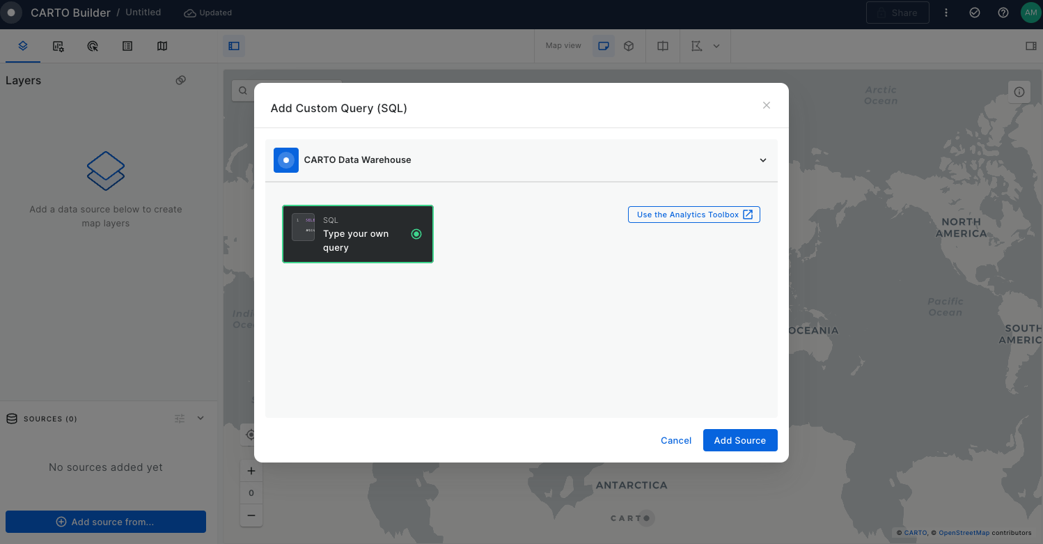
Adding sources to Builder
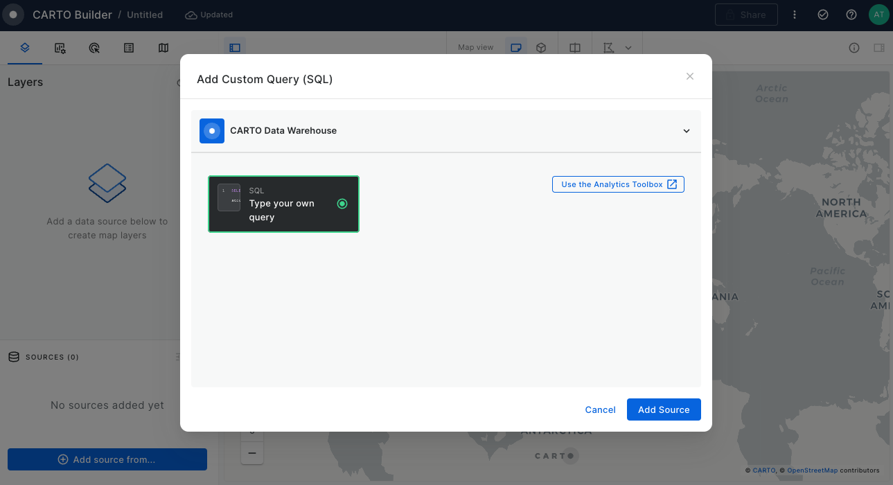
In Builder, you can add data sources either as table sources, by connecting to a materialized table in your data warehouse, or through custom SQL queries. These queries execute directly in your data warehouse, fetching the necessary properties for your map.
Table sources
You can directly connect to your data warehouse table by navigating through the mini data explorer. Once your connection is set, the data source is added as a map layer to your map.
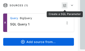
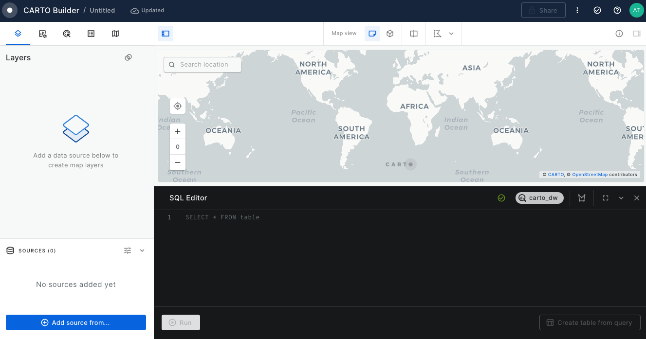
SQL query sources
You can perform a custom SQL query source that will act as your input source. Here you can select the precise columns for better performance and customize your analyses according to your need.
Best practices for SQL Query sources
SQL Editor is not designed for conducting complex analysis or detailed step-by-step geospatial analytics directly, as Builder executes a separate query for each map tiles. For analysis requiring high computational power, we recommend two approaches:
Materialization: Consider materializing the output result of your analysis. This involves saving the query result as a table in your data warehouse and use that output table as the data source in Builder.
Workflows: Utilize for conducting step-by-step analysis. This allows you to process the data in stages and visualize the output results in Builder effectively.
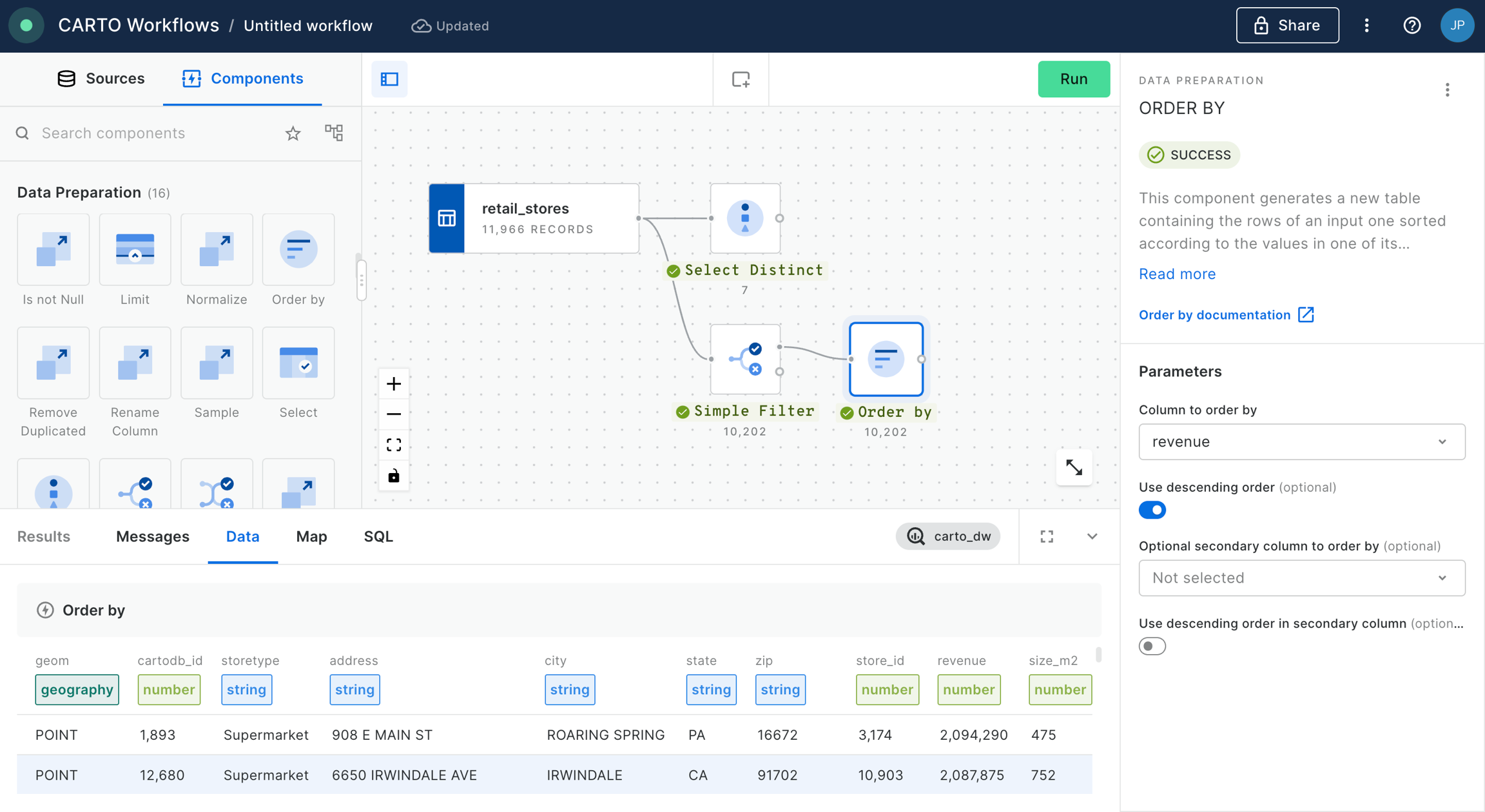
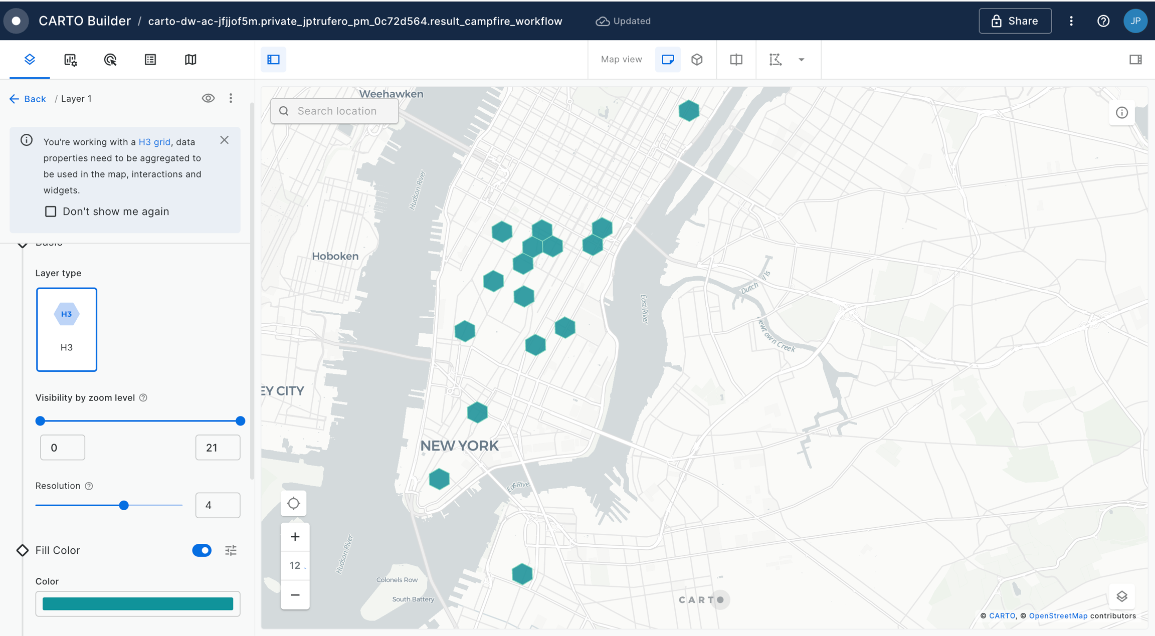
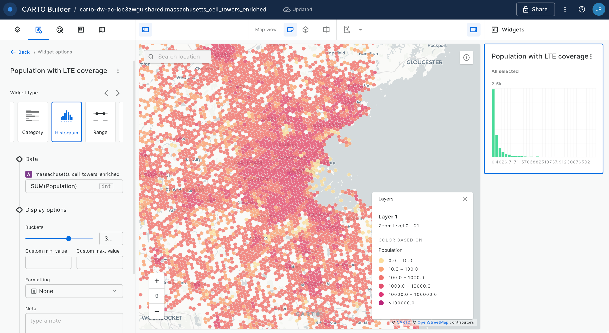
Map layers
Once a data source is added to Builder, a layer is automatically added for that data source. The spatial definition of the source linked to a layer specifies the layer visualization type and additional visualization and styling options. The different layer visualization types supported in Buider are:
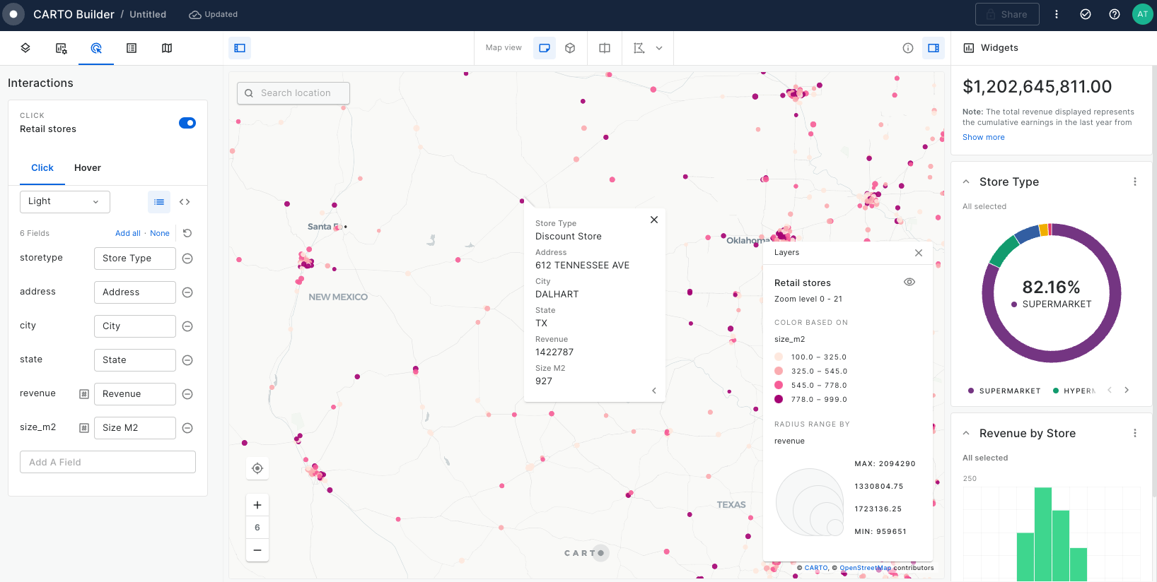
Point: Displays as point geometries. Point data can be dynamically aggregated to the following types: grid, h3, heatmap and cluster.
New to spatial data? Learn some of the essential foundations of handling spatial data in the modern data stack.
Optimizing your data for spatial analysis
Prepare your data so that it is optimized for spatial analysis in your cloud data warehouse with CARTO.
Introduction to Spatial Indexes
Learn to scale your analysis with Spatial Indexes, such as H3 and Quadbin.
Types of location data
Raster, Vector & everything in-between
The two primary spatial data types are raster and vector - but what’s the difference?
Raster data
Raster data is represented as a grid of cells or pixels, with each cell containing a value or attribute. It has a grid-based structure and represents continuous values such as elevation, temperature, or satellite imagery.
Common raster file types
Common file types for raster data include:
GeoTIFF: a popular raster file format with embedded georeferencing.
JPEG, PNG & BMP: ubiquitous image files which can be georeferenced with a World or TAB file. PNG supports lossless compression and transparency, making it particularly useful for spatial visualization.
ASCII: stores gridded data in ASCII text format. Each cell value is represented as a text string in a structured grid format, making it easy to read and manipulate.
You may also encounter: ERDAS, NetCDF, HDF, ENVI, xyz.
Vector data
Vector data represents geographic features as discrete points, lines, and polygons.It has a geometry-based structure in which each element in vector data represents a discrete geographic object, such as roads, buildings, or administrative boundaries. Vector data is scalable without loss of quality and can be easily modified or updated.
Vector data is useful for spatial analysis operations such as overlaying, buffering, and network analysis, facilitating advanced geospatial studies. Vector data formats are also well-suited for data editing, updates, and maintenance, making them ideal for workflows that require frequent changes.
Common vector file types
Shapefiles
Shapefiles are a format developed by ESRI. They have been widely adopted across the spatial industry, but their drawbacks see them losing popularity. These drawbacks include:
Shareability: They consist of multiple files (.shp, .shx, .dbf, etc.) that comprise one shapefile, which can make them tricky for non-experts to share and use.
Limited Attribute Capacity: Shapefiles are limited to a maximum of 255 attributes.
Lack of Native Support for Unicode Characters: This can cause issues when working with datasets that contain non-Latin characters or multilingual attributes.
Limited File Size Limitations: Shapefile size is limited to 2 GB.
Other vector file types
GeoJSON (Geographic JavaScript Object Notation): GeoJSON is an open standard file format based on JSON (JavaScript Object Notation). It allows for the storage and exchange of geographic data in a human-readable and machine-parseable format.
KML/KMZ (Keyhole Markup Language): KML is an XML-based file format used for representing geographic data and annotations. It was originally developed for Google Earth but has since become widely supported by various GIS software. KMZ is a compressed version of KML, bundling multiple files together.
GPKG (Geopackage): GPKG is an open standard vector file format developed by the Open Geospatial Consortium (OGC). It is a SQLite database that can store multiple layers of vector data along with their attributes, styling, and metadata. GPKG is designed to be platform-independent and self-contained.
Everything in-between
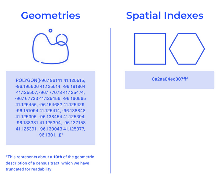
There is a small area in between raster and vector data types, with Spatial Indexes being one of the most ubiquitous data types here.
Spatial Indexes are global grids - in that sense, they are a lot like raster data. However, they render a lot like vector data; each "cell" in the grid is an individual feature which can be interrogated. They can be used for both vector-based analysis (like running intersections and spatial joins) and raster-based analysis (like slope or hotspot analysis).
But where they really excel is in their size, and subsequent processing and analysis speeds. Spatial Indexes are "geolocated" through a reference string, not a long geometry description (like vector data). This makes them small, and quick. So many organizations are now taking advantage of Spatial Indexes to enable highly performant analysis of truly big spatial data. Find out more about these in the ebook
Scaling common geoprocessing tasks with Spatial Indexes
So, you've decided to start scaling your analysis using Spatial Indexes - great! When using these grid systems, some common spatial processing tasks require a slightly different approach to when using geometries.
To help you get started, we've created a reference guide below for how you can use Spatial Indexes to complete common geoprocessing tasks - from buffers to clips. Once you're up and running, you'll be amazed at how much more quickly - and cheaply - these operations can run! Remember - you can always revert back to geometries if needed.
All of these tasks are undertaken with CARTO Workflows - our low-code tool for automating spatial analyses. Find more tutorials on using Workflows .
Data visualization
In this section you can find step-by-step guides focused on bringing your data visualization to life with Builder. Each tutorial utilizes available demo data from the CARTO Data Warehouse connection, enabling you to dive straight into map creation right from the start.
How to use GenAI to optimize your spatial analysis
In this webinar we showcase how to leverage the component in Workflows to optimize and help us understand the results of a spatial analysis.
Step-by-step tutorials to learn how to build best-in-class geospatial visualizations with CARTO Builder.
Data analysis with maps
Train your spatial analysis skills and learn to build interactive dashboards and reports with our collection of tutorials.
Sharing and collaborating
Tutorials showcasing how Builder facilitates the generation and sharing of insights via collaborative and interactive maps.
Solving geospatial use-cases
More advanced tutorials showcasing how to use Builder to solve geospatial use-cases.
Step-by-step tutorials
Tutorials with step-by-step instructions for you to learn how to perform different spatial analysis examples with CARTO Workflows.
Workflow templates
Drag & drop our workflow templates into your account to get you started on a wide range of scenarios and applications, from simple building blocks for your data pipeline to industry-specific geospatial use-cases.
Spatial Analytics for BigQuery
Learn how to leverage our Analytics Toolbox to unlock advanced spatial analytics in Google BigQuery.
Spatial Analytics for Snowflake
Learn how to leverage our Analytics Toolbox to unlock advanced spatial analytics in Snowflake.
Spatial Analytics for Redshift
Learn how to leverage our Analytics Toolbox to unlock advanced spatial analytics in AWS Redshift.
Access our Product Documentation
Detailed specifications of all tools and features available in the CARTO platform.
Contact Support
Get in touch with our team of first-class geospatial specialists.
Join our community of users in Slack
Our community of users is a great place to ask questions and get help from CARTO experts.
Lack of Topology Information: Shapefiles do not inherently support topological relationships, such as adjacency, connectivity, or overlap between features.
No Native Support for Time Dimension: No native time field type.
Lack of Direct Data Compression: Shapefiles do not provide built-in compression options, which can result in larger file sizes.
FGDB (File Geodatabase): FGDB is a proprietary vector file format developed by Esri as part of the Esri Geodatabase system.
GML (Geography Markup Language): GML is an XML-based file format developed by the OGC.
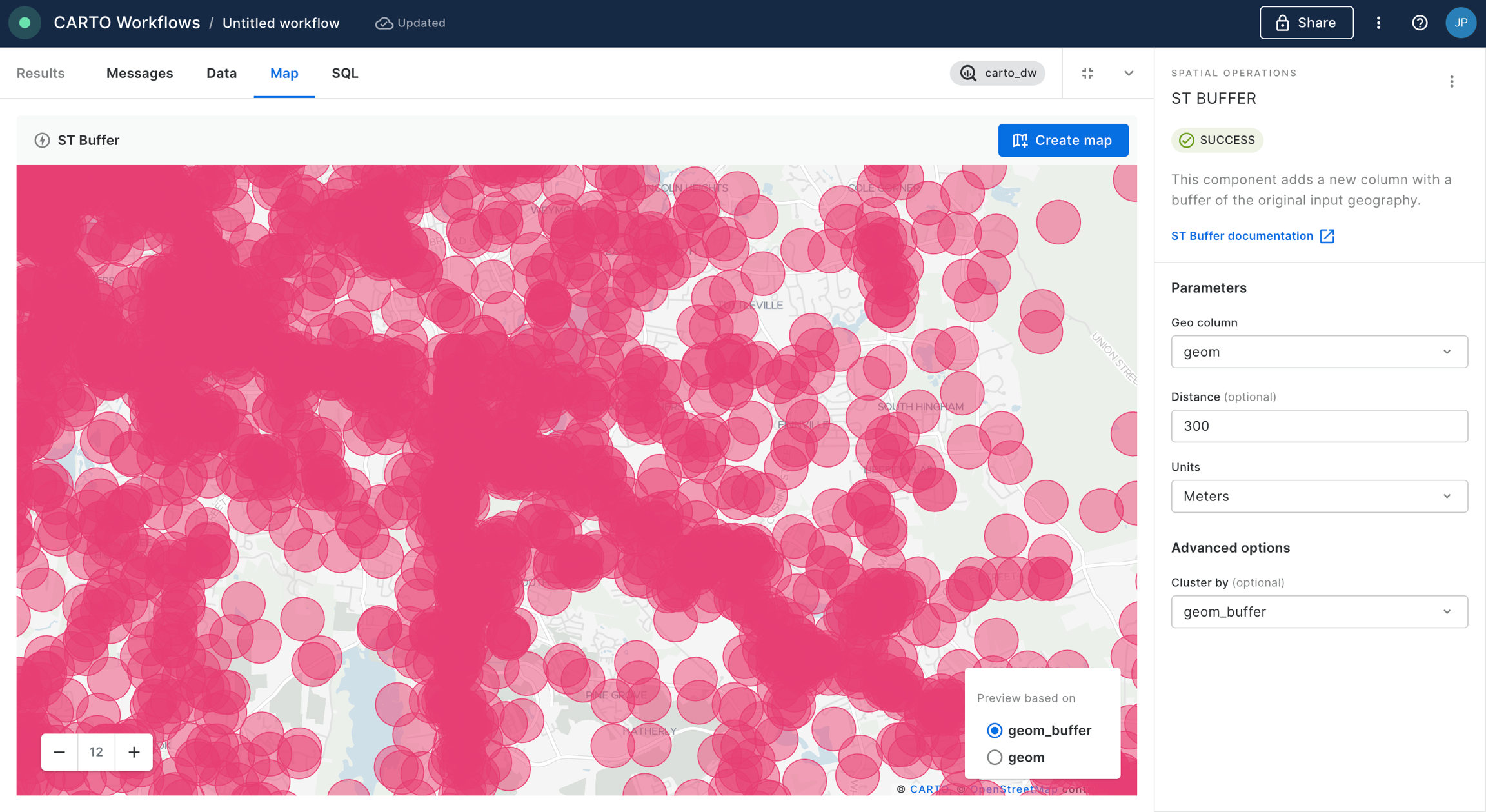
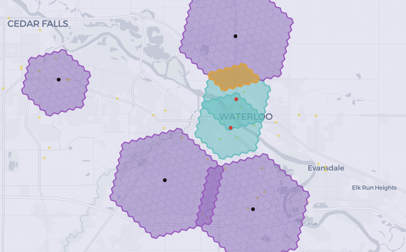
The humble buffer is one of the most basic - but most useful - forms of spatial analysis. It's used to create a fixed-distance ring around an input feature.
With geometries... use the ST Buffer tool.
With Spatial Indexes...convert the input geometry to a Spatial Index, then use a H3/Quadbin K-Ringcomponent to approximate a buffer. Lookup H3 resolutions here and Quadbin resolutions here to work out the K-Ring size needed.
Clip/intersect
Where does geometry A overlap with geometry B? It’s one of the most common spatial tasks, but heavy geometries can make this straightforward task a pain.
With geometries... use the ST Intersection tool. This may look like a simple process, but it can be incredibly computationally expensive.
With Spatial Indexes...convert both input geometries to a Spatial Index, then use a Join (inner) to keep only cells which can be found in both inputs.
Difference
For a “difference” process, we want the result to be the opposite of the previous intersection, retaining all areas which do not intersect.
With geometries... use the ST Difference tool. Again, while this may look straightforward, it can be slow and computationally expensive.
With Spatial Indexes... again convert both input geometries to a Spatial Index, this time using a full outer Join. A Where component can then be used to filter only "different" cells (where h3 IS null AND h3_joined IS not null) - at a fraction of the calculation size.
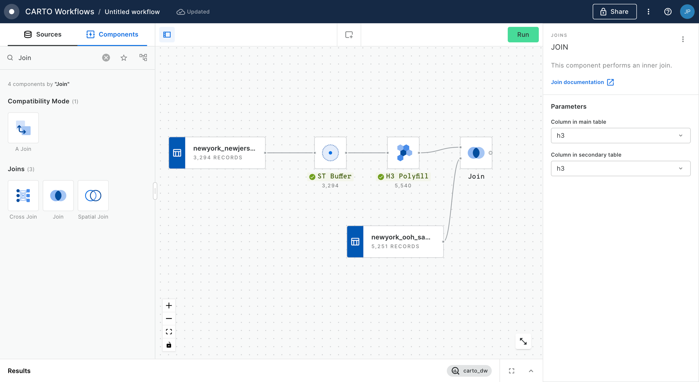
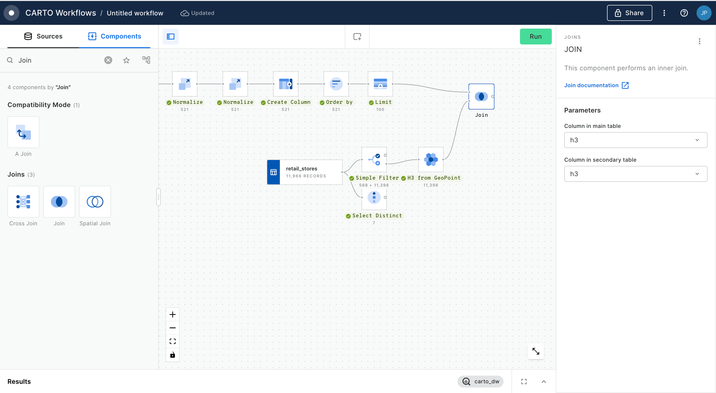
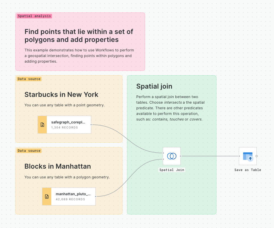
Spatial Join
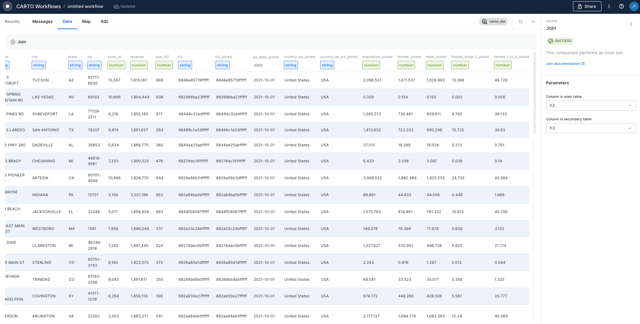
Spatial Joins are the "bread and butter" of spatial analysis. They can be used to answer questions like "how many people live within a 10-minute drive of store X?" or "what is the total property value in this flooded area?"
Our Analytics Toolbox provides a series of Enrichment tools which make these types of analyses easy. Enrichment tools for both geometries and Spatial Indexes are available - but we've estimated the latter of these are up to 98% faster!
With geometries... use the Enrich Polygons component.
With Spatial Indexes... use the Enrich H3 / Quadbin Grid component.
Check out the full guide to enriching Spatial Indexes here.
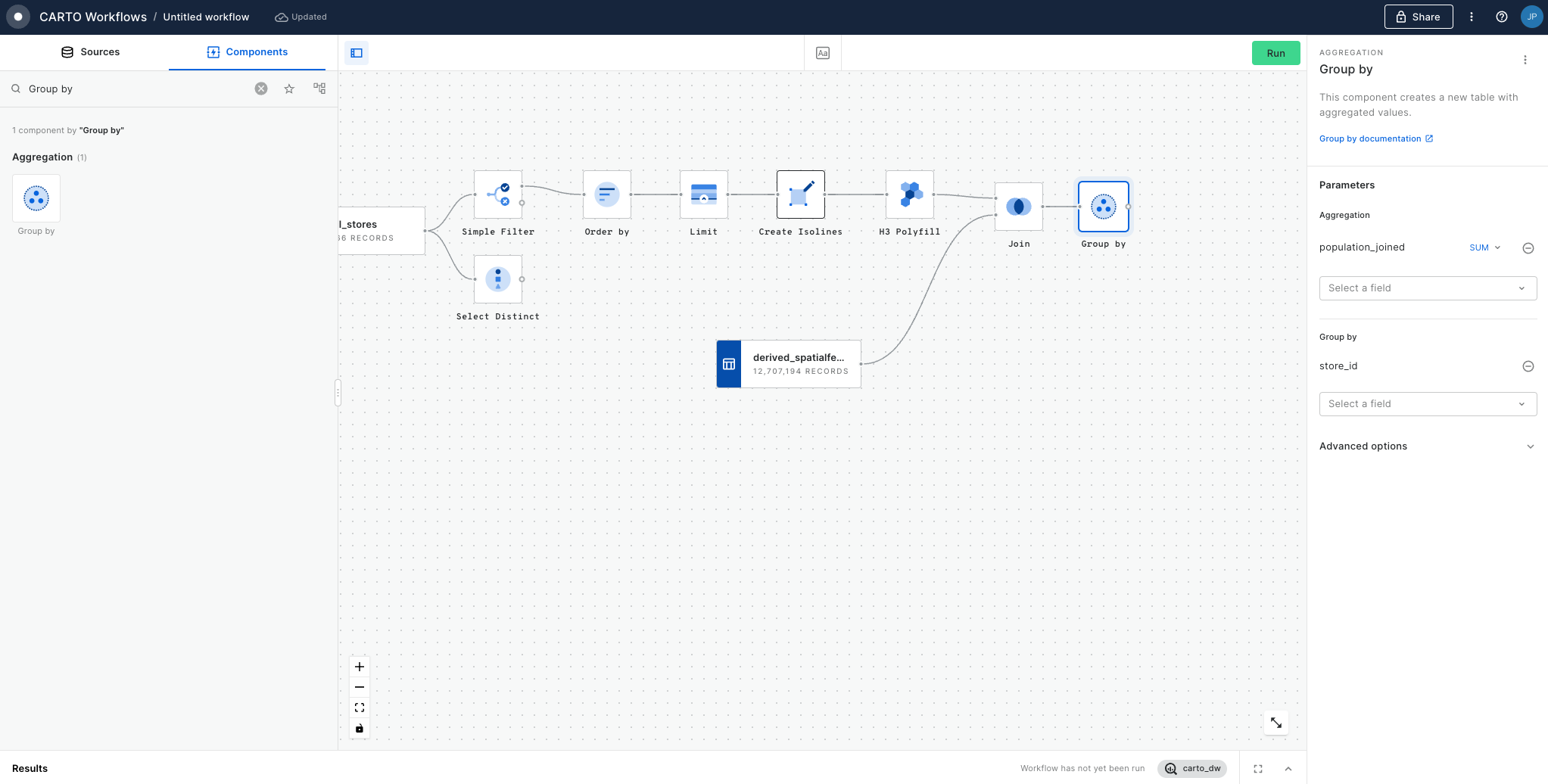
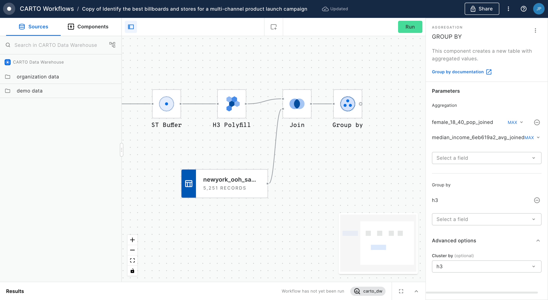
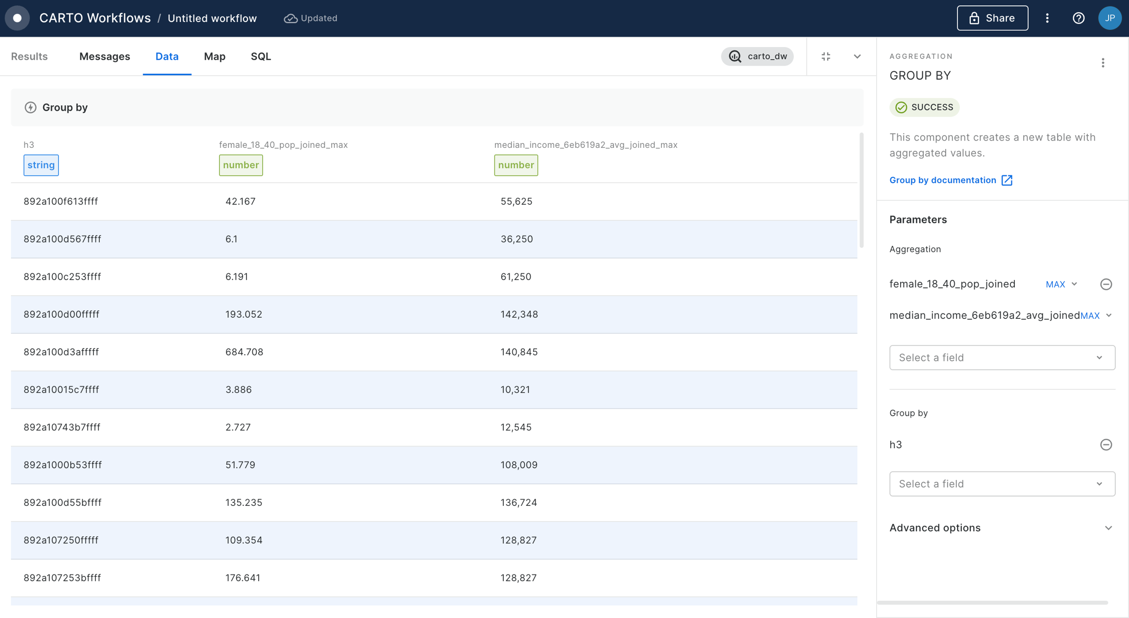
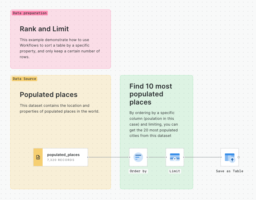
Aggregate within a distance
Say you wanted to know the population within 30 miles of
For instance, in the example below we want to create a new column holding the number of stores in a 1km radius.
With Geometries... create a Buffer, run a Spatial Join and then use Group by to aggregate the results.
With Spatial Indexes... have the inputs stored as a H3 grid with both the source and target features in the same table. Like in the earlier Buffer example, use the H3 K-Ring component to create your "search area." Now, you can use the Group by component - grouping by the newly created H3 K-Ring ID - to sum the number of stores within the search area.
This is a fairly simple example, but let's imagine something more complex - say you wanted to calculate the population within 30 miles of a series of input features. Creating and enriching buffers of this size - particularly when you have tens of thousands of inputs - will be incredibly slow, particularly when your input data is very detailed. This type of calculation could take hours - or even days - without Spatial Indexes.
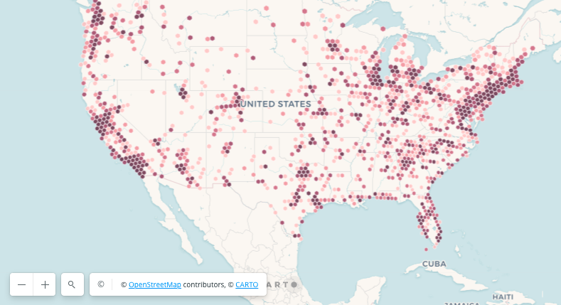
Find out how to style point locations in Builder, making it easier for users to understand. This guide will show you simple ways to use Builder to color and shape these places on your map, helping you understand how people are spread out across the globe.
Style qualitative data using hex color codes
In this tutorial, you'll learn how to generate hex color code values through both Workflows and SQL. Moreover, you'll gain insights on how to efficiently apply them in Builder, enhancing your styling process and overcoming palette limitations.
Create an animated visualization with time series
This tutorial takes you through a general appraoch of building animated visualizations using Builder Time Series Widget. The techniques you'll learn here can be applied broadly to animate and analyze any kind of temporal geospatial data whose position moves over time.
Visualize administrative regions by defined zoom levels
Create a visualization that showcases specific administrative regions at predetermined zoom level ranges. This approach is perfect for visualizing different levels of detail as users zoom in and out. At lower zoom levels, you'll see a broader overview, while higher zoom levels will reveal more detailed information.
Build a dashboard to understand historic weather events
Learn how to create an interactive dashboard to navigate through America's severe weather history, focusing on hail, tornadoes, and wind. The goal is to create an interactive map that transitions through different layers of data, from state boundaries to the specific paths of severe weather events, using 's datasets.
Customize your visualization with tailored-made basemaps
Create a visualization using a custom basemap in Builder. In this tutorial you'll learn how you can create your own Style JSON custom basemaps using an open source tool, upload them into your CARTO organization from Settings and leverage them using Builder.
Visualize static geometries with attributes varying over time
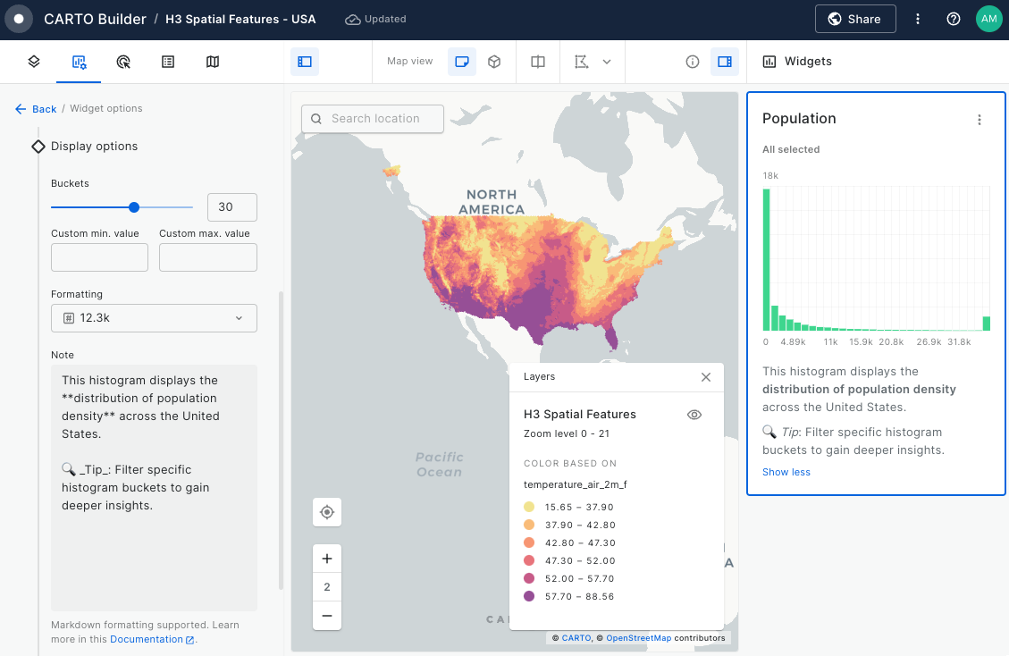
Learn how to efficiently visualize static geometries with dynamic attributes using Aggregate by Geometry in CARTO Builder.
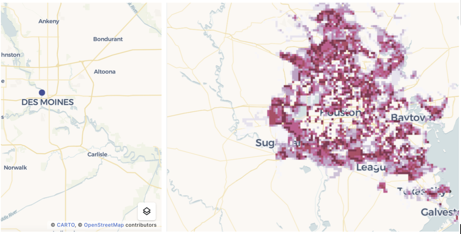
This tutorial explores the Global Historical Climatology Network (NOAA) dataset, focusing on U.S. weather stations in 2016. By aggregating identical geometries—such as administrative boundaries or infrastructure—you can uncover trends in temperature, precipitation, and wind speed while optimizing map performance.
Mapping the precipitation impact of Hurricane Milton with raster data
In this tutorial, you'll learn how to visualize and analyze raster precipitation data from Hurricane Milton in CARTO. We’ll guide you through the preparation, upload, and styling of raster data, helping you extract meaningful insights from the hurricane’s impact. By the end of this tutorial, you’ll create an interactive dashboard in CARTO Builder, combining raster precipitation data with Points of Interest (POIs) and hurricane track to assess the storm’s impact.
Calculating traffic accident rates
In this tutorial, we will calculate the rate of traffic accidents (number of accidents per 1,000 people) for Bristol, UK. We will be using the following datasets. The first one is available in the demo tables section of the CARTO Data Warehouse, while the latter two are freely available in our Spatial Data Catalog.
Bristol traffic accidents (CARTO Data Warehouse)
Census 2021 - United Kingdom (Output Area) [2021] (Office for National Statistics)
Lower Tier Local Authority (Office for National Statistics)
Alternatively, you could use a different traffic accident dataset from another source (or a dataset on a different topic, such as crime incidence or service provision), and use a different demographic boundary dataset from our Spatial Data Catalog to create your own custom analysis.
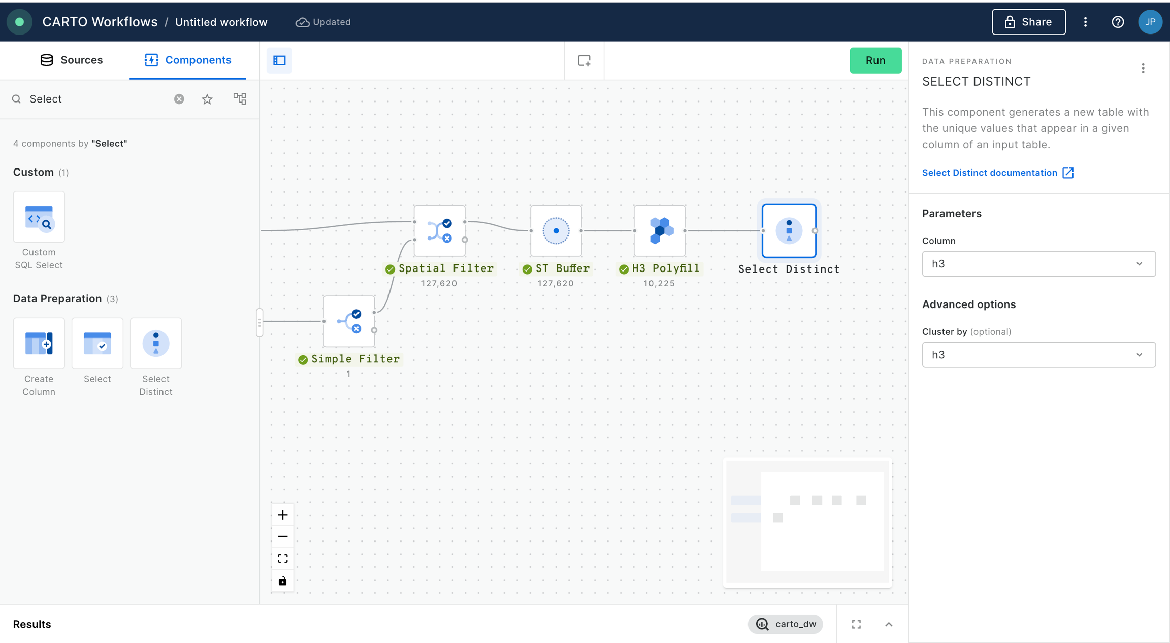
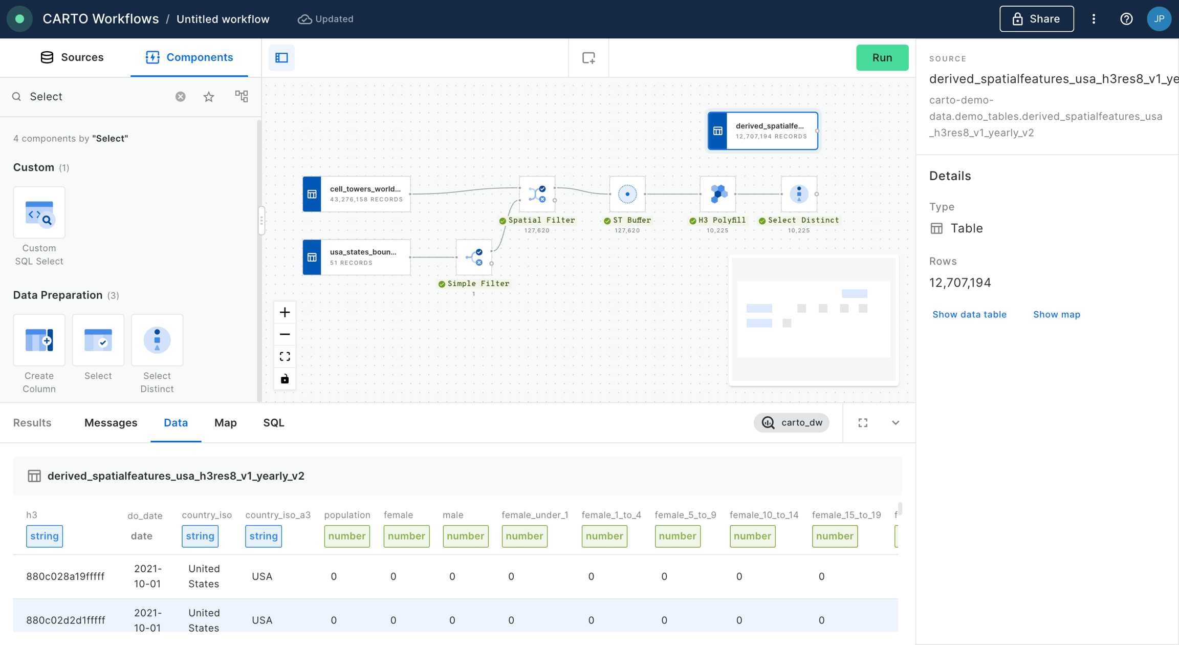
Step 1: Converting accident data to Spatial Indexes
In this step, you'll convert the individual accident point data to aggregated H3 cells.
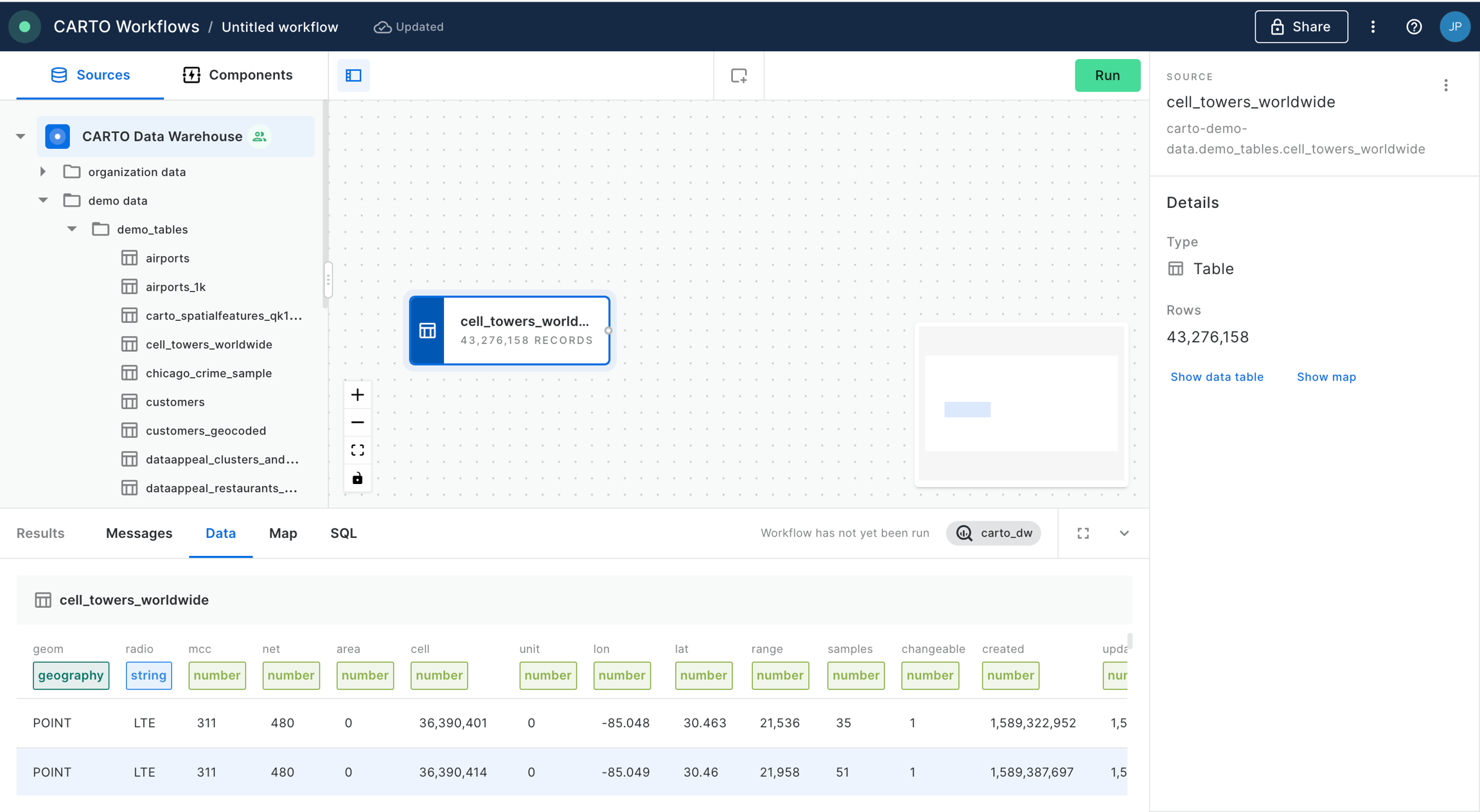
Create a Workflow using the CARTO Data Warehouse connection.
First, drag the Lower Tier Local Authority data onto the canvas. It can be found under Sources > Data Observatory > Office for National Statistics.
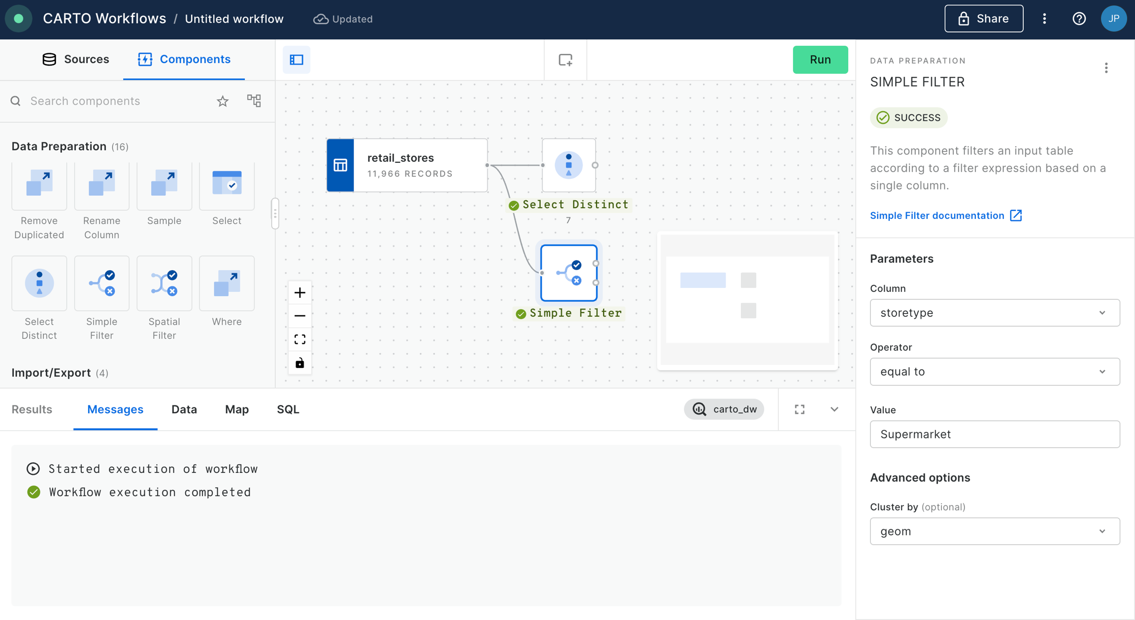
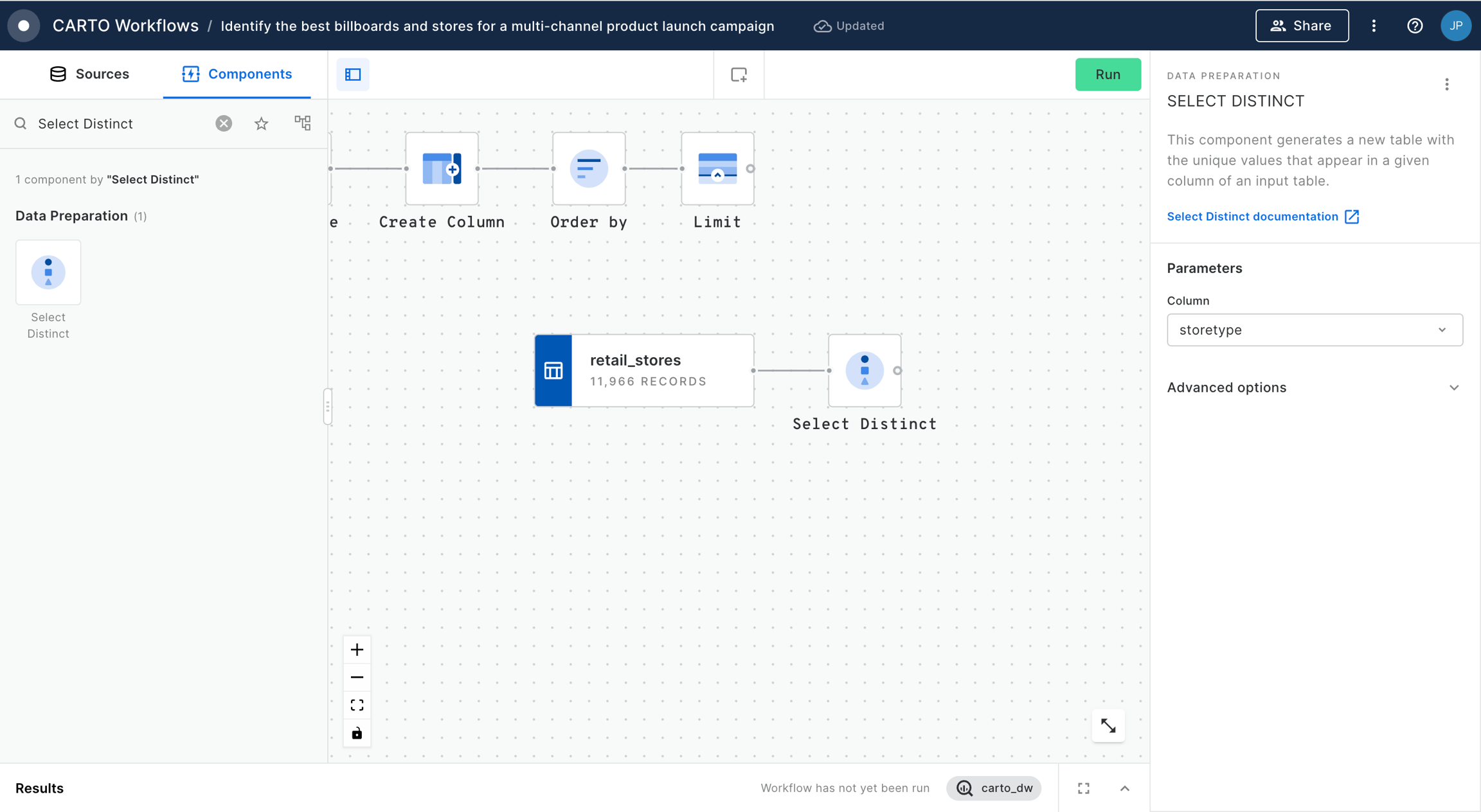
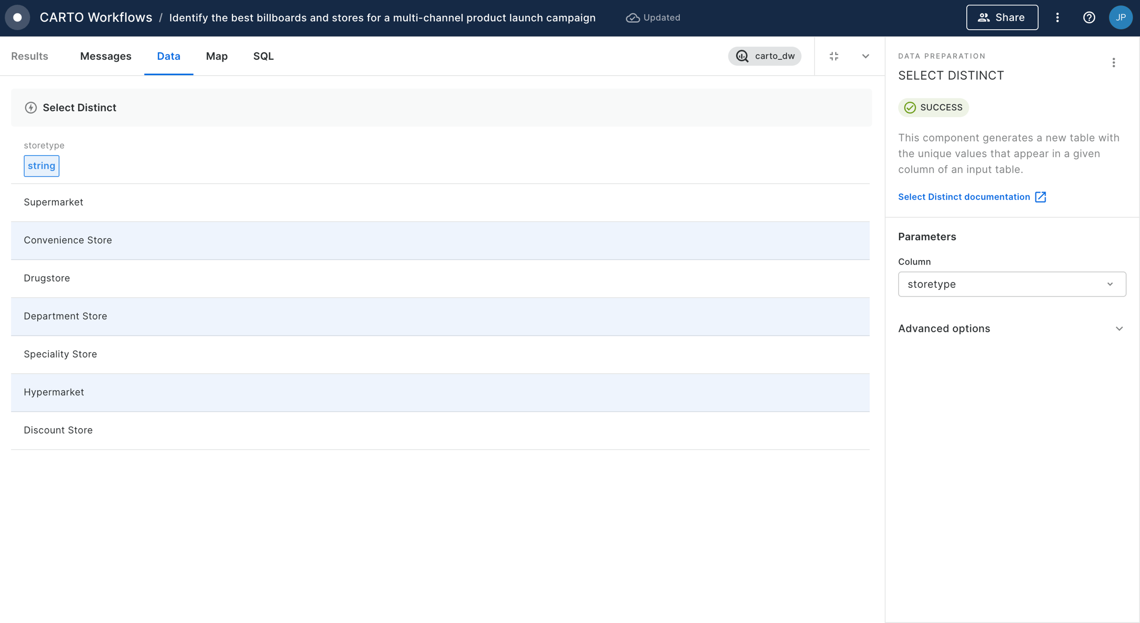
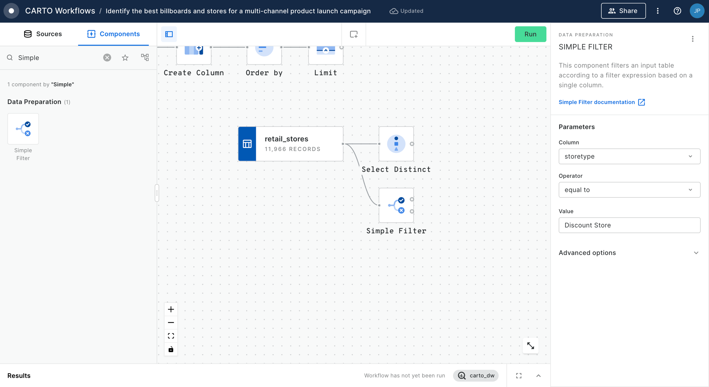
Connect this to a Simple Filter component. Set the filter to do_label is equal to "Bristol, City of".
The result of this will be a H3 index covering the Bristol area with a count for the number of accidents which have taken place within each cell. Now let's put those counts into context!
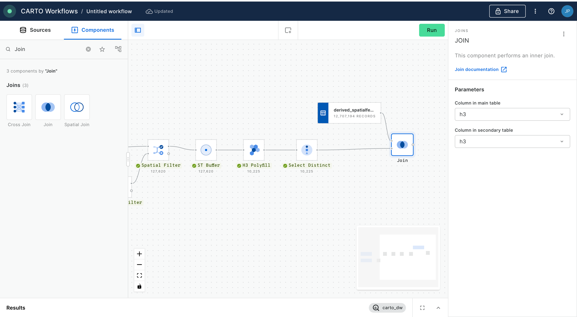
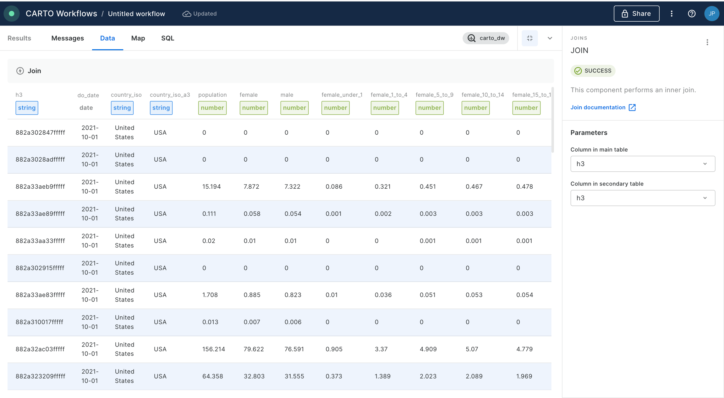
Step 2: Enrich the grid with population data
In this section of the tutorial, we will enrich the H3 grid we have just created with population data from the UK Census.
Drag the Census 2021 - United Kingdom (Output Area) [2021] table onto the canvas from Sources > Connections > Office for National Statistics.
Drag an Enrich H3 Grid onto the canvas. Connect the Join component (Step 1 point 4) to the top input, and the Census data to the bottom output.
The component should detect the H3 and geometry columns by default. From the Variables drop down, add "ts001_001_ff424509" (total population, you can reference Variable descriptions for any dataset on our Data Observatory) and specify the aggregation method as SUM. This will estimate the total population living in each H3 cell based on the area of overlap with each Census Output Area.
Run the workflow.
Step 3: Calculating the accident rate & hotspot analysis
Now we have all of the variables collected into the H3 support geography, we can start to turn this into insights.
First, we'll calculate the accident rate. Connect the output of Enrich H3 Grid to a new Create Column component. Call the new column "rate".
Set the expression as CASE WHEN h3_count_joined IS NULL THEN 0 ELSE h3_count_joined/(ts001_001_ff424509_sum/1000) END. This code calculates the number of accidents per 1,000 people, unless there has been no accident in the area, in which case the accident rate is set to 0.
Now, let's explore hotspots of high accident rates . Connect the output of Create Column to a new
You can explore the results below!
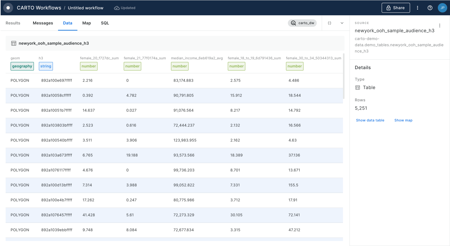
💡 Note that to be able to visualize a H3 index in CARTO Builder, the field containing the index must be called H3.
Using Spatial Indexes for analysis
Further tutorials for running analysis with Spatial Indexes
Featured resources
These resources have been designed to get you started. They offer an end-to-end tutorial for creating, enriching and analyzing Spatial Indexes using data freely available on the CARTO platform.
Spatial Statistics
For your use case
Work with unique Spatial Index properties
Take advantage of the unique properties of Spatial Indexes
On this page, you'll learn how to take advantage of some of the unique properties of Spatial Indexes.
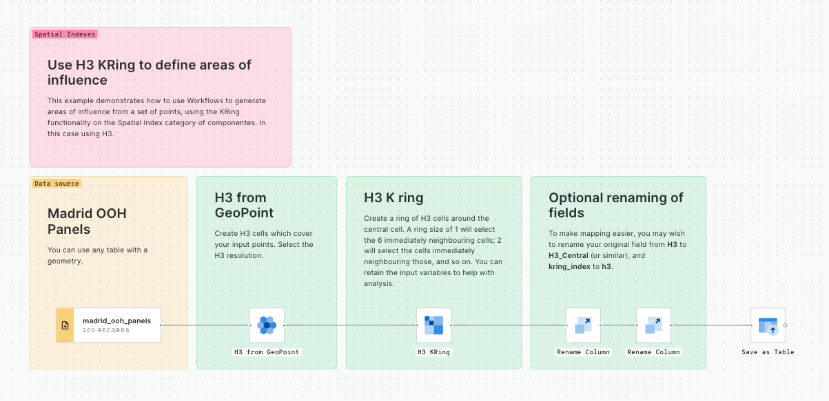
Create K-rings; define areas of interest without requiring the use of geometries.
; when and how to do this.
; how to aggregate data from a spatial index to a geometry.
Use parent and children hierarchies
Being able to seamlessly move data between resolutions is one of the reasons Spatial Indexes are so powerful. With geometries, this would involve a heavy spatial join operation whereas Spatial Indexes enable an efficient string process.
Resolutions are referred to as having "parent" and "child" relationships; less detailed hierarchies are the parents, and more detailed hierarchies are the children. In this tutorial, we'll share how you can easily move between these resolutions.
💡 You will need a Spatial Index table to follow this tutorial. You can use your own or follow the steps in the tutorial. We'll be using "" which you can access as a demo table from the CARTO Data Warehouse.
Our source dataset (USA Spatial Features H3 - resolution 8) has around 12 million cells in it - which is a huge amount! In this tutorial, we'll create the workflow below to move down a hierarchy to resolution 7 to make this slightly more manageable.
In the CARTO workspace, head to Workflows > Create a new workflow. Choose the relevant connection for where your data is stored; if you're following this tutorial you can also use the CARTO Data Warehouse.
Drag your Spatial Index table onto the canvas.
Next, drag a H3 to Parent component onto the canvas. Note you can also use a Quadbin to Parent component if you are using quadbins.
At this point, it is good practice to use a Rename Column component to rename the H3_Parent column "H3" so it can be easily identified as the index column.
Create K-rings
K-rings are a simple concept to understand, but can be a powerful tool in your analytics arsenal.
A ring is the adjacent cells surrounding an originating, central cell. The origin cell is referred to as “0,” and the adjacent cells are ring “1.” The cells adjacent to those are ring “2,” and so on - as highlighted in the image below.
What makes this so powerful is that it enables fast and inexpensive distance-based calculations; rather than having to make calculations based on - for example - buffers or isolines, you could instead stipulate 10 K-rings. This is a far quicker and cheaper calculation as it removes the requirement for use heavy geometries.
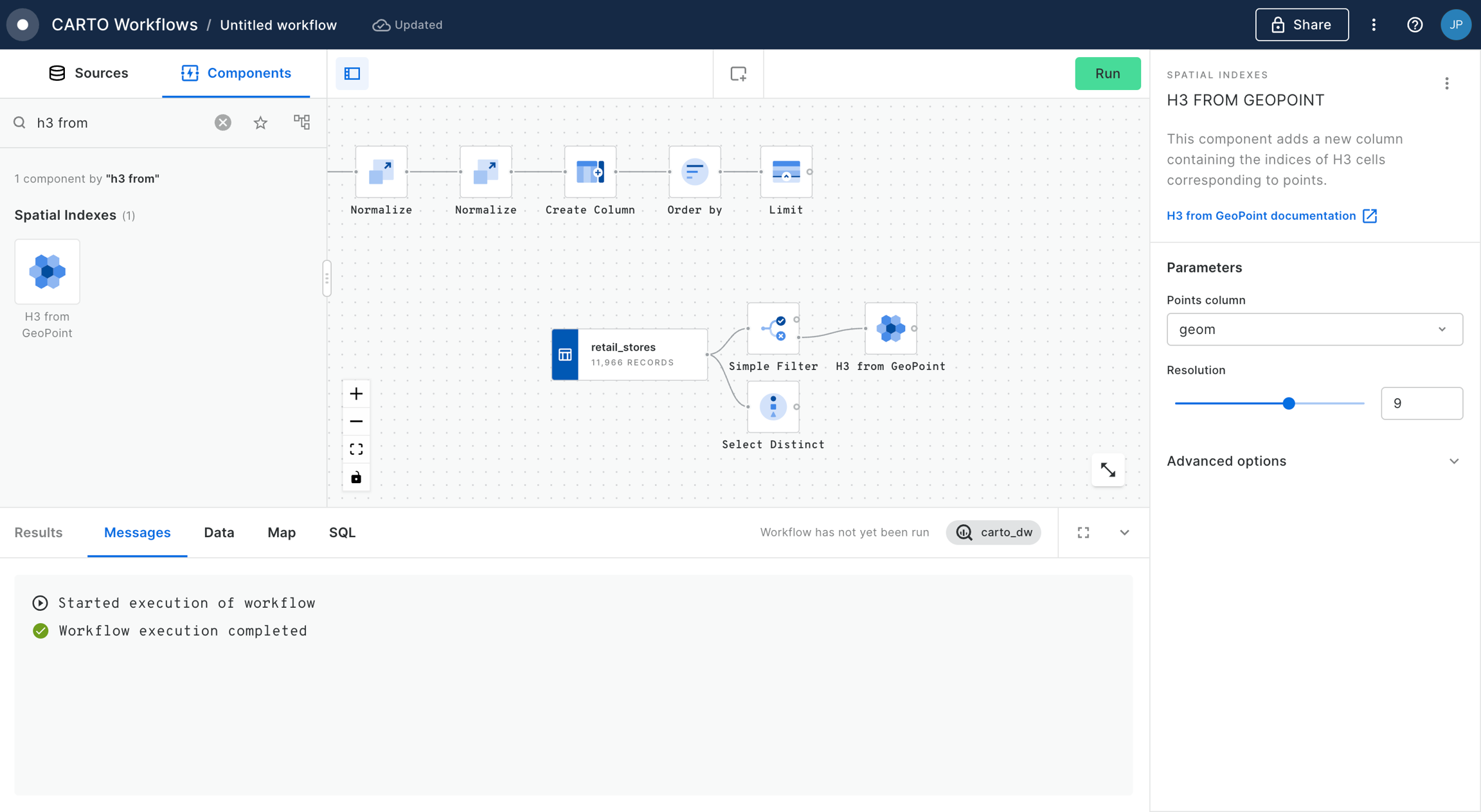
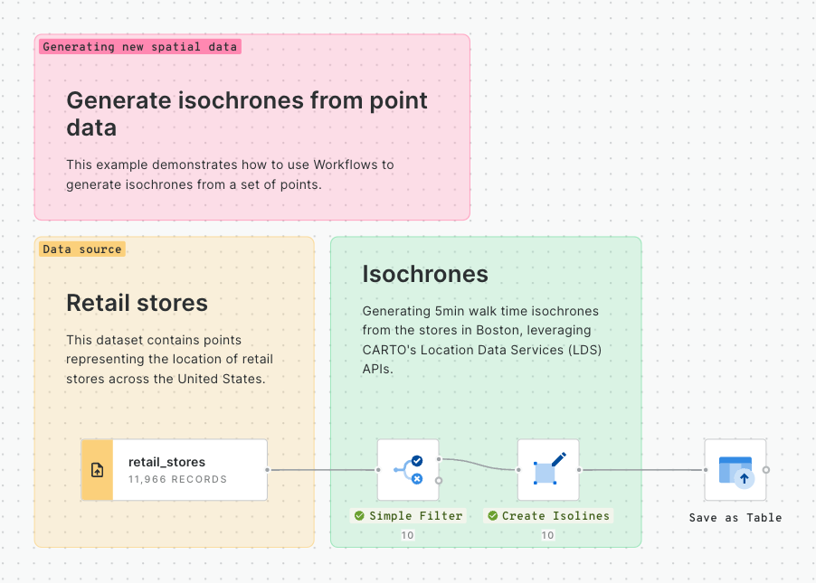
💡 You will need a Spatial Index table to follow this tutorial. We have used the Retail Stores dataset from demo tables in the CARTO Data Warehouse, and used a Simple Filter to filter this table to stores in Boston. We've then used H3 from GeoPoint to convert these to a H3 table. Please refer to the tutorial for more details on this process.
Connect your H3 table to a H3 KRing component. Note you can also use a Quadbin KRing component if you are using this type of index.
Set the K-ring to 1. You can use and this to work out how many K-rings you need to approximate specific distances. For instance, we are using a H3 resolution of 8 which has a long-diagonal "radius" of roughly 1km. This means our K-ring of 1 will cover an area approximately 1km away from the central cell.
Run your workflow! This will generate a new field called
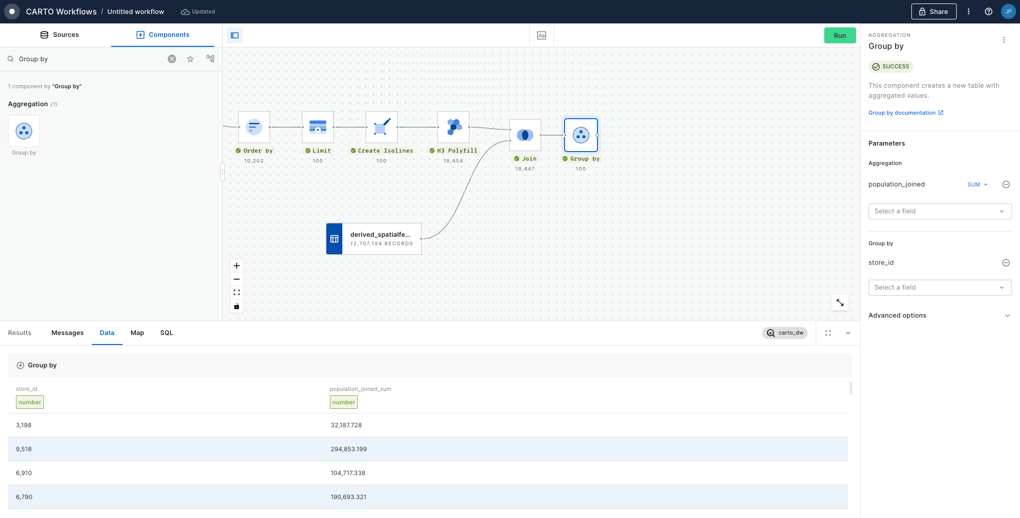
So how can you use this? Well, you can see an example in the workflow above in the "Calculate the population" section, where we analyze the population within 1km of each store.
We run a Join (inner) on the results of the K-ring, joining it by the kring_index column to the H3 column in USA Spatial Features table (available for free to all CARTO users via the ). Next, with the Group by component we aggregate by summing the population, and grouping by H3_joined. This gives us the total population in the K-ring around each central cell, approximately the population within 1km of each store. Finally, we use a Join (left) to join this back to our original H3 index which contains the store information.
With this approach, we leverage string-based - rather than geometry-based - calculations, for lighter storage and faster results - ideal for working at scale!
Convert indexes into a geometry
There are some instances where you may want to convert Spatial Indexes back into a geometry. A common example of this is where you wish to calculate the distance from a Spatial Index cell to another feature, for instance to understand the distance from each cell to its closest 4G network tower.
There are two main ways you can achieve this - convert the index cell to a central point, or to a polygon.
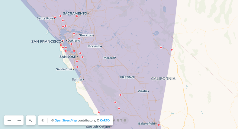
💡 You will need a Spatial Index table to follow this tutorial. You can use your own or follow the steps in the tutorial. We have used the USA States dataset (available for free to all CARTO users via the ) and filtered it to California. We then used H3 Polyfill to create a H3 index (resolution 5) to cover this area. For more information on this process please refer to the tutorial.
Converting to a point geometry: connect any Spatial Index component or source to a H3 Center component. Note you can alternatively use Quadbin Center.
Converting to a point geometry: connect any Spatial Index component or source to a H3 Boundary component. Note you can alternatively use Quadbin Boundary.
So, which should you use? It depends completely on the outcome you're looking for.
Point geometries are much lighter than polygons, and so will enable faster analysis and lighter storage. They can also be more representative for analysis. Let's illustrate by returning to our example of finding the distance between each cell and nearby 4G towers. By calculating the distance from the central point, you are essentially calculating the average distance for the whole cell. If you were to use a polygon boundary, your results would be skewed towards the side of the cell which is closest to the tower. On the other hand, polygon boundaries enable "cleaner" visualizations and are more appropriate for any overlay analysis you may need to do.
But remember - because Spatial Index grids are geographically "fixed" it's easy to move to and from index and geometry, or different geometry types.
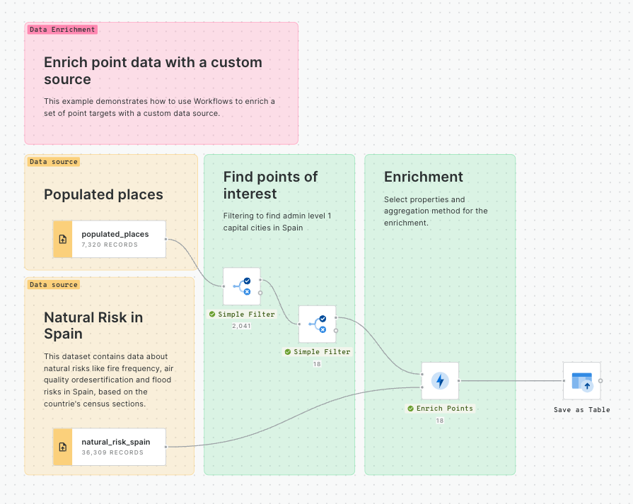
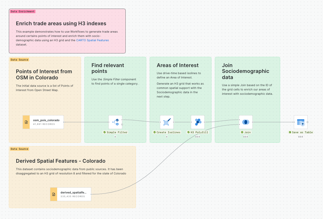
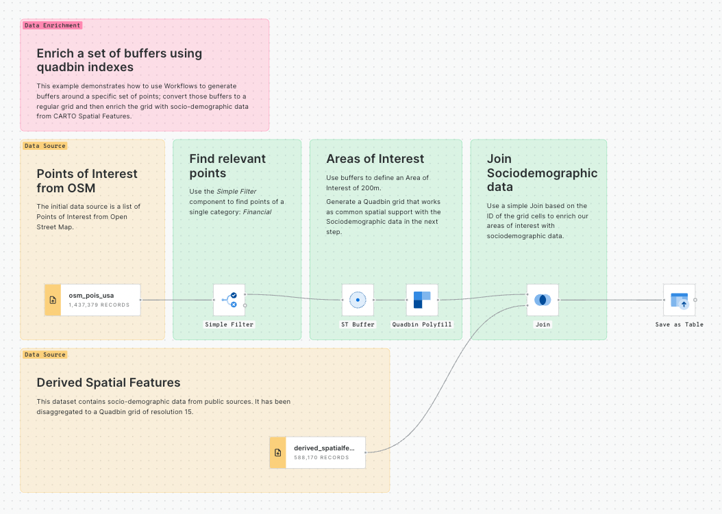
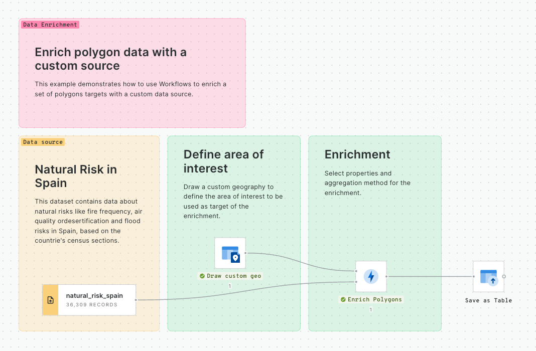
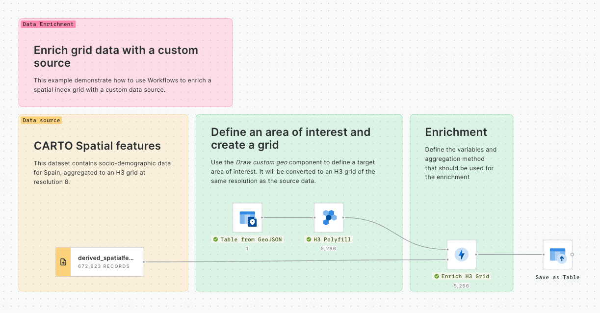
Enriching a geometry with a Spatial Index
So, you've learned how to convert a , and how to convert that . Another really common task which is made more efficient with Spatial Indexes is to use them to enrich a geometry - for instance to calculate the population within a specified area.
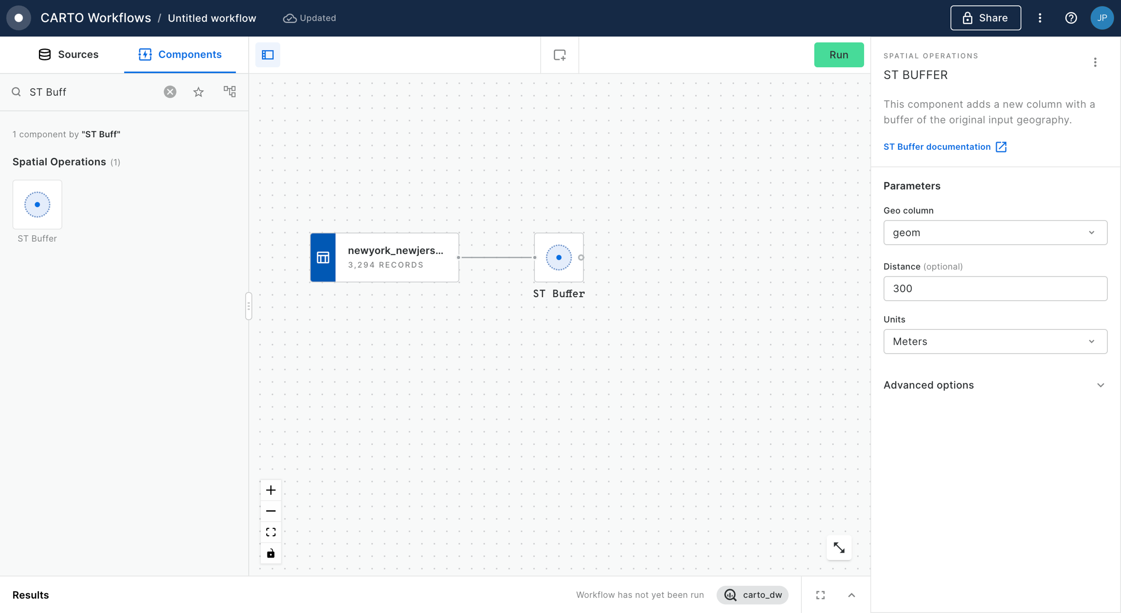
In this tutorial, we'll calculate the total population within 25 miles of Grand Central Station NYC. You can adapt this for any example; all you need is a polygon to enrich, and a Spatial Index to do the enriching with.
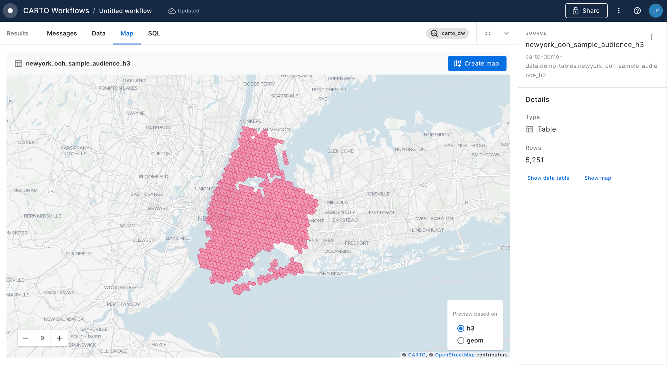
For this specific example, you will need access to the USA Spatial Features H3 table (available for free to all CARTO users either in the CARTO Data Warehouse > demo data > demo tables, or via the ). In addition, the workflow below creates a polygon of 25 miles from Grand Central Station, which we've manually digitized using the component.
To run the enrichment, follow the below steps:
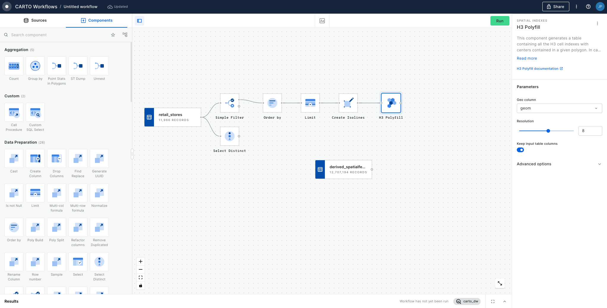
In addition to your polygon, drag your Spatial Index layer onto the canvas.
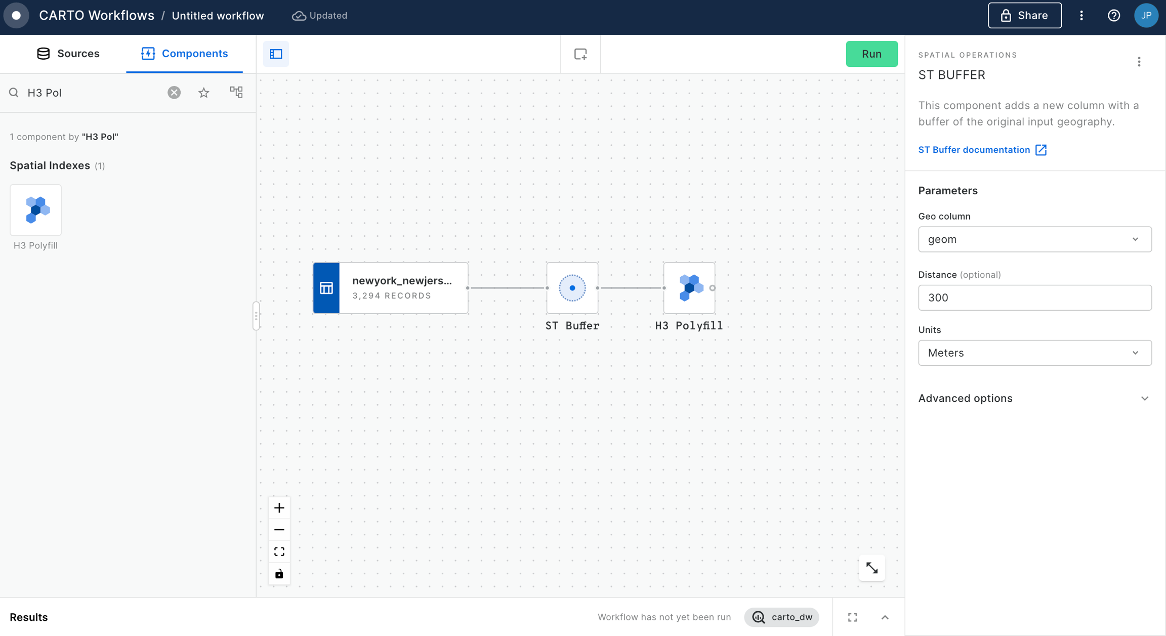
Connect the ST Buffer output to a component (note you can also use a if you are using this Spatial Index type).
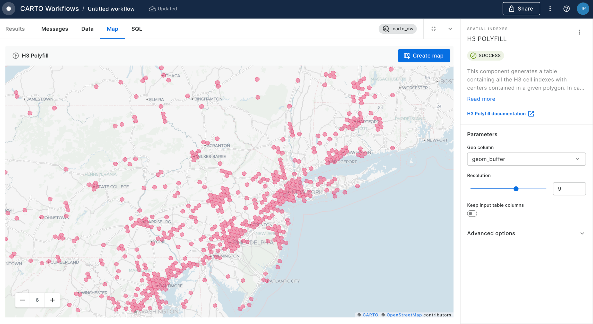
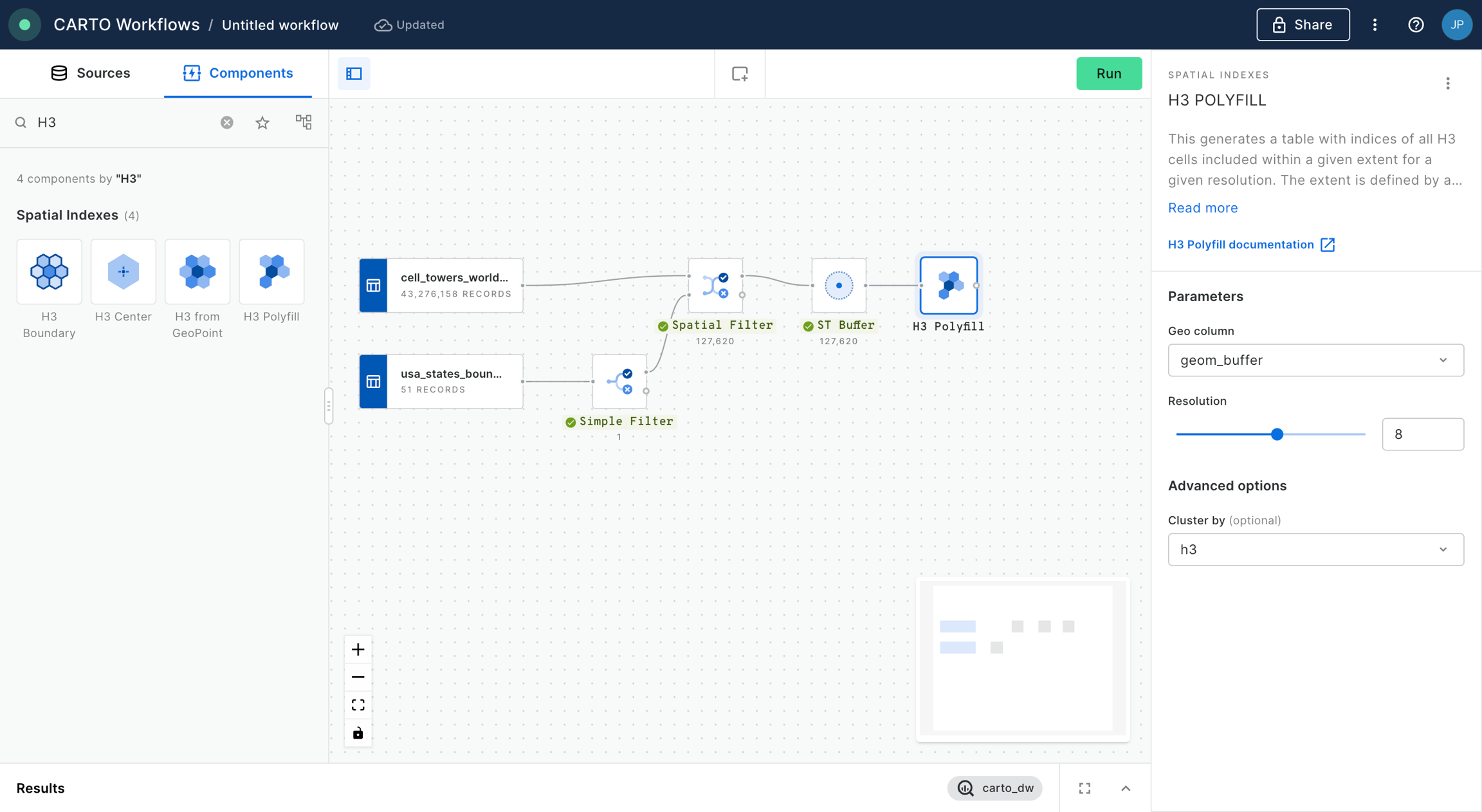
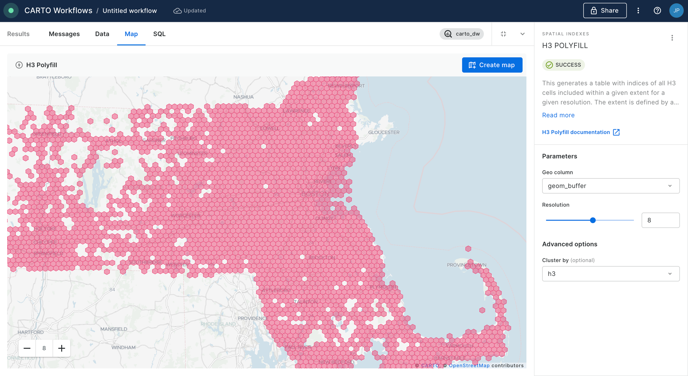
Set the resolution of H3 Polyfill to the same resolution as your input Spatial Index; for us that is 8. If you have multiple polygon input features, we recommend enabling the Keep input table columns option. Optional: run the workflow to check out the interim results! You should have a H3 grid covering your polygon.
And what's the result?
Show me the answer!
13,576,991 people live within 25 miles of Grand Central Station NYC!
The benefit of this approach is that after you've run the H3 Polyfill component, all of the calculations are based on string fields, rather than geometries. This makes the analysis far less computationally expensive - and faster!
Check out more examples of data enrichment in the !
Sharing and collaborating
Enhance your sharing and collaborating skills with Builder through our detailed guides. Each tutorial, equipped with demo data from the CARTO Data Warehouse, showcases how Builder facilitates the sharing and collaboration of insights, ensuring ease of understanding and effective communication in your maps.
Solving geospatial use-cases
Explore a range of tutorials in this section, each designed to guide you through solving various geospatial use-cases with Builder and the wider CARTO Platform. These tutorials leverage available demo data from the CARTO Data Warehouse connection, enabling you to dive straight into map creation right from the start.
Workflows as MCP Tools
MCP Tools in CARTO are built from Workflows. Each tool you create defines how to solve a specific spatial problem, what inputs it needs, and what results it returns.
This guide shows you how to configure a Workflow as an MCP Tool.
Step 1: Create a Workflow
Build a Workflow that solves the specific problem you want agents to handle. For example, if you want agents to find nearby stores, create a workflow that performs that spatial query.
Step 2: Add an MCP Tool Output
Add the MCP Tool Output component to your workflow. This defines what the tool returns.
Choose the output mode:
Sync: Returns results immediately (use for fast queries)
Async: Returns results after processing completes (use for long-running operations)
Step 3: Configure the tool
Click the three-dot menu in the top-right corner and select the MCP Tool settings.
When the dialog opens up, write a clear description explaining what the tool does. Make sure to also. Define all input parameters with descriptive names and descriptions and enable the tool to make it available through the MCP Server.
Example description:
"Finds the 5 nearest retail stores to a given location and returns their addresses and distances."
Step 4: Sync changes
When you update a workflow, click Sync to propagate changes to the MCP Tool. This ensures agents always use the latest version.
Step 5: Use your own tools
Once your workflow is configured as an MCP Tool, you can:
Connect external agents (like Gemini CLI) to your CARTO MCP Server. See Using MCP Tools with CARTO.
Give CARTO AI Agents access to the tool. See Adding MCP Tools to AI Agents.
Step-by-step tutorials
In this section you can find a set of tutorials with step-by-step instructions on how to solve a series of geospatial use-cases with the help of Agentic GIS.
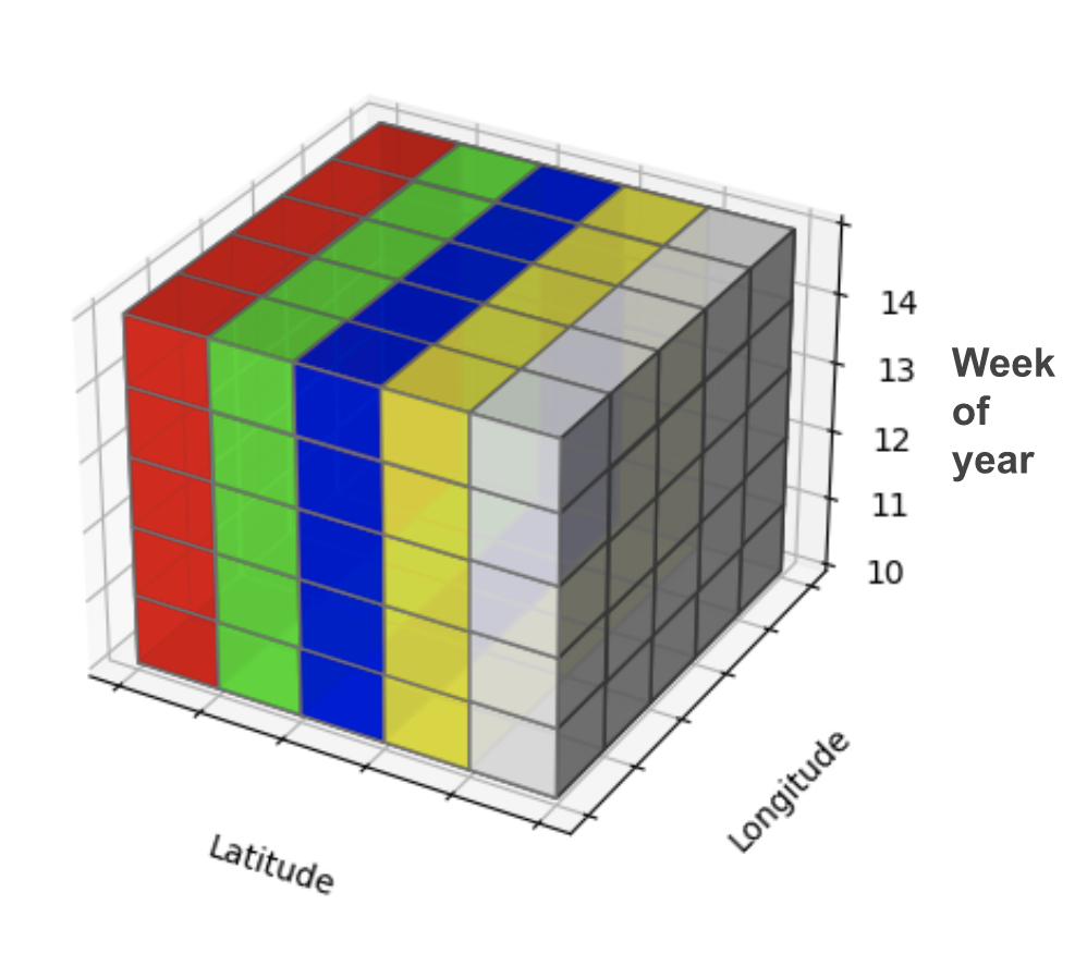
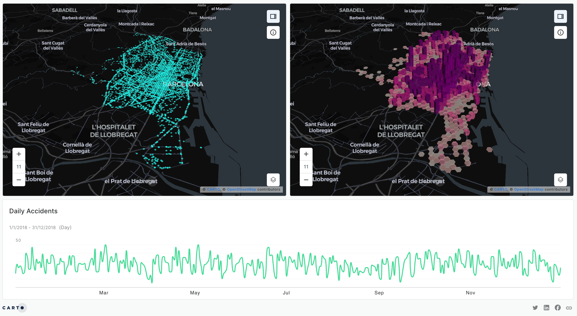
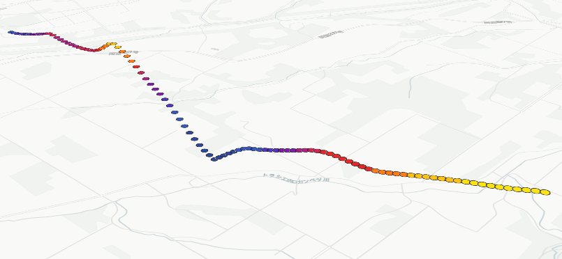
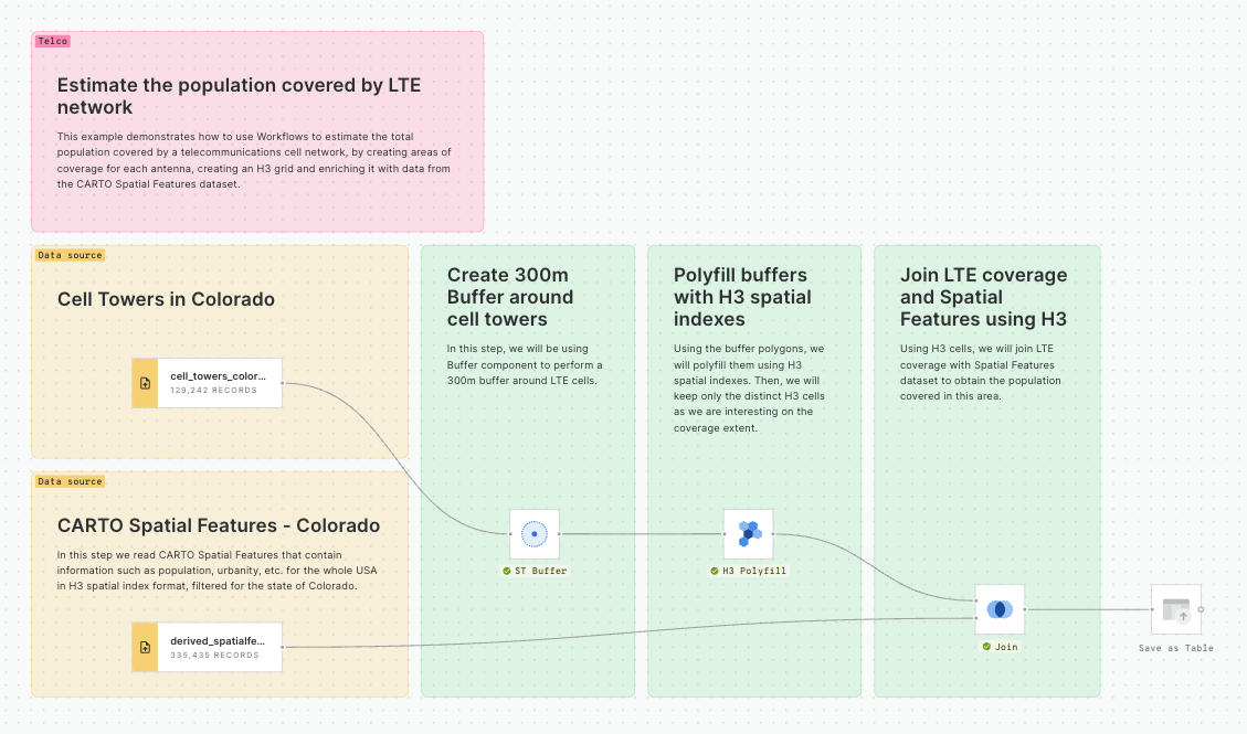
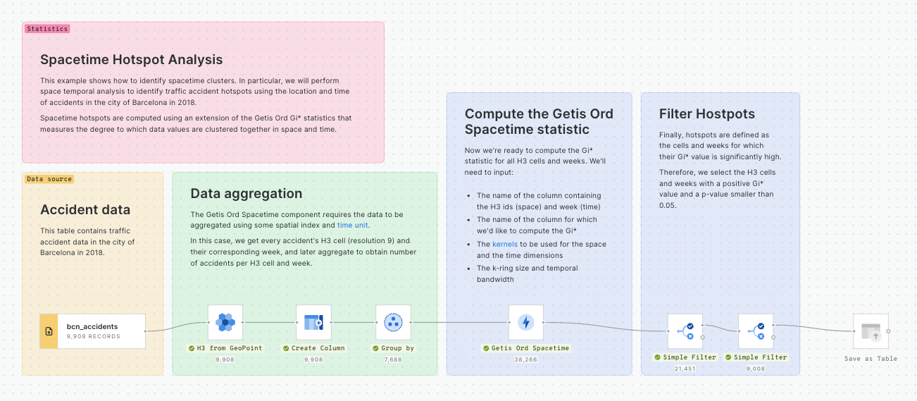
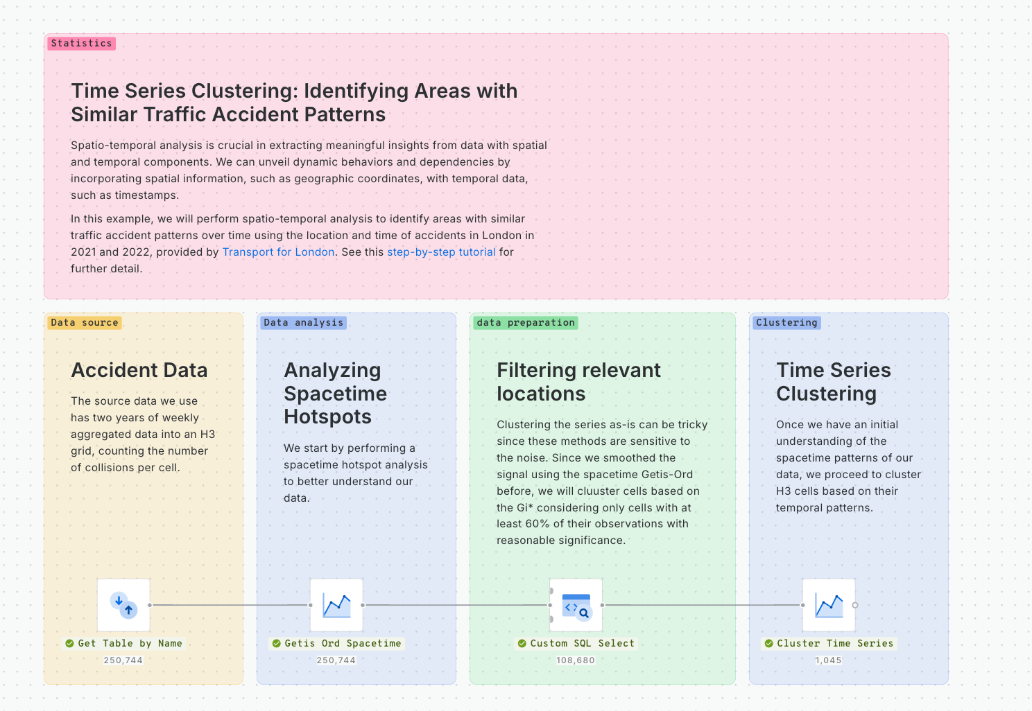
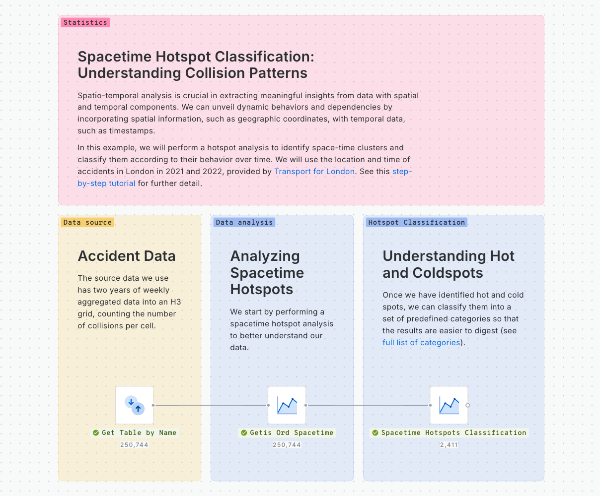
Spatio-temporal analysis is crucial in extracting meaningful insights from data that possess both spatial and temporal components. By incorporating spatial information, such as geographic coordinates, with temporal data, such as timestamps, spatio-temporal analysis unveils dynamic behaviors and dependencies across various domains. This applies to different industries and use cases like car sharing and micromobility planning, urban planning, transportation optimization, and more.
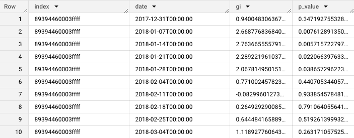
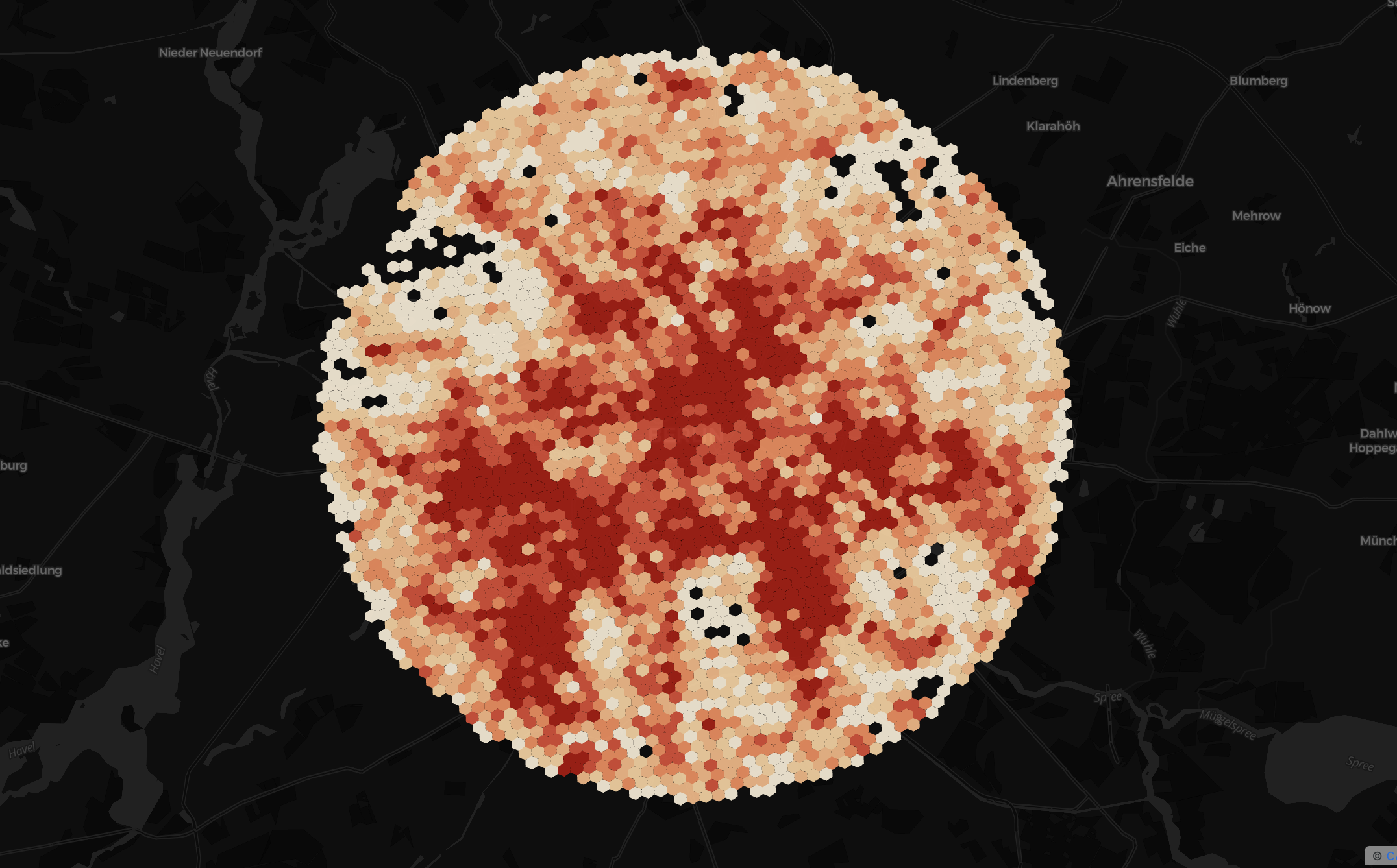
In this example, we will perform a hotspot analysis to identify space-time clusters and classify them according to their behavior over time. We will use the location and time of accidents in London in 2021 and 2022, provided by Transport for London. This tutorial builds upon this previous one, where we explained how to use the spacetime Getis-Ord functionality to identify traffic accident hotspots.
Data
The source data we will use has two years of weekly aggregated data into an H3 grid, counting the number of collisions per cell. The data is available at cartobq.docs.spacetime_collisions_weekly_h3 and it can be explored in the map below.
Spacetime Getis-Ord
We start by performing a spacetime hotspot analysis to identify hot and cold spots over time and space. We can use the following call to the Analytics Toolbox to run the procedure:
For further detail on the spacetime Getis-Ord check out and .
By performing this analysis, we can check how different parts of the city become “hotter” or “colder” as time progresses.
Understanding hot and cold spots
Once we have identified hot and cold spots, we can classify them into a set of predefined categories so that the results are easier to digest. For more information about the categories considered and the specific criteria, please check .
We can run the analysis by calling the procedure using the previously obtained Getis-Ord results.
We can see how now we have different types of behaviors at a glance in a single map. There are several insights we can extract from this map:
There is an amplifying hotspot in the city center that shows an upward trend in collisions.
The surroundings of that amplifying hotspot are mostly occasional.
The periphery of the city is mostly cold spots, but most of them are fluctuating or even declining.
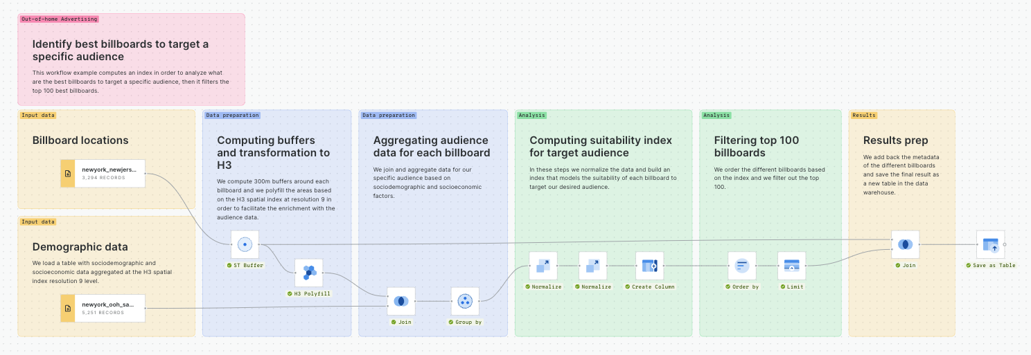
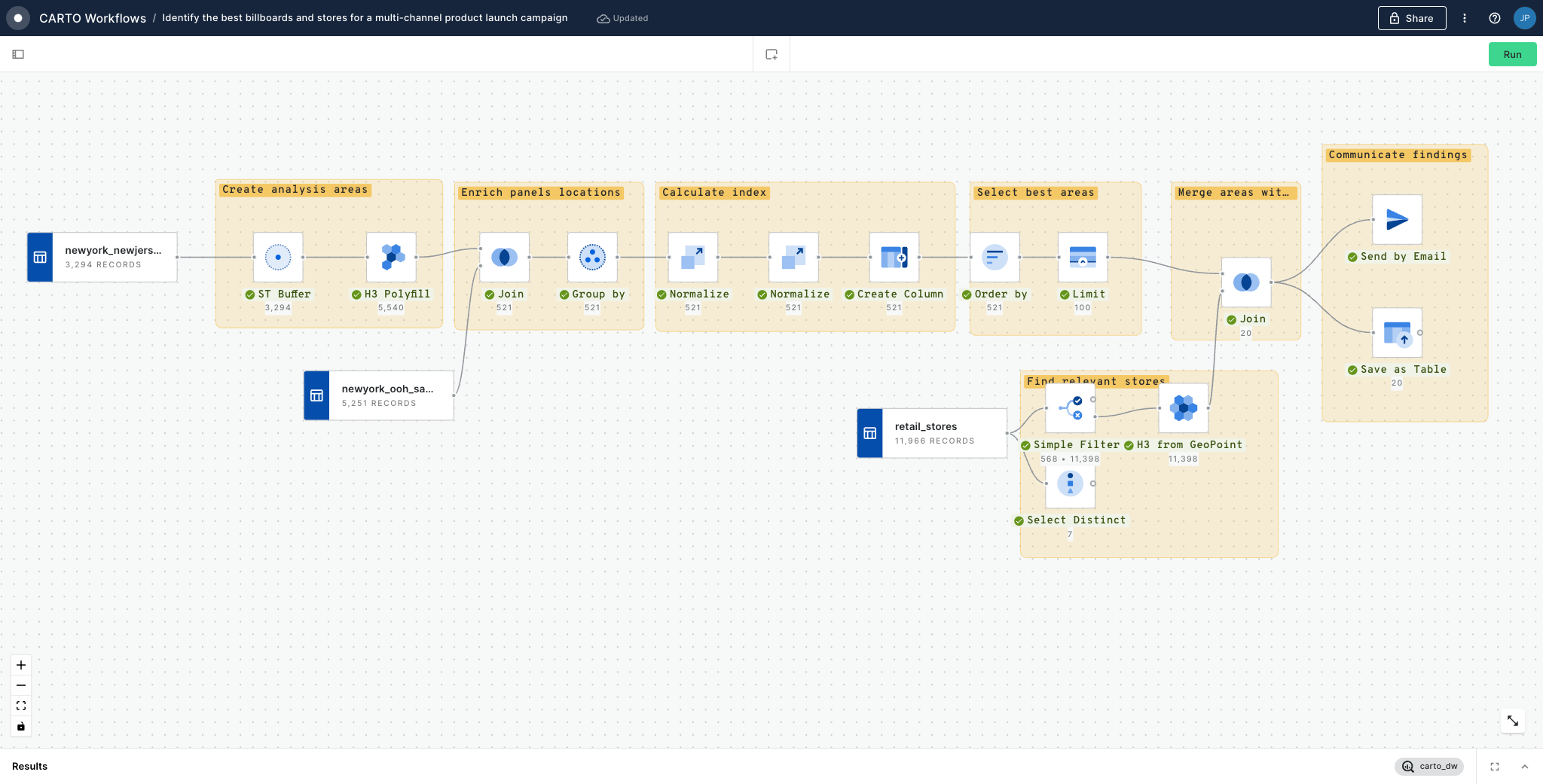
Out Of Home Advertising
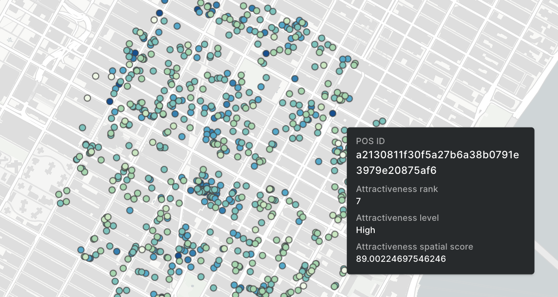
Identify best billboards to target a specific audience
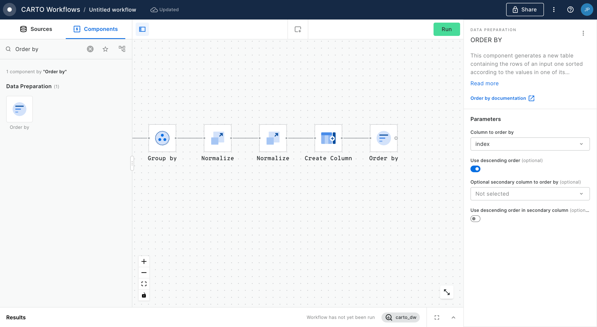
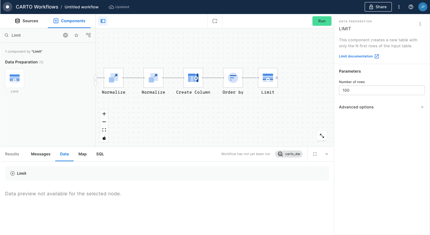
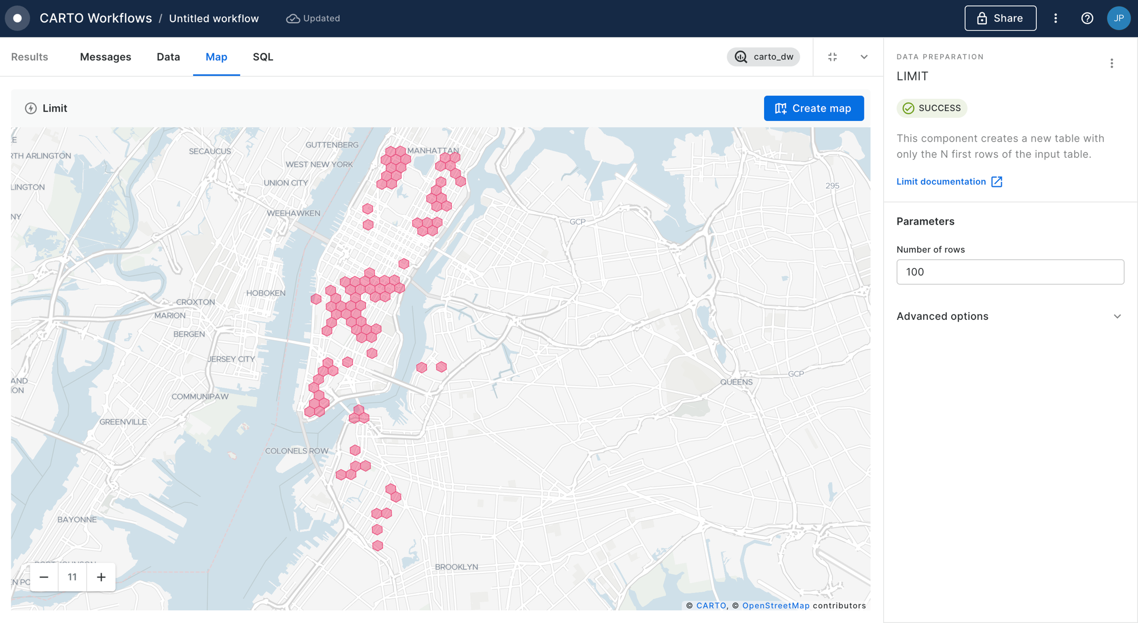
This workflow example computes an index in order to analyze what are the best billboards to target a specific audience, then it filters the top 100 best billboards.
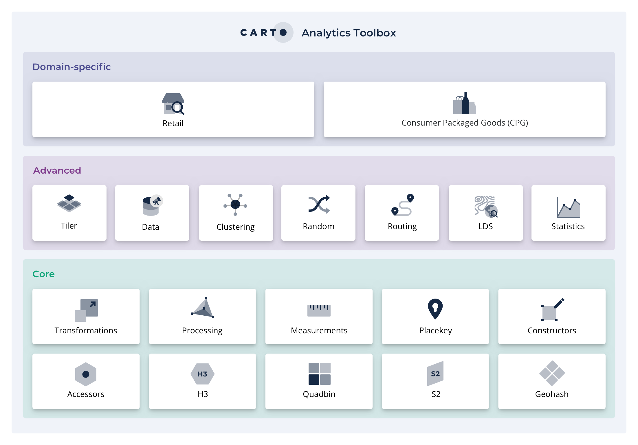
CARTO's Analytics Toolbox for BigQuery is a set of UDFs and Stored Procedures to unlock Spatial Analytics. It is organized in a set of modules based on the functionality they offer. Visit the SQL Reference to see the full list of available modules and functions. In order to get access to the Analytics Toolbox functionality in your BigQuery please read about the different access methods in our documentation.
Data analysis
In this section, you can explore our step-by-step guides designed to enhance your data analysis skills using Builder. Each tutorial features demo data from the CARTO Data Warehouse connection, allowing you to jump directly into creating and analyzing maps.
AI Agents
CARTO AI Agents provide a powerful conversational interface that allows anyone, regardless of technical expertise, to ask questions in natural language and receive instant, actionable insights. This marks a fundamental shift beyond dashboards to a dynamic, intuitive way of exploring your geospatial data.
You can create agents directly in Builder and link them to your maps. This transforms static maps into interactive experiences where end-users can ask questions, explore data, and extract insights through conversation.
What is an AI Agent?
An AI Agent is a system powered by a large language model (LLM) that can interact with your data and tools to answer questions. Unlike a simple chatbot, agents can decide which tools to use, analyze results, and take multiple steps to solve a problem.
CARTO MCP Server
MCP Tools let you expose Workflows as tools that AI Agents can use. This means you can build custom geospatial operations in Workflows and make them available to any MCP-compliant agent.
For example, you could create a Workflow that finds optimal delivery routes, then expose it as an MCP Tool. An agent like Gemini CLI could then call that tool automatically when someone asks a routing question.
The CARTO MCP Server enables AI Agents to use geospatial tools built with Workflows. By exposing workflows as MCP Tools, GIS teams can empower agents to answer spatial questions with organization-specific logic. Each tool follows the MCP specification, including a description, input parameters, and output, making them accessible to any MCP-compliant agentic application.
How it works:
Build a Workflow that solves a specific problem
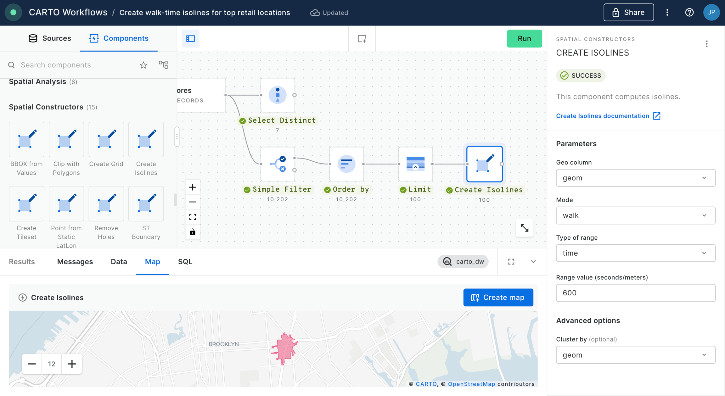
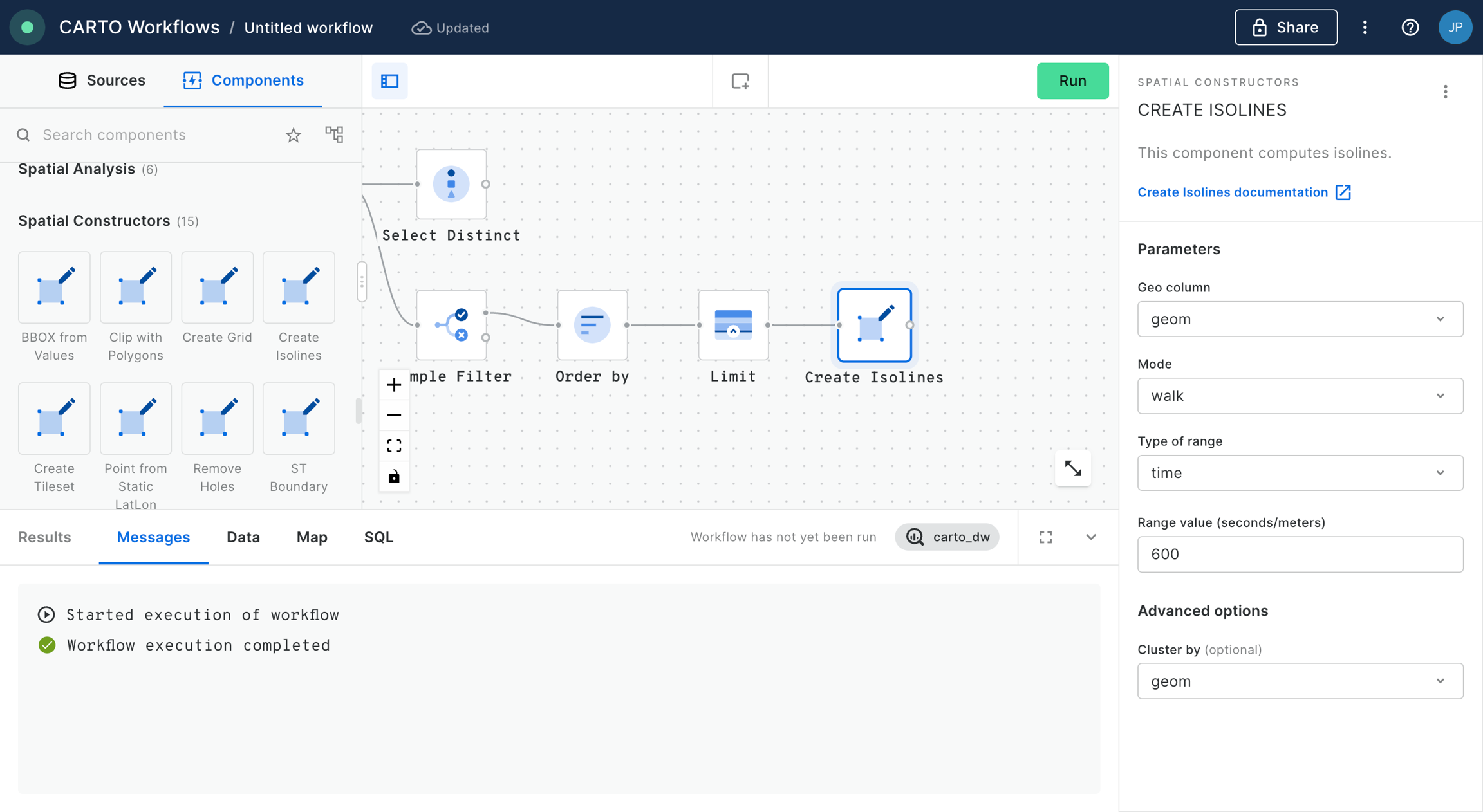
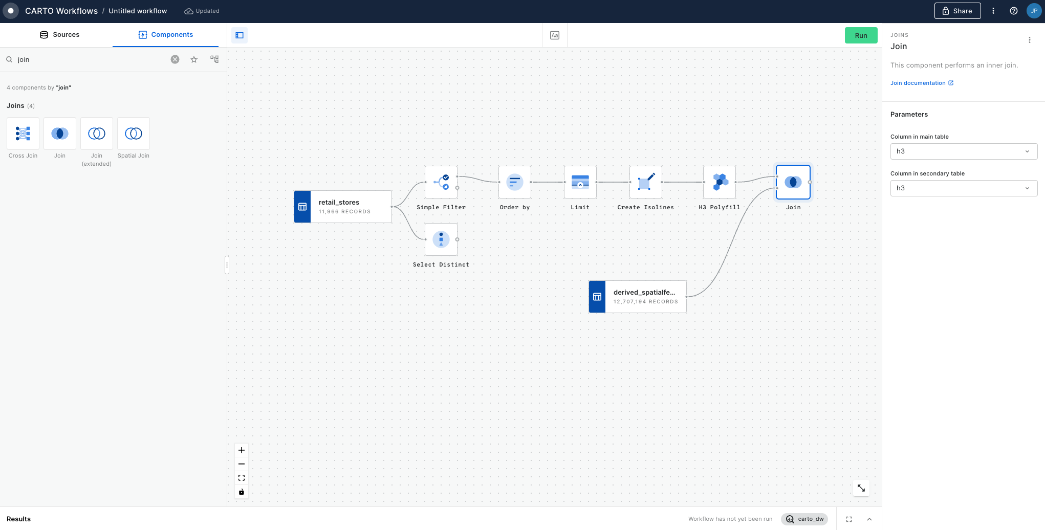
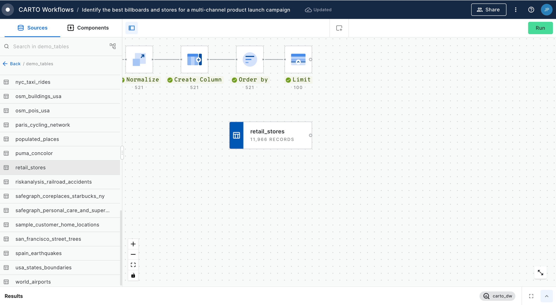
Retail and CPG
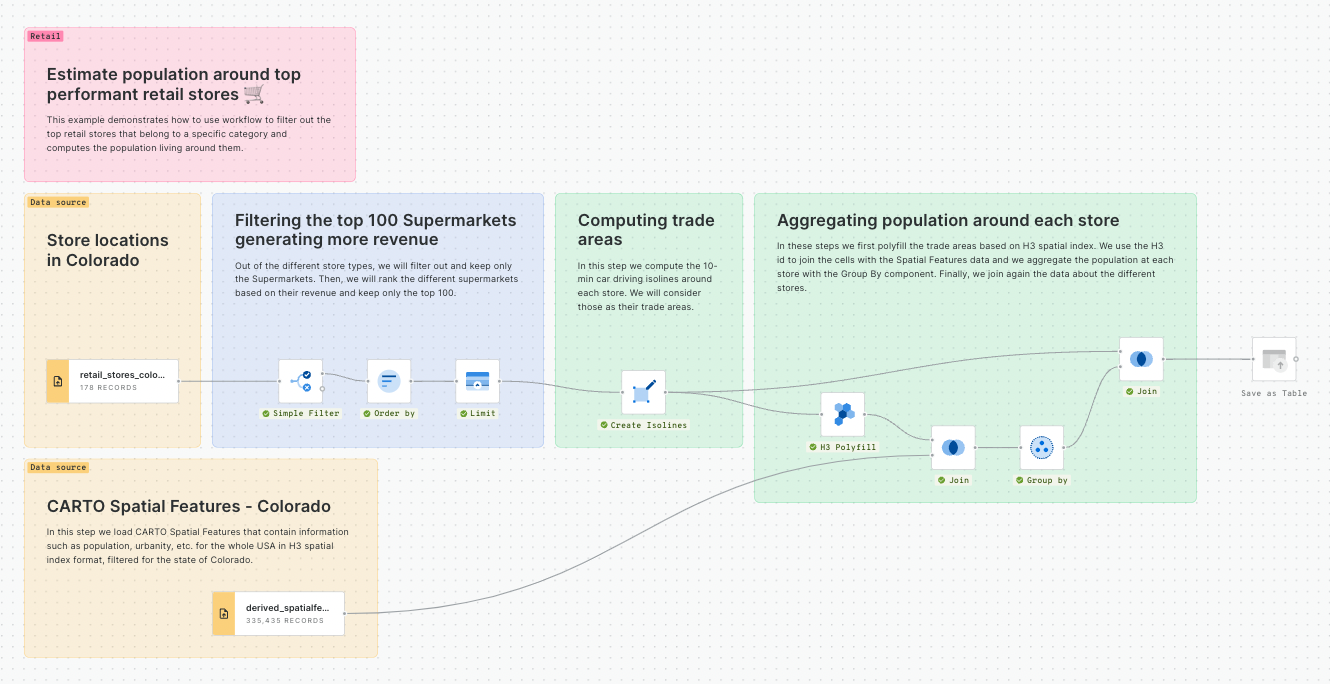
Estimate population around top performant retail stores
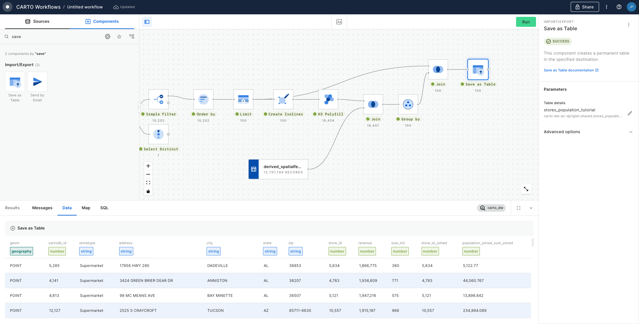
This example demonstrates how to use workflow to filter out the top retail stores that belong to a specific category and computes the population living around them.
Snowflake ML
For these templates, you will need to install the extension package.
Create a classification model
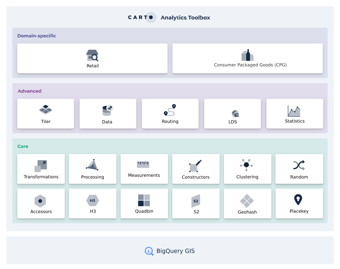
Introduction to the Analytics Toolbox
The CARTO Analytics Toolbox is a suite of functions and procedures to easily enhance the geospatial capabilities available in the different leading cloud data warehouses.
It is currently available for Google BigQuery, Snowflake, Redshift, Databricks and PostgreSQL.
The Analytics Toolbox contains more than 100 advanced spatial functions, grouped in different modules. For most data warehouses, a core set of functions are distributed as , while the most advanced functions (including vertical-specific modules such as retail) are distributed only to CARTO customers.
Set your index column (likely "H3") and a parent resolution - we'll use 7. Run! This process will have generated a new column in your table - "H3_Parent."
You can now use a Group by component - setting the Group by field to H3_Parent - to create a new table at the new resolution. At this point you can also aggregate any relevant numeric variables; for instance we will SUM the Population field.
kring_index
which contains the H3 reference for the K-ring cells, which can be linked to the central cell, referenced in the column
H3
.
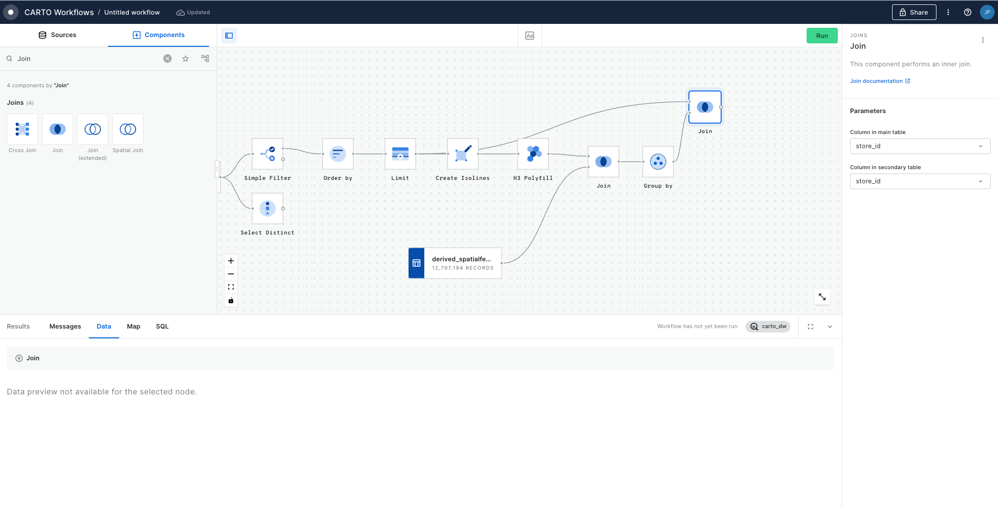
To attach population data to this grid, use a Join component with the type Left, and connect the results of H3 Polyfill to the top input. For the bottom input, connect the Spatial Index source layer (for us, that's the Spatial Features table).
Set the main and secondary table columns as H3 (or whichever field contains your index references), and the join type as Left, to retain only features from the Spatial Features table which can also be found in the H3 Polyfill component. Run!
Finally, we want to know the total population in this area, so add a Group by component. Set the aggregation column to population_joined and the type as SUM. If you had multiple input polygons and you wanted to know the total population per polygon, here you could set the Group by column to the unique polygon ID - but we just want to know the total for one polygon so we can leave this empty. Run!
Illustrating how three different H3 hierarchies "fit" together
The concept of K-rings
Working with K-rings
Converting Spatial Indexes to geometries
Creating a buffer polygon
Enriching a polygon with a Spatial Index
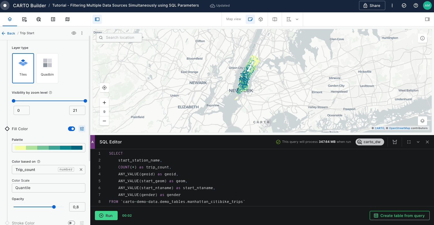
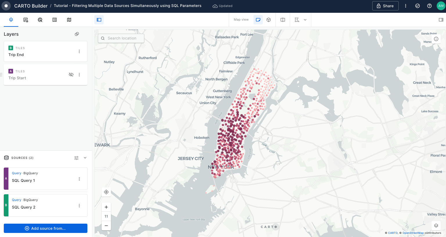
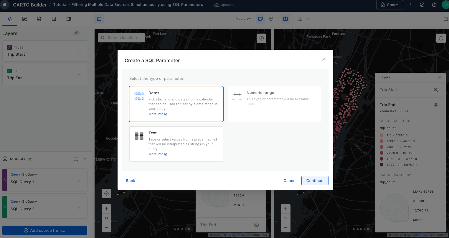
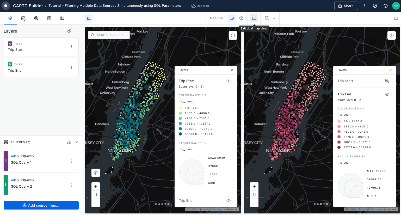
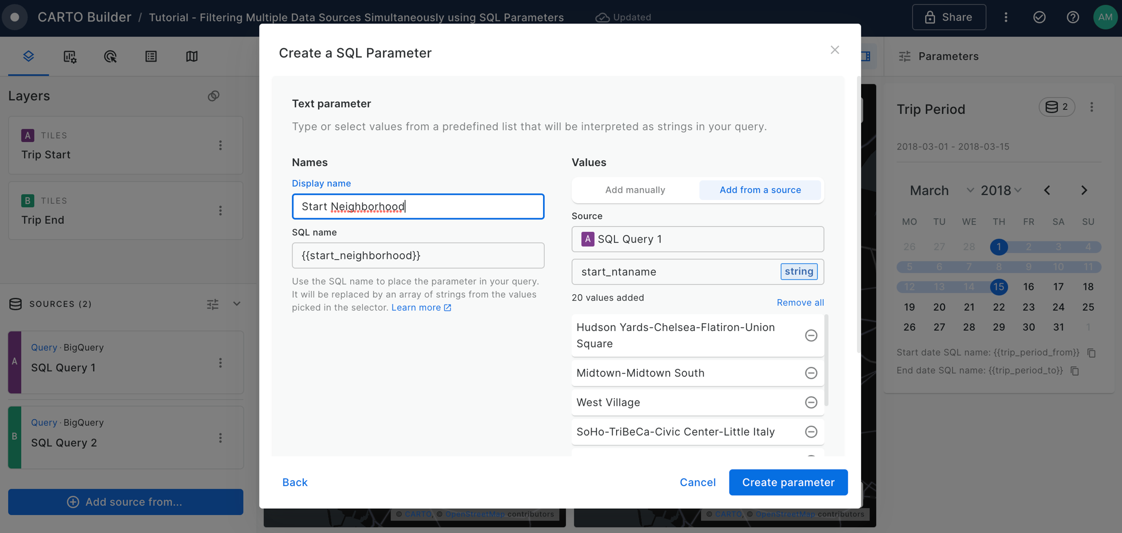
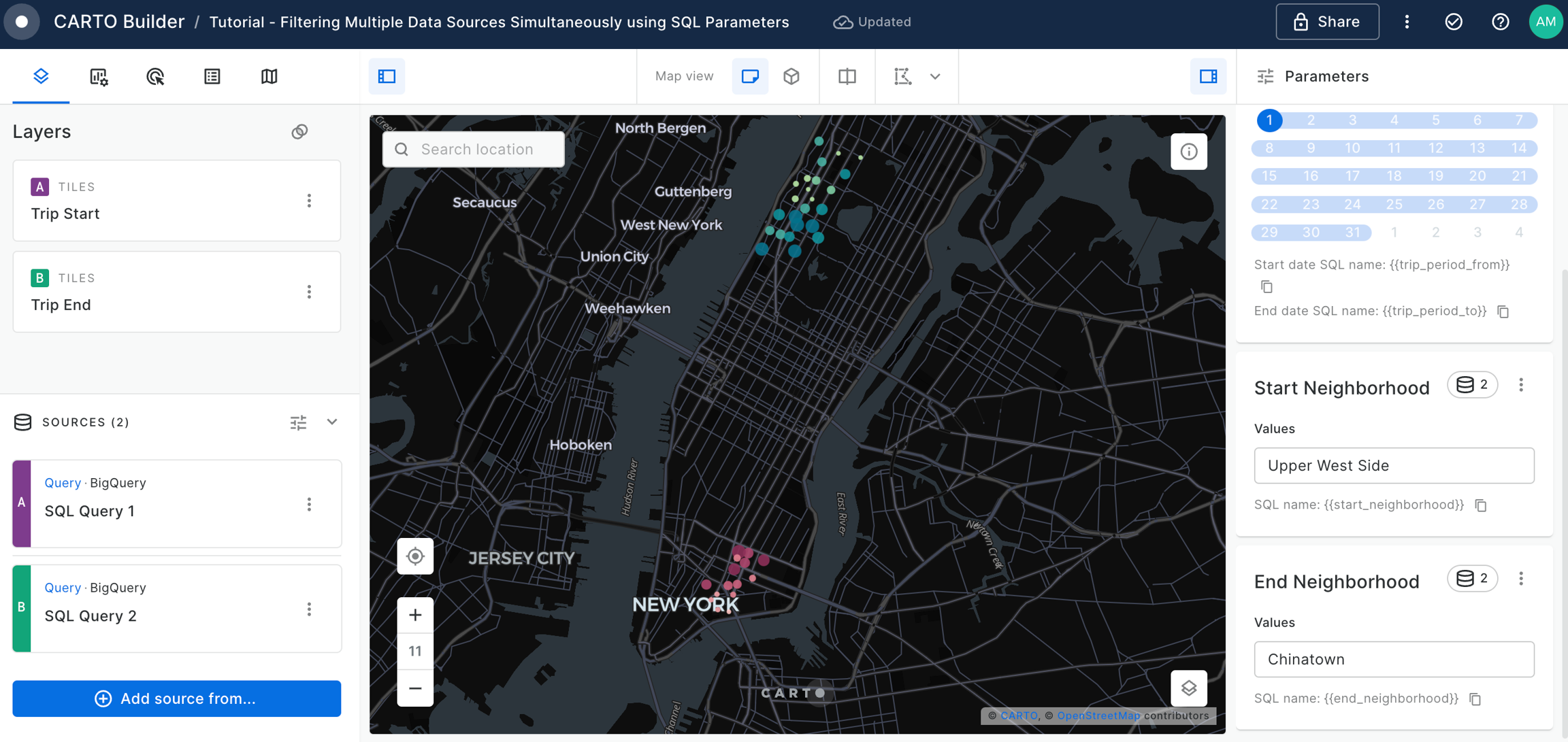
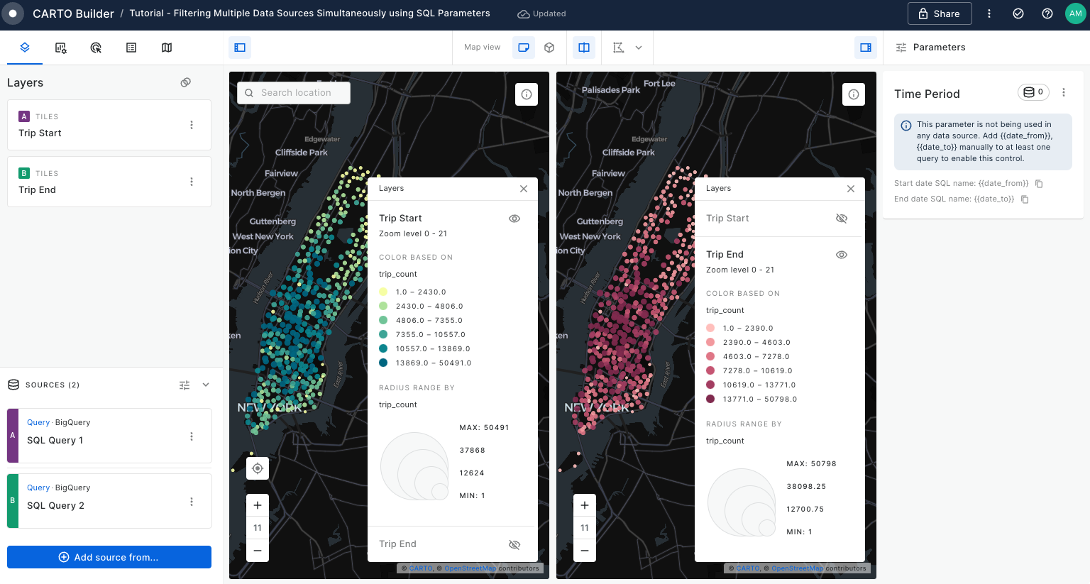
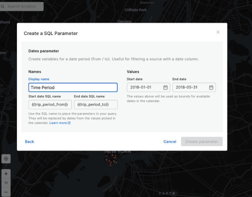
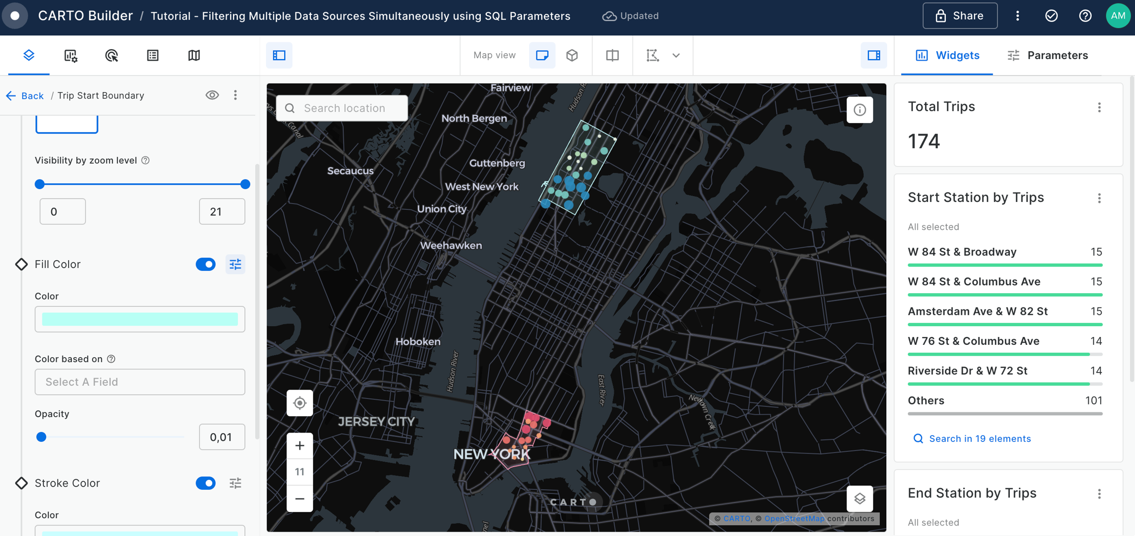
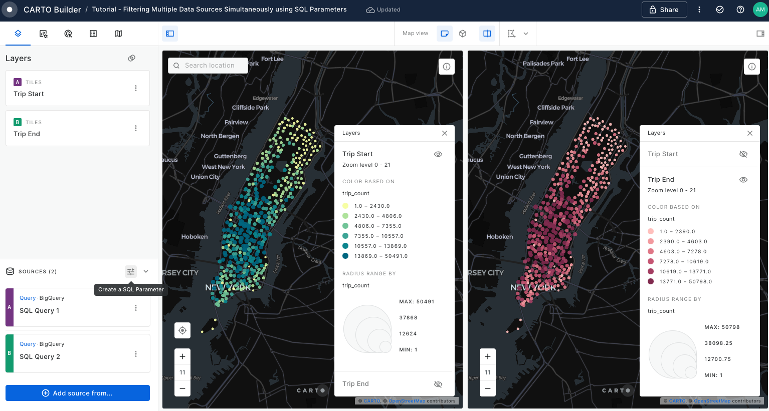
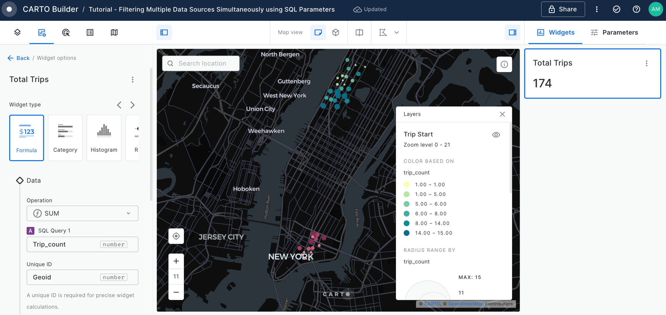
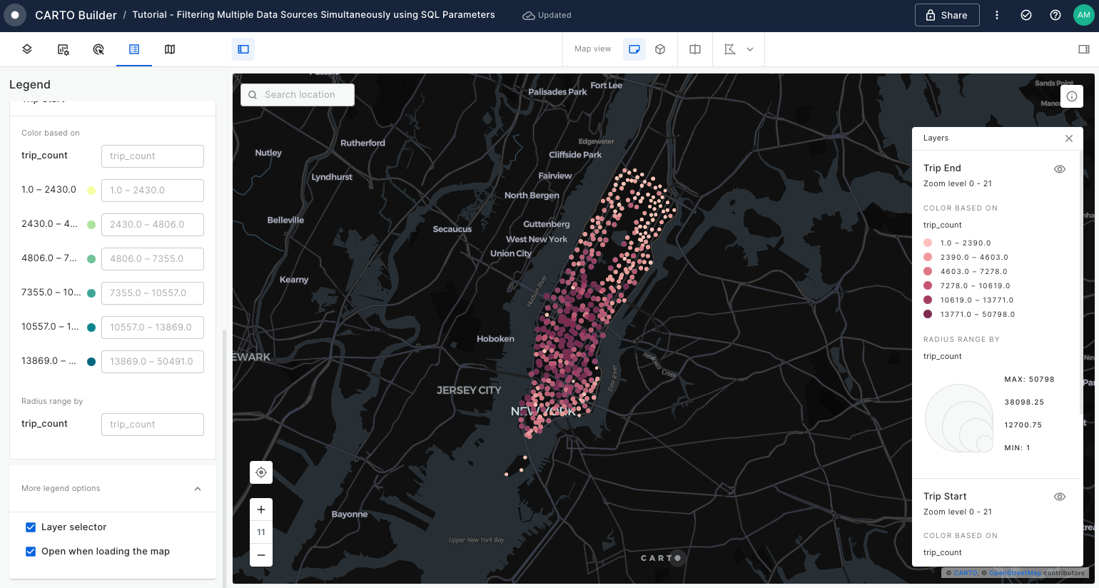
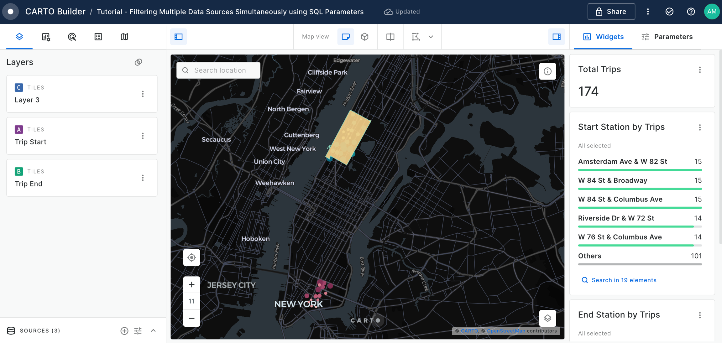
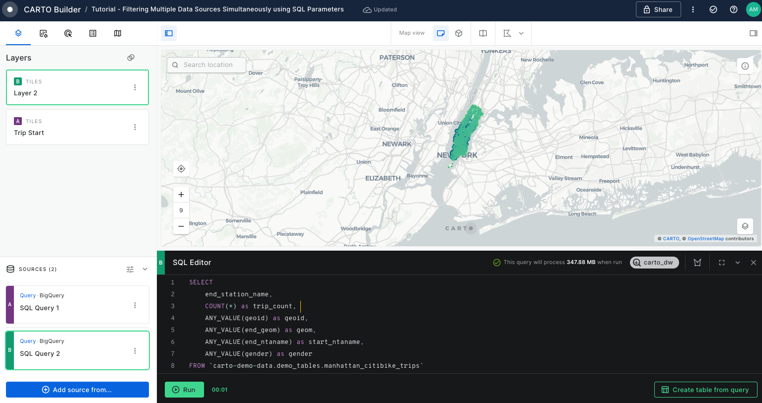
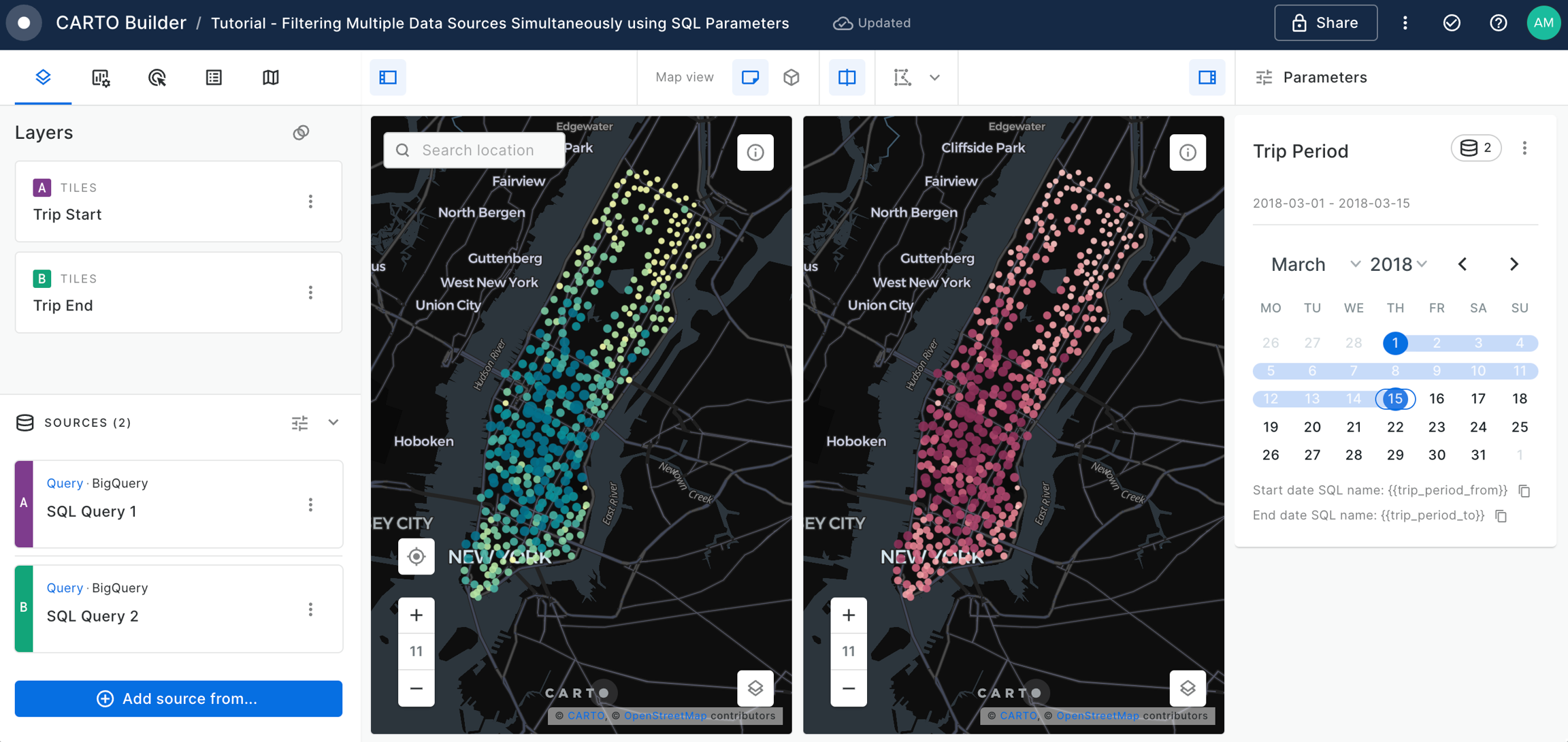
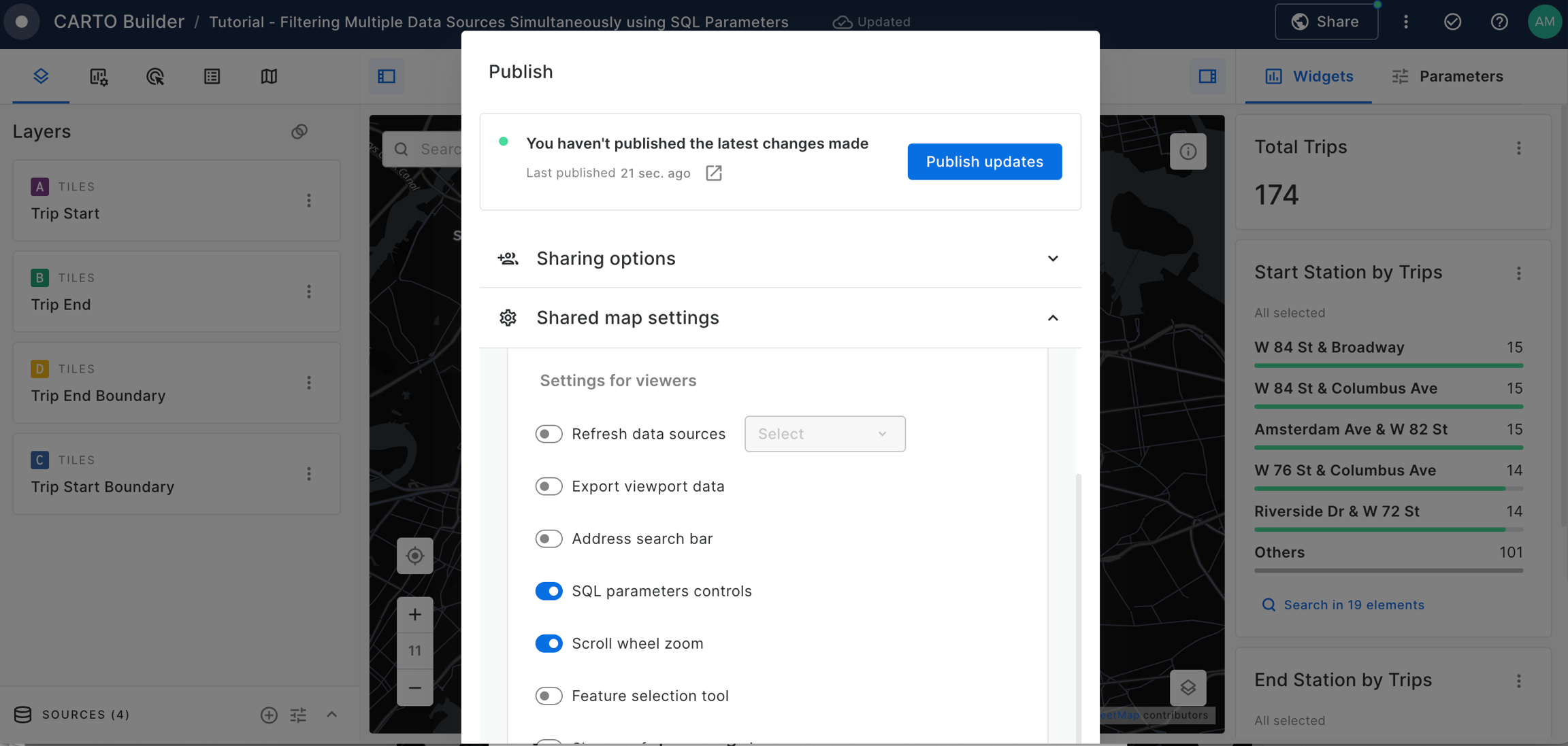
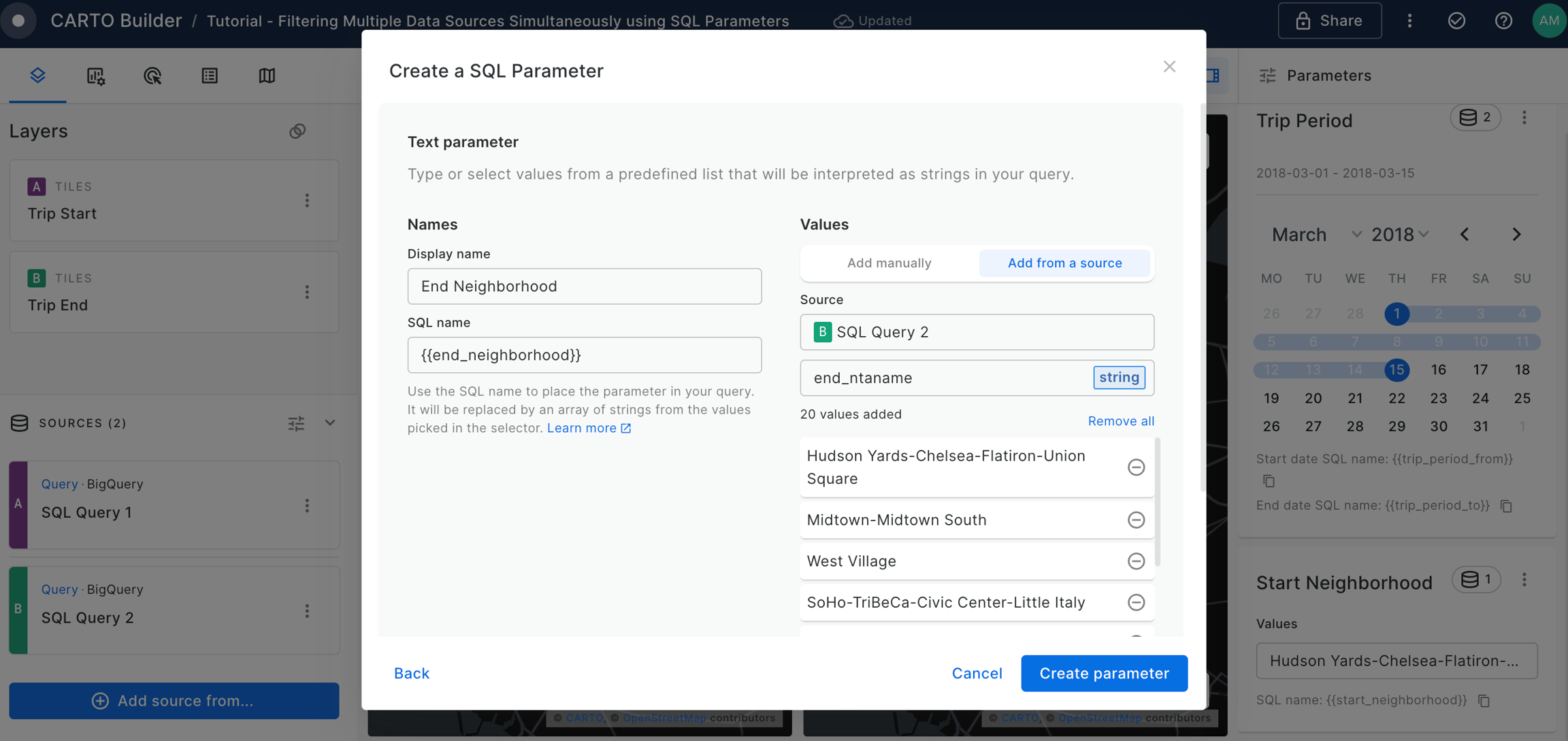
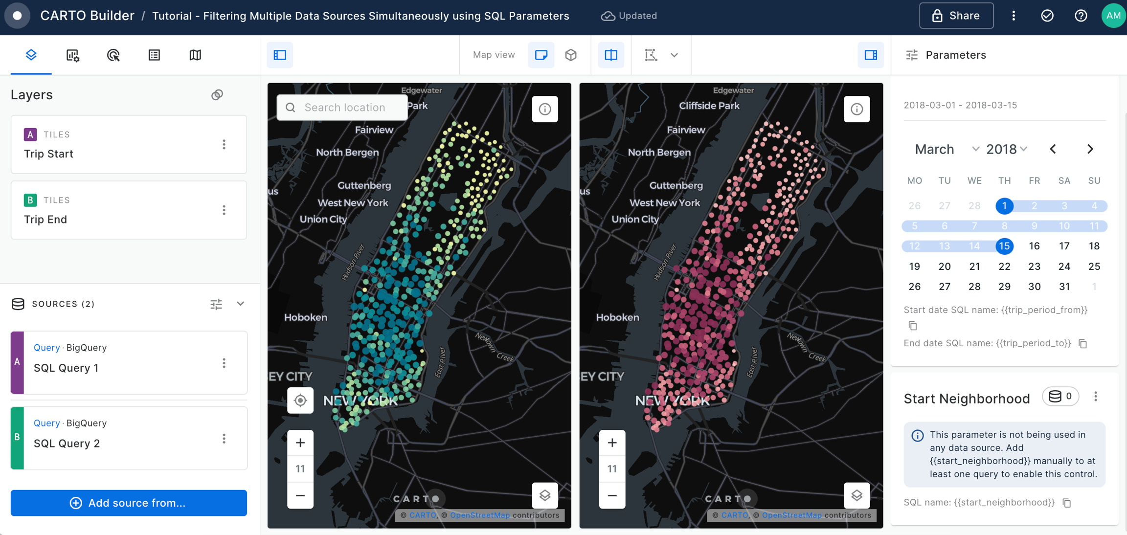
Filtering multiple data sources simultaneously with SQL
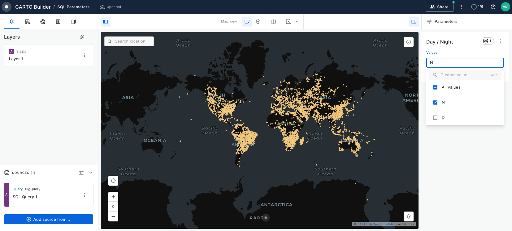
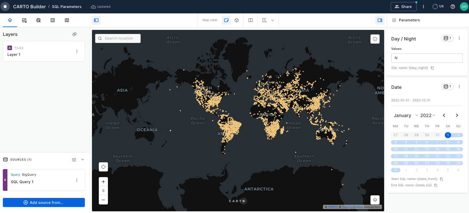
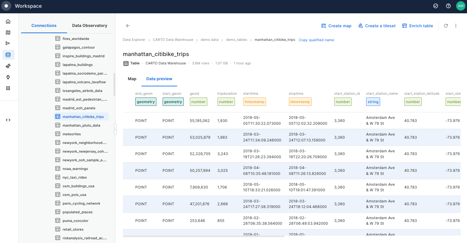
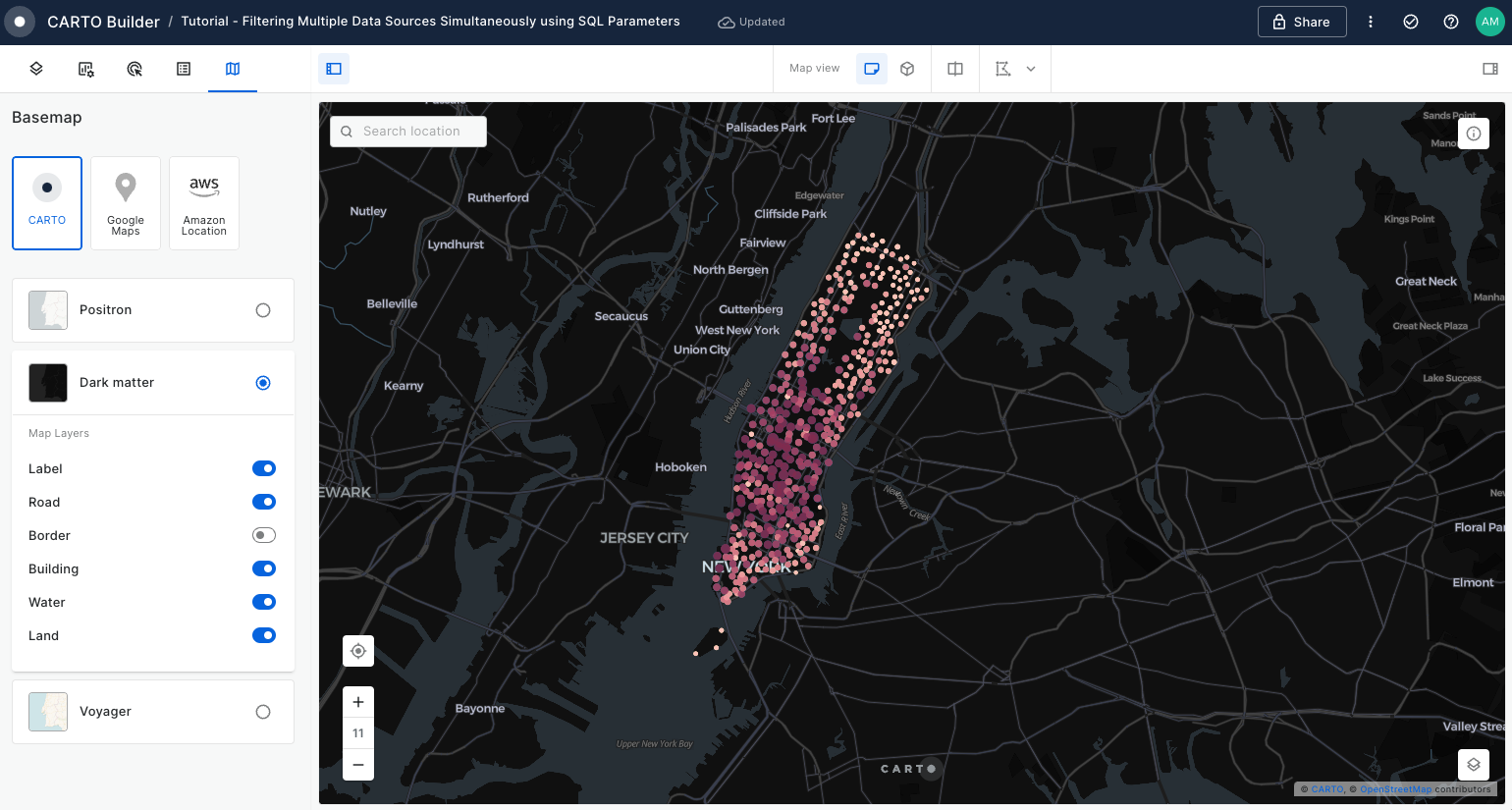
Learn how to filter multiple data sources to reveal patterns in NYC's Citi Bike trips. The result will be an interactive Builder Map with parameters that will allow users to filter multiple source data by time period and neighbourhoods for insightful visual analysis.
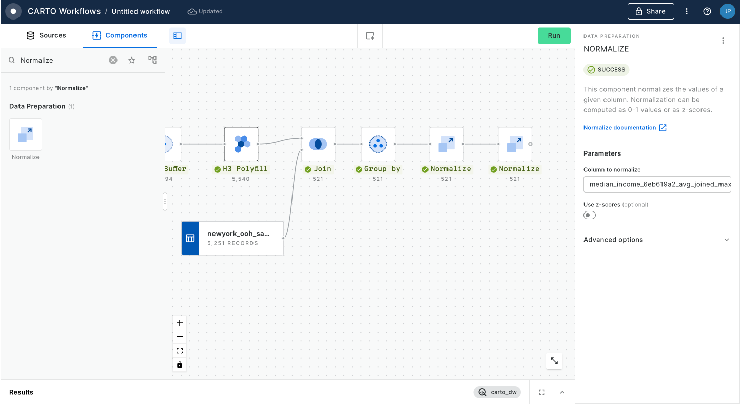
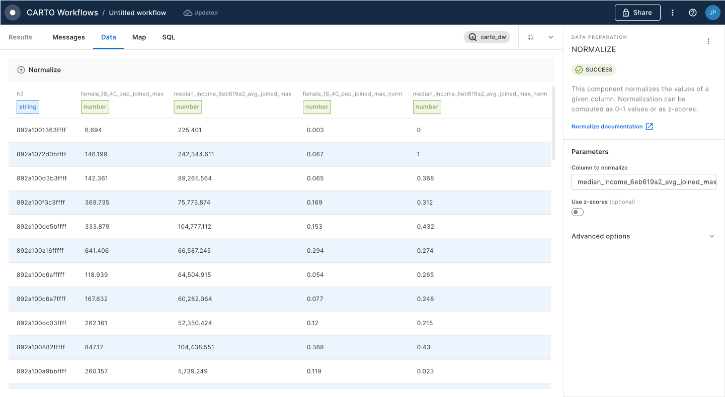
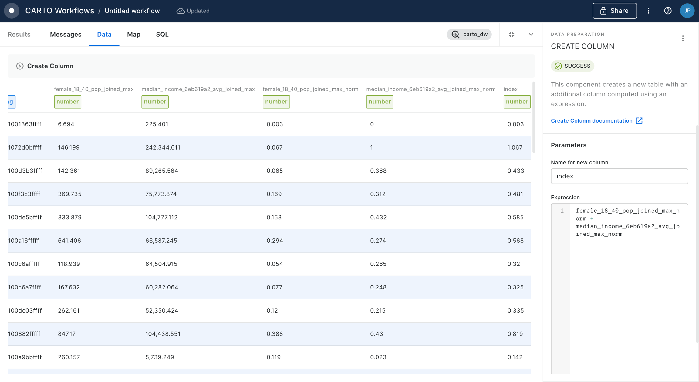
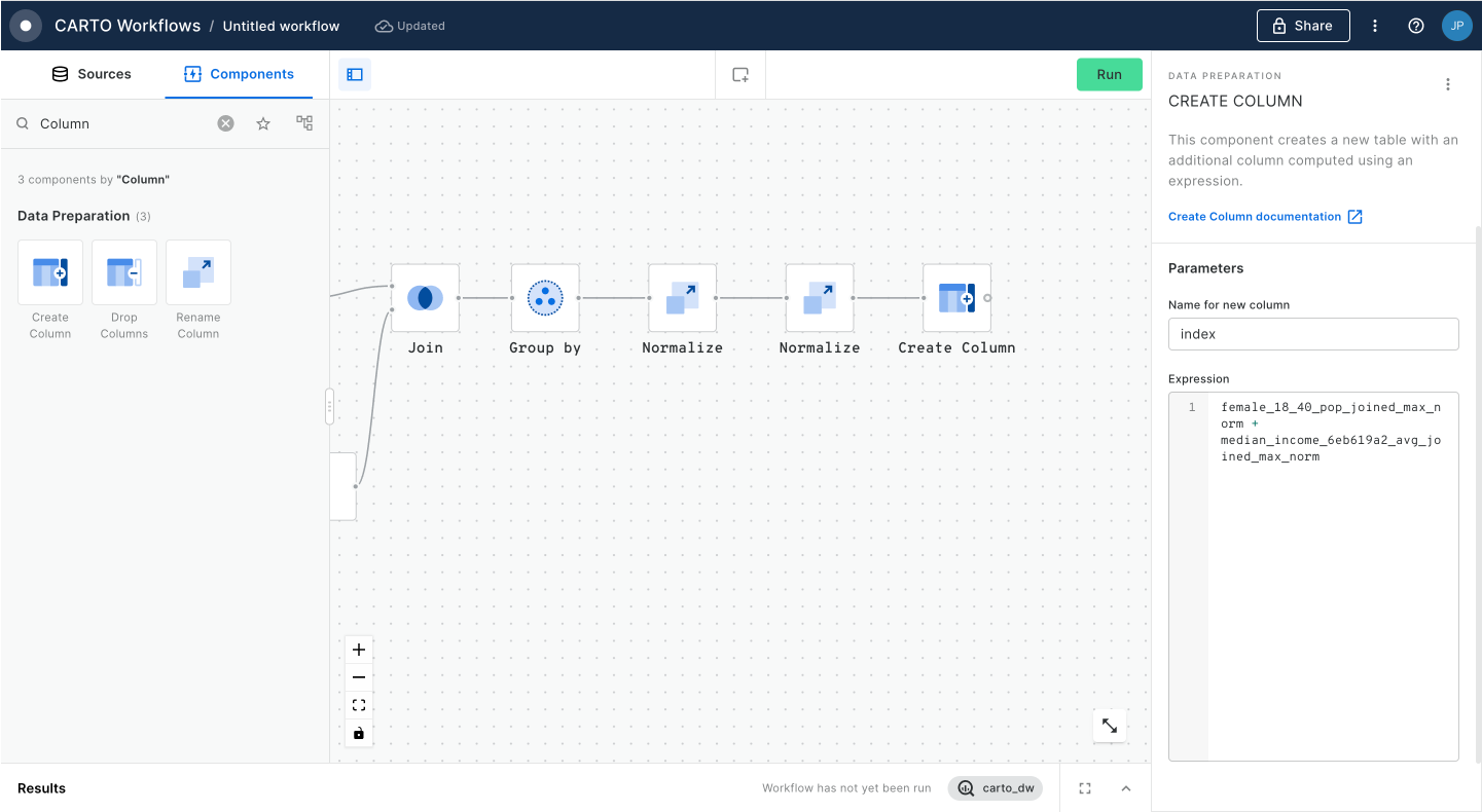
Generate a dynamic index based on user-defined weighted variables
Discover the process of normalizing variables using Workflows to create a tailored index score. Learn how to implement dynamic weights with SQL Parameters in Builder, enhancing the adaptability of your analysis. This approach allows you to apply custom weights in index generation, catering to various scenarios and pinpointing locations that best align with your business objectives.
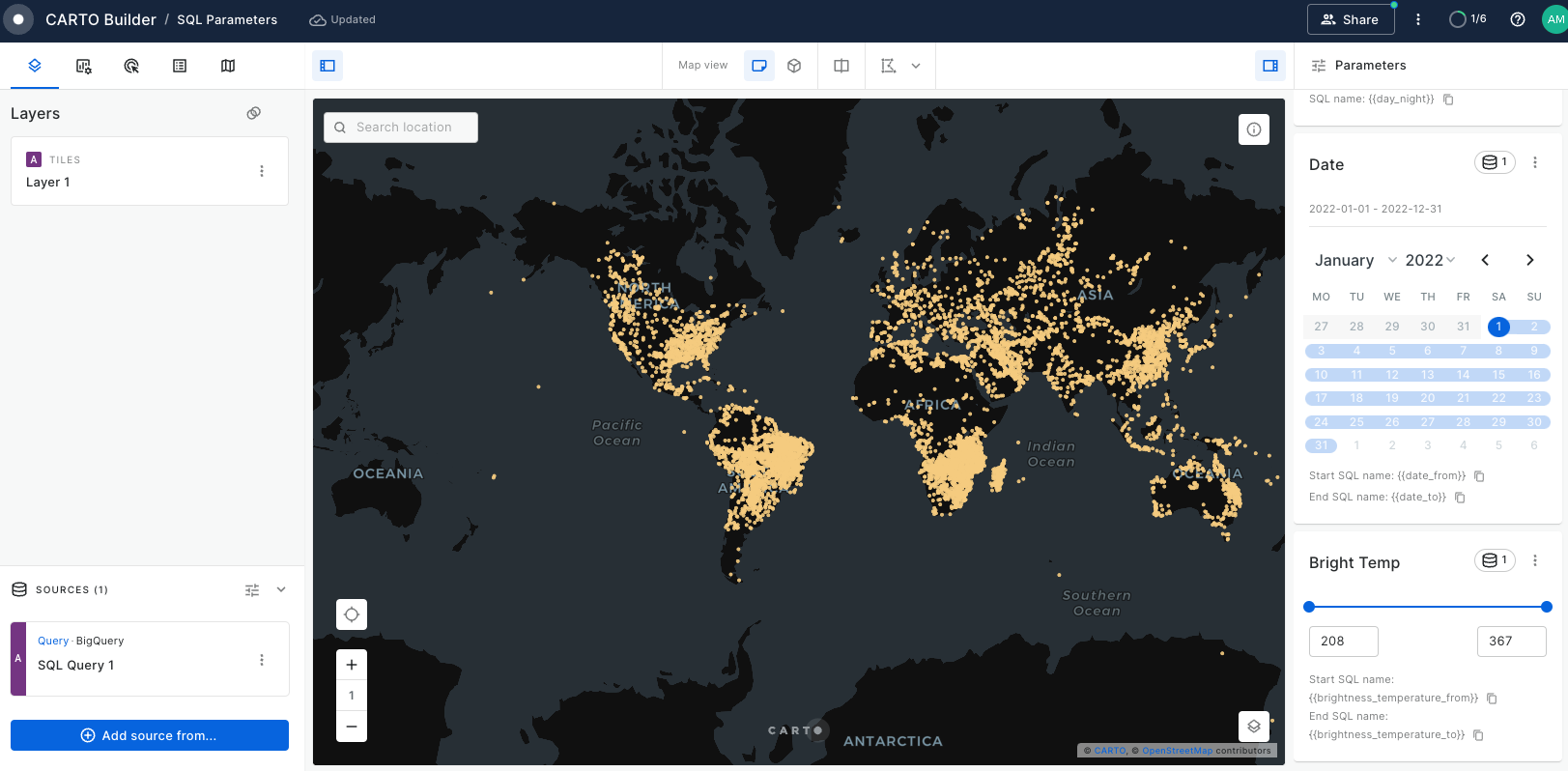
Create a dashboard with user-defined analysis using SQL Parameters
Learn to build dynamic web map applications with Builder, adapting to user-defined inputs. This tutorial focuses on using SQL Parameters for on-the-fly updates in geospatial analysis, a skill valuable in urban planning, environmental studies, and more. Though centered on Bristol's cycle network risk assessment, the techniques you'll master are widely applicable to various analytical scenarios.
Analyze multiple drive-time catchment areas dynamically
In this tutorial, you'll learn to analyze multiple drive time catchment areas at specific times, such as 8:00 AM. We'll guide you through creating five distinct catchment zones based on driving times using CARTO Workflows. You'll also master crafting an interactive dashboard that uses SQL Parameters, allowing users to select and focus on catchment areas that best suit their business needs and objectives.
Dynamically control your maps using URL parameters
URL parameters allow you to essentially share multiple versions of the same map, without having to rebuild it depending on different user requirements. This guide will show you how to embed a Builder map in a low-code tool, using URL parameters for dynamic updates based on user input.
Embedding maps in BI platforms
Embedding Builder maps into BI platforms like Looker Studio, Tableau, or Power BI is a straightforward way to add interactive maps to your reports and dashboards. This guide shows you how to do just that, making your data visualizations more engaging and informative.
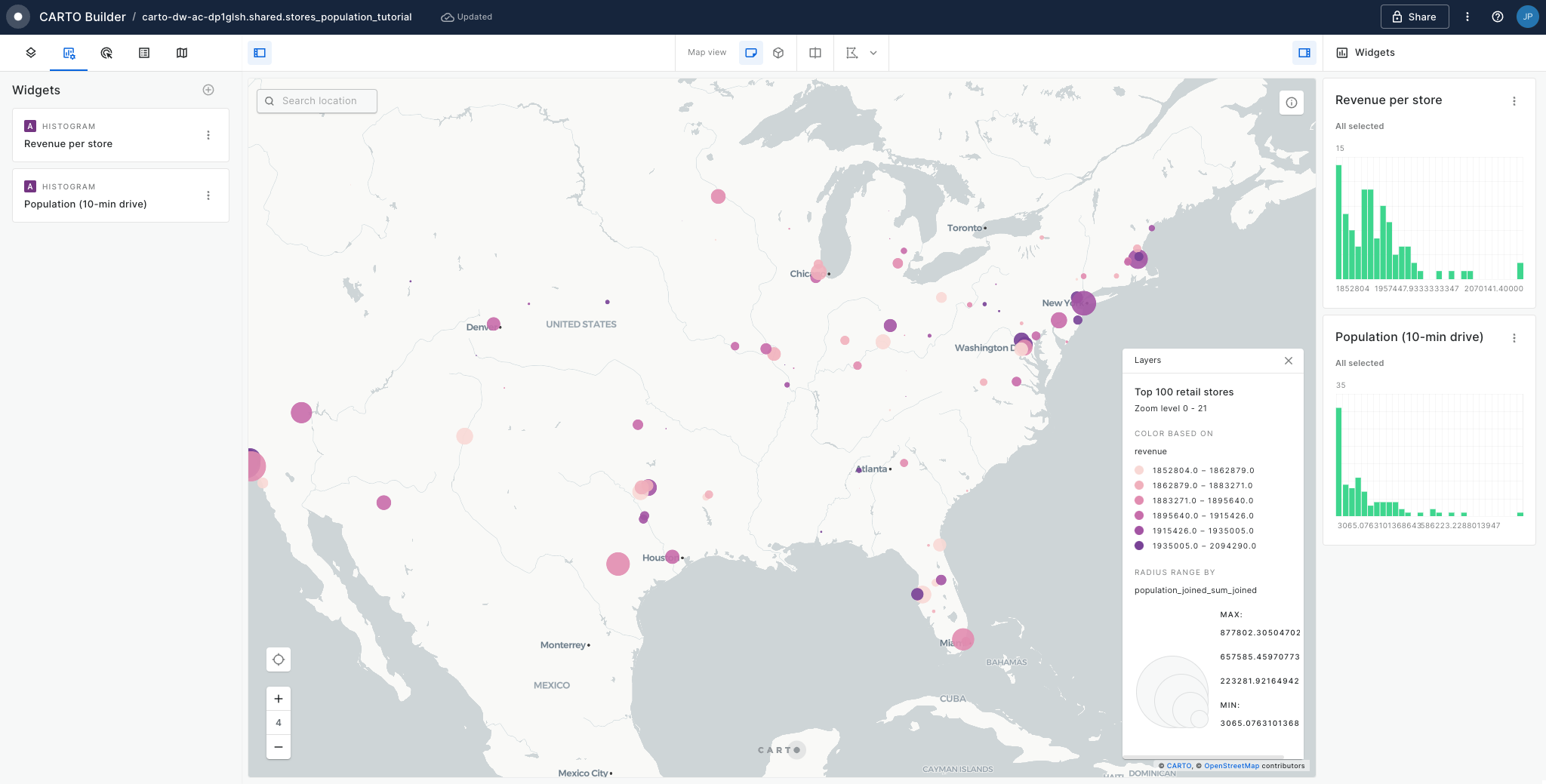
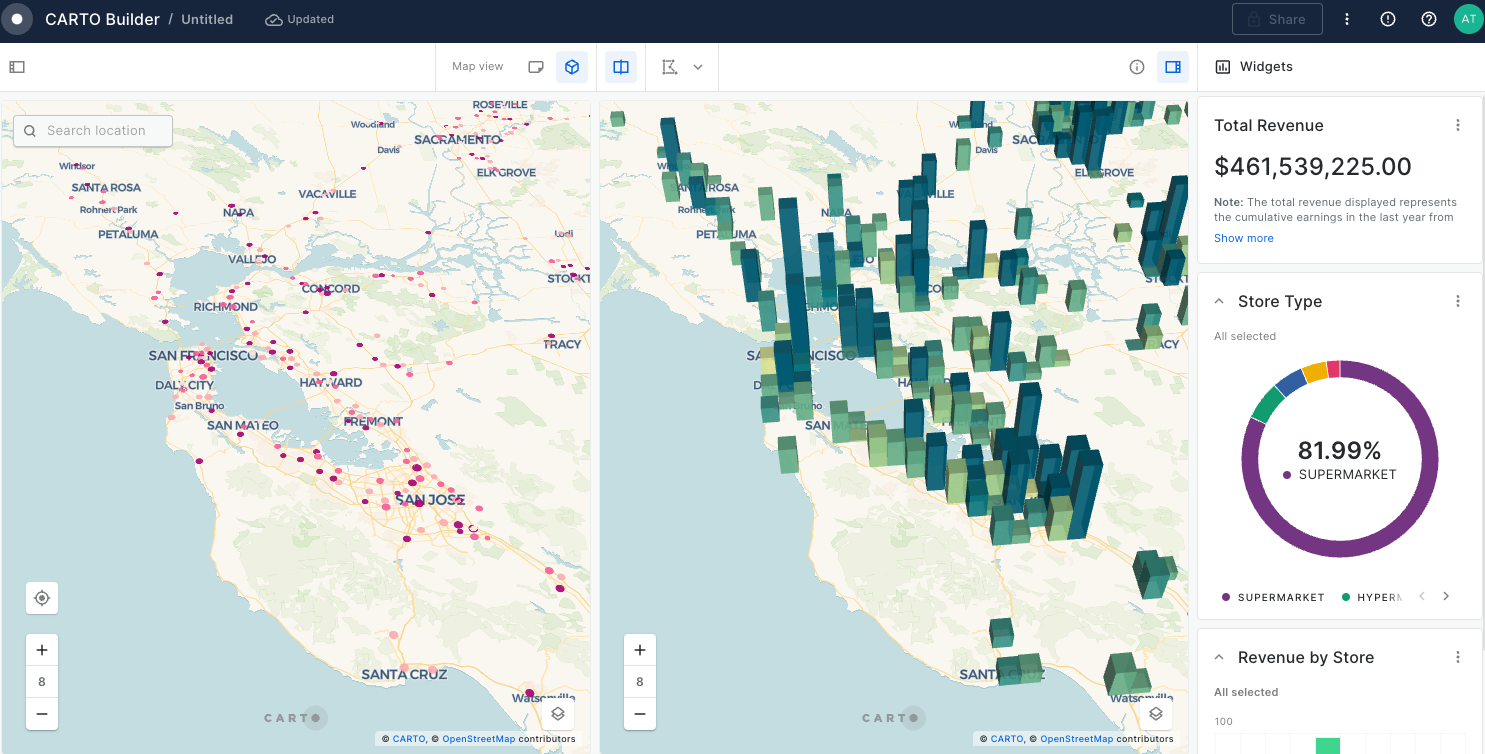
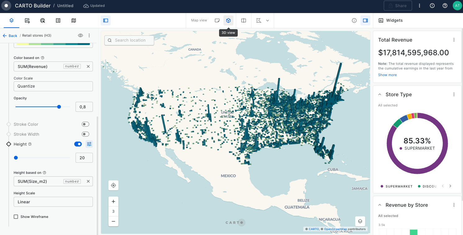
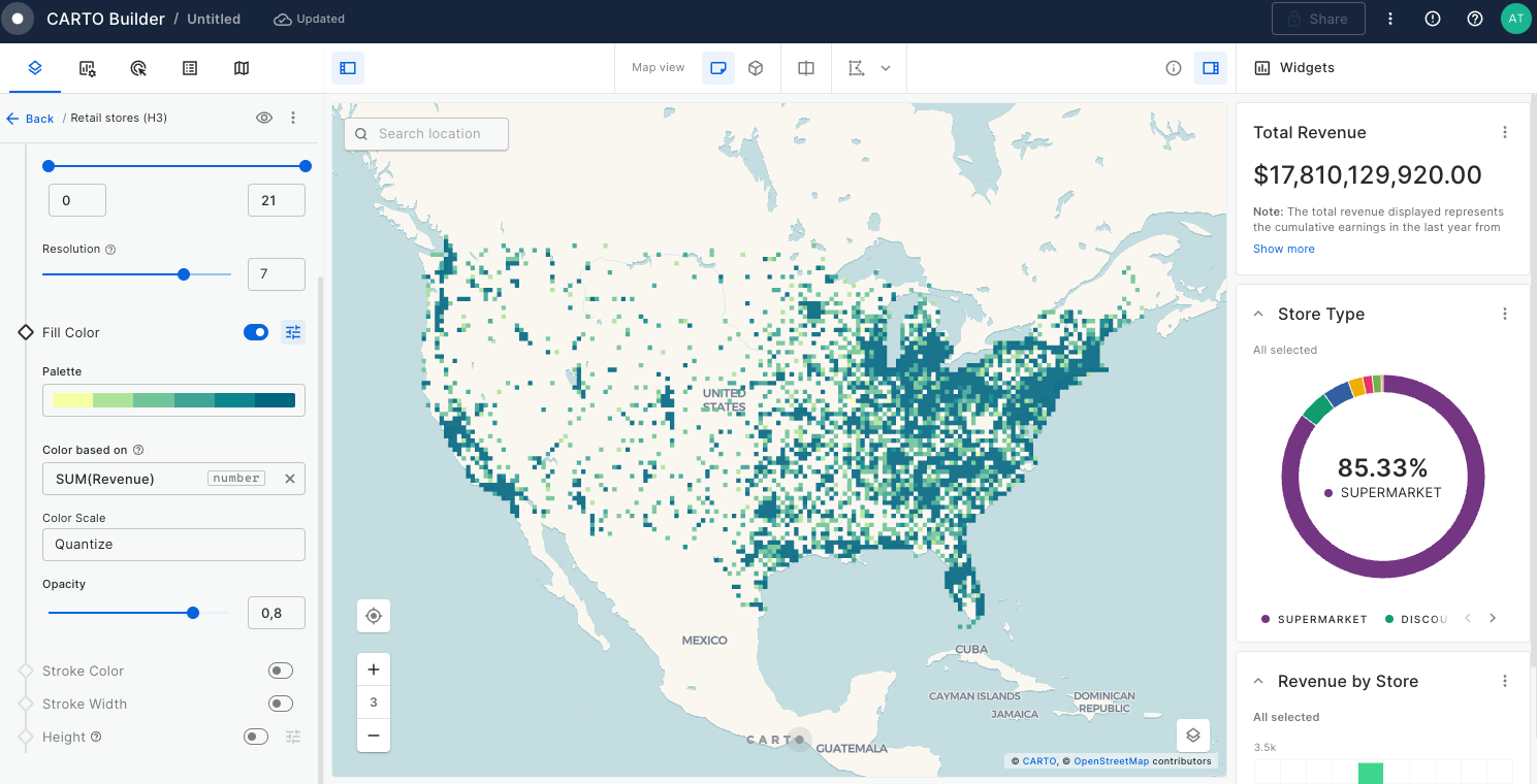
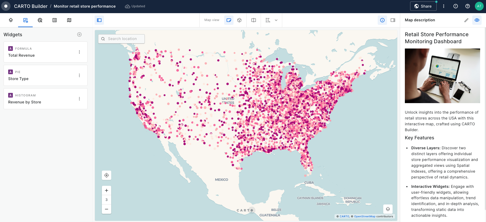
Build a store performance monitoring dashboard for retail stores in the USA
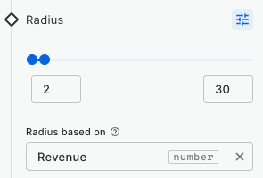
In this tutorial we are going to visualize revenue performance and surface area of retail stores across the USA. We will construct two views, one of individual store performance using bubbles, and one of aggregated performance using hexagons. By visualizing this information on a map we can easily identify where our business is performing better and which are the most successful stores (revenue inversely correlated with surface area).
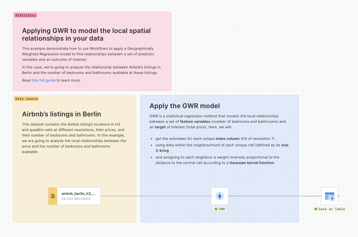
Analyzing Airbnb ratings in Los Angeles
In this tutorial we will analyzi which factors drive the overall impression of Airbnb users by relating the overall rating score with different variables through a Geographically Weighted Regression model. Additionally, we'll analyze more in-depth the areas where the location score drives the overall rating, and inspect sociodemographic attributes on these by enriching our visualization with data from the Data Observatory
Assessing the damages of La Palma Volcano
Since 11 September 2021, a swarm of seismic activity had been ongoing in the sourthern part of the Spanish Canary Island of La Palma. The increasing frequency, magnitude, and shallowness of the seismic events were an indication of a pending volcanic eruption; which occurred on the 16th September, leading to evalucation of people living in the vicinity. In this tutorial we are going to assess the number of buildings, estimated property value and population that may get affected by the lava flow and its deposits.
Build an AI Agent to collect map-based fleet safety feedback
Create an AI Agent that helps fleet managers, safety analysts, and other operators submit precise, location-based feedback back to their systems using the vehicle data available in the interactive map.
Optimizing rapid response hubs placement with AI Agents and Location Allocation
Analyzing areas of influence with AI Agents through user-driven isoline generation
Create an AI Agent that generates user-driven isolines based on user input and obtain insights from data within those custom areas. Learn how to combine isoline generation with spatial filtering to analyze points of interest, demographics, or any spatial data within walking, driving, or transit-accessible zones around key locations.
Next, connect the filter results to a H3 Polyfill component, and set the resolution to 9. This will create a H3 grid covering the Bristol area.
Now, drag the Bristol traffic accidents table onto the canvas. It can be found under Sources > Connection > CARTO Data Warehouse > demo tables.
Connect this to a H3 from GeoPoint component, setting the resolution of this to 9 also. This will create a H3 index for each input point.
Connect the output of H3 from GeoPoint to a Groupby component. Set the group by column to H3, and the aggregation column to H3 (count). The result of this will be a table with a count for the number of accidents within each H3 cell.
In the final stage for this section, add a Join component. Connect the H3 Polyfill component to the top input, the Group by component to the bottom input, and set the join type to Left.
Run!
Getis Ord
component which is the hotspot function we will be using. Set the value column as "rate" (i.e. the variable we just created), the kernel to gaussian and the neighborhood size to 3. Learn more about this process
.
Finally, connect the results of this to a Simple Filter, and the filter condition to where the p_value is equal to or less than 0.05; this means we can be 95% confident that the locations we are looking at are a statistically significant hotspot.
Instructions: Define what the agent does, what it knows, and how it should behave. This is where you specify its purpose and expertise.
Tools: The agent can access CARTO's built-in geospatial tools and your custom MCP tools for connecting to other systems.
Model: The LLM that powers the agent's ability to understand questions and decide which tools to use.
Enable AI Agents in your organization
AI Agents are disabled by default. To enable them, navigate to Settings > CARTO AI and toggle Enable CARTO AI to enable them for your whole organization. Once enabled, any Editor user can create AI Agents in Builder maps.
To enable AI Agents in your organization you must be an Admin user.
Set up an AI Agent in Builder
Once AI Agents are available in your organization, you can start the creation of Agents directly in Builder. To start, create a new map or open an existing one. Then navigate to the AI Agents tab on the left pane and click Create agent. This will open the agent configuration dialog.
The Use Case field is required. Use it to explain what the map is for and what questions users will ask. For example, "Help network planners identify optimal locations for Rapid Response Hubs, ensuring full network coverage and efficient maintenance through location intelligence. The goal is to maximize coverage and minimize response time, so that when incidents occur—such as outages, equipment failures, or natural disasters—the nearest facility can respond quickly and restore service." This helps the agent deliver relevant, accurate answers. Once you've filled in the Use Case, you're ready to test your agent. Everything else is optional.
You can also add custom instructions for more specific guidance. This is optional but recommended. Use it to add domain knowledge, define response style, or set boundaries on what the agent should and shouldn't do.
To enhance the user experience, you can set a welcome message that greets users when they open the agent, and add conversation starters—preset questions users can click to begin interacting with the agent.
Once you're ready, click Create Agent. This makes it available to Editors in your organization. To make it available for Viewers, toggle the setting in Map settings for viewers on the top banner. This will also make the agent available to anyone with the map link if the map is public.
Configure it as an MCP Tool (add descriptions, inputs, and outputs)
Connect an agent to your CARTO MCP Server
The agent can now use your custom tools
Step 1: Create a Workflow
Each MCP Tool needs a Workflow behind it. Design workflows that solve the specific questions you want agents to answer. For detailed instructions on building Workflows as MCP Tools, see the Workflows as MCP Tools documentation.
Step 2: Create an API Access Token
The MCP Server uses API tokens for authentication.
In the CARTO Workspace, navigate to Developers > Credentials and create a new API Access Token
Under Allowed APIs, select the MCP Server permission
Copy the token and save it securely
You'll need this token to connect agents to your MCP Server.
Step 3: Connect an Agent
Once your workflow and token are ready, connect your agent to the CARTO MCP Server. Here's an example using Gemini CLI:
Best Practices
Write clear tool descriptions
Explain what the tool does and when to use it. This helps agents choose the right tool for each question.
Define inputs precisely
Use descriptive parameter names and types. Vague labels confuse agents.
Test workflows first
Run workflows manually before exposing them as tools. Verify the outputs match what you expect.
Choose the right output mode
Use Sync for quick queries. Use Async for long-running operations. Keep in mind that Async requires the agent to poll for status and fetch results when complete, which may need additional prompt engineering.
Keep tools updated
When you modify a workflow, sync it promptly. Let users know if tool behavior changes.
Monitor usage
Review how tools are used and check for errors. Use this to refine workflows or improve descriptions.
Bear in mind that with Async mode, the agent will need to poll for the status of the execution and make an additional query to get results when the job is finalized. Implementing this logic in your agent's prompt might require additional work.
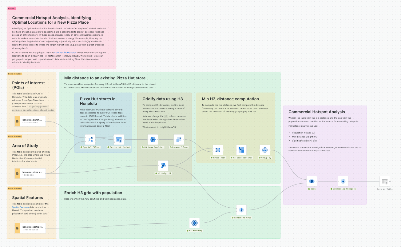
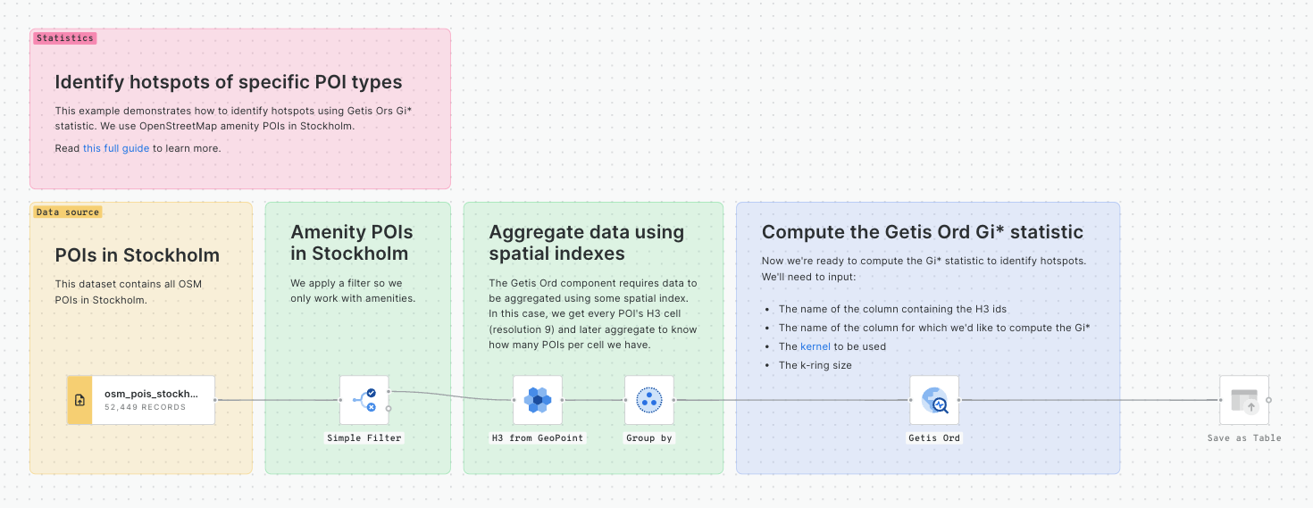
Commercial Hotspot Analysis. Identifying Optimal Locations for a New Pizza Place
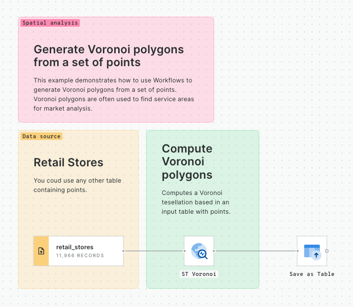
Identifying an optimal location for a new store is not always an easy task, and we often do not have enough data at our disposal to build a solid model to predict potential revenues across an entire territory. In these cases, managers rely on different business criteria in order to make a sound decision for their expansion strategy. For example, they rely on defining their target market and segmenting population groups accordingly in order to locate the store closer to where the target market lives (e.g. areas with a great presence of youngsters).
In this example, we are going to use the Hotspot Analysis component to explore good locations to open a new Pizza Hut restaurant in Honolulu, Hawaii. We will use H3 as our geographic support and population and distance to existing Pizza Hut stores as our criteria to identify hotspots. For a detailed description of this use case read this guide.
This example shows how to create a pipeline to train a classification model using Snowflake ML, evaluate the model and use it for prediction. In particular, we will create a classification model to estimate customer churn for a telecom company in California.
This example workflow will help you see how telco companies can detect high-risk customers, uncover the reasons behind customer departures, and develop targeted strategies to boost retention and satisfaction by training a classification model.
This template shows how to create a forecast model using Snowflake ML through the extension package for Workflows. There are three main stages involved:
Training a model, using some input data and adjusting to the desired parameters,
Evaluating and understanding the model and its performance,
The CARTO Analytics Toolbox is a set of SQL UDFs and Stored Procedures that run natively within each data warehouse, leveraging their computational power and scalability and avoiding the need for time consuming ETL processes.
The functions can be executed directly from the CARTO Workspace or in your cloud data warehouse console and APIs, using SQL commands.
Here’s an example of a query that returns the compact H3 cells for a given region, using Analytics Toolbox functions such as H3_POLYFILL() or H3_COMPACT() from our H3 module.
Check the documentation for each data warehouse (listed below) for a complete SQL reference, guides, and examples as well as instructions in order to install the Analytics Toolbox in your data warehouse.
WITH q AS (
SELECT `carto-os`.carto.H3_COMPACT(
`carto-os`.carto.H3_POLYFILL(geom,11)) as h3
FROM `carto-do-public-data.carto.geography_usa_censustract_2019`
WHERE geoid='36061009900'
)
SELECT h3 FROM q, UNNEST(h3) as h3
How to calculate spatial hotspots and which tools do you need?
Space-time hotspots: how to unlock a new dimension of insights
Spatial interpolation: which technique is best & how to run it
How To Optimize Location Planning For Wind Turbines
How to use Location Intelligence to grow London's brunch scene
Optimizing Site Selection for EV Charging Stations
Using Spatial Composites for Climate Change Impact Assessment
Cloud-native telco network planning
Finding Commercial Hotspots
Analyzing 150 million taxi trips in NYC over space & time
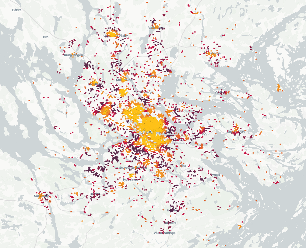
Understanding accident hotspots
Identifying customers potentially affected by an active fire in California
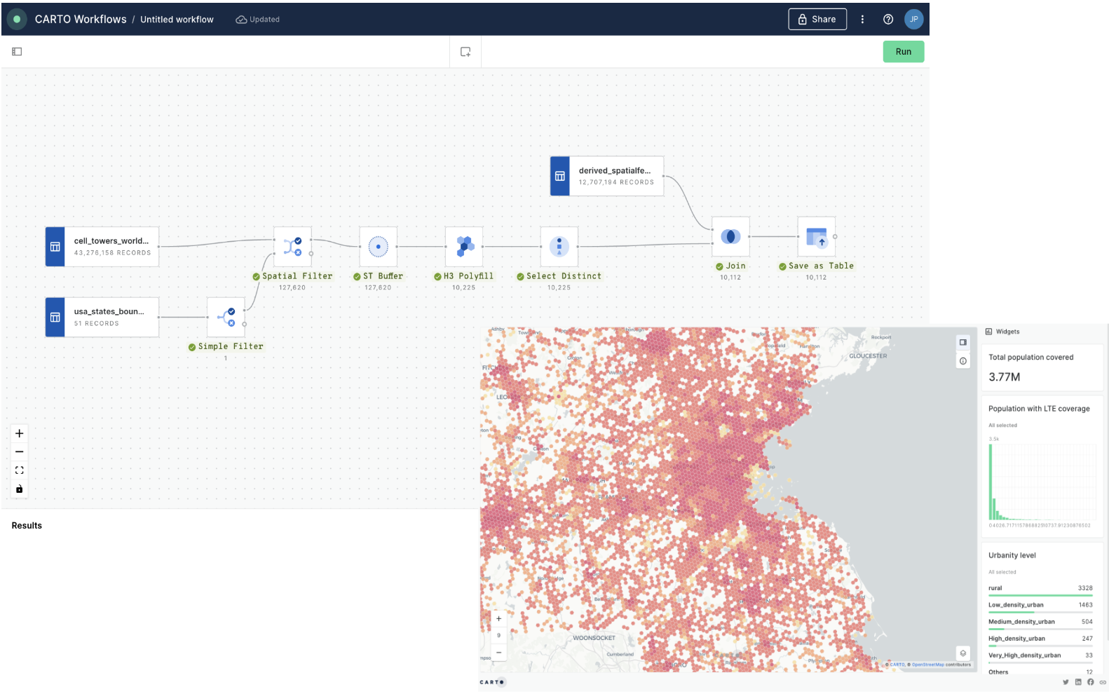
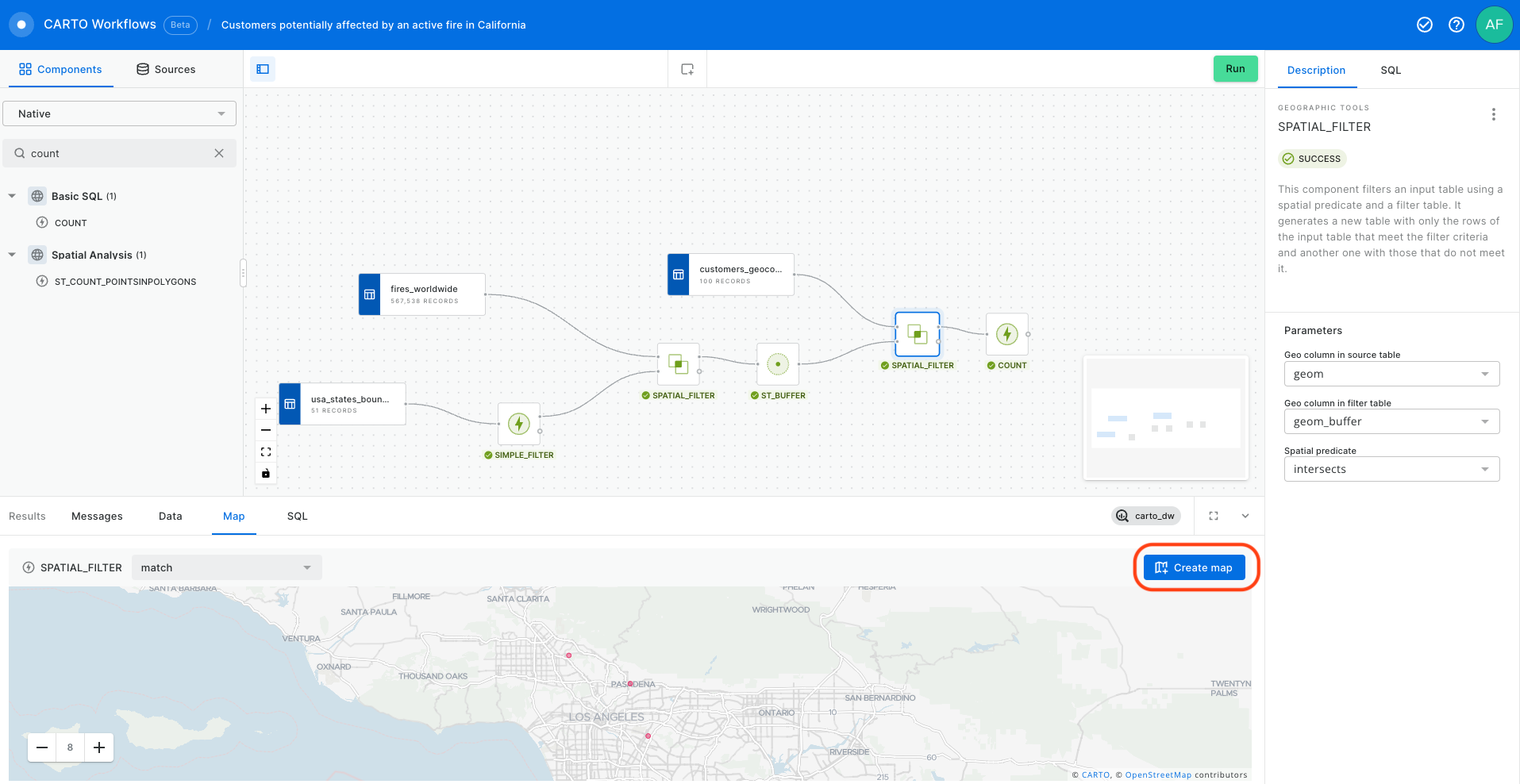
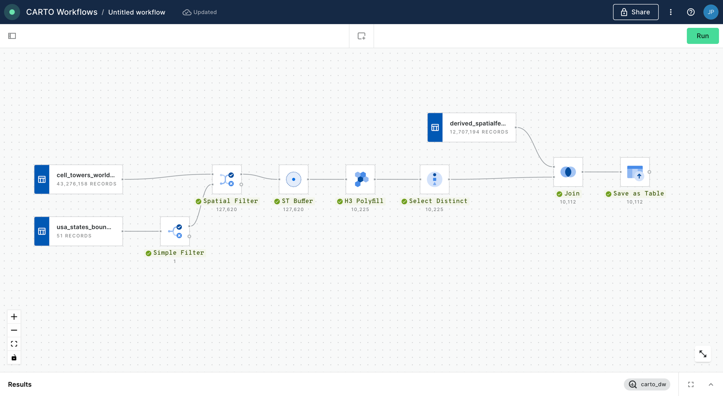
In this example we will see how we can identify customers potentially affected by an active fire in California using CARTO Workflows. This approach is one of the building blocks of spatial analysis and can be easily adapted to any use case where you need to know which features are within a distance of another feature.
All of the data that you need can be found in the CARTO Data Warehouse (instructions below).
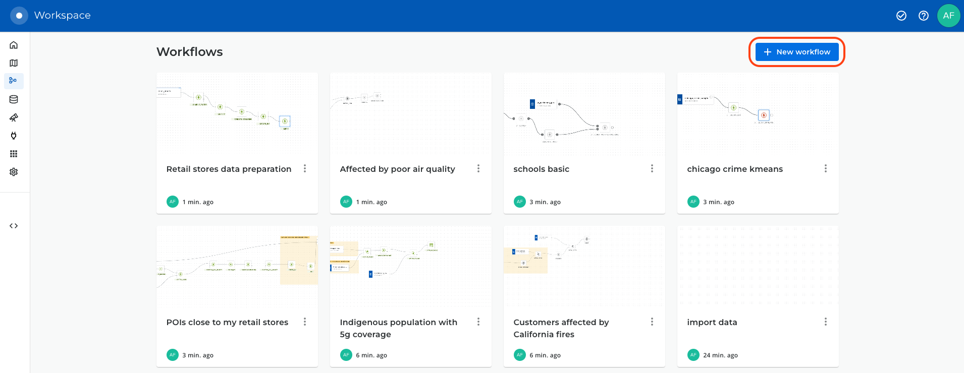
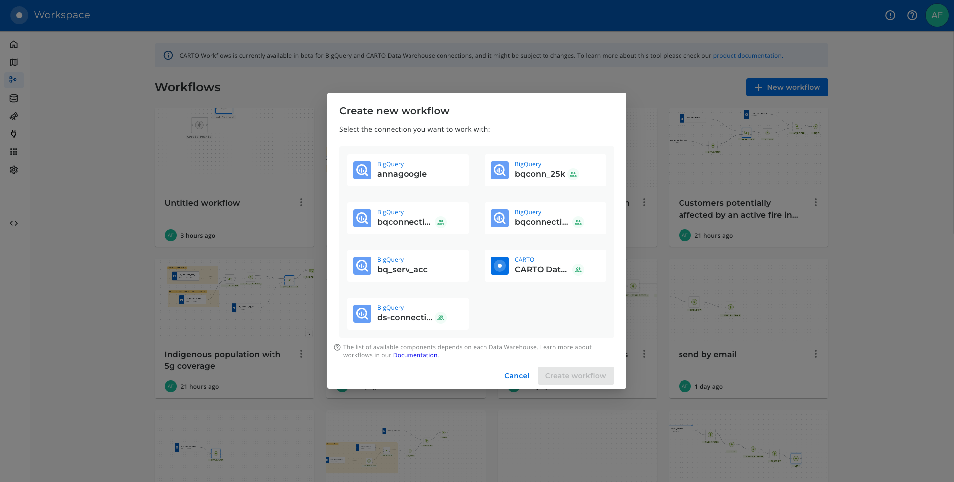
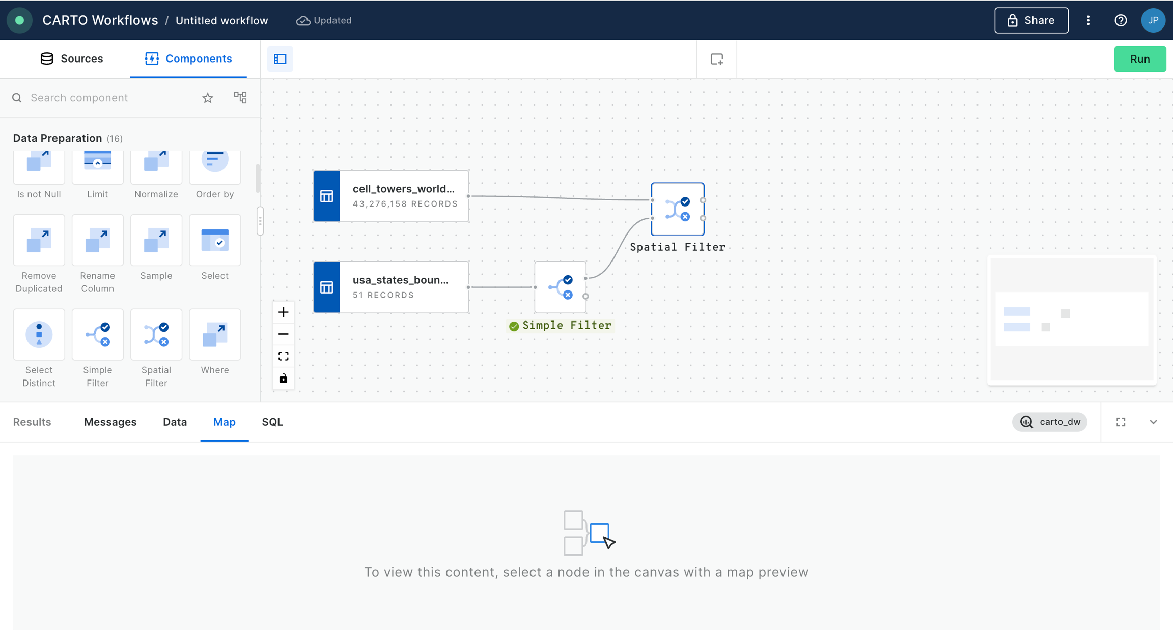
To begin, click on "+ New workflow" in the main page of the Workflows section. If it will be your first workflow, click on "Create your first workflow".
To begin, click on "+ New workflow" in the main page of the Workflows section. If it will be your first workflow, you will instead see the option to "Create your first workflow".
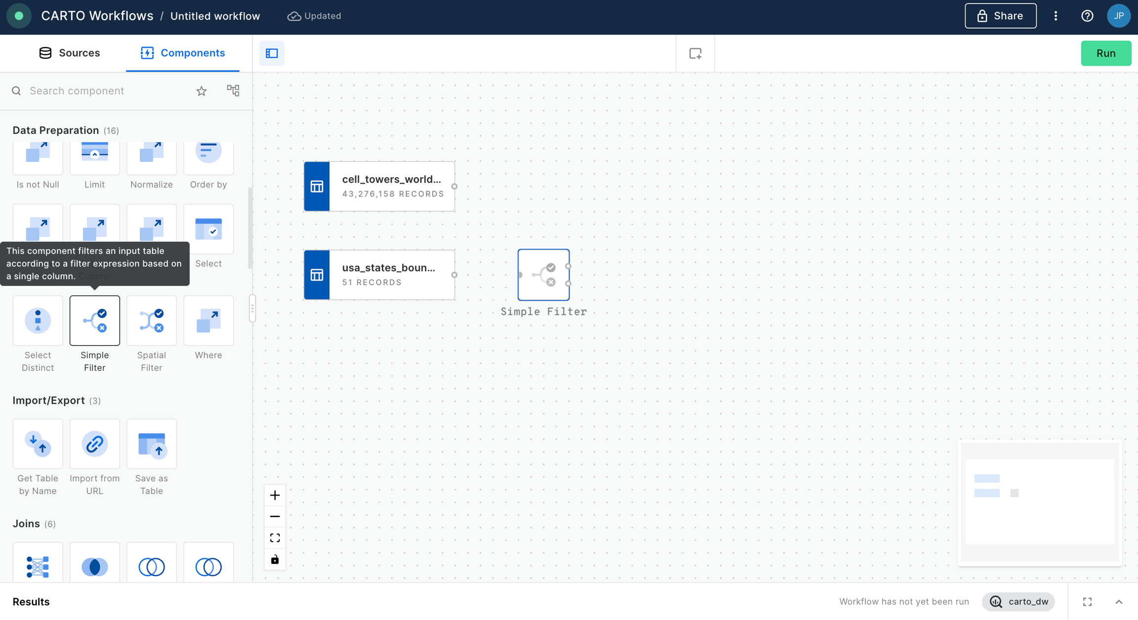
From here, you can drag and drop data sources and analytical components that you want to use from the explorer on the left side of the screen into the Workflow canvas that is located at the center of the interface.
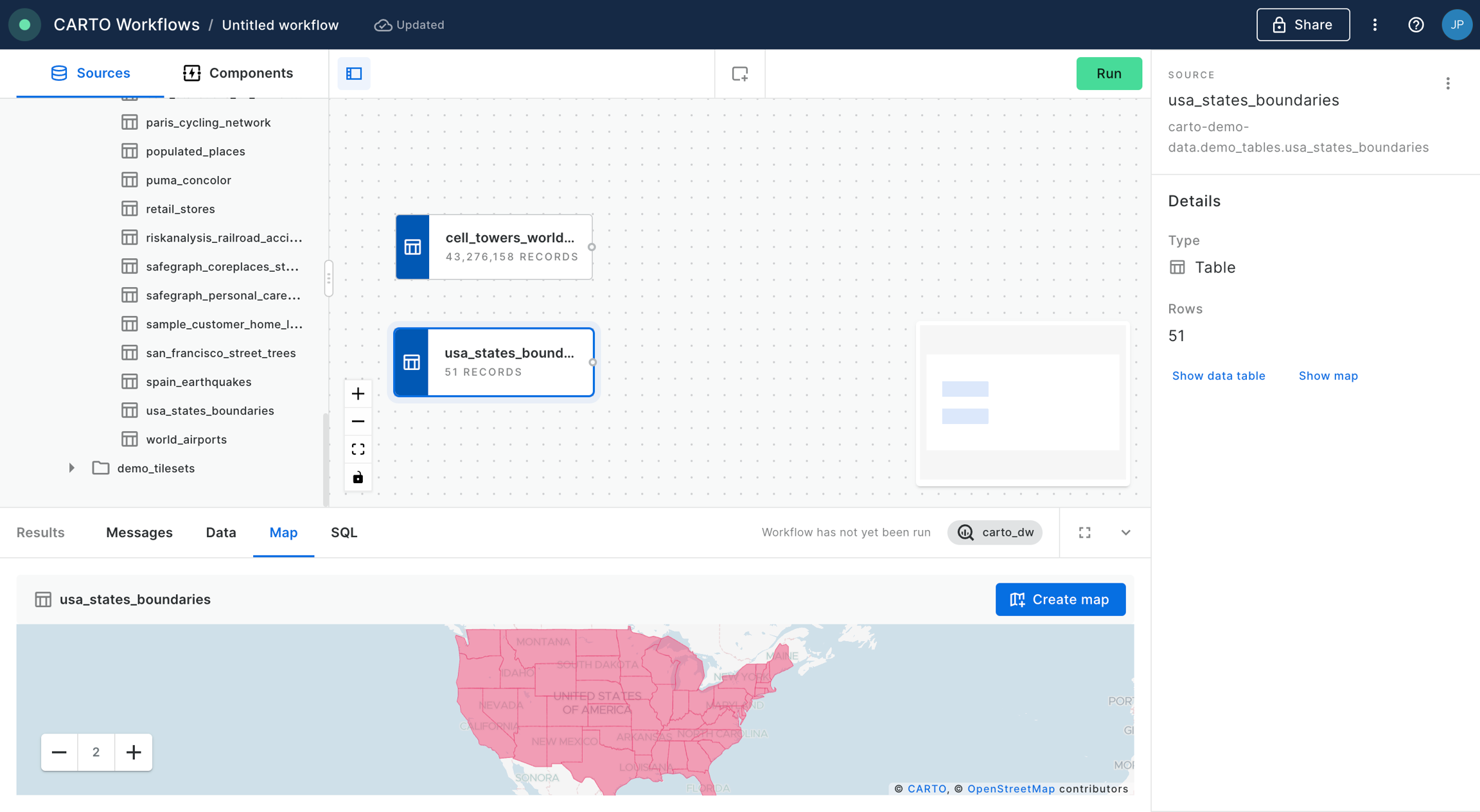
Let's add the usa_states_boundaries data table into our workflow from the demo_tables dataset available in the CARTO Data Warehouse connection. You can find this under Sources > Connection > demo data > demo_tables.
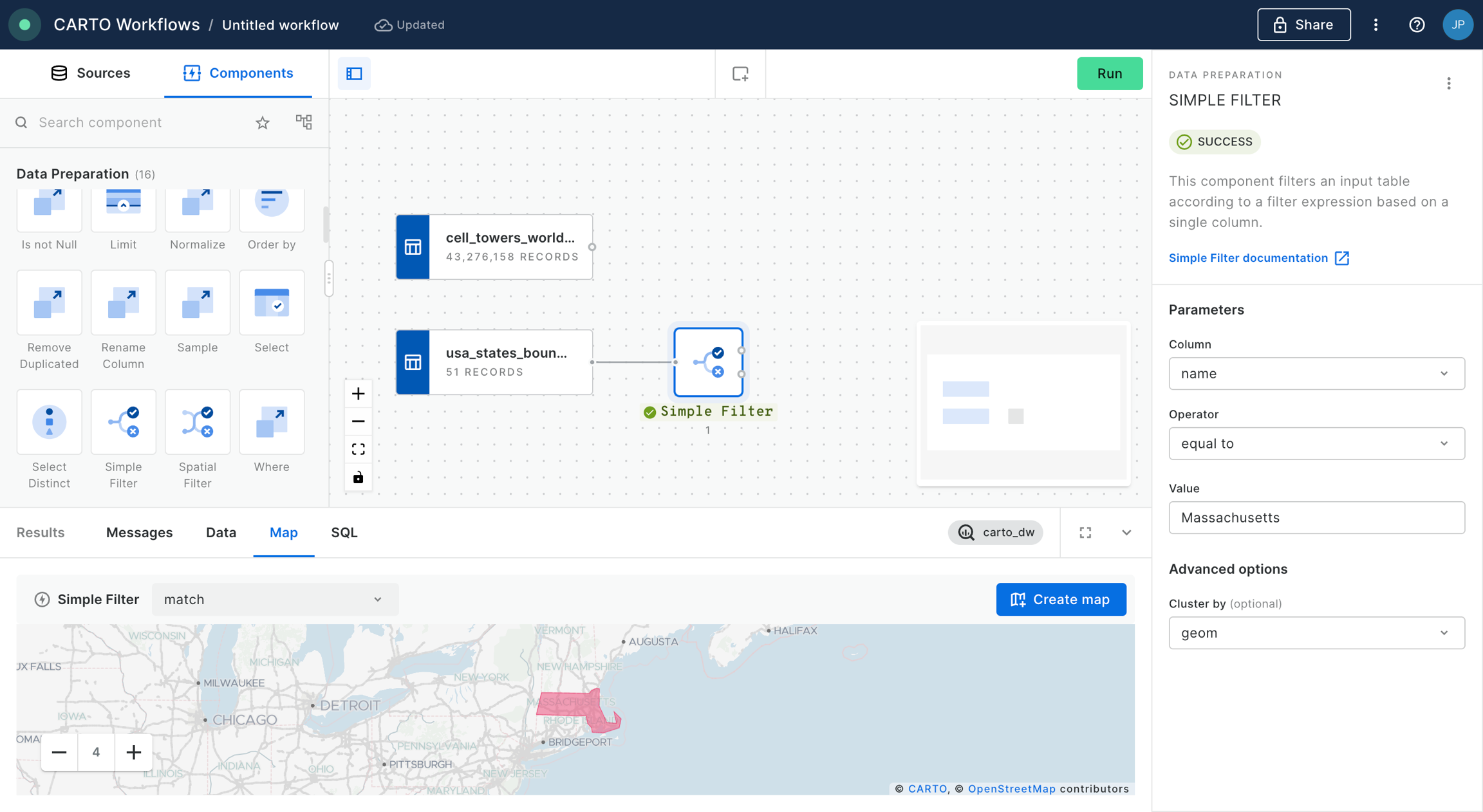
Then filter only the boundary of the state of California using the Simple Filter component; set the column as name, the operator as equal to and the value as California.
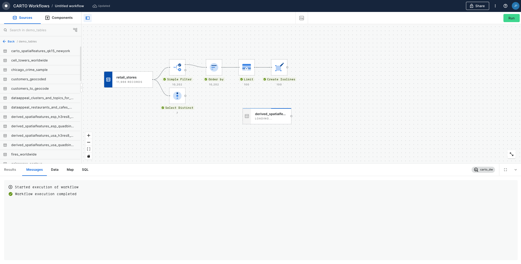
Run your workflow!
You can run the workflow at any point in this tutorial - only new or edited components will be run, not the entire workflow. You can also just wait to run until the end.
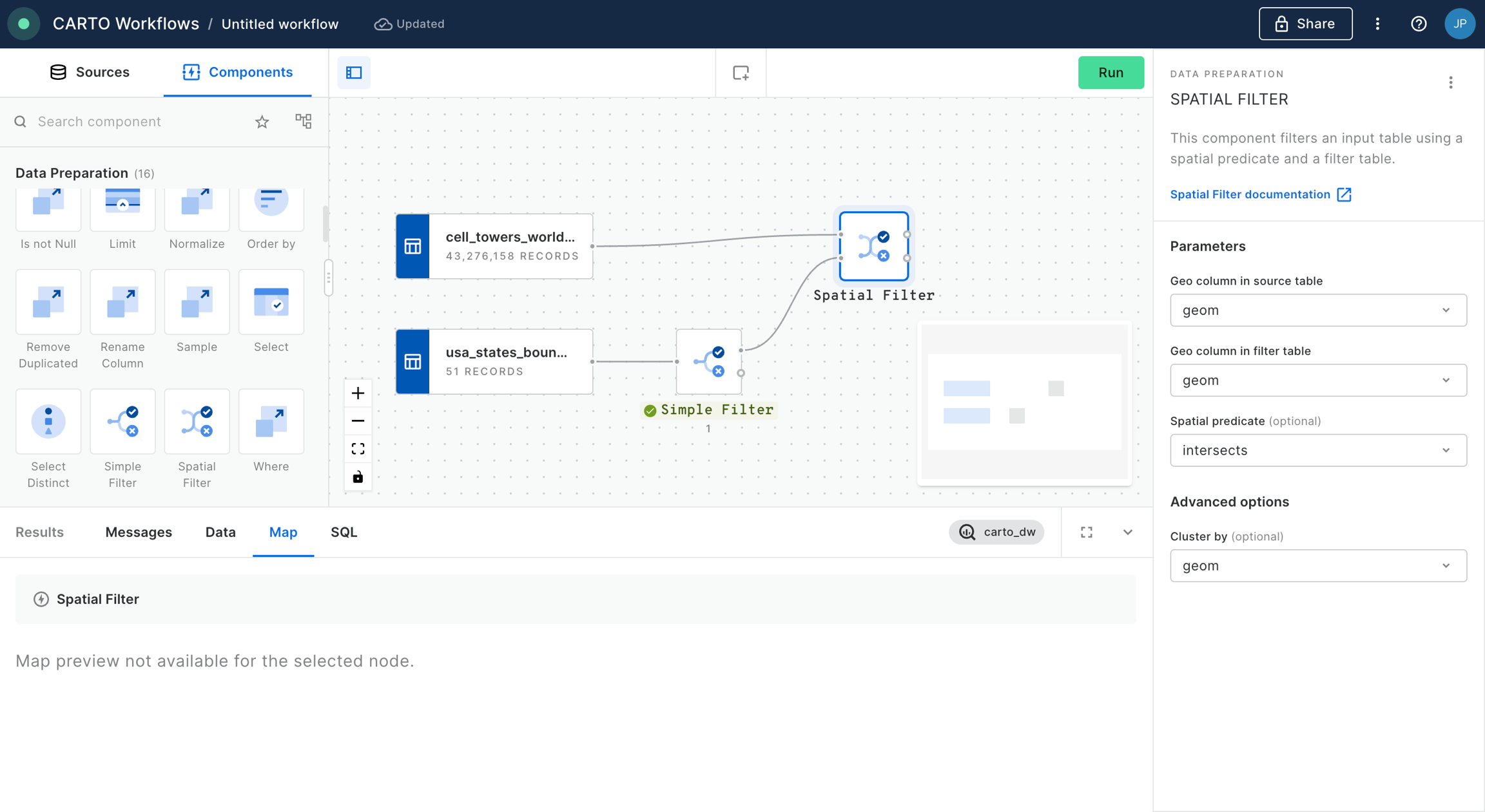
Next, let's explore fires in this study area.
From the same location that you added usa_states_boundaries, add fires_worldwide to the canvas. For ease later, you'll want to drop it just above the Simple Filter component from the previous step.
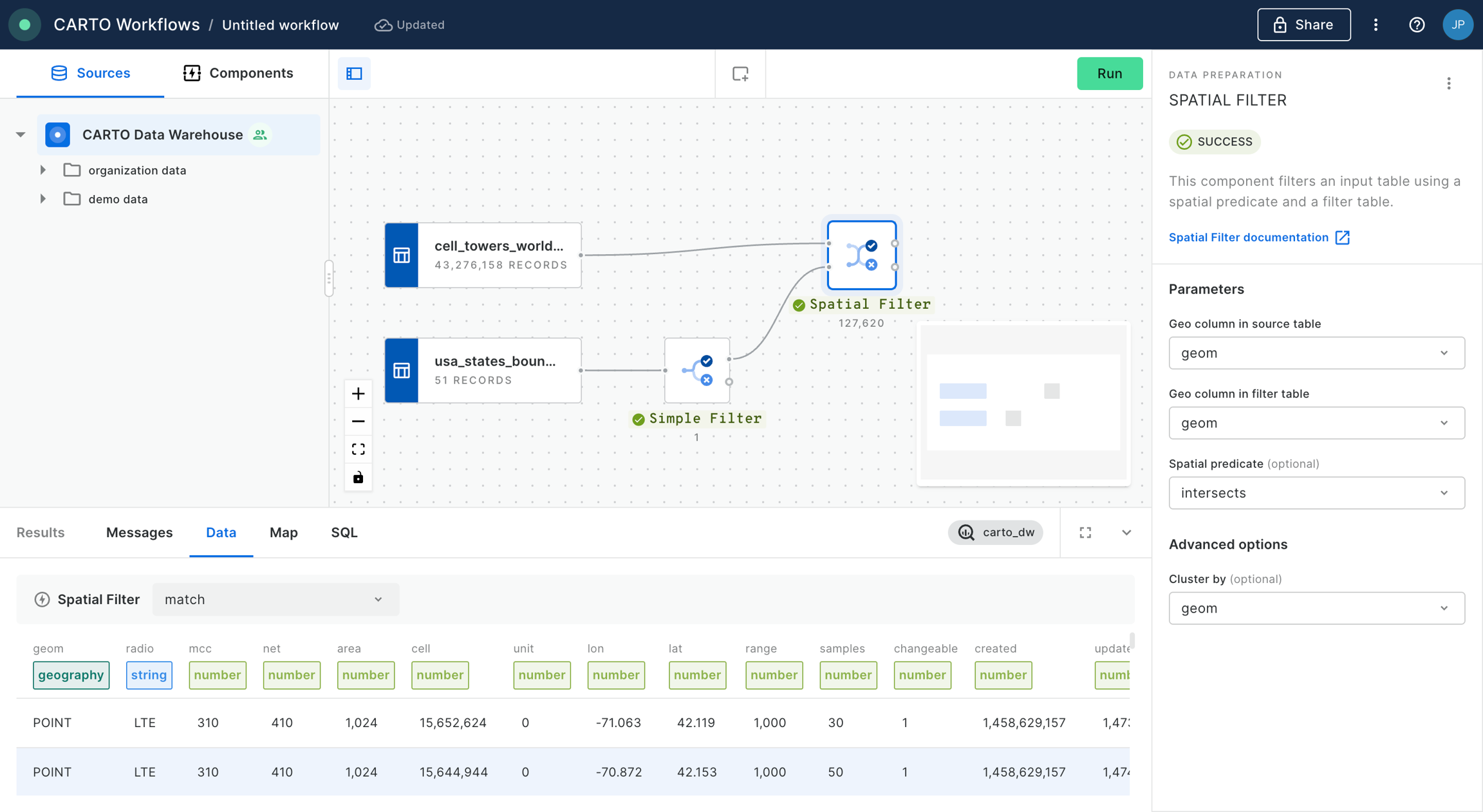
Next, add a Spatial Filter component to filter only the fires that fall inside the digital boundary of the state of California. Connect fires_worldwide to the top input and Simple Filter to the bottom. Specify both geo columns as "geom" and the spatial predicate as intersect (meaning the filter will apply to all features where any part of their shape intersects California).
To keep your workflow well organized, use the Add a note (Aa) tool at the top of the window to draw a box around this section of the workflow. You can use any markdown syntax to format this box - our example uses
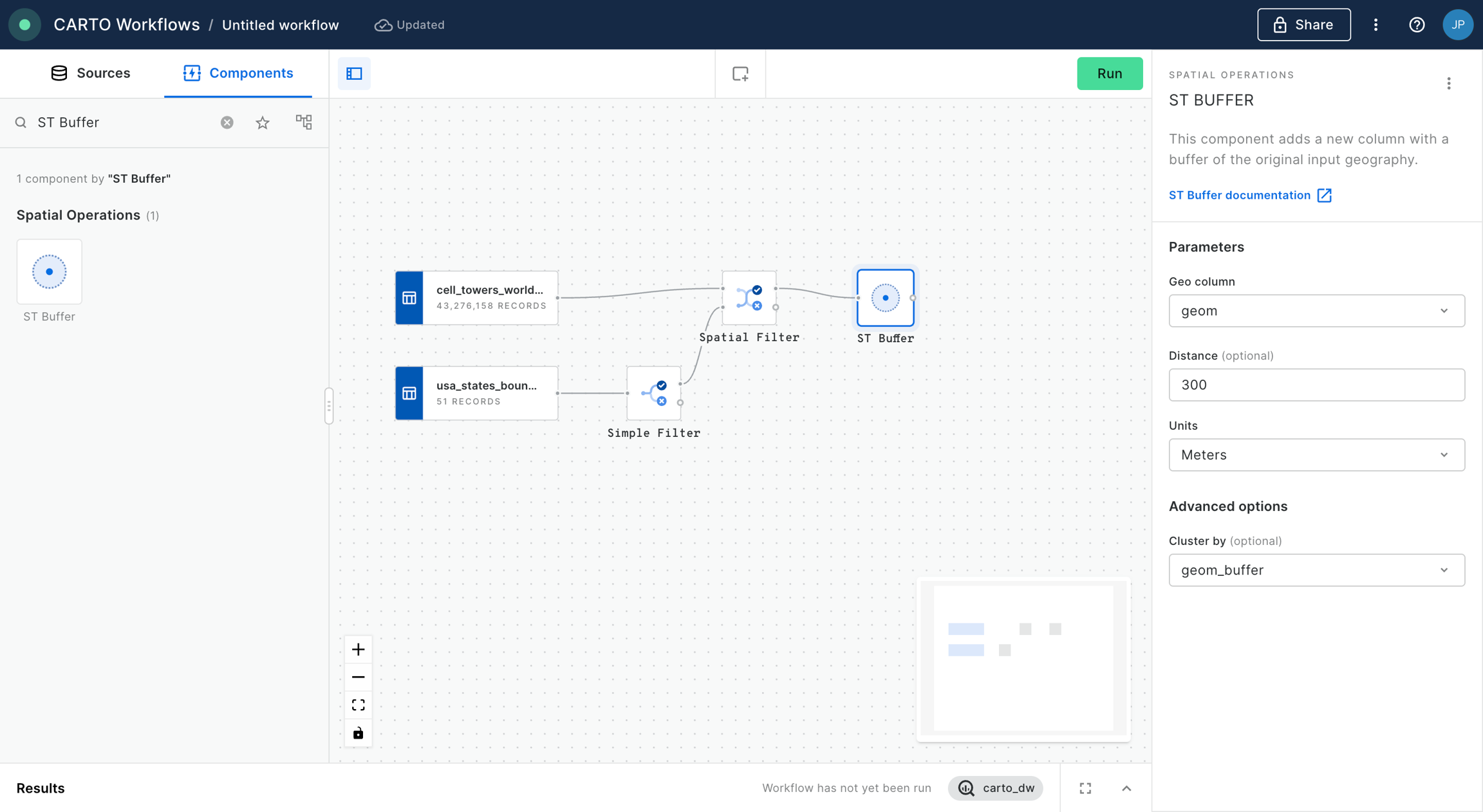
Now, use the ST Buffer component to generate a 5 km radius buffer around each of the active fires in California.
Next, add third data source with a sample of customer data from an illustrative CRM system. You can find it as customers_geocoded in demo_tables inside your CARTO Data Warehouse.
Now let’s add another Spatial Filter component to know which of our customers live within the 5 km buffer around the active fires and thus could potentially be affected.
You'll notice we now have a couple of instances of duplicated records where these intersect multiple buffers. We can easily remove these with a Remove duplicated component. Now is also a great time to add a second note box to your workflow, this time called ## Filter customers.
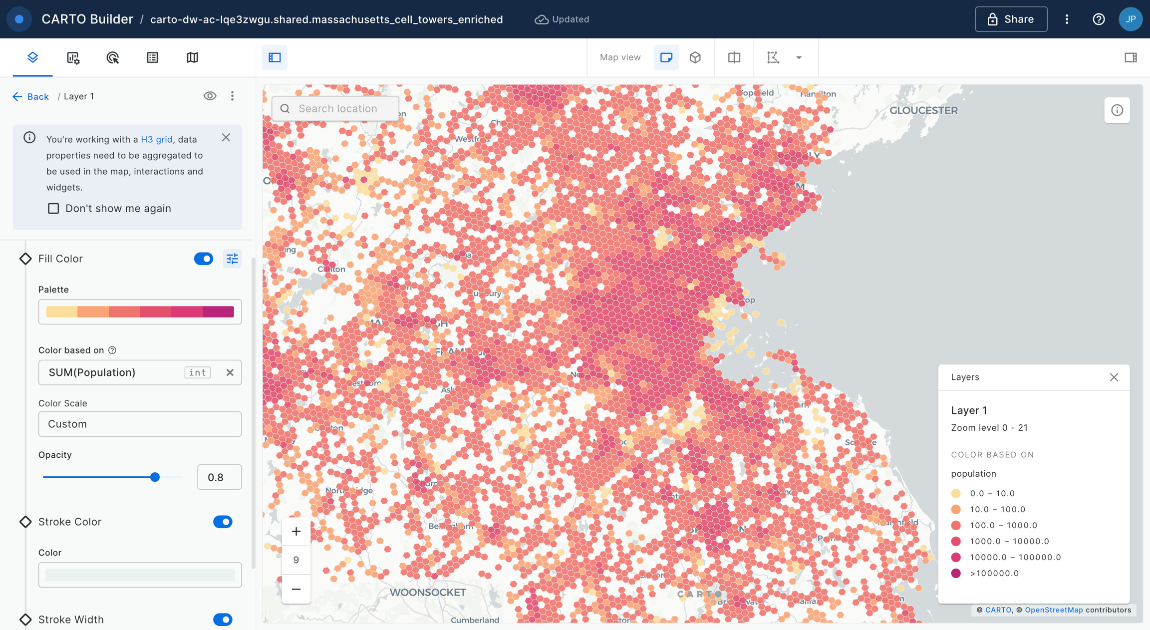
You can explore the results of this analysis at the bottom panel of the window, via both the Data and Map tabs. From the map tab, you can select Create map to automatically create a map in CARTO Builder.
Head to the section of the Academy next to explore tutorials for building impactful maps!
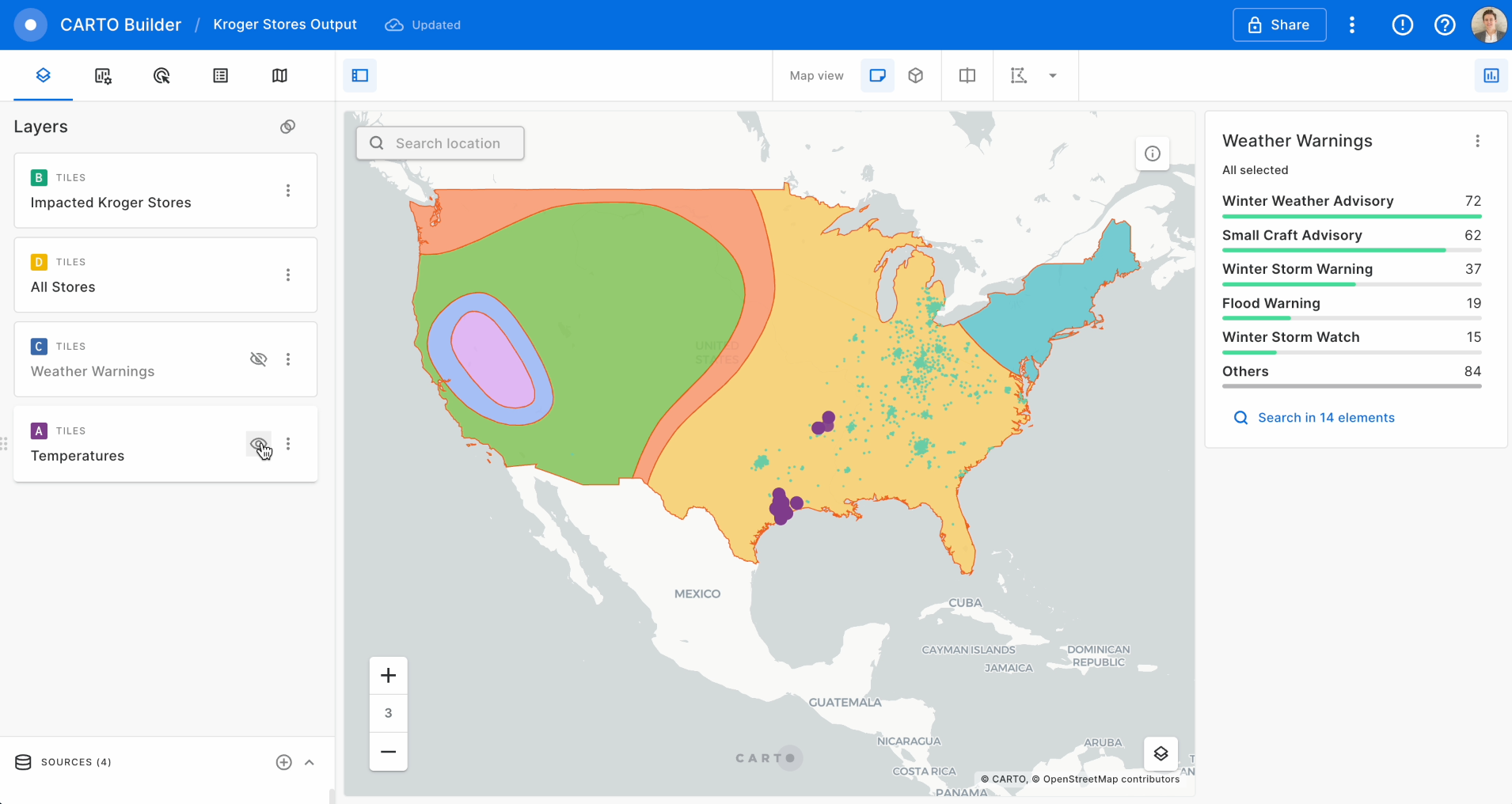
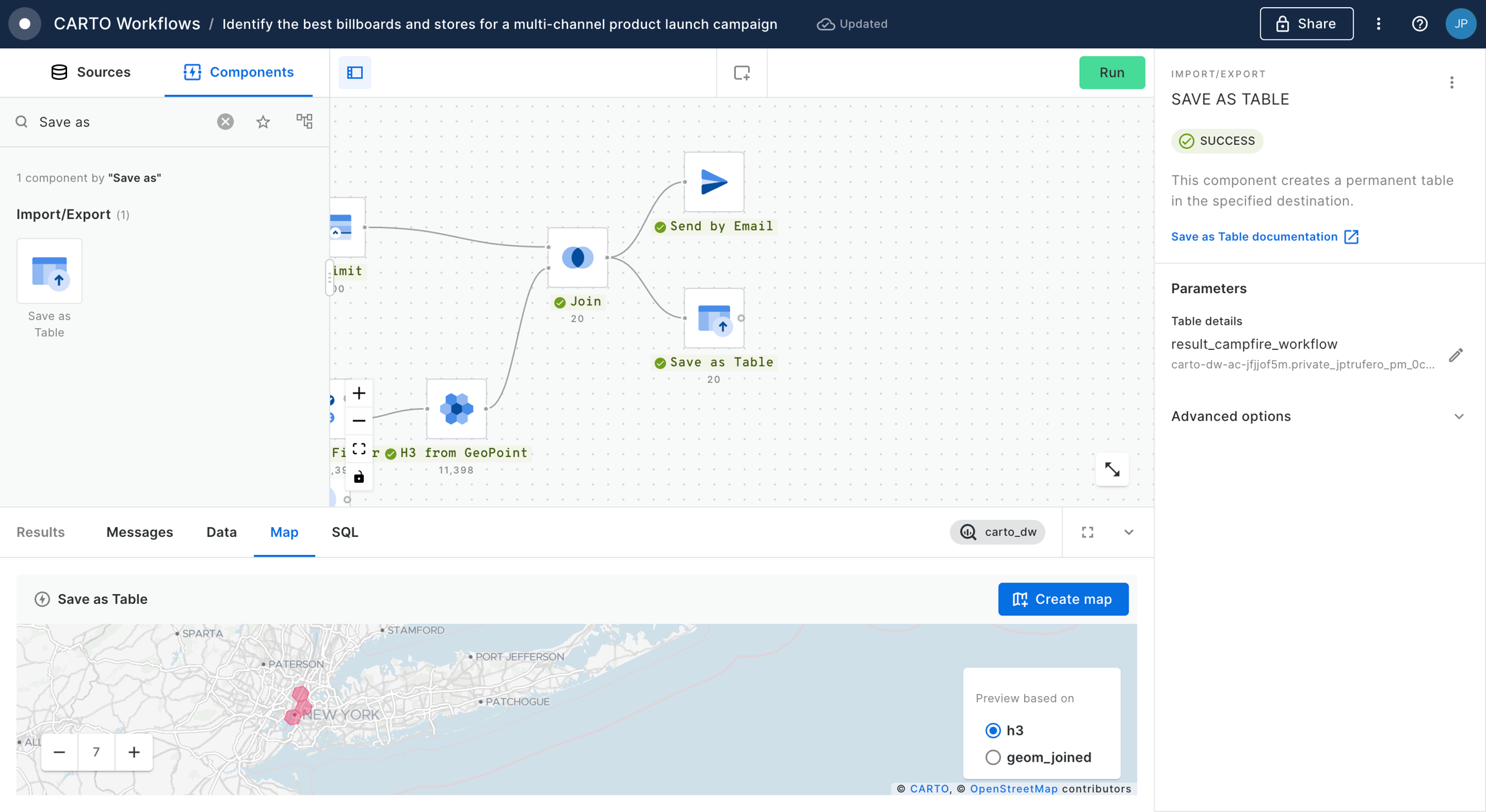
Finding stores in areas with weather risks
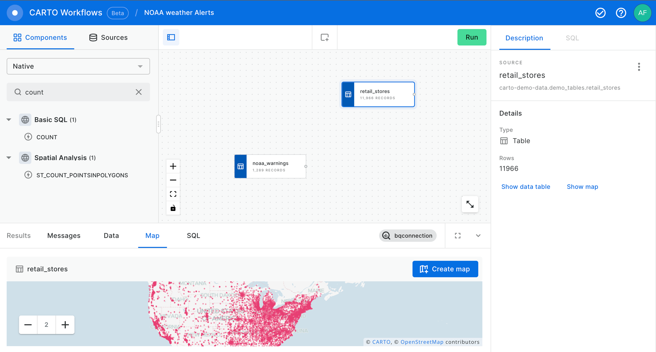
In this example we use CARTO Workflows to ingest data from a remote file containing temperature forecasts in the US together with weather risk data from NOAA, and data with the location of our stores; we will identify which of the stores are located in areas with weather risks or strong deviations in temperature.
To start creating the workflow, please click on "+ New workflow" in the main page of the Workflows section. If it will be your first workflow, click on "Create your first workflow".
Choose the data warehouse connection that you want to use. In this case, please select the CARTO Data Warehouse connection to find the data sources used in this example.
Now you can drag and drop the data sources and components that you want to use from the explorer on the left side of the screen into the Workflow canvas that is located at the center of the interface.
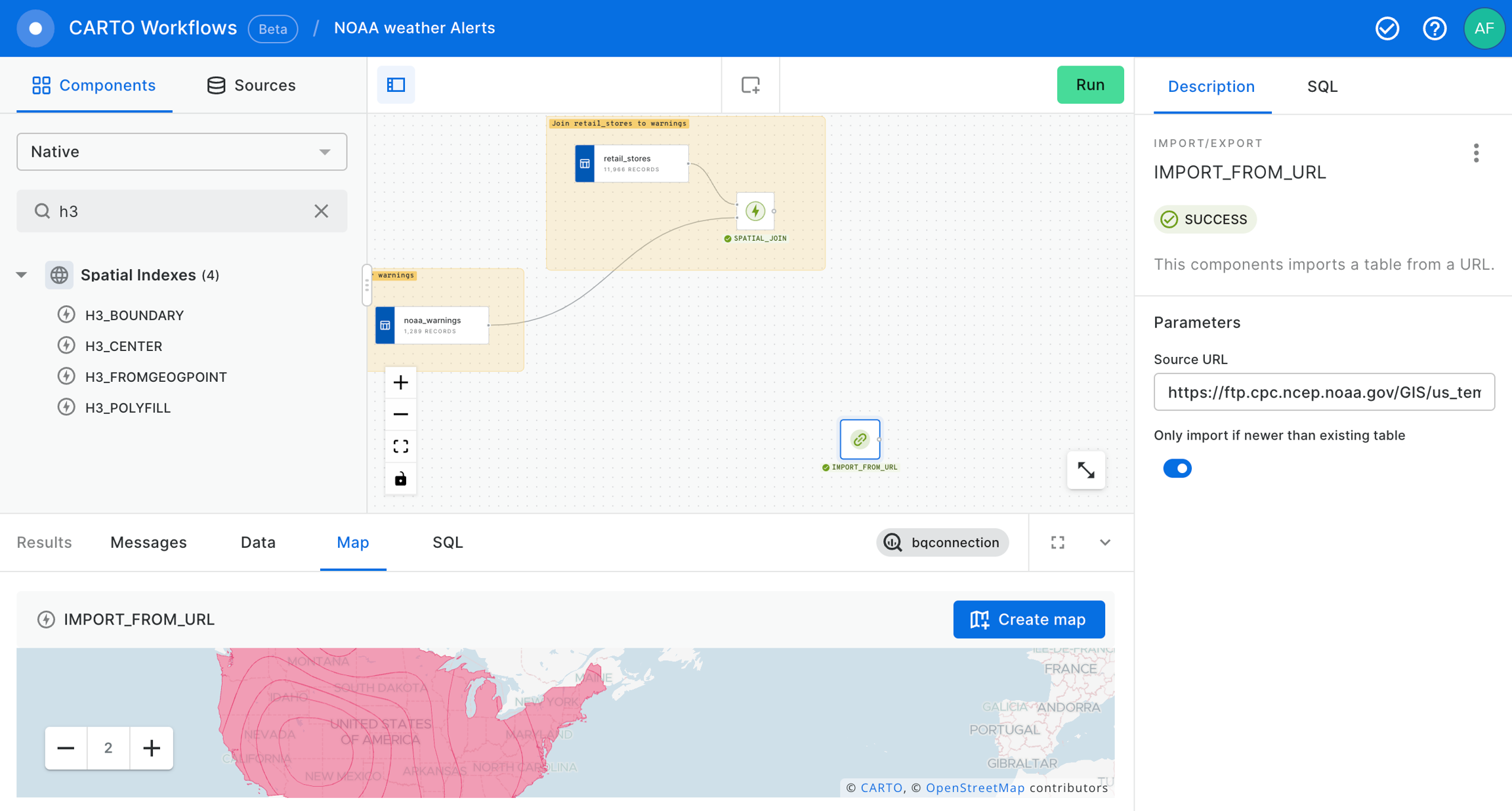
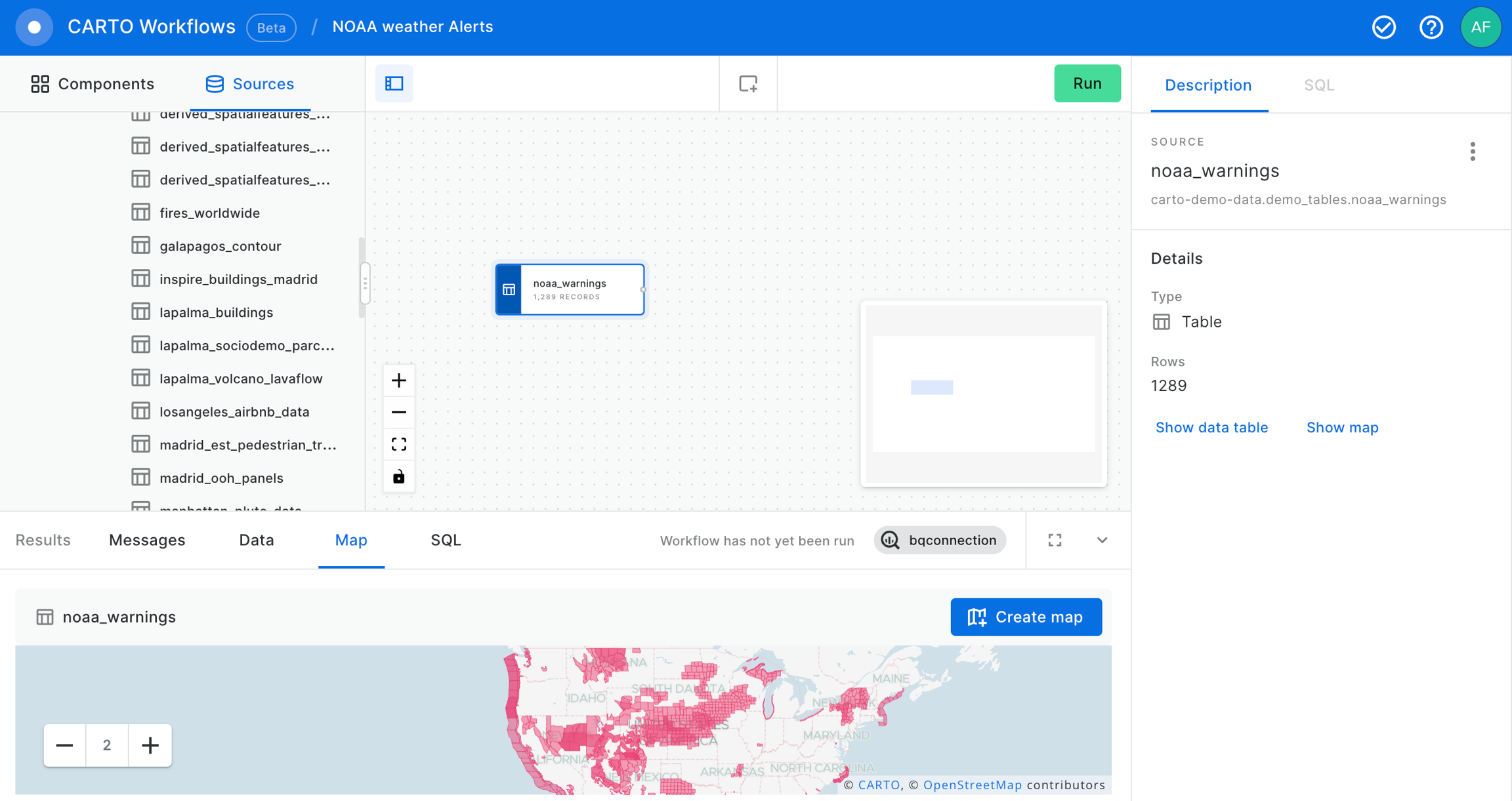
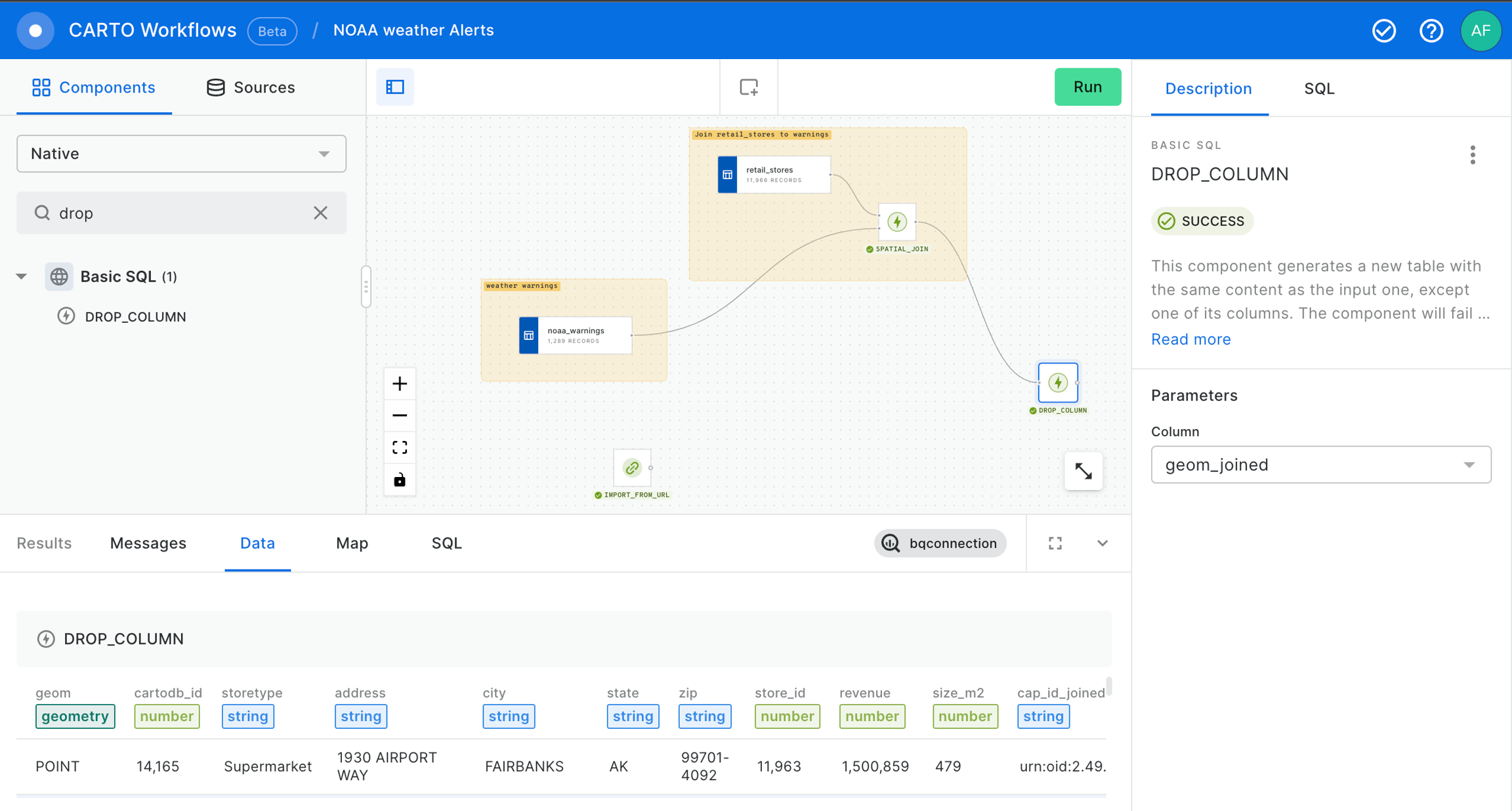
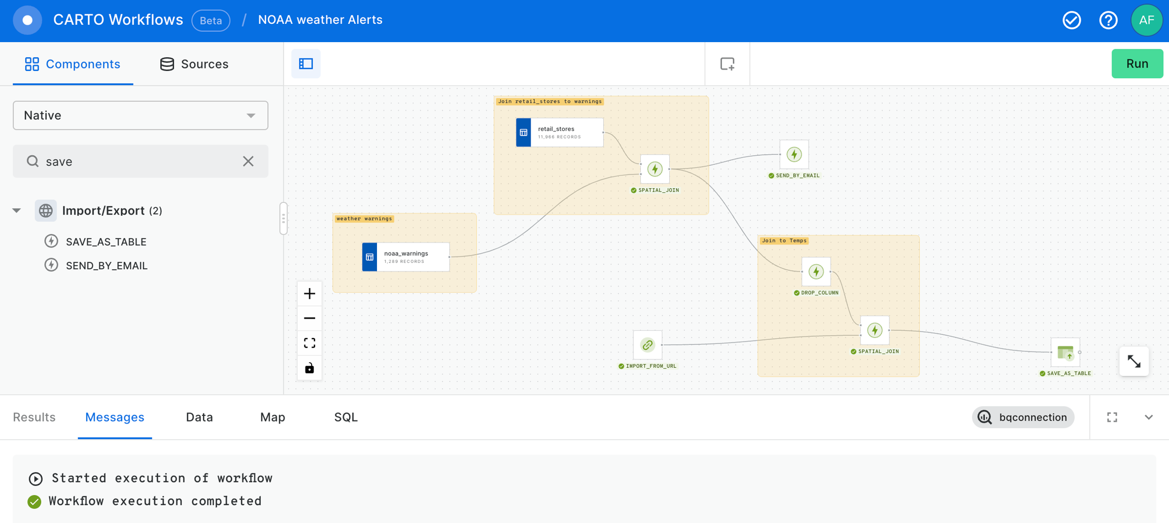
Now, let's add the noaa_warnings data table into our workflow from the demo_tables dataset available in the CARTO Data Warehouse connection.
After that, let’s add the retail_stores data table from the demo_tables dataset, also available in the CARTO Data Warehouse connection.
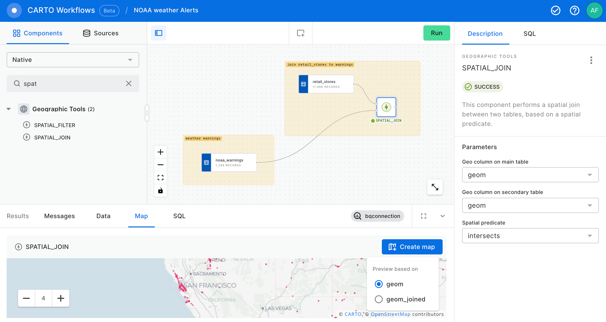
Now let's use the SPATIAL_JOIN component to know which of our retail_stores are in the warning areas.
At that point we already have our stores within a NOAA Weather Warning and, if we deem it appropriate, we can send an email to share this warnings to anyone interested in this information using the SEND_BY_EMAIL component.
After that, we can use the IMPORT_FROM_URL component to import the temperature forecast from using this URL in particular to take the latest temperature forecast in a Shapefile: . These data will be consulted again with each execution of the workflow. It means that the results of the workflow will change if the data has been updated.
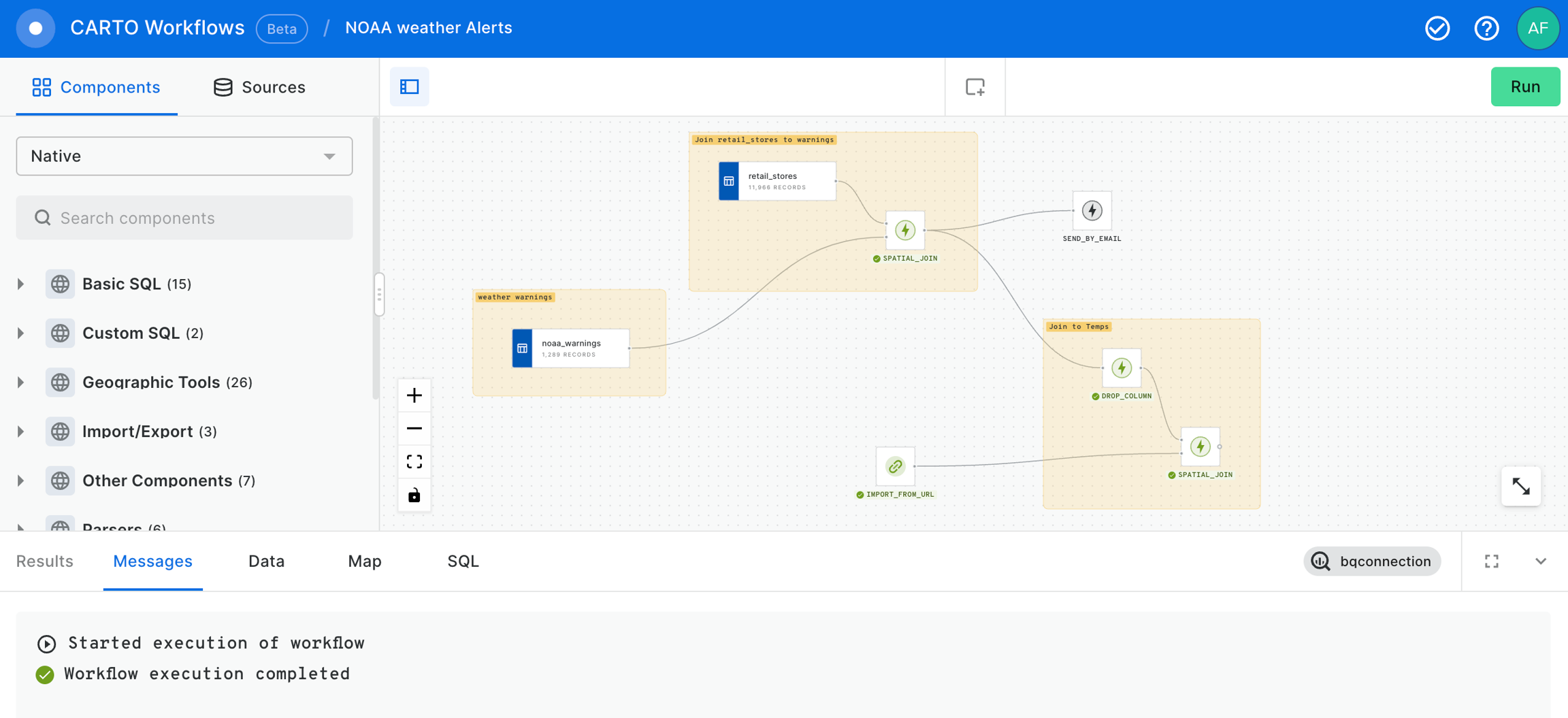
Now, we are going to drop the geom_joined column to keep only one geom column in order to avoid confusions.
We will proceed to make a new SPATIAL_JOIN in order to have the temperature forecast associated to the stores.
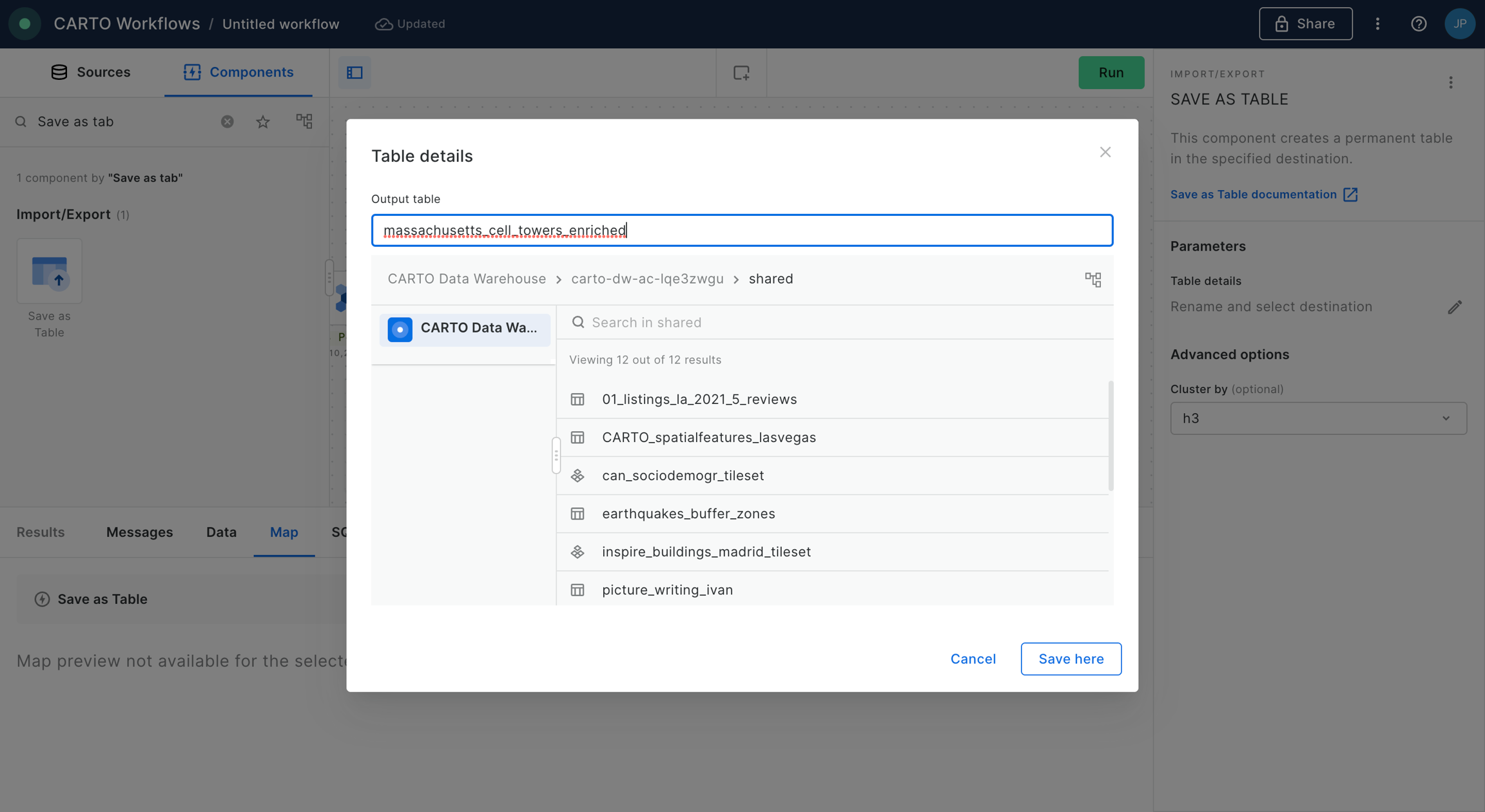
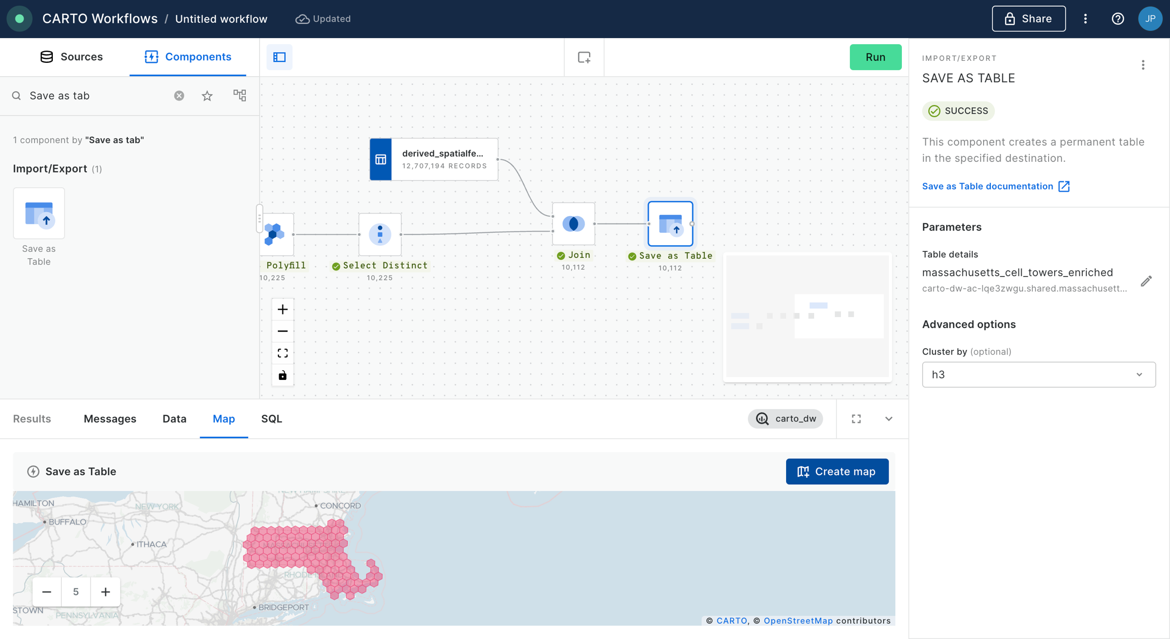
Finally, we conclude with this example saving the outcome in a new table using SAVE_AS_TABLE component. Remember that you should specify the fully qualified name of the new dataset in the field of this component.
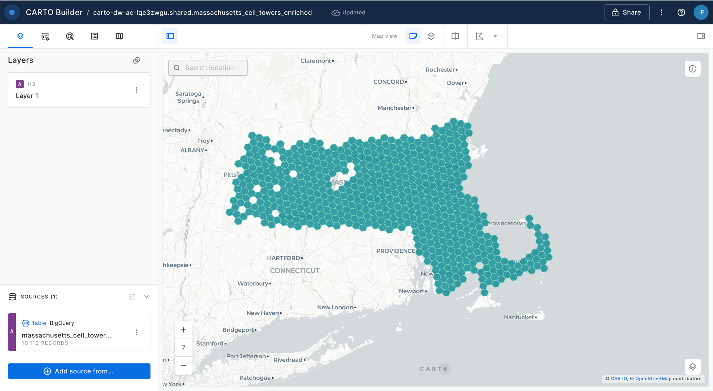
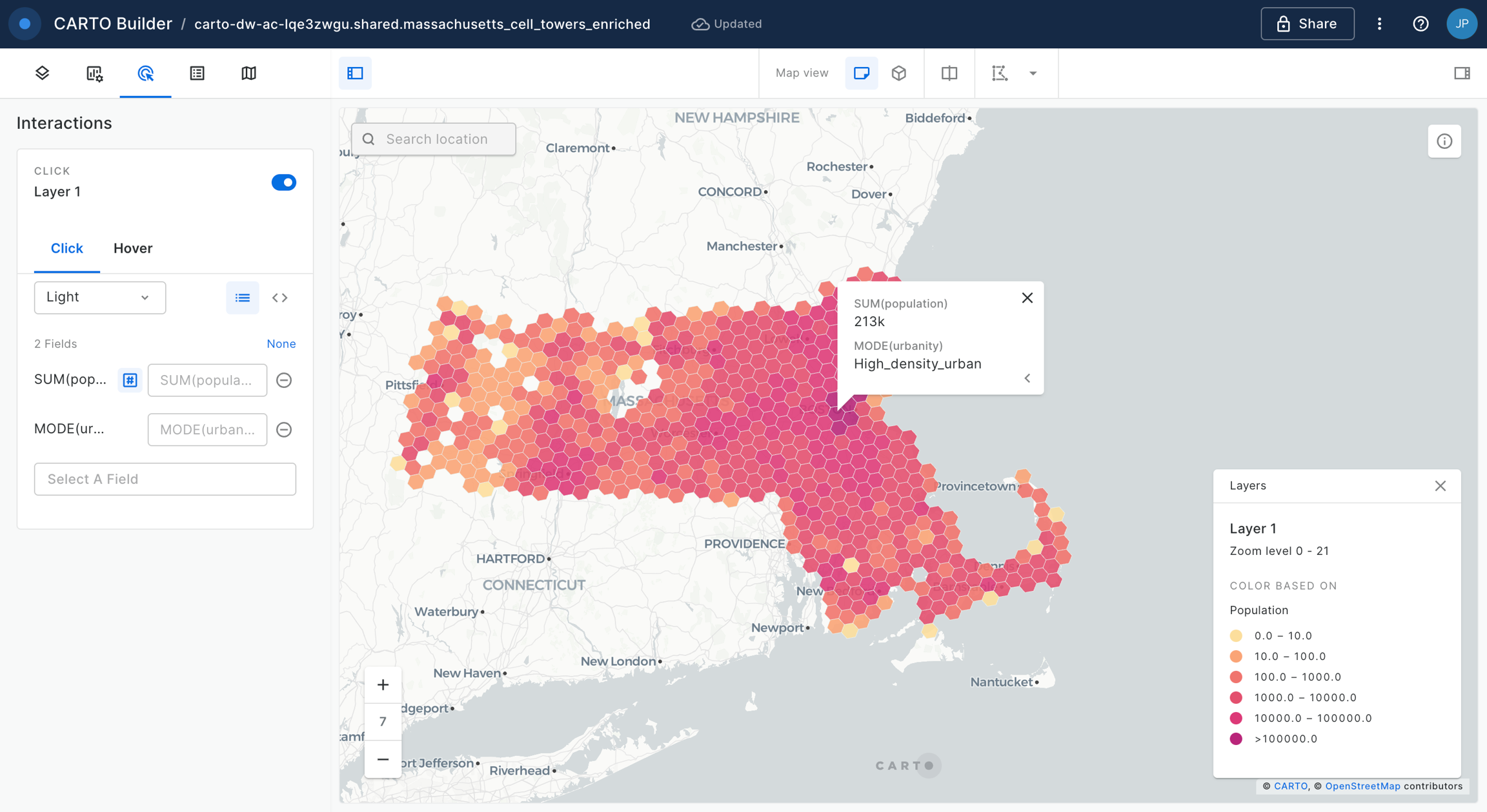
We can use the "Create map" button in the map section of the Results panel to create a new Builder map and analyze the results in a map.
Territory Planning
For these templates you will need to install the Territory Planningextension package.
Territory Balancing
BigQuery
CARTO Data Warehouse
In this template, we’ll explore how to optimize work distribution across teams by analyzing sales territory data to identify imbalances and redesign territories.
Focusing on a beverage brand in Milan, we’ll evenly assign Point of Sale (POS) locations to sales representatives by dividing a market (a geographic area) into a set of continuous territories. This ensures fair workloads, improves customer coverage, and boosts operational efficiency by aligning territories with demand.
Location Allocation - Maximize Coverage
BigQuery
CARTO Data Warehouse
Managing a modern telecom network requires balancing cost, coverage, and operational efficiency. Every network node—a set of cell towers—represents demand that must be effectively served by strategically placed facilities.
In this tutorial, we’ll explore how network planners can determine the optimal locations for Rapid Response Hubs, ensuring that each area of the network is monitored and maintained efficiently through Location Allocation. More specifically, we aim to maximize network coverage so that whenever an emergency occurs (i.e. outages, equipment failures, or natural disaster impacts), the nearest facility can quickly respond and restore service.
Location Allocation - Minimize Total Cost
BigQuery
CARTO Data Warehouse
Managing a modern telecom network requires balancing cost, coverage, and operational efficiency. Every network node—a set of cell towers—represents demand that must be effectively served by strategically placed facilities.
In this example, we’ll explore how network planners can determine the optimal locations for Maintenance Hubs, ensuring that each area of the network is monitored and maintained efficiently through Location Allocation. More specifically, we aim to minimize total operational costs for ongoing inspections and servicing, respecting resource capacities, and ensuring that routine maintenance is delivered cost-effectively. Our goal will be to expand our existing facilities by adding one selected site per county in Connecticut to serve rising network demand.
Introduction to Spatial Indexes
Scale your analysis with Spatial Indexes
Spatial Indexes - sometimes referred to as Data Cubes or Discrete Global Grid Systems (DGGs) - are global grid systems which tessellate the world into regular, evenly-shaped grid cells to encode location. They are available at multiple resolutions and are hierarchical, with resolutions ranging from feet to miles, and with direct relationships between “parent”, “child” and “neighbor” cells.
They are gaining in popularity as a support geography as they are designed for extremely fast and performant analysis of big data. This is because they are geolocated by a short reference string, rather than a long geometry description which is much larger to store and slower to analyze.
To learn more about Spatial Indexes you can get a copy of our free ebook .
Create or enrich an index
Get started with Spatial Indexes
The tutorials on this page will teach you the fundamentals for working with Spatial Indexes; how to create them!
; convert a point geometry dataset to a Spatial Index grid, and then aggregate this information.
.
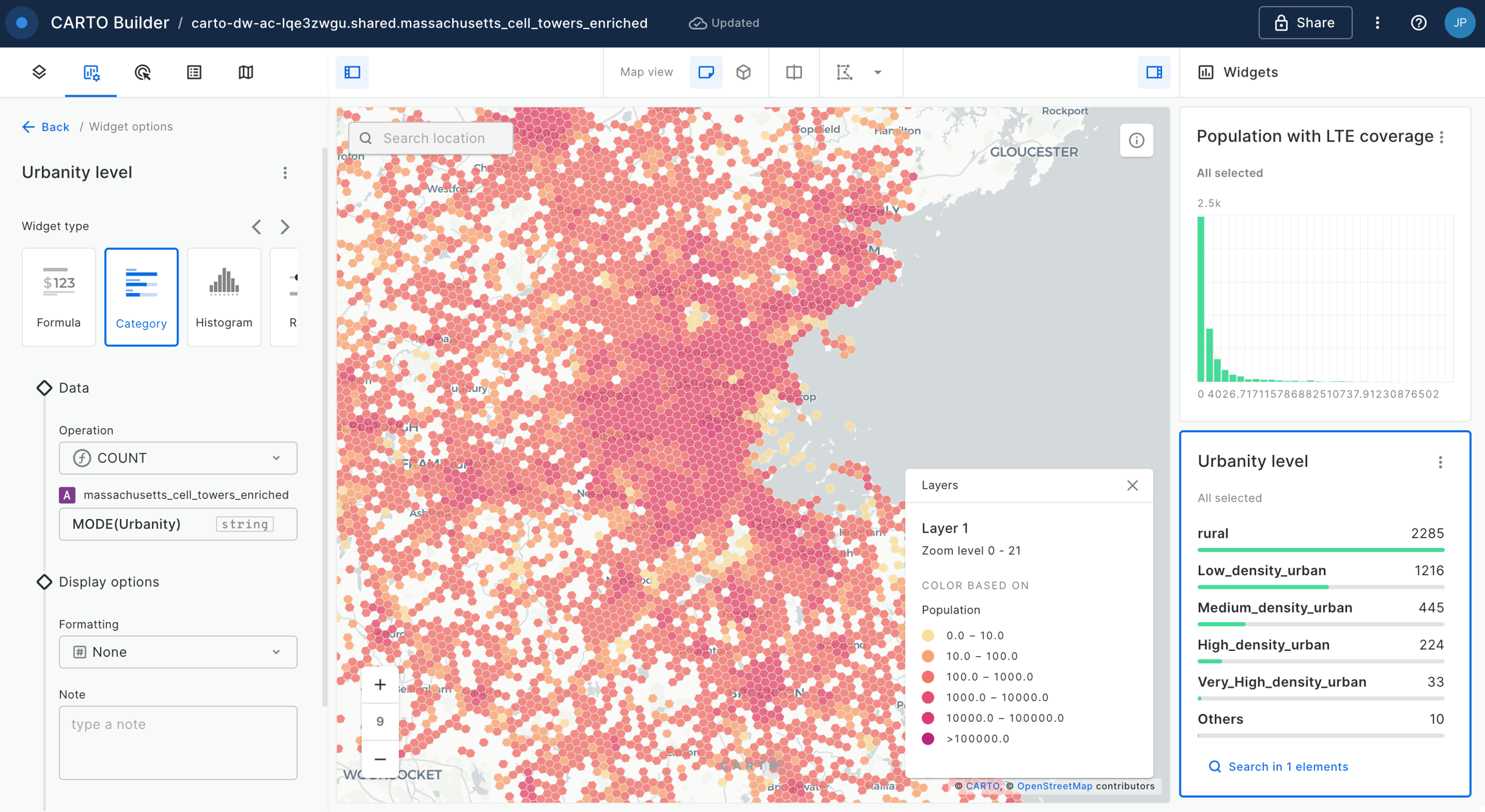
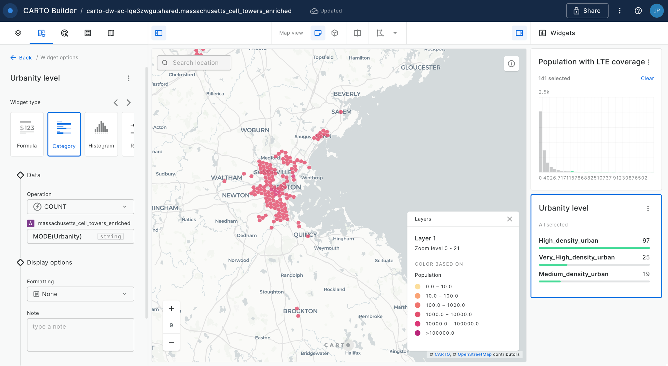
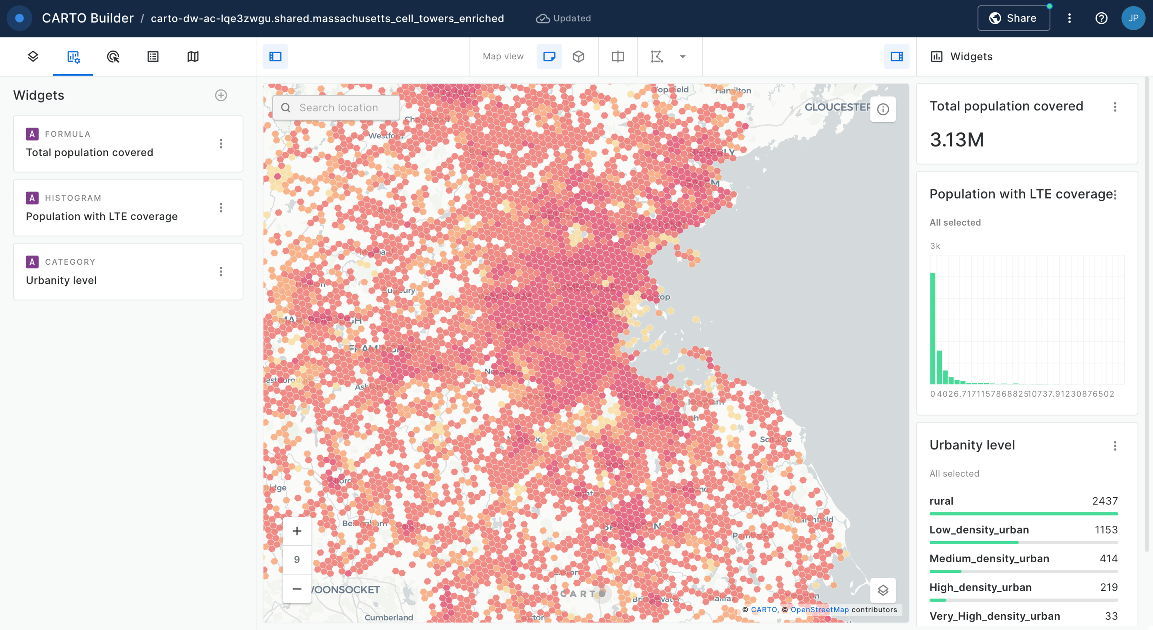
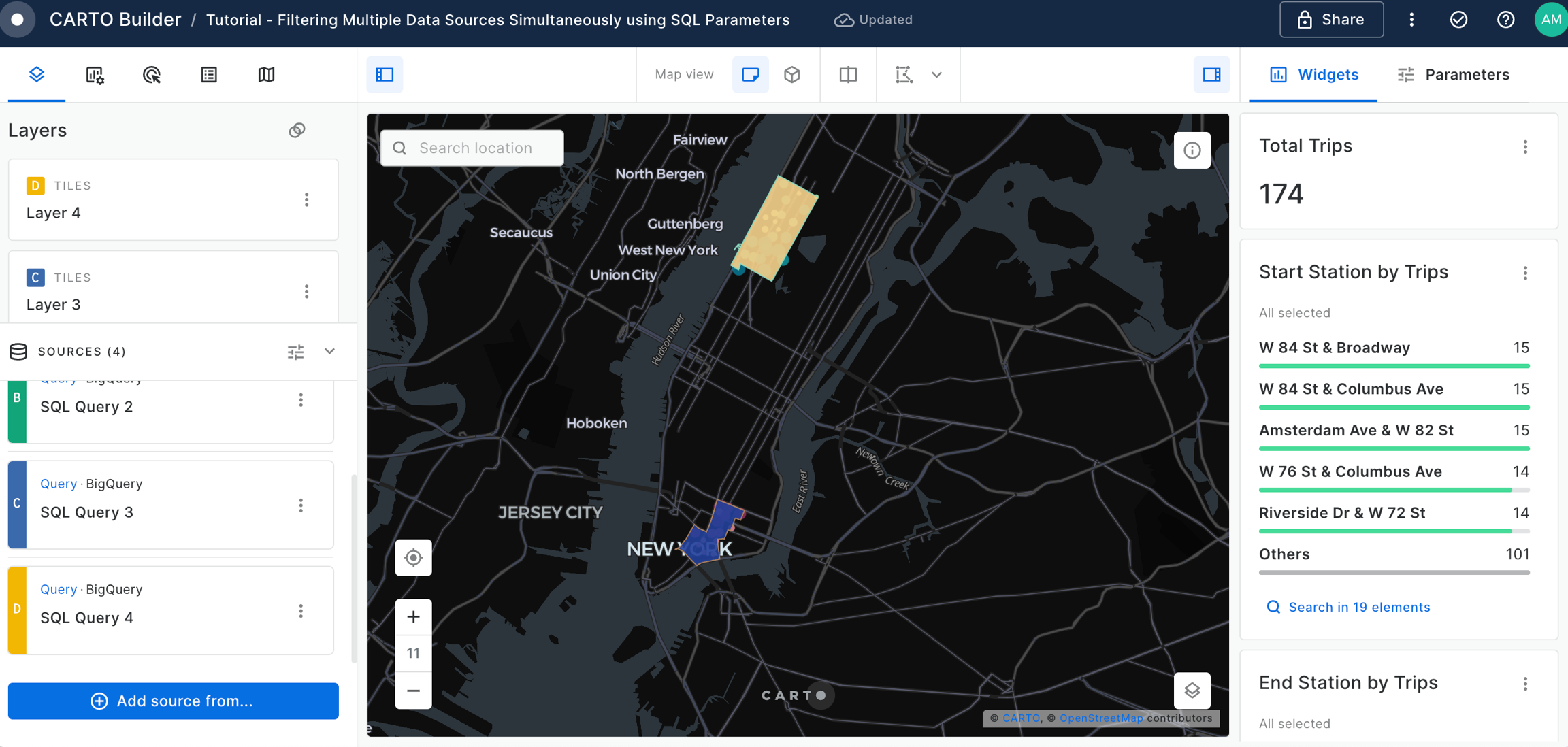
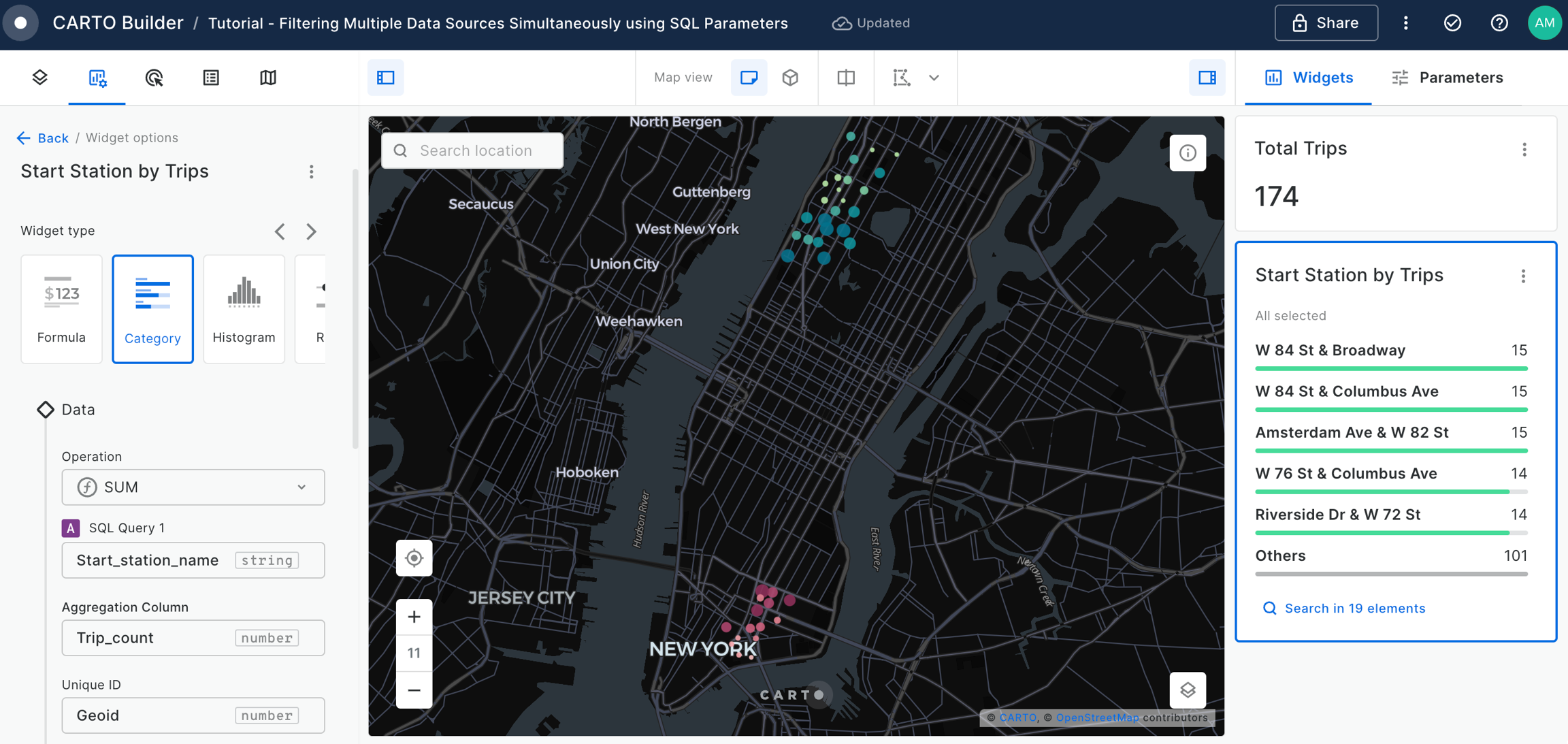
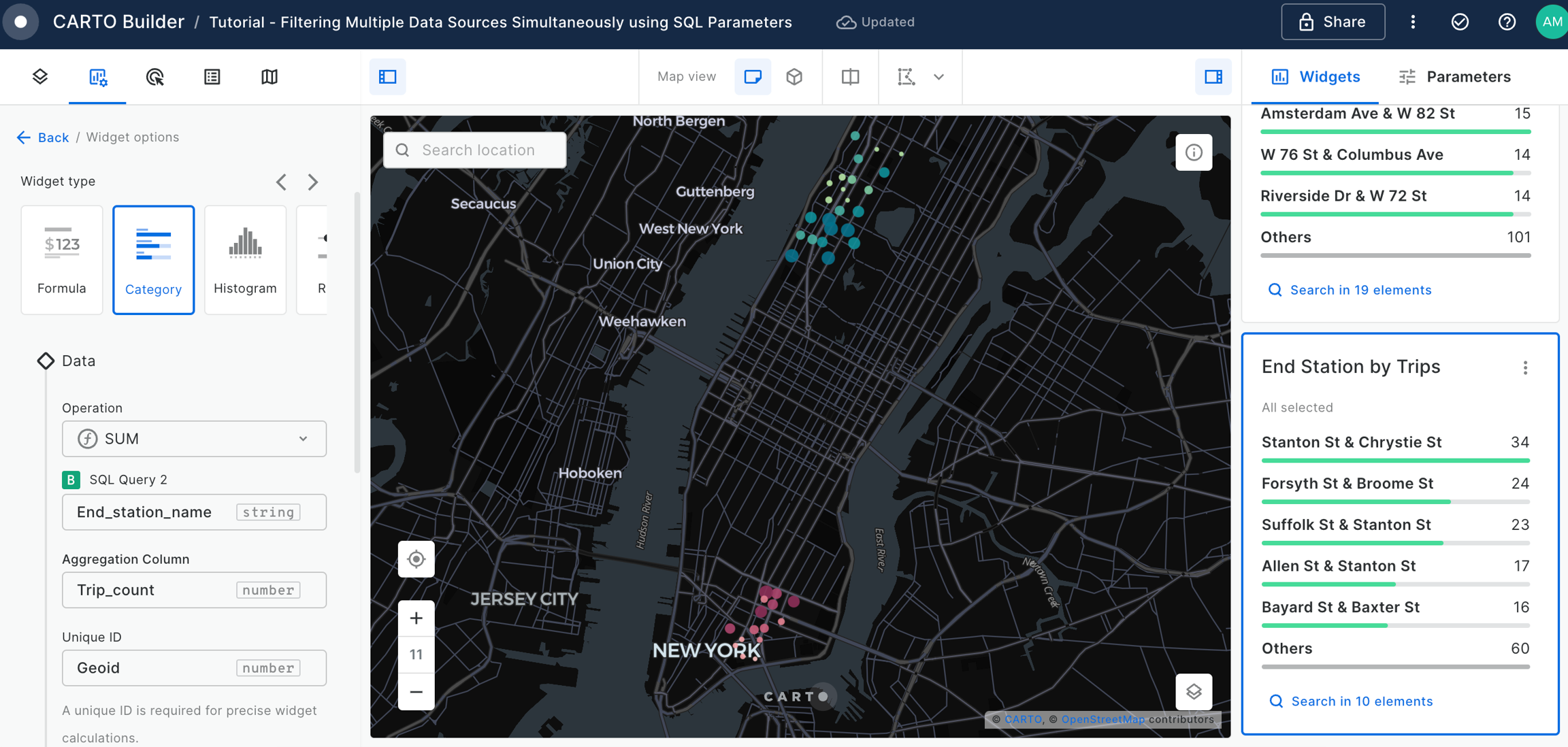
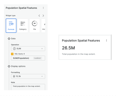
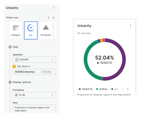
Widgets & SQL Parameters
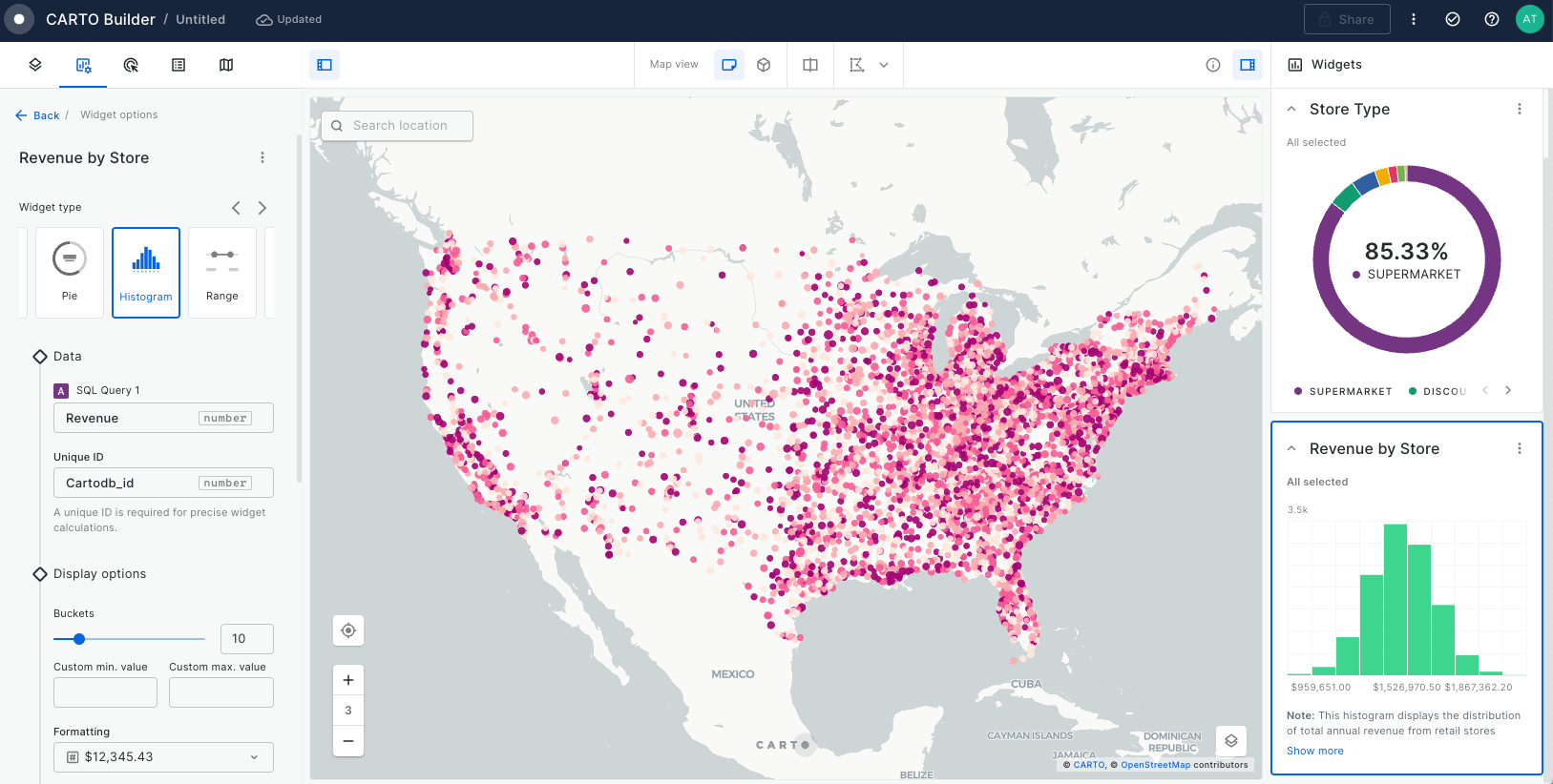
Builder enhances data interaction and analysis through two key features: and . Widgets, linked to individual data sources, provide insights from map-rendered data and offer data filtering capabilities. This functionality not only showcases important information but also enhances user interactivity, allowing for deeper exploration into specific features.
Meanwhile, SQL Parameters act as flexible query placeholders. They enable users to modify underlying data, which is crucial for updated analysis or filtering specific subsets of data.
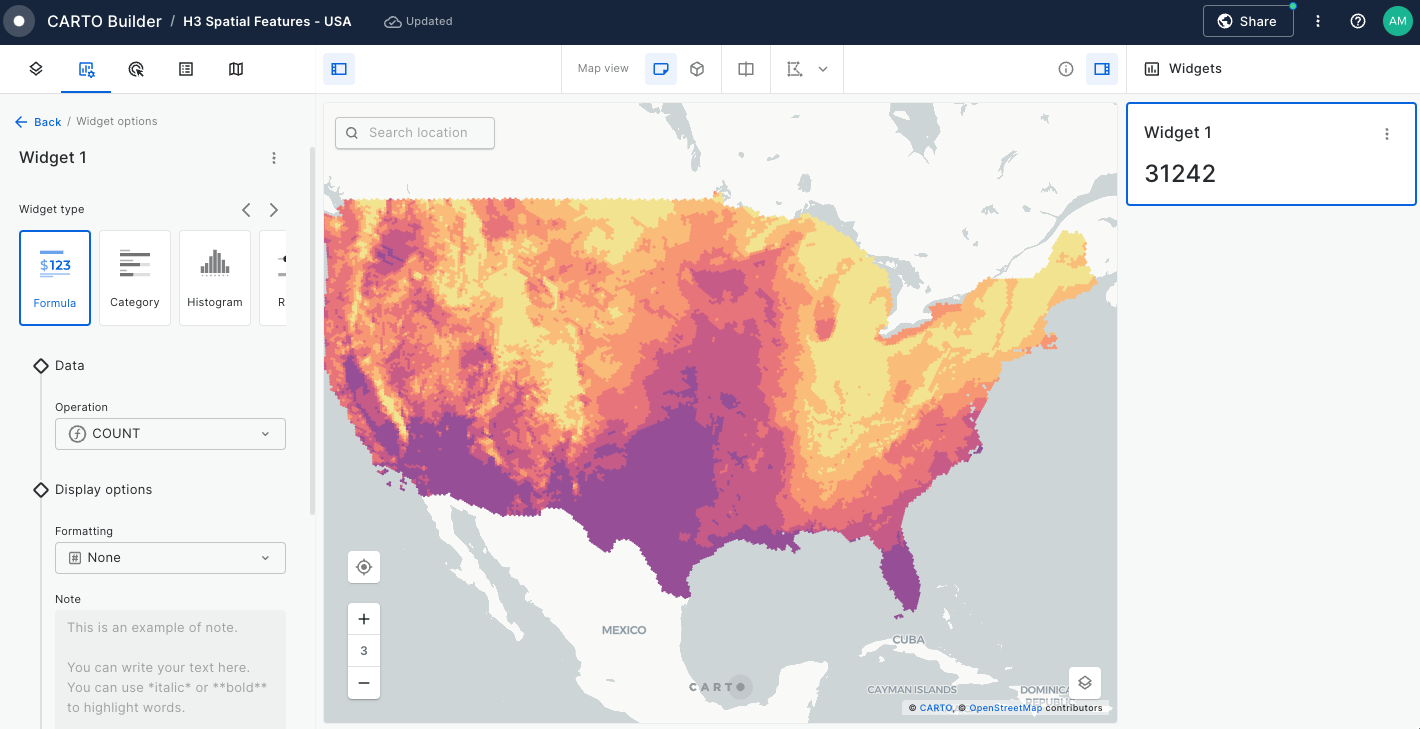
Widgets
Analyzing origin and destination patterns
This tutorial leverages the H3 to visualize origin and destination trip patterns in a clear, digestible way. We'll be transforming 2.5 million origin and destination locations into one H3 frequency grid, allowing us to easily compare the spatial distribution of pick up and drop off locations. This kind of analysis is crucial for resource planning in any industry where you expect your origins to have a different geography to your destinations.
You can use any table which contains origin and destination data - we'll be using the NYC Taxi Rides demo table which you can find in the CARTO Data Warehouse (BigQuery) or the listing on the Snowflake Marketplace.
Optimizing workload distribution through Territory Balancing
In this tutorial, we’ll explore how to optimize work distribution across teams by analyzing sales territory data to identify imbalances and redesign territories using .
Focusing on a beverage brand in Milan, we’ll use the component, a feature available in the , to evenly assign Point of Sale (POS) locations to sales representatives by dividing a market (a geographic area) into a set of continuous territories. This ensures fair workloads, improves customer coverage, and boosts operational efficiency by aligning territories with demand.
So far, we’ve spoken about Spatial Indexes as a general term. However, within this there are a number of index types. In this section, will cover three main types of Spatial Indexes:
H3 is a hexagonal Spatial Index, availaIble at 16 different resolutions, with the smallest covering an average area of 0.9m2, reaching up to and 4.3 million km2 at the largest resolution. Unlike standard hexagonal grids, H3 maps the spherical earth rather than being limited to a smaller plan of an area.
H3
H3 has a number of advantages for spatial analysis over other Spatial Indexes, primarily due to its hexagonal shape - which is the closest of the three to a circle:
The distance between the centroid of a hexagon to all neighboring centroids is the same in all directions.
The lack of acute angles in a regular hexagon means that no areas of the shape are outliers in any direction.
All neighboring hexagons have the same spatial relationship with the central hexagon, making spatial querying and joining a more straightforward process.
Unlike square-based grids, the geometry of hexagons is well-structured to represent curves of geographic features which are rarely perpendicular in shape, such as rivers and roads.
The “softer” shape of a hexagon compared to a square means it performs better at representing gradual spatial changes and movement in particular.
Moreover, the widespread adoption of H3 is making it a great choice for collaboration.
However, there may be some cases where an alternative approach is optimal.
Quadbin
Quadbin is an encoding format for Quadkey, and is a square-based hierarchy with 26 resolutions.
Quadbin
At the most coarse level, the world is split into four quadkey cells, each with an index reference such as “48a2d06affffffff.” At the next level down, each of these is further reaching the most detailed resolution which measures less than 1m2 at the equator. This system is known as a quadtree key. The rectangular nature of the Quadbin system makes it particularly suited for modeling perpendicular geographies, such as gridded street systems.
S2
Finally, we have S2; a hierarchy of quadrilaterals ranging from 0 to 30, the smallest of which has a resolution of just 1cm2. The key differentiator of S2 is that it represents data on a three-dimensional sphere. In contrast, both H3 and Quadbin represent data using the Mercator coordinate system which is a cylindrical coordinate system. The cylindrical technique is a way of representing the bumpy and spherical (ish!) world on a 2D computer screen as if a sheet of paper were wrapped around the earth in a cylinder. This means that there is less distortion in S2 (compared to H3 and Quadbin) around the extreme latitudes. S2 is also not affected by the “break” at 180° longitude.
S2
Which Spatial Index should I use?
As we mentioned earlier, H3 has a number of advantages over the other index types and because of this, it is fairly ubiquitous. However, before you decide to move ahead with H3, it’s important to ask yourself the following questions which may affect your decision.
What is the geography of what I’m modeling? This is particularly pertinent if you’re modeling networks. In some cases, the geometry of hexagons is less appropriate for modeling perpendicular grids, particularly where lines are perpendicular with longitude as there is no “flat” horizontal line. If this sounds like your use case, consider using Quadbin or S2.
Where are you modeling? As mentioned earlier, due to being based on a cylindrical coordinate system, both H3 and Quadbin cells experience greater area distortion at more extreme latitudes. However, H3 does have the lowest shape-based distortion at different latitudes. If you are undertaking analytics near the poles, consider instead working with the S2 index which does not suffer from this. Similarly, if your analysis needs to cross the International date Line (180° longitude) then you should also consider working with S2, as both H3 and Quadbin “break” here.
What index type are your collaborators using? It’s worth researching which index your data providers, partners, and clients are using to ensure smooth data sharing, transparency and alignment of results.
Choosing a resolution
The resolution that you work with should be linked to the spatial problems that you’re trying to solve. You can’t answer neighborhood-level questions with cells a few feet wide, and you can’t deal with hyperlocal issues if your cells are a mile across.
For example, if you are investigating what might be causing food delivery delays, you probably need a resolution with cells of around 100-200 yards/meters wide in order to identify problem infrastructure or services.
It’s also important to consider the scale of your source data when making this decision. For example, if you want to know the total population within each index cell but you only have this data available at county level, then transforming this to a grid with a resolution 100 yards wide isn’t going to be very illuminating or representative.
Just remember - the whole point of Spatial Indexes is that it’s easy to convert between resolutions. If in doubt, go for a more detailed resolution than you think you need. It’s easier to move “up” a resolution level and take away detail than it is to move “down” and add detail in.
Learn more about working with Spatial Index "parent" and "children" resolutions in these tutorials.
Keep learning...
Continue your Spatial Indexes journey with the resources below 👇
Enrich an index; take numeric data from a geometry input such as a census tract, and aggregate it to a Spatial Index.
Note that when you're running any of these conversions, you aren't replacing your geometry - you're just creating a new column with a Spatial Index ID in it. Your geometry column will still be available for you, and you can easily use either - or both - spatial format depending on your use case.
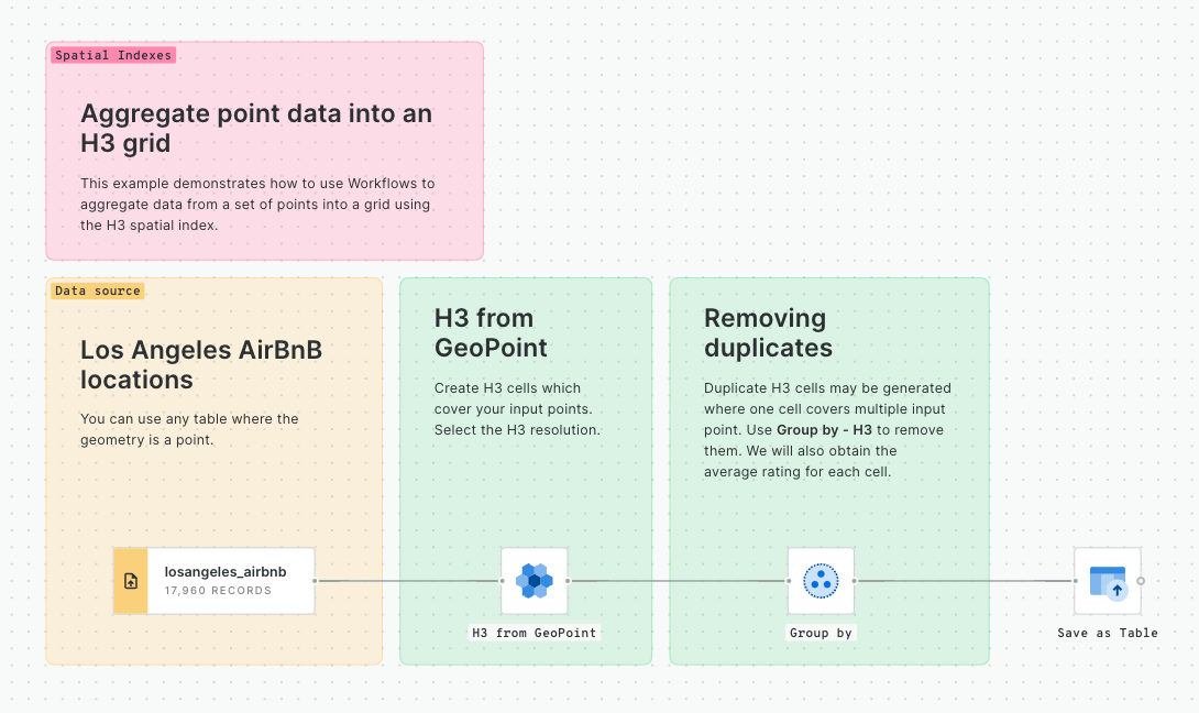
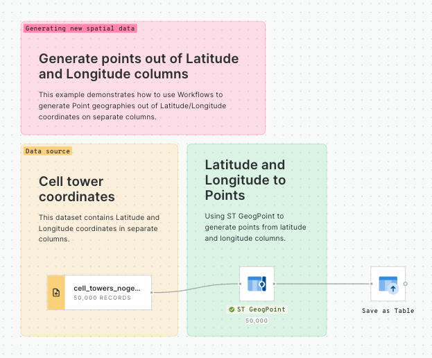
Convert points to a Spatial Index
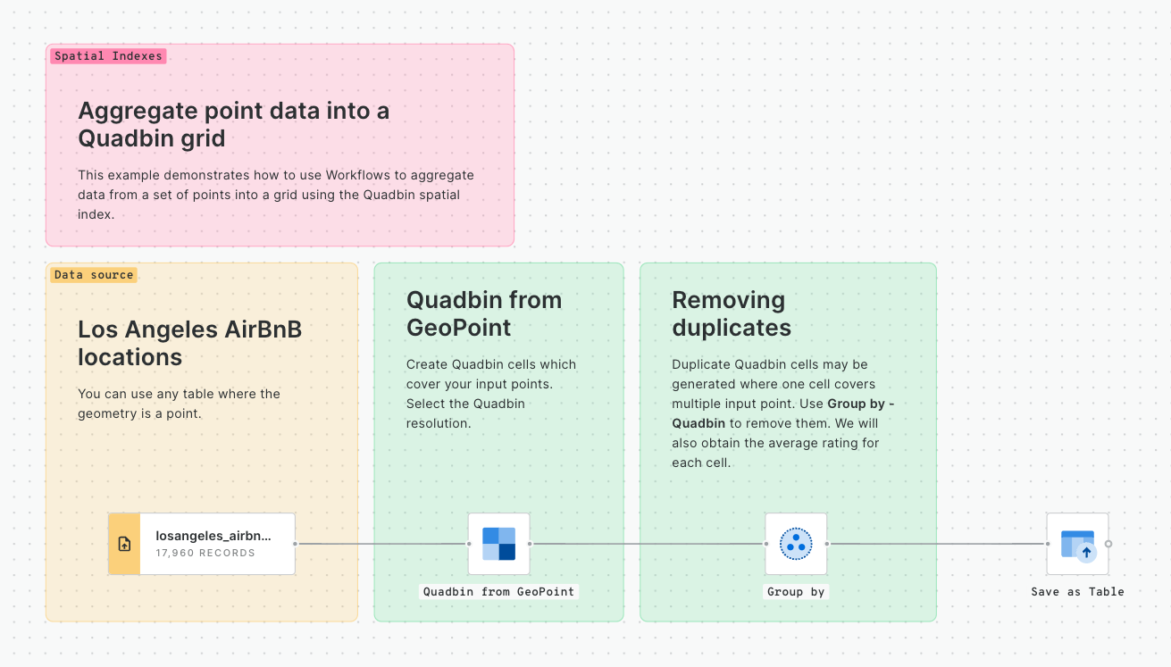
In this tutorial, we will be building the below simple workflow to convert points to a Spatial Index and then generate a count for how many of those points fall within each Spatial Index cell.
Converting points to Spatial Indexes - the Workflow
💡 You will need access to a point dataset - we'll be using San Francisco Trees, which all CARTO users can access via the CARTO Data Warehouse - but you can substitute this for any point dataset.
Once logged into your CARTO account, head to the Workflows tab and Create a new workflow. Select a connection. If you're using the same input data as us, you can use the CARTO Data Warehouse - otherwise select the connection with your source data.
Switch to the Sources tab and navigate to your point table (for us, that's CARTO Data Warehouse > Organization > demo_tables > san_francisco_street_trees) then drag it onto the workflow canvas.
Next, switch to the Components tab and drag the H3 from GeoPoint onto the canvas, connecting it to the point dataset. This will convert each point input to the H3 cell which it falls inside. Alternatively, you could use the Quadbin from GeoPoint if you wanted to create a square grid instead. Learn more about which Spatial Index is right for you .
Here we can change the resolution of the H3 output; the larger the number, the smaller the H3 resolution, and the more geographically detailed your analysis will be. If you're following our example, change the resolution to 10. Note if you're using a different point table, you may wish to experiment with different resolutions to find one which adequately represents your data and will generate the insights you're looking for.
Run your workflow and examine the results! Under the table preview, you should see a new variable has been added: H3. This index functions to geolocate each H3 cell.
Next, add a Group by component; we will use this to count the number of trees which fall within each H3 cell. Draw a connection between this and the output (right) node of H3 from GeoPoint. Select H3 in both the Group by and Aggregation parameters, and set the aggregation type to Count. At this point, you can also input any numeric variables you wish to aggregate and operators such as Sum and Average.
Setting the Group by parameters
Run your workflow again!
If you've been following along with this example, you should now be able to create a tree count map like the below!
Converting points to polygons - the results!
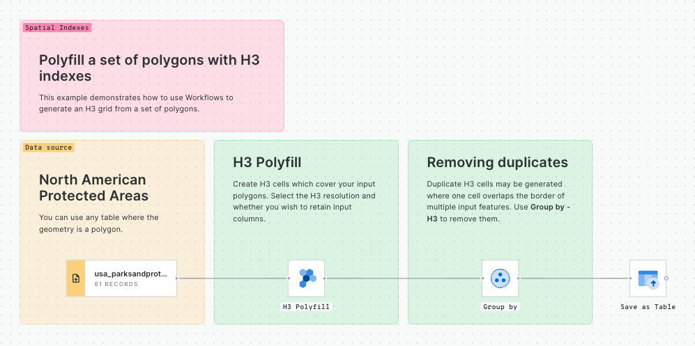
Convert polygons to a Spatial Index
In this tutorial, we will build the below simple workflow to convert a polygon to a Spatial Index.
Converting polygons to Spatial Indexes - the Workflow
💡 You will need access to a polygon dataset. We will use US Counties (which you can subscribe to for free from the CARTO Data Observatory) but - again - you're welcome to use any polygon dataset for this.
Drag the polygon "area of interest" table onto the workflow canvas. You can do this again through the Sources tab, and if you - like us - are using a table that you've subscribed to from our Data Observatory, then switch to the Data Observatory tab (at the bottom of the screen). For our example, we need to navigate to CARTO > County - United States of America (2019).
If the table you've just added contains some superfluous features you can use a Simple Filter to omit these. For instance, we'll filter the counties table to the feature which has the "do_label" of San Francisco.
Next, drag a H3 Polyfill onto the canvas (or a Quadbin polyfill if you chose to work with that Index). Select the resolution you wish to use; we'll use 10. Please note if you are using multiple polygons as your "area of interest" then duplicate H3 cells may be generated along touching borders; you can use Group by to omit these duplicates in the same way that we did earlier (but with no need to include a count aggregation).
Run your workflow! If you're following our example, you should see that we have 7,779 H3 cells comprising the area of San Francisco.
H3 Polyfill results
Converting lines to a Spatial Index
If you have a line geometry that you wish to convert to a Spatial Index, the approach is slightly different. First, you need to convert the data to a polygon by buffering it - and then converting that polygon to a Spatial Index like in the tutorial above.
💡 Looking for a line-based table to practice on? In the CARTO Data Warehouse under demo data > demo tables, try the bristol_cycle_network table.
Let's build out the above workflow!
Drag your line source onto the Workflows canvas.
Connect this to an ST Buffer component. Set the buffer distance as 1 meter.
Connect this to a H3 Polyfill component. You'll likely want this fairly detailed - the larger the resolution number the more detailed the grid will be (we've used a resolution of 12). To ensure a continuous grid along your whole line, change the mode to Intersects.
And Run! ⚡ Your results should look something like the below:
A H3 grid representing linear features
Enrich an index
In this tutorial, you will learn how to take numeric data from a geometry input, and aggregate it to a Spatial Index. This is really useful for understanding things like the average age or total population per cell.
💡 You will need access to a Spatial Index table for this. You can follow either of the above tutorials to create one - we'll be using the results from the Convert polygons to a Spatial Index tutorial. You will also need access to a source dataset which contains the numeric information you want to aggregate. In our example, we want to find out the total population and average income for each Spatial Index cell; we will use "Sociodemographics, 2018, 5yrs - United States of America (Census Block Group)" which you can subscribe to for free from the CARTO Spatial Data Catalog.
Enrich an index workflow
Drag both your source dataset and Spatial Index dataset onto a workflow canvas. If you're building on an existing workflow such as one of the above, you can just continue to edit.
Next drag an Enrich H3 Grid component onto the canvas. Note you can also use an Enrich Quadbin Grid if you are working with this type of index.
Connect your target H3 grid to the top input, and your source geometry (for us, that's Census block groups) to the bottom input.
Set the following parameters:
Target H3 column: H3 (or whichever field is holding your H3 index)
Source geo column: geom (or - again - whichever field is holding your source geometry data)
Variables: select the variables and aggregation types. For us, that's total_pop_3409f36f (SUM) and median_income_6eb619a2 (AVG). Be mindful of whether your variables are extensive or intensive when doing this.
Enrichment parameters
Run! The result of this should be a table with three columns; a H3 index, total population and average income.
Widgets, linked to individual data sources, provide insights from map-rendered data and offer data filtering capabilities. This functionality not only showcases important information but also enhances user interactivity, allowing for deeper exploration into specific features.
Adding a Widget
Add a widget to Builder by clicking "New Widget" and select your data source.
Then, select a widget type from the menu: Formula,Category, Histogram, Range, Time Series or Table.
Configuring a Widget
Once you have selected the widget type of your preference, you are ready to configure your Widget.
Widget Data
In theData section of the Widget configuration, choose an aggregation operation COUNT, AVG, MAX, MIN or SUM and, if relevant, specify the column on which to perform the aggregation.
Selecting an operation
Widget Display
Using the Formatting option, you can auto-format data, ensuring enhanced clarity. For instance, you can apply automatic rounding, comma-separations, or percentage displays.
Formatting selector on Widget configuration
You can use Notes to supplement your Widgets with descriptive annotations which support Markdown syntax, allowing to add text formatting, ordered lists, links, etc.
Adding a rich note using markdown
Widget Behavior
Widgets in Builder automatically operate in viewport mode, updating data with changes in the viewport. You can also configure them for global mode to display data for the entire source.
Furthermore, Widgets can be set as collapsible for convenient hiding. Some widgets have the capability to filter not only themselves but also related widgets and connected layers. This filtering capability can be easily enable or disable for each widget using the cross-filtering icon.
SQL Parameters
SQL Parameters serve as placeholders in your SQL Query data sources, allowing viewer users to input specific values that dynamically replace these placeholders. This allows users to interactively customize and analyze the data displayed on their maps.
SQL Parameters are categorized based on the data format of the values expected to be received, ensuring flexibility and ease of use. Below are the current type of SQL Parameters:
Date Parameter: Ideal for handling date values, date parameters allow users to input a specific date range, enabling data analysis over precise time periods. For example, analyzing sales data for a specific month or quarter.
Text Parameter: Tailored for text values, users can input or select a specific category to obtain precise insights. For instance, filtering Points of Interest (POI) types like "Supermarket" or "Restaurant".
: Designed for numeric values, users can input specific numerical criteria to filter data or perform analysis based on their preferences. For example, updating the radius size of a geofence to update an analysis result.
Using SQL Parameters
SQL Parameters can be used in many different ways. One of the most common is allowing viewers to interact with the data in a controlled manner. Let's cover a simple use case step by step:
Add a SQL Query data source
The option to create a new SQL Parameter will be available once there is at least one data source of type Query:
Create a SQL Parameter
So, let's create a SQL Query data source with a table that contains information about fires all over the world:
On a new map, click on 'Add source from...' and select 'Custom query (SQL)' .
Select CARTO Data Warehouse as connection.
Use the following query
Create and configure a text parameter
Once we have the data rendered in the map, we'll add a text parameter that helps us select between fires that happened during the day or the night.
Click on 'Create a SQL Parameter'
Select 'Text Parameter'
In the 'Values' section, click on 'Add from source'. Select your data source and pick the daynight column
In the 'Naming' section, pick a display name, like 'Day/Night'. The SQL name gets automatically generated as {{day_night}}
After the parameter has been created, open the SQL panel and add it to your query:
You can now use the control UI to add/remove values and check how the map changes.
Create and configure a date parameter
Now, let's add a date parameter to filter fires by its date:
Click on 'Create a SQL parameter'
Select 'Date parameter'
Type or select from a calendar the range of dates that are going to be available from the control UI.
Give it a display name, like 'Date'. The SQL names gets automatically generated as {{date_from}} and {{date_to}}
Open the SQL Panel and add the parameters to your query, like:
The parameters {{date_from}} and {{date_to}} will be replaced by the dates selected in the calendar.
Create and configure a numeric parameter
Next, we'll incorporate a range slider to introduce a numeric parameter. It will allow users to focus on fires based on their brightness temperature to identify the most intense fires.
Click on 'Create a SQL parameter'
Select 'Numeric parameter'
In the 'Values' section, select Range Slider and enter the 'Min Value' and 'Max Value' within the range a user will be able to select.
Give it a display name, like 'Bright Temp'. The SQL names gets automatically generated as {{bright_temp_from}} and {{bright_temp_to}}
Open the SQL Panel and add the parameters to your query, like:
SELECT * FROM `carto-demo-data.demo_tables.fires_worldwide`
SELECT * FROM `carto-demo-data`.demo_tables.fires_worldwide
WHERE daynight IN {{day_night}}
SELECT * FROM `carto-demo-data`.demo_tables.fires_worldwide
WHERE daynight IN {{day_night}}
AND acq_date > {{date_from}} AND acq_date < {{date_to}}
SELECT * FROM `carto-demo-data`.demo_tables.fires_worldwide
WHERE daynight IN {{day_night}}
AND acq_date > {{date_from}} AND acq_date < {{date_to}}
AND bright_ti4 >= {{bright_temp_from}} AND bright_ti4 <= {{bright_temp_to}}
Step-by-Step tutorial
Creating a Workflow
In the CARTO Workspace, head to Workflows and Create a Workflow, using the connection where your data is stored.
Under Sources, locate NYC Taxi Rides (or whichever input dataset you're using) and drag it onto the workflow canvas).
#1 Filtering trips to a specific time period
When running origin-destination analysis, it's important to think about not only spatial but temporal patterns. We can expect to see different trends at different times of the day and we don't want to miss any nuances here.
Filtering taxi trips to a specified time period
Connect NYC Taxi Rides to a Spatial Filter component.
Set the filter condition to PART_OF_DAY = morning (see screenshot above). You can pick any time period you'd like; if you select the NYC Taxi Rides source, open the Data preview and view Column Stats (histogram icon) for the PART_OF_DAY variable, you can preview all of the available time periods.
Note we've started grouping sections of the workflow together with annotation boxes to help keep things organized.
#2 Convert origins and destinations to a H3 frequency grid
The 2.5 million trips - totalling 5 million origin and destination geometries - is a huge amount of data to work with, so let's get it converted to a Spatial Index to make it easier to work with! We'll be applying the straightforward approach from the Convert points to a Spatial Index tutorial.
Creating a H3 frequency grid
Connect the match output of the Simple Filter to a H3 from GeoPoint component and change the points column to PICKUP_GEOM; which will create a H3 cell for each input geometry. We're looking for junction and street level insights here, so change the resolution to 11.
Connect the output of this to a Group by component. Set the Group by column to H3 and the aggregation column to H3 (COUNT). This will count the number of duplicate H3 IDs, i.e. the number of points which fall within each cell.
Repeat steps 1 & 2, this time setting the initial points column to DROPOFF_GEOM.
Add a Join component and connect the results of your two Group by components to this. Set the join type to Full Outer; this will retain all cells, even where they don't match (so we will retain a H3 cell that has pickups, but no dropoffs - for instance).
Now we have a H3 grid with count columns for the number of pick ups and drop offs, but if you look in the data preview, things are getting a little messy - so let's clean them up!
#3 Data cleaning
Some quick data cleaning!
Create Column: at the moment our H3 index IDs are contained in two separate columns; H3 and H3_JOINED. We want just one single column containing all IDS, so let's create a column called H3_FULL and use the following CASE statement to combine the two: CASE WHEN H3 IS NULL THEN H3_JOINED ELSE H3 END.
Drop Columns: now we can drop both H3 and H3_JOINED to avoid any confusion.
Rename Column: now, let's rename H3_COUNT as pickup_count and H3_COUNT_JOINED as dropoff_count to keep things clear.
Now, you should have a table with the fields H3_FULL, pickup_count and dropoff_count, just like in the preview above!
#4 Normalize & Compare
Now, we can compare the spatial distribution of pickups and dropoffs:
Connect two subsequent Normalize components, first normalizing pickup_count, and then dropoff_count. This will convert the raw counts into scores from 0 to 1, making a relative comparison possible.
Add a Create Column component, and calculate the difference between the two normalized fields (pickup_count_norm - dropoff_count_norm). The result of this will be a score ranging from -1 (relatively more dropoffs) to 1 (relatively more pickups).
You can see the full workflow below.
The full workflow
Check out the results below!
Do you notice any patterns here? We can see more drop offs in the business district of Midtown - particularly along Park Avenue - and more pick ups in the more residential areas such as the Upper East and West Side, clearly reflecting the morning commute!
Now, let’s dive into the step-by-step process of creating a workflow to balance territories, ensuring each sales representative is assigned a manageable and strategically optimized area. You can access the full templatehere.
Imagine a field sales team responsible for visiting hundreds of restaurants across the greater Milan metropolitan area to promote and distribute a soft drink. When Points of Sale (POS) are assigned manually, territories often become unbalanced—some sales representatives end up with too many accounts to manage effectively, while others are left underutilized. This imbalance may lead to inconsistent store visits and missed sales opportunities. By balancing the POS to visit, Territory Balancing ensures that each sales rep is responsible for a fair and strategically valuable territory.
Loading the POS data
For this use case, we will consider restaurant point of sales (POS) in the city center of Milan from The Data Appeal Company, together with popularity and sentiment scores. The full dataset is available on demand in CARTO’s Data Observatory, but we have prepared a sample for you to easily follow this tutorial.
Once in your workflow, go to the Components section, and drag-and-drop the Get Table by Name component. Then, type in the table’s Fully Qualified Name (FQN): cartobq.docs.territory_balancing_milan_pos.
Using H3 Spatial Indexes
The Territory Balancing component uses a graph partitioning algorithm that splits a gridified area into a set of optimal, continuous territories, ensuring balance according to a specified metric while maintaining internal similarity within each territory. To account for spatial dependencies when defining the graph, we rely on spatial indexes for efficiency and scalability: each node in our graph is defined by an H3 or Quadbin cell (white dots), with edges or connections (white lines) defined by their direct first-degree neighbours.
We'll map each restaurant to its corresponding H3 cell at resolution 9 and aggregate the data by cell. This will allow us to calculate the number of points of sale (POS) within each cell, along with the average popularity and sentiment scores. Use the H3 from GeoPoint and the Group by components to do so.
Balancing territories based on POS presence
Lastly, we will use the Territory Balancing component to obtain 9 continuous areas of equal (with a tolerance) number of restaurants so that workload is distributed evenly. We will select geom_count (the number of restaurants) as the business KPI to be balanced, the so-called demand. We will also consider the average popularity and sentiment as similarity features, so that H3 cells within the same territory are similar in these metrics, while these averages differ across territories.
In the following map, we can see a comparison between a manual assignment based on administrative regions (Nuclei di Identità Locale, NIL) and an automatic one using territory balancing. The former is very unbalanced, with some territories being highly overloaded while others being assigned just a few restaurants. Using territory balancing techniques, it can be seen how territories are optimally assigned with balanced workload.
In addition to easily subscribing to data on the cloud via the CARTO Data Observatory, another way you can easily access spatial data is via API.
Data is increasingly being published via API feeds rather than static download services. By accessing data this way, you can benefit from live feeds and reduce data storage costs.
In this tutorial, we will walk through how to import data from an external REST API into CARTO Workflows.
What are we aiming for? We're going to extract data from the US Current Air Quality API and map it. Then we're going to keep doing that, every hour (at least for a while), so we can monitor those changes over time - but you won't have to lift a finger - once you've set up your workflow, that is! By the end of it, you'll end up with something that looks like this 👇
All the data we'll be using here is free and openly available - so all you need is your CARTO account.
Step 1: Accessing data from an API
We're going to be using CARTO Workflows to make this whole process as easy as possible.
Sign into the CARTO platform and head to the Workflows tab.
Create a new Workflow using any connection - you can also use the CARTO Data Warehouse here.
Open the Components tab (on the left of the window) and search for the Import from URL component. Drag it onto the canvas.
Note that the Import from URL component requires you to run the import before proceeding to further workflow steps - so let's Run! Once complete, you should be able to select the component to view the data, just like with any other component.
This is pretty much the most straightforward API call you can make to access spatial data - things can obviously get much more complicated!
First, let's say we want to only return a handful of fields. We would do this by replacing the outFields=* portion of the URL with a list of comma-separated field names, like below.
Next, let's image we only want to return air quality results from a specified area. You can see how the URL below has been adapted to include a geometry bounding box.
Let's leave the URL editing there for now, but do make sure to check the documentation of the API you're using to explore all of the parameters supported. Many will also supply UI-based custom API builders to help you to create the URL you need without needing to code.
Before we move on to analyzing this data, there are an extra couple of considerations to be aware of:
This API is fully open, but many require you to set up an API and/or application key to access data. This can usually be easily appended to your URL with the code %APIKEY.
If an API service is private and requires further authentication or access tokens, you should first use a HTTP Request component to obtain an authentication token by sending your credentials to the service. From here, you can extract the token and use it in a subsequent HTTP Request component to access the data, including the token in the appropriate header as specified by the service.
Similarly, current the Import from URL supports CSV and GeoJSON formats - for other data formats HTTP Request should be used.
Many APIs impose a limit to the number of features you can access, whether in a single call or within a time period. This limit is not imposed by CARTO, and if you require more features than the API allows you should contact the service provider.
Now, let's do something exciting with our data!
Step 2: Adding contextual information
Before creating a map, let's add some contextual information to our data to make it even more useful for our end users.
We'll do this with the below simple workflow, which we'll build on the one which we already started.
Create local timestamp: as we start to build up a picture of air quality changes over time, we'll need to know when each recording was taken. It's important to know this in local time, as it's likely changes will be affected by time-sensitive patterns like commutes. For this, connect a Create Column component to your Import from URL. Call the field "local_time" and use the below formula for this calculation:
USA_counties: let's make sure our users can find out which state and county each sensor can be found in. If you're working in the CARTO Data Warehouse, find the table usa_counties under Sources > Connection data > Organization data > demo tables. If not, you can locate and subscribe to this data via the Data Observatory and add this table through there.
Join to counties with the following components:
A Spatial Join to join counties to air quality sensors.
Now we have a snapshot of this data from the time we ran this - now let's make some tweaks to the workflow so we can keep fetching the results every hour.
Step 3: Hourly updates
To prepare for our incoming hourly data, let's make the below tweaks to our workflow.
First, give your page a refresh.
Under Sources, navigate to wherever you saved your output in the previous step. Drag it onto the canvas, roughly below Edit schema.
Delete the connection between Edit schema and Save as Table, instead connecting both Edit schema and your existing table to a new Union All component. Now, every time you run this workflow your table will have the new values appended to it.
Now your workflow will be set up to run hourly until you come back here to select Delete schedule. You should also come here to sync your scheduled workflow whenever you make changes to it.
While we're waiting for our table to be populated by the next hour of results... shall we build a map ready for it?
Step 3: Building a dashboard
In your workflow, select the Save as Table component, and open the Map preview on the bottom of the screen - from here you can select Create Map to open a new CARTO Builder map with your data ready to go!
Under Sources to the bottom-left of the screen, select Data freshness. Open the Data freshness window from here and set the data freshness to every 1 hour (see below).
Open the map legend (bottom right of the screen) and click the three dots next to your newly generated Layer 1, and select Zoom to to fly to the extent of your layer.
Now let's build out our map:
Rename the map (top left of the screen) "USA Air Quality"
Rename the layer (3 dots next to the layer name - likely Layer 1) "Air Quality Index - PM 2.5"
Style the layer:
Your map should be looking a little like this...
Now let's add some widgets to help our users understand the data.
In the Widgets panel to (the left of Interactions), create a New Widget using your sensor locations layer.
Change the widget type to Time Series, setting the below parameters:
Name: PM2.5 AQI hourly changes. You can change this in the same way you change layer names.
As we have data for multiple time zones on the map, you should already be able to see some temporal patterns and interaction with the time series widget.
Let's add a couple more widgets to tell more of a story with this data:
Add a new Formula Widget called "Average PM2.5 AQI." This should use the average of the pm25_aqi column with 2 decimal place formatting.
Add a new Category Widget called "PM2.5 AQI - top 5 counties." Set the operation to average, the column to name_joined and the aggregation column to pm25_aqi column. Again make sure you set the formatting to 2 decimal places.
Can you notice a problem with this? There are multiple counties in the US with the same names, so we need to do something to differentiate them or the widget will group them together.
In the Sources window (bottom left of the screen), click on the three dots next to your source and select Query this table/Open SQL console (the display will depend on whether you have opened the console before.
Between the * and FROM, type , CONCAT(name_joined, ', ', state_name_joined) AS county_label. So your entire console will look something like:
Run the code, then head back to your category widget. Switch the SQL Query field from name_joined to county_label. Much better!
Altogether, your map should be looking something like...
Finally, if you'd like to share the results of your hard work, head to the Share options at the top of the screen!
What's next?
Why not explore some of our space-time statistics tools to help you draw more advanced conclusions from spatio-temporal data?
Dynamically control your maps using URL parameters
Context
URL parameters allow you to share multiple versions of the same map, without having to rebuild it depending on different user requirements. This tutorial will guide you through embedding a Builder map in a low code tool that can be controlled using URL parameters to update the map's view based on users input. Through these steps, you'll learn to make your embedded maps more engaging and responsive, providing users with a seamless and interactive experience.
Resources for this tutorial:
In this tutorial, we're providing you with an existing Builder map as a hands-on example to guide you through the process. This example map highlights historic weather events. If you're interested in creating a similar map, this is for you.
Public map URL:
Embed code:
Step-by-Step Guide:
In this guide, we'll walk you through:
Accessing your map URL and embed code
To access your map's URL and/or embed code, first ensure that your map has been shared — either within your organization, with specific groups, or publicly. After sharing the map, you can proceed with the following steps:
Map Link: This direct URL to your map can be quickly obtained in two ways:
Through a quick action from the 'Share' button.
Within the sharing modal in the left bottom corner.
Dynamically updating URL parameters in Builder
Leveraging with Builder maps enables dynamic customization for specific audience views without creating multiple map versions. This method simplifies sharing tailored map experiences by adjusting URL parameters, offering a personalized viewing experience with minimal effort.
In the viewer mode of a Builder map, any modifications you make are instantly updated in the URL. For example, if you zoom to a specific level in the loaded Builder map, the zoom level gets added to the URL. Here's how it looks:
Below you can see how when you interact with the map: navigating, filtering widgets, parameters, etc. automatically change the URL displaying that specific map view.
Updating an embedding map using URL parameters
You also have the option to manually insert URL parameters to customize your map's viewer mode further. This option is particularly useful for tailoring map content to specific user queries or interests when the map is embedded, making the application more engaging and interactive.
In this section we'll illustrate how to integrate a Builder map in a custom application using , a development platform for creating apps rapidly.
Begin by inserting an iFrame component in your Retool application. In the URL section, use your map URL. You can use the provided map URL: .
Add a container in Retool to neatly organize UI components that will interact with your map.
Implement UI elements to enable users to filter the map view based on criteria like state, type of severe weather event, and the event's date range. Start by adding a multi-select dropdown to allow users select a specific state. Name this element as State, and pre-fill it with the names of all U.S. states in alphabetical order:
Include a checkbox group element named Event. This component will enable users to select the type of severe weather event they are interested in, such as hail, tornadoes, or wind, with one option set as the default.
Add two date pickers, one named as StartDate and the other EndDate. These components will define the timeframe of the event, providing default start and end dates to guide the user's selection. For the provided map example, let's ensure we are matching the temporal frame of the weather events by setting the start date to 1950-01-03 and end date to 2022-01-03.
Create a transformer named mapUrlParameters to dynamically construct the iframe's URL based on the user's selections. Use JavaScript to fetch the values from the UI components and assemble them into the URL parameters.
Add a button component labelled Apply that, when clicked, updates the iFrame URL with the new parameters selected by the user. This action ensures the map is only refreshed when the user has finalized their choices, making the map interaction more efficient and user-friendly.
To further enhance user experience, implement a secondary event that zooms to the map's focal point in the iFrame when the "Apply" button is clicked. This ensures the map is centered and zoomed appropriately for the user.
Additionally, customize your application by adding headers, more interactive elements, and so on, to increase usability and aesthetic appeal.
Build a dashboard with styled point locations
Context
Understanding population distribution has important implications in a wide range of geospatial analysis such as human exposure to hazards and climate change or improving geomarketing and site selection strategies.
In this tutorial we are going to represent the distribution of the most populated places by applying colours to each type of place and a point size based on the maximum population. Therefore, we can easily understand how the human settlement areas is distributed with a simple visualization that we can use in further analysis.
Customize your visualization with tailored-made basemaps
Context
The basemap is the foundational component of a map. It provides context, geographic features, and brand identity for your creations. Every organization is unique, and CARTO allows you to bring your own basemaps to fit your specific needs.
In this tutorial, you'll learn to customize your visualizations in Builder by using tailor-made basemaps. Don't have a custom basemap already? We'll start with the creation of a custom basemap using Maputnik, a free and open-source visual editor.
Prerequisites: You need to be an Admin user to add custom basemaps to your CARTO organization.
Introduction to CARTO Workflows
What is CARTO Workflows
CARTO Workflows is a visual modeling tool that allows you to create multi-step analyses without writing any code. With Workflows, you can orchestrate complex spatial analyses with as many steps as needed which can be edited, updated, duplicated, and run as many times as needed.
Optimizing site selection for EV charging stations
Using Spatial Indexes to pinpoint areas for expansion
In this tutorial, you will learn how to optimize the site selection process for EV charging stations at scale. While this guide focuses on EV charging stations, you can adapt this process to optimize site selection for any service or facility.
You will need...
Spatial Indexes
Polyfill a set of polygons with H3 indexes
CARTO DW
BigQuery
Snowflake
Redshift
PostgreSQL
Time series clustering: Identifying areas with similar traffic accident patterns
Spatio-temporal analysis is crucial in extracting meaningful insights from data that possess both spatial and temporal components. By incorporating spatial information, such as geographic coordinates, with temporal data, such as timestamps, spatio-temporal analysis unveils dynamic behaviors and dependencies across various domains. This applies to different industries and use cases like car sharing and micromobility planning, urban planning, transportation optimization, and more.
In this example, we will perform spatio-temporal analysis to identify areas with similar traffic accident patterns over time using the location and time of accidents in London in 2021 and 2022, provided by . This tutorial builds upon where we explained how to use to identify traffic accident hotspots.
Open the US Current Air Quality API page on the ArcGIS hub. Scroll down until you see View API Resources on the right. Expand this section and copy the URL from the GeoJSON section (it should look like the below), pasting it into your Import from URL component.
An Edit Schema, selecting only the relevant fields; aqsid, pm25_aqi, geom, local_time, name_joined, state_name_joined. The original field types can be retained.
Finally, use a Save as Table to commit your results.
Connect this to a Remove Duplicates component. This will remove any duplicate rows, useful if the API isn't updated or if you need to do additional executions in between scheduled runs.
Connect the Union All to the Save as Table component, ensuring the name is the same as the original table that you saved; this will overwrite the table every time it is run.
Run the workflow! Don't worry, the Remove Duplicates component will remove any duplicated values.
Now we can set up our workflow to run hourly. Select the clock to the left of Run (top-right of the window). Set the repeat frequency to every 1 hour - and save your changes.
We also need to clear the workflow cache so that it generates fresh results each time - learn more about this here. This option can be found to the left of the clock icon we just used in Workflow settings. Simply disable the cache here.
Radius: fixed, 3px.
Fill color: pm25_aqi, using the color ramp Color Brewer Yellow-Orange-Red and the color scale Quantize. By choosing a pre-defined scale like Quantize or Quantile, your color ramp will auto-scale as new data is added.
Stroke: white, px.
Create an pop-up interaction for your layer by opening the Interactions panel (top left of the screen). Choose the style Light with highlighted 1st value, and then select which fields you'd like to appear in the pop-up (we're using AQSID, PM2.5_AQI, local_time, name_joined (i.e. county) and state_joined). You should also rename each field here so the names are easier to read.
Time field: the widget builder should auto-detect Local time, but if your source has multiple time inputs, you would change it here.
Operation: average.
Aggregation column: PM25_AQI.
Display options: 1 hour (if you leave your workflow running for a long time, you may wish to change this to days).
SELECT *,
CONCAT(name_joined, ', ', state_name_joined) AS county_label
FROM yourproject.yourdataset.yourtable
Embed code: This is specifically available within the sharing modal:
Navigate to the sharing settings of your map.
Look for the "Developers and embedding" section. Here, the embed code is provided, allowing you to copy and paste it into the HTML of your site or application for seamless embedding.
Access the Maps section from your CARTO Workspace using the Navigation menu and create a new Map using the button at the top right of the page. This will open the Builder in a new tab.
Let's add populated places source. To do so, follow the next steps:
Select the Add source from button at the bottom left on the page.
Select Custom Query (SQL) and then Type your own query under the CARTO Data Warehouse connection.
Click on the Add Source button.
The SQL Editor panel will be opened.
To add populated places source, run the query below:
Change the layer name to "Populated Places". Click over the layer card to start styling the layer.
In the Fill Color, we will use the 'Color based on' functionality to color by featurecla. It has information about what kind of places there are, so we will pick a palette for a categorical variable (versus a gradient). Additionally, we will remove the Stroke Color so we are able to differentiate the different categories.
Now click on the options for the Radius configuration and in the section “Radius Based On” pick the column pop_max. Play with the minimum/maximum size to style the layer as you like.
Go to Widget tab and click on 'New widget' to add a new Widget for "populated_places" source.
Select the Category widget, choose COUNT as the operation method and select the column admin0name. Then, rename your widget to 'Populated places by country'.
Using the Category widget on the right panel, select “United States of America” to filter out the rest of countries. You can also lock your selection to ensure the selection is not removed by mistake.
Let's now add another widget, this time a Pie widget based on featurecla. We will add a Markdown note for this widget to provide users with further information about each category type. We will also set the behaviour mode of this widget to global, so the represented date is for the whole dataset without it being affected by the viewport intersection.
Finally, we will rename this widget to 'Places by type' and move it to the top of the Widgets panel by dragging the card on the left panel.
The third and final widget we will add to our dashboard is a Histogram widget using pop_max column. This will allow users to select the cities based on the population. Finalise the widget configuration by setting the buckets limit to 10 and formatting the data to be displayed. Finally, rename the widget to 'Max population distribution'.
Interactions allow users to gather information about specific features, you can configure this functionality in the Interaction panel. First, select the type of interaction to Click and Info Panel. Then, add the attributes you are interested in, renaming and changing the formatting as needed.
Finally we can change our basemap. Go to Basemaps tab and select “Dark matter” from CARTO.
Rename the map to “Populated Places”.
Add a map description that will allow users understand the nature of your map.
We can make the map public and share it online with our colleagues. For more details, see Publishing and sharing maps.
Finally, let's export our map into a portable, easy-to-share PDF.
In the window that appears, select Include map legend. You can also include comments here (such as the version number or any details about your approval process). In the Share drop-down menu, select Download PDF Report.
Select Preview, and when you're happy Download PDF Report.
SELECT * FROM `carto-demo-data.demo_tables.populated_places`
**Percentage of Populated Places by Type**
This chart shows the distribution of various types of populated places, each representing a unique category:
- **Populated Place**: General areas with a concentration of inhabitants, such as towns or cities.
- **Admin-0 Capital**: Primary capital cities of countries, serving as political and administrative centers.
- **Admin-1 Capital**: Capitals of first-level administrative divisions, like states or provinces.
- **Admin-0 Region Capital**: Important cities that are the administrative centers of specific regions within a country.
- **Admin-1 Region Capital**: Major cities that serve as the administrative centers of smaller regions within first-level divisions.
- **Admin-0 Capital Alt**: Alternative or secondary capitals in countries with more than one significant administrative center.
- **Scientific Station**: Locations established for scientific research, often in remote areas.
- **Historical Place**: Sites of historical significance, often tourist attractions or areas of cultural importance.
- **Meteorological Station**: Facilities focused on weather observation and data collection.
*Each category in this chart gives insight into the diversity and function of populated areas, providing a deeper understanding of the region's composition.*
### Populated Places

Explore a world map that categorizes populated places by type, each color-coded for quick reference. It highlights the link between population density and administrative roles.
**Data Insights**
Notice the dense capitals signifying political and economic hubs, contrasted with isolated scientific stations. Each point's size indicates the maximum population, adding a layer of demographic understanding.
**How to Use It**
📊 Examine the charts for a country-wise breakdown and population details.
📌 Click on points for specifics like population peaks and elevation.
🌎 Dive in and engage with the map for a closer look at each location.
Access the online version of Maputnik at https://maplibre.org/maputnik/. Then, click "Open" and select "Zoomstack Night." Zoomstack Night is an open vector basemap provided by Ordnance Survey's OS Open Zoomstack, showcasing coverage of Great Britain.
You might get overwhelmed by all the options available in the UI, but using it is simpler than it seems. To make it easier to recognize the different items you can update in the style, simply click on the map, and Maputnik will display the layers you can customize.
Now that you're more familiar with this tool, let's start customizing the look and feel of this map.
Set the "buildings" layer to blue using this hex color code #4887BD.
For the green spaces, set the "greenspaces" layer to #09927A and "woodland" to #145C42.
To highlight the visualization of both "greenspace names" and "woodland names" labels, increase the size using the below JSON code and set the fill color to white.
Once you're done, export the Style JSON and save it. You'll need this for the next section. Note depending on which style you have used as a template, you may need to include an access token at this point, such as from MapTiler.
Hosting a Style JSON in Github
In this section, we'll showcase how you can host Style JSON files using GitHub to consume them in your CARTO organization. We'll be using a feature called gist, which allows you to host files. Here’s how to do it:
Ensure you have access to GitHub and your own repository and create a new gist. To do so:
Go to GitHub and create a new gist.
Drag your exported Style JSON into the gist.
Make sure the gist is public.
Create the public gist.
Now we'll get the raw URL of the hosted Style JSON, to do so:
Access the raw version of the gist.
Copy the URL of the raw file. This URL will be used to consume the custom basemap in CARTO.
Adding custom basemaps to your organization
Note: You need to be the Admin of your organization to have the rights to add custom basemaps to your CARTO organization.
Go to Organization > Settings > Customizations > Basemaps
Click on "New basemap" to add your custom basemap, completing the following parameters:
URL: Enter the gist raw URL of the hosted Style JSON.
Name: The name you'd like to provide to your basemap
Attribution: Automatically filled but you can edit this if required.
Once the basemap URL has been validated, you can use the interactive map to navigate to the desired basemap extent.
Activate the custom basemap type in the "Enabled basemaps in Builder" section. Doing so, you'll enable all Editors of the organization to access all added custom basemaps.
Creating a map using your custom basemap
Navigate to the Maps section and click on "New map".
Provide the map with a title "Using custom basemaps" and load Bristol traffic accidents source. To do so:
Click on "Add sources from..."
Navigate to CARTO Data Warehouse > demo data > demo_tables.
Select "bristol_traffic_accidents" table.
Click "Add source".
The source and related layer is added to the map.
Rename the newly added layer "Traffic Accidents".
Go to the Basemap tab and choose your recently uploaded custom basemap.
Style the "Traffic Accidents" layer:
In the Fill Color section, set the color to light yellow.
Configure the Size to 4.
Now, you're done with your map creation and ready to share it with others!
Why Workflows?
Workflows is completely cloud-native, which means that behind the scenes Workflows compiles native SQL to your data warehouse or database and runs the Workflow directly within the database or data warehouse. What does this mean for you?
Speed: Since Workflows uses native SQL in the data warehouse, the speed of your analysis is comparable to running the analysis directly on the data warehouse itself. For example, a spatial point in polygon count of US Counties (3k+ polygons) to 26 million+ points can take ~6 seconds to run (depending on your infrastructure)
No data transfer: Your data never leaves your data source. This means that compared to other tools that take data out of the source, the performance boosts are massive, and you ensure your data remains in the same place
Faster analysis: You can assemble and modify analyses much faster than writing SQL and you can automate repetitive tasks
Lower costs: In nearly all cases, Workflows is a lower-cost analysis method compared to other desktop-based tools
Our goal with Workflows is to bring the power of spatial SQL to a much larger audience including GIS Analysts, Data Analysts, and Business Users who can now create complex spatial analysis without writing code. It reduces the need of specialist knowledge and for those specialists, they can now automate the repetitive tasks and focus on more complex and valuable analytical tasks.
Workflows UI elements
Before we jump into workflow's tutorials and templates, let's take a quick look of the Workflows interface so you know your way around before getting started.
Canvas
First is the Canvas where you will design your Workflow. This is a free-form Canvas meaning you can drag nodes onto any part of the canvas. You can zoom in and out to see different parts of your workflow and see the layout of the workflow in the mini viewer in the lower right corner. As you add nodes to the canvas they will snap to a grid to align.
Sources & Components panel
On the left side, you will find a menu where you can add data sources from the connection you created the Workflow. You can add any data source that you want that exists in your connection. You also have all the components, or nodes, that you can add to the canvas. You can search for components or scroll to find the component you want.
Results panel
The bottom panel is the results space where you will see four different tabs:
Messages: Messages about the status of your Workflow including success and error messages.
Data: After clicking on a node, you can see the tabular data outputs of that specific workflow step.
Map: After clicking on a node, if that step returns a valid geometry, it will show up in the map. If there is more than one geometry you will have an option to pick which one to show.
SQL: The compiled SQL of the workflow. This includes different steps and procedural language.
Resources in CARTO Academy
In order to accelerate your onboarding to CARTO and get you ready to get the most out of Workflows for your day-to-day data pipeline and analytics, we have carefully curated a set of detailed step-by-step tutorials and workflow templates, from basic introductory ones to others covering more advanced and industry-specific use-cases.
Keep learning...
Deep dive in some of the advanced features available in CARTO Workflows to ensure you get the most out of this tool by reading the specifications in our Product Documentation.
A subscription to the USA H3 Spatial Features dataset (free) from our Spatial Data Catalog. You can replace this with any Spatial Index dataset that includes a population field.
A subscription to the OpenStreetMap places dataset, available for all countries in the Spatial Data Catalog. If you're following our example, you'll want to use the USA version.
Electric Vehicle charging location data. Our example uses data downloaded from the National Renewable Energy Laboratory here. Prior to following the tutorial, you'll need to load this data into your cloud data warehouse.
Step 1: Identifying areas of high demand for EV charging locations
In this first step of this tutorial, we'll be building the workflow below to understand where has the highest likely demand for EV charging locations in the USA. We will do this by identifying which H3 cells are furthest from an existing charging location, but also have a high population.
Identifying areas of demand
First, log into the CARTO Workspace and Create a new workflow and Select a Connection (this should be to wherever you have loaded the EV charging location data).
Drag the EV charging location data onto the map. 💡 If the table doesn't include a geometry field, use ST GeogPoint to create point geometries from the latitude and longitude columns.
Next, drag the H3 population data onto the canvas. The H3 Spatial Features table from the Spatial Data Catalog contains a vast number of fields. To make your life easier, you may wish to instead use the Select component to only select the fields of interest, using the SQL "SELECT geoid AS h3, population FROM..."
We first need to calculate the distance from each H3 cell to its closest charging location:
Use to convert each H3 cell to a point geometry.
Use to calculate the distance from each H3 cell to the closest EV charging station.
Next, use a to filter out any H3 cells which are closer than 4 km to an EV charging station, assuming that these locations are already well served for vehicle charging.
Next, the results of this filter to the input H3 selection to access its population data.
Finally, the function is used in a to select only areas with a high population (>97th percentile). You can see the SQL used to perform this below - note we can use placeholders like $a to call other components in the workflow.
The result of this workflow should be a H3 grid covering all areas further than 4km from a charging station, and the 97th population percentile. Select the final Custom SQL Select component, open the map preview on the bottom of the screen then select Create Map to explore your results.
Section 2: Pinpointing potential EV charging locations
Now we know areas of likely high demand for EV charging locations, we can identify possible infrastructure which could accomodate future charging locations such as gas stations, hotels or parking lots.
To do this, we'll extend the workflow we created above.
Pinpointing the best location for EV charging stations
First, drag the “OSM places” layer onto your canvas.
As your workflow is starting to become more complex, consider adding annotations to keep it organized.
First, convert the OSM Places to a H3 index using H3 from GeoPoint.
Secondly, use an inner is used to join the H3 cells to the result of Custom SQL Select from earlier; this will retain only "places" within these high demand areas. This process acts a lot like a , but as we are using Spatial Indexes there is no geometry processing required, making the process much faster and more efficient.
The results of this are a query containing only infrastructure in areas of high demand for EV charging - perfect locations for future charging infrastructure!
Continue learning...
Learn more about how this analysis can be used in the blog post below.
WITH
stats AS (
SELECT
h3,
nearest_distance AS percentile,
population_joined,
PERCENTILE_CONT(population_joined, 0.97) OVER() AS percentile_97
FROM
$a)
SELECT
*
FROM
stats
WHERE
population_joined >= percentile_97
✅
✅
✅
❌
✅
This example demonstrates how to use Workflows to generate an H3 grid from a set of polygons.
This example demonstrates how to use Workflows to generate areas of influence from a set of points, using the KRing functionality on the Spatial Index category of componentes. In this case using H3.
The source data we use has two years of weekly aggregated data into an H3 grid, counting the number of collisions per cell. The data is available at cartobq.docs.spacetime_collisions_weekly_h3 and it can be explored in the map below.
Spacetime Getis-Ord
We start by performing a spacetime hotspot analysis to better understand our data. We can use the following call to the Analytics Toolbox to run the procedure:
By performing this analysis, we can check how different parts of the city become “hotter” or “colder” as time progresses.
Finding time series clusters
Once we have an initial understanding of the spacetime patterns of our data, we proceed to cluster H3 cells based on their temporal patterns. To do this, we use the TIME_SERIES_CLUSTERING procedure, which takes as input:
input: The query or fully qualified name of the table with the data
output_table: The fully qualified name of the output table
partitioning_column: Time series unique IDs, which in this case are the H3 indexes
ts_column: Name of the column with the value per ID and timestep
value_column: Name of the column with the value per ID and timestep
options: A JSON containing the advanced options for the procedure
One of the advanced options is the time series clustering method. Currently, it features two basic approaches:
Value characteristic that will cluster the series based on the step-by-step distance of its values. One way to think of it is that the closer the signals, the closer the series will be understood to be and the higher the chance of being clustered together.
Profile characteristic that will cluster the series based on their dynamics along the time span passed. This time, the closer the correlation between two series, the higher the chance of being clustered together.
Clustering the series as-is can be tricky since these methods are sensitive to the noise in the series. However, since we smoothed the signal using the spacetime Getis-Ord before, we could try clustering the cells based on the resulting temperature. We will only consider those cells with at least 60% of their observations with reasonable significance.
CALL `carto-un`.carto.TIME_SERIES_CLUSTERING(
'''
SELECT * FROM `cartobq.docs.spacetime_collisions_weekly_h3_gi`
QUALIFY PERCENTILE_CONT(p_value, 0.6) OVER (PARTITION BY index) < 0.05
''',
'cartobq.docs.spacetime_collisions_weekly_h3_clusters',
'index',
'date',
'gi',
JSON '{ "method": "profile", "n_clusters": 4 }'
);
CALL `carto-un-eu`.carto.TIME_SERIES_CLUSTERING(
'''
SELECT * FROM `cartobq.docs.spacetime_collisions_weekly_h3_gi`
QUALIFY PERCENTILE_CONT(p_value, 0.6) OVER (PARTITION BY index) < 0.05
''',
'cartobq.docs.spacetime_collisions_weekly_h3_clusters',
'index',
'date',
'gi',
JSON '{ "method": "profile", "n_clusters": 4 }'
);
CALL carto.TIME_SERIES_CLUSTERING(
'''
SELECT * FROM `cartobq.docs.spacetime_collisions_weekly_h3_gi`
QUALIFY PERCENTILE_CONT(p_value, 0.6) OVER (PARTITION BY index) < 0.05
''',
'cartobq.docs.spacetime_collisions_weekly_h3_clusters',
'index',
'date',
'gi',
JSON '{ "method": "profile", "n_clusters": 4 }'
);
Even if it can feel like some layers of indirection, this provides several advantages:
Since it has been temporally smoothed, noise has been reduced in the dynamics of the series;
and since it has been geographically smoothed, nearby cells are more likely to be clustered together.
This map shows the different clusters that are returned as a result:
We can immediately see the different dynamics in the widget:
Apart from cluster #3, which clearly clumps the “colder” areas, the rest start 2021 with very similar accident counts.
However, from July 2021 onwards, cluster #2 accumulates clearly more collisions than the other two.
Even though #1 and #4 have similar levels, certain points differ, like September 2021 or January 2022.
This information is incredibly useful to kickstart a further analysis to understand the possible causes of these behaviors, and we were able to extract these insights at a single glance at the map. This method “collapsed” the results of the space-time Getis-Ord into a space-only result, which makes the data easier to explore and understand.
Builder is a web-based mapping tool designed for creating interactive maps and visualizations directly from your cloud data warehouse. It offers powerful map making capabilities, interactive data visualizations, collaboration and publication options - all seamlessly integrated with your data warehouse for a streamlined experience.
CARTO Builder UI Elements
This diagram provides a quick look of the Builder interface so you know your way around before getting started.
7. 13.
8. 14.
9. 15.
1. Data sources
The data sources section allows you to add new sources to Builder, access each source options as well as enabling features at source level.
The button allows you to add SQL Parameters to your map as long as your map contains one SQL Query source.
You can access your data source options using this button , located in the right side of the data source card. From here, you can access different options depending on the nature of your source:
Open SQL Editor
When adding new sources to Builder, its direct connection to your Data Warehouse ensures your data remains centralized, facilitating seamless geospatial visualization creation within your own data infrastructure. Learn more about .
2. SQL Editor
The Builder SQL Editor enhances your ability to precisely control and flexibility for the data you wish to display and analyze on your map. By defining your data source via SQL queries, you can fine-tune your map's performance, such as selecting only essential columns and conducting data aggregations. Refer to this for essential recommendations on using the SQL Editor effectively.
3. Layers
Once a data source is added to Builder, it instantly creates a map layer. From here, you can dive into the map layer options to choose your preferred visualization type and customize the layer's styling properties to your liking. Learn more about .
4. Widgets
enable users to dynamically explore and interact with data, resulting in rich and engaging visualizations. These widgets not only facilitate data exploration but also allow for filtering based on the map viewport and interactions with other connected widgets.
Each widget is linked to a specific data source. After configuration, they are displayed in the right panel of the interface. As an Editor, you have the flexibility to define the behavior of these widgets: they can be set to update based on the current viewport, providing localized insights, or configured to reflect global statistics, representing the entire data source.
5. Interactions
Enable interactions in Builder to reveal attribute values of your source, allowing users to gain insights by clicking or hovering over map features.
As a more advance feature, you can customize tooltips using HTML, which lets you embed images, gifs, and more, enhancing the visual appeal and informativeness of your data presentation.
6. Legend
The legend in Builder helps viewers understand layer styles in your map. Configure it in the legend panel to apply properties to specific legends, customize labels, and access controls to set legend behavior.
7. Basemap
In the basemap panel, you have the flexibility to choose a basemap that best fits the specific needs of your visualization or analysis.
For those utilizing CARTO Basemap, you can easily adjust the basemap's appearance to show or hide different map components, such as labels, roads, or landmarks, tailoring it to your project's requirements and enhancing the overall clarity and effectiveness of your map.
8. Map view
While working in Builder, you have the option to customize your map view according to your preferences. You can choose between a single view, which provides a focused perspective on one area of the map, or a split view, offering a comparative look at different regions or aspects simultaneously.
Additionally, there's a 3D view option, which is particularly useful if you're utilizing our height intrusion feature to represent polygon features in three dimensions. This 3D view can significantly enhance the visualization of spatial data, offering a more immersive and detailed perspective.
9. Search locations
Builder contains different features that allow users to easily find locations. Users can leverage the Location Search Bar located at the top left corner of the map to either find address or lat/long locations. Additionally, they can make use of focus on your current location that will focus the map to the device IP location.
10. Select features
In Builder, the feature selection tool lets you highlight areas on the map and filter data at the same time. You can choose how to select areas: use a rectangle, polygon, circle, or the lasso for free-hand drawing.
11. Measure distances
Also available in the top bar, you can use Builder measure tool to measure point-to-point distances. Once the measurement is finalised, the total distance will be displayed.
12. SQL Parameters
Builder allows you to add as placeholders in your SQL Query sources. This allows end users to update these placeholders dynamically by entering input in the parameter controls. Learn more about SQL Parameters in this .
13. Data export
The data export feature in Builder, found in the top right corner, lets users export features from selected layers. It exports features within the current map view, including any filters applied through the feature selection tool, widgets, or parameters.
14. Map Description
A rich map description is essential in Builder for giving users context and clarity, thereby improving their understanding and interaction with the map. To add a description, use the button at the top right corner.
This feature supports , offering options like headers, text formatting, links, images, and more to enrich your map's narrative.
15. Share and collaborate
Once you've finished your map in Builder, it's easy to share it with your organization or the public. While sharing, you can activate collaboration mode, permitting other organization members to edit the map. Additionally, you can grant map viewers specific functionalities, like searching for locations or measuring distances, to enhance their interactive experience.
16. Map settings
To access map settings in Builder, click on the three dots in the top right corner. From here, you have the option to either delete or duplicate your map as needed.
Embedding maps in BI platforms
Context
Embedding Builder maps into BI platforms like Looker Studio, Tableau, or Power BI is a straightforward way to add interactive maps to your reports and dashboards. This guide shows you how to do just that, making your data visualizations more engaging and informative.
Resources for this tutorial:
In this tutorial, we're providing you with an existing Builder map as a hands-on example to guide you through the process. This example map highlights historic weather events. If you're interested in creating a similar map, this is for you.
Public map URL:
Embed code:
Step-by-Step Guide:
In this guide, we'll walk you through:
Accessing your map URL and embed code
To access your map's URL and/or embed code, first ensure that your map has been shared — either within your organization, with specific groups, or publicly. After sharing the map, you can proceed with the following steps:
Map Link: This direct URL to your map can be quickly obtained in two ways:
Through a quick action from the 'Share' button.
Within the sharing modal in the left bottom corner.
Embedding maps in BI platforms
Embedding Builder maps into BI platforms, which often lack geospatial support, can significantly enhances data visualization and analysis capabilities. By incorporating interactive maps, users can unlock spatial insights that are often hidden in traditional BI data views, allowing for a more intuitive understanding of geospatial patterns, trends, and relationships.
We'll explore how to embed Builder maps into the following platforms:
Embed a map in Looker Studio
Embedding a Builder map in is seamless with the URL embed functionality. Here’s how you can do it:
In the toolbar, click URL embed.
On the right, in the properties panel, select the SETUP tab.
Enter the Builder map URL in the External Content URL field.
Once embedded, you have the freedom to further refine your Looker Studio report. This can include adding charts, implementing filters, organizing content with containers, and enhancing the overall aesthetics of your report.
To see an example of a Looker Studio report featuring an embedded public Builder map, explore this . And for a visual walkthrough, check out below GIF displaying the example report in action.
Embed a map in Power BI
In , you can embed a Builder map on your dashboard following these steps:
Start by setting up a new dashboard within Power BI.
Make sure you are in editing mode to make changes to your dashboard.
Look for the option to add a Web Content Tile to your dashboard.
Click "Apply" to finalize the tile's setup.
After these steps, your Builder map will be displayed as a Web Content Tile within your Power BI dashboard.
Embed a map in Tableau
Embedding a URL, such as a web map or any other web content, in is straightforward using the Web Page object in Tableau Dashboard. Here’s how you can do it:
Open Tableau and go to the dashboard where you want to embed the URL.
Select Web Page from the objects list at the bottom of the screen.
Drag the Web Page object to your dashboard workspace.
Embed a map in Google Sites
Embedding a URL in a allows you to integrate external web content directly into your site. To do so, follow these steps:
Navigate to the Google Site where you want to embed the URL.
Make sure you are in edit mode. You can enter edit mode by clicking on the pencil icon or the Edit button, depending on your version of Google Sites.
Look for the Insert menu on the right side of the screen. Under this menu, you will find various elements you can add to your page. Click on Embed.
You can enhance your Google Site by adding further components such as new pages, text, logos, etc. As per below example:
Creating a composite score for fire risk
In this tutorial, we'll share a low code approach to calculating a composite score using Spatial Indexes. This approach is ideal for creating numeric indicators which combine multiple concepts. In this example, we'll be combining climate and historic fire extents to calculate fire risk - but you can apply these concepts to a wide range of scenarios - from market suitability for your new product to accessibility scores for a service that you offer.
You will need...
Climate data. Fires are most likely to start and spread in areas of high temperatures and high wind. We can access this information from our Spatial Features data - a global grid containing various climate, environmental, economic and demographic data. You can subscribe to this from the , or access the USA version of this data in the CARTO Data Warehouse.
USA Counties data. This can also be subscribed to from the , or accessed via the CARTO Data Warehouse.
Historic fires data. We’ll be using the LA County Historic Fires Perimeter data to understand areas where fires have been historically prevalent. You can download this data as a geojson .
We’ll be creating the below workflow for this:
Step 1: Climate data
Before running our composite score analysis, we need to first filter the Spatial Features data to our area of interest (LA County). The climate data we are interested in is also reported at monthly levels, so we need to aggregate the variables to annual values.
We’ll be running this initial section of the workflow in this step.
💡 You can run the workflow at any point, or wait to the end and run then! Only non-edited components will run each time you execute.
Set up First, in your CARTO Workspace, head to Workflows and Create a workflow, using the CARTO Data Warehouse connection.
In the workflow, on the Sources panel (left of the screen), in the Connection panel you’ll see the CARTO Data Warehouse. Navigate to demo data > demo tables > usa_counties and derived_spatialfeatures_usa_h3res8_v1_yearly_v2. Drag these onto the canvas.
Beside sources, switch to Components. Search for and drag a onto the canvas, then connect the usa_counties source to this. Set the name as equal to Los Angeles.
Next up, we'll factor historic wildfire data into our analysis.
Step 2: Historic wildfires
In this step, we'll calculate the number of historic fires which have occurred in each H3 cell.
Locate the LA County Historic Fires Perimeter dataset from where you’ve downloaded it and drag it directly onto your workflow canvas. Alternatively, you can into your cloud data warehouse and drag it on via Sources.
Like we did with the LA county boundary, use another (resolution 8) to create a H3 grid across the historic fires. Make sure you enable Keep input table columns; this will create duplicate H3 cells where multiple polygons overlap.
Run the workflow!
Step 3: Creating a composite score
There are two main methods for calculating a composite score. Unsupervised scoring (which this tutorial will focus on) consists in the aggregation of a set of variables, scaled and weighted accordingly, , whilst supervised scoring leverages a regression model to relate an outcome of interest to a set of variables and, based on the model residuals, focuses on detecting areas of under and over-prediction. You can find out more about both methods and which to use when , and access pre-built workflow templates .
There are three main approaches to unsupervised scoring:
Principal Component Analysis (PCA): This method derives weights by maximizing the variation in the data. This process is ideal for when expert knowledge is lacking and the sample size is large enough, and extreme values are not outliers.
Entropy: By computing the entropy of the proportion of each variable, this method, like PCA, makes it ideal for those without expert domain knowledge.
Custom Weights: Recommended to use for those with expert knowledge of their data and domain, this method allows users to customize both scaling and aggregation functions, along with defining a set of weights, enabling a tailored approach to scoring by incorporating domain-specific insights.
We'll be using Custom Weights here.
First, we need to drop all superfluous columns. With a component, drop all fields apart from h3, temp_avg, wind_avg and wildfire count.
Connect this to a component, using the method, and set the following parameters:
Set the weights as: temp_avg = 0.25, wind_avg = 0.25, fire_count = 0.5. Alternatively choose your own weights to see how this affects the outcome!
Once complete, head into the map preview and select Create map. Set the fill color of your grid to be determined by the spatial score and add some widgets to help you explore the results.
With historic fires and climate data factored into our risk score, we can begin to understand the complex concept of risk. For instance, risk is considered much high around Malibu, the location of the famous , but low to the southeast of the county.
Check out how we’ve used a combination of widgets & interactive pop ups to help our user interpret the map - head over to the section to learn more about how you can do this!
How to optimize location planning for wind turbines
Running site feasibility analysis at scale
In this tutorial, you'll learn how to conduct wind farm site feasibility analysis at scale. This will include assessing terrain, demographics and infrastructure to understand which locations in West Virginia & Virginia are best suited for a wind farm.
While this tutorial focuses on wind farm sites, you can adapt this methodology to conduct site feasibility analysis for... just about anything!
Check out this webinar for an overview of this tutorial:
You will need...
USA H3 data, which can be accessed via the CARTO Data Warehouse.
Powerline data, sourced from the and loaded into your data warehouse (you can also use the CARTO Data Warehouse).
US state boundaries, which you can access directly via the CARTO Data Warehouse or subscribe to in the Spatial Data Catalog.
Step 1: Accessing OpenStreetMap data
For this analysis, we first need to access highway and protected area (see definition ) data, which we will source from - a fantastic global free database often dubbed “Wikipedia for maps.” While the crowdsourced nature of this dataset means quality and consistency can vary, major highways and protected areas are typically accurate due to their significance.
You can access this data for free from the Google BigQuery OpenStreetMap by modifying the below code, either in your BigQuery console, CARTO Builder SQL console or a Custom SQL Select component in Workflows.. This code extracts protected areas which intersect our study area (the five named states in the first CTE) and are >=0.73km² in size. Why? This is the of a H3 cell at resolution 8, which is the we’ll be using for this analysis (keep reading for more information).
To access major highways, you can modify this code by replacing the boundary key with "highway" and change the final WHERE statement to WHERE ST_CONTAINS(aoi.geom, geoms.geom) AND geoms.highway IN ('motorway', 'motorway_link', 'trunk', 'trunk_link').
You can read our full guide to working with the BigQuery OpenStreetMap dataset .
Step 2: Filtering out unsuitable areas
With all of our data collated, we first should filter our support geography (H3 Spatial Features) to only suitable locations. For the purposes of this tutorial, that is:
Must be within 25 miles of a >=400KV powerline.
Must be within 15 miles of a motorway or trunk level highway.
Must not intersect a large protected area (please note Native American lands are not included as many Native American communities are pro wind farm developments).
To achieve this, follow these steps:
In the CARTO Workspace, create a new workflow and select the connection where you have the relevant tables saved.
Drag all four tables (H3 Spatial Features, power lines, major highways and protected areas) onto the canvas. We've created a copy of the Spatial Features dataset limited to our study area, but this step is optional.
Connect the Spatial Features table to a H3 Center component which will transform each cell into a point geometry.
In the final step for this section, add a final Spatial Filter, selecting the results of Group by as the top (source) input, and the bottom as the protected (filter) input.
The bottom output of this is all of the features which do not match this criteria; every H3 cell which is within 15 miles of a major highway or a major power line but is not within a large protected area. Add another Group by component here (Group by: H3, Aggregate: H3 (any)) to remove duplicates.
These are our areas where a wind farm is feasible - now let's see where it's optimal!
Step 3: Optimal locations for a wind farm
In this section, we'll be ranking the feasible locations based on where has optimal conditions for a wind farm. For this example, we are looking for locations with high wind speed and a small local population. We'll be extending the above workflow as follows:
First, we want to connect the wind speed and population data to the H3 grid we just created. Connect the output of the final Group by component from step 2 to the bottom input of a Join component. Connect the original Spatial Features source to the top input of the Join. Ensure the join columns are set to the H3 index column, and set the join type to right.
Now, add a Create Column component and connect this to the output of the previous step. Call this field avg_wind and use AVG(wind_jan, wind_feb... wind_dec) to calculate the average annual wind speed.
And that's it! The result of this Index calculation will be a score out of 2; 2 being the ideal wind farm location, with the highest wind speed but smallest population. Check this out below!
You can learn also about this example by following our publication in the CARTO blog:
Calculate population living around top retail locations
In this example we will create drive-time isolines for selected retail locations and we will then enrich them with population data leveraging the power of the H3 spatial index. This tutorial includes some examples of simple data manipulation, including filtering, ordering and limiting datasets, plus some more advanced concepts such as polyfiling areas with H3 cells and joining data using a spatial index.
As input data we will leverage a point-based dataset representing retail location that is available in the demo data accessible from the CARTO Data Warehouse connection (i.e. retail_stores), and a table with data from CARTO's Spatial Feature dataset in the USA aggregated at H3 Resolution 8 (i.e. derived_spatialfeatures_usa_h3res8_v1_yearly_v2).
Let's get to it!
Creating a workflow and loading your point data
In your CARTO Workspace under the Workflows tab, create a new workflow.
Select the data warehouse where you have the table with the point data accessible. We'll be using the CARTO Data Warehouse, which should be available to all users.
Navigate the data sources panel to locate your table, and drag it onto the canvas. In this example we will be using the retail_stores table available in demo data. You should be able to preview the data both in tabular and map format.
Selecting relevant stores
In this example, we want to select the 100 stores with the highest revenue, our top performing locations.
First, we want to eliminate irrelevant store types. Drag the Select Distinct component from the Data Preparation toolbox onto the canvas. Connect the stores source to the input side of this component (the left side) and change the column type to storetype.
Click run.
Once run, click on the Select Distinct component and switch to the data preview at the bottom of the window. You will see a list of all distinct store type values. In this example, let’s say we’re only interested in supermarkets.
To select supermarkets, add a Simple Filter component from the Data Preparation toolbox.
Connect the retail stores to the filter, and specify the column as storetype, the operator as equal to, and the value as Supermarket (it's case sensitive).
This leaves us with 10,202 stores. The next step is to select the top 100 stores in terms of revenue.
Add an Order By component from the Data Preparation toolbox and connect it to the top output from Simple Filter. Note that the top output is all features which match the filter, and the bottom is all of those which don't.
Change the column to revenue and the order to descending.
Next add a Limit component - again from Data Preparation - and change the limit to 100, connecting this to the output of Order By.
Click run, to select only the top 100 stores in terms of generated revenue.
Creating walk-time isolines around the stores
Next, add a Create Isolines component from the Spatial Constructors toolbox. Join the output of Limit to this.
Change the mode to car, the range type to time and range limit to 600 (10 minutes).
Click run to create 10-minute drive-time isolines. Note this is quite an intensive process compared to many other functions in Workflows (it's calling to an external location data services provider), and so may take a little longer to run.
We now add a second input table to the canvas, we will drag and drop the table derived_spatialfeatures_usa_h3res8_v1_yearly_v2 from demo_tables. This table include different spatial features (e.g. population, POIs, climatology, urbanity level, etc.) aggregated at H3 grid with resolution 8.
In order to be able to join the population data with the areas around each retail store, we will use the component H3 Polyfill in order to compute the H3 grid cells in resolution 8 that cover each of the isolines around the stores. We configure the node by selecting the Geo column "geom", configuring the Resolution value to 8 and enabling the option to keep input table columns.
Next step is to join both tables based on their H3 indices. For that, we will use the Join component. We select the columns named h3 present in both tables to perform an inner join operation.
Check in the results tab that now you have joined data coming from the retail_stores table with data from CARTO's spatial features dataset.
As we now have multiple H3 grid cells for each retail store, what we want to do is to aggregate the population associated with the area around each store (the H3 polyfilled isoline). In order to do that we are going to use the Group By component, and we are going to aggregate the population_joined column with a SUM as the aggregation operation and we are going to group by the table by the store_id column.
Now, check that in the results what we have again is one row per retail store (i.e. 100 rows) and in each of them we have the store_id and the result of the sum of the population_joined values for the different H3 cells that were associated with the isoline around each store.
We are going to re-join with a Join component the data about the retail_stores (including the point geometry) with the aggregated population we have now. We take the output of the previous Limit component and we add it to a new Join component together with the data we generated in the previous step to perform an inner join. We will use the column store_id to join both tables.
Finally we use the Save as table component to save the results as a new table in our data warehouse. We can then use the "Create map" option to build an interactive map to explore this data further.
This example shows how to create a pipeline to train a classification model using , evaluate the model and use it for prediction. In particular, we will create a classification model to estimate customer churn for a telecom company in California.
This example workflow will help you see how telco companies can detect high-risk customers, uncover the reasons behind customer departures, and develop targeted strategies to boost retention and satisfaction by training a classification model.
Create a regression model
CARTO DW
BigQuery
This example shows how to create a pipeline to train a regression model using , evaluate the model and use it for prediction. In particular, we will create a regression model to predict the average network speed in the LA area.
This example workflow will help you see how telco companies can improve network planning use by training a regression model to estimate the network speed in areas where no measurements are available.
Forecast
CARTO DW
BigQuery
This template shows how to create a forecast model using the BigQuery ML extension package for Workflows. There are three main stages involved:
Training a model, using some input data and adjusting to the desired parameters,
Evaluating and understanding the model and its performance,
Predicting to a given horizon and saving the results.
Import a model
CARTO DW
BigQuery
This example shows how to create a pipeline to import a pre-trained model using and use it for prediction. In particular, we will import a regression model to predict the ration of crime counts per 1000 population in the Chicago area.
Create an animated visualization with time series
Context
As we grow more attuned to the delicate balance of our natural world, understanding the movements of its inhabitants becomes crucial, not just for conservation but for enhancing our data visualization skills. The migration routes of blue whales offer a wealth of data that, when visualized, can inform and inspire protective measures.
This tutorial takes you through a general approach to building animated visualizations using Builder . While we focus on the majestic blue whales of the Eastern Pacific from 1993 to 2003, the techniques you'll learn here can be applied broadly to animate and analyze any kind of temporal geospatial data whose position moves over time.
Data Enrichment
Enrich a set of buffers using Quadbin indexes
CARTO DW
BigQuery
Snowflake
Redshift
PostgreSQL
Detecting space-time anomalous regions to improve real estate portfolio management (quick start)
A more comprehensive version of this guide is available .
From , to , or , many applications require the monitoring of time series data in order to detect anomalous data points. In these event detection scenarios, the goal is to either uncover anomalous patterns in historical space-time data or swiftly and accurately detect emerging patterns, thereby enabling a timely and effective response to the detected events.
As a concrete example, in this guide we will focus on the task of detecting spikes in violent crimes in the city of Chicago in order to improve portfolio management of real estate insurers.
Insurance
Flood Risk Assessment
Many government agencies such as FEMA in the United States, provide flood zone data for long term flooding risk, but what about areas that may be prone to flash floods or wildfire? This analysis takes synthetic policy data in Florida and analyzes it for Flash Flood risk using historic storms and historic fires, along with current weather warnings.
In this section we provide a set of tutorials with step-by-step instructions for you to learn how to perform different spatial analysis examples with CARTO Workflows.
Workflow templates
Drag & drop our workflow templates into your application to get you started in a wide range of scenarios and applications, from simple building blocks for your data pipeline to industry-specific geospatial use-cases.
Workflow components
Find the list and reference of all components available in CARTO Workflows in our product documentation.
Scheduling workflows
Learn how to schedule periodic executions of your workflows to keep your results always up to date.
Executing workflows via API
Learn how to execute a workflow via an API call to integrate it in your processes.
Embed code: This is specifically available within the sharing modal:
Navigate to the sharing settings of your map.
Look for the "Developers and embedding" section. Here, the embed code is provided, allowing you to copy and paste it into the HTML of your site or application for seamless embedding.
Configure the Web
Content Tile:
Set a title for your tile to indicate what the map represents.
Include the embed code for your Builder map in the tile configuration:
Next, connect the Simple Filter to a H3 Polyfill component, ensuring the resolution is set to 8. This will create a H3 grid across LA, which we can use to filter the climate data to this area.
Connect the H3 Polyfill output to the top input and the Spatial Features source to the bottom input of a Join component. Ensure both the main and secondary table join fields are set to H3 (this should autodetect), and then set the join type to Left. This will join only the features from the USA-wide Spatial Features source which are also found in the H3 polyfill component, i.e. only the cells in Los Angeles.
Now, we want to use two subsequent Create Column components to create two new fields. 💡 Please note that if you are using a data warehouse that isn't Google BigQuery, the SQL syntax for these calculations may need to be slightly different.
Temp_avg for the average temperature:(tavg_jan_joined + tavg_feb_joined + tavg_mar_joined + tavg_apr_joined + tavg_may_joined + tavg_jun_joined + tavg_jul_joined + tavg_aug_joined + tavg_sep_joined + tavg_oct_joined + tavg_nov_joined + tavg_dec_joined) / 12
On a separate branch, Wind_avg for the average wind speeds: (wind_jan_joined + wind_feb_joined + wind_mar_joined + wind_apr_joined + wind_may_joined + wind_jun_joined + wind_jul_joined + wind_aug_joined + wind_sep_joined + wind_oct_joined + wind_nov_joined + wind_dec_joined) / 12
Finally, connect the second Create Column to an Edit schema component, selecting the columns h3, temp_avg and wind_avg.
With a Group by component, set the Group by column to H3 and the aggregation to H3 (COUNT) to count the number of duplicate H3 cells, i.e. the number of fires which have occurred in each area.
Now, drag a Join onto the canvas; connect the Group by to the bottom input and the Edit schema component from Step 1.7 to the top input. The join type should be Left and both input columns should be H3.
Do you see all those null values in the h3_count_joined column? We need to turn those into zeroes, indicating that no fires occurred in those locations. Add a Create Column component, and use the calculation coalesce(h3_count_joined,0) to do this - calling this column wildfire_count.
Leave the user-defined scaling as min-max and the aggregation function as linear, but change the output formatting to jenks. This will partition the results into classes based on minimizing within-class variance and maximizing between-class variance. Keep the number of buckets as 5 - and run!
We'll also be leveraging OpenStreetMap data for major highways and protected areas which you can subscribe to from the Google Data Marketplace here with a Google BigQuery account. More information on accessing this data can be found in step 1.
Connect the power lines and major highways to an ST Buffer component each, and set the buffer distance 15 miles for both components.
Next, use two consecutive Spatial Filter components to filter the H3 Centers to those which intersect each buffer (see below).
At this stage, you are likely to have many duplicates where multiple buffers overlap. Remove these by using a Group by component and set the group colum to H3, and select H3_geo as an aggregation column with the type "any" to retain the geometry data.
Now we'll use the Normalize component so we can use these two different measures together. Connect the first Normalize component to the output of Create Column and select avg_wind as the variable, then repeat this for the Population variable.
Add a final Create Column component. Call the column Index, and set the formula to avg_wind_norm + (1-population_norm).
WITH
aoi AS ( SELECT ST_UNION_AGG(geom) AS geom
FROM `carto-data.ac_xxxxxxxx.sub_carto_geography_usa_state_2019`
WHERE do_label IN ('West Virginia', 'Virginia')),
geoms AS (
SELECT
(SELECT osm_id) osmid,
(SELECT value FROM UNNEST(all_tags) WHERE KEY = "boundary") AS boundary,
(SELECT value FROM UNNEST(all_tags) WHERE KEY = "name") AS name,
(SELECT geometry) AS geom
FROM bigquery-public-data.geo_openstreetmap.planet_features)
SELECT geoms.*
FROM geoms, aoi
WHERE ST_CONTAINS(aoi.geom, geoms.geom) AND geoms.boundary = 'protected_area') AND ST_AREA(geoms.geom) >= 737327.598
Join us in this tutorial, as we transform raw data into a dynamic map that tells a compelling story over time.
Steps To Reproduce
Access the Maps from your CARTO Workspace using the Navigation menu and create a "New map".
Let's add the blue whales point location as the first data source.
Select the Add source from button at the bottom left on the page.
Click on the CARTO Data Warehouse connection.
Select Type your own query.
Click on the Add Source button.
The SQL Editor panel will be opened.
To add blue whales source, run the query below:
Change the layer name to "Blue Whales". Click over the layer card to start styling the layer.
In the Fill Color settings, choose a shade of medium blue. For the Stroke Color, opt for a slightly lighter blue.
Set the Stroke Width to 1 and the Radius Size to 1.5
Your map should look something similar to the below:
Before we progress to add the Time Series Widget, let's name the map "Blue Whales in Eastern Pacific" and change the Basemap to CARTO Dark Matter.
Now, let's add a Time Series Widget. To do so, open the Widgets tab and select Time Series Widget type. In the Data configuration, add the unique identifier column named event_id.
In the Display section, set the Interval to 1 week and enable Animation controls to allow users animate the features temporarily. Additionally, add a Note to provide further context to the end users accessing this map.
You can now use the animation controls to animate the map updating its speed, range and so on so you can easily gather whales movement across your desired temporal range.
To enhance the storytelling of our animated visualization, we'll give users more background and details. For that, we'll use the Map Description which supports markdown syntax.
You can copy the below example or use your own description.
Now we'll make the map public and share it online with our colleagues. For more details, see Publishing and sharing maps.
The end result should look something similar to the below.
Bonus track
If you're ready to take your map to the next level, dive into our bonus track. Add a layer for individual whale tracks and harness SQL parameters to filter by specific identifiers, enriching your research with targeted insights.
Add a new data source to display the whales tracks by executing the following query using Builder SQL Editor:
A new layer is added to the map displaying the different blue whales tracks.
Rename the layer to "Whale tracks" and move the layer to the 2nd position, just below Blue Whales.
In the layer style configuration of this new layer, set the Stroke Color to a darker blue.
Now we will add a Text SQL Parameter to filter both "Blue Whales" and "Whales tracks" by the same identifier.
We will start adding the parameter and using it on "Whales tracks" layer linked to SQL Query 2. To do so:
Click on "Add SQL Parameter" and select "Text Parameter"type.
Use Add from source selecting name from SQL Query 2 linked to "Whales tracks" layer.
Add a Display name and SQL name to the configuration
Click on "Create Parameter". Now the parameter control has been added to the map.
Copy the SQL name from the parameter control
Add it to your SQL Query 2 adding a WHERE statement and execute your query.
Now let's add it to "Blue Whales" data source. To do so, we need to modify the SQL Query 1 to generate the whales_identifier by concatenating two string columns as well as adding the WHERE statement using the parameter.
Now if you use the parameter control to filter for a specific identifier, both the "Blue Whales" and the "Whales tracks" are filtered simultaneously.
Now, let's publish the recent changes and add SQL Parameters to the Map Sharing Settings to allow users explore and filter specific identifiers.
The final map from the Bonus Track should look something similar to the below:
Time Series Widget
SELECT * FROM carto-demo-data.demo_tables.blue_whales_eastern_pacific_point
### Blue Whales in Eastern Pacific

This map animates the migration of blue whales through the Eastern Pacific from 1993 to 2009.
----
#### How to Use this Map
To discover the migration patterns of blue whales:
- **Explore Timeline**: Hoover over the Time Series graph to obtain insights about the number of seen whales at each aggregated period.
- **See Patterns**: Click 'Play' to animate the whale movements and observe emerging patterns.
- **Filter Data Range**: Drag across a timeline to focus on specific intervals.
- **Navigate**: Pan and zoom to explore different areas of the map.
*Click the top-right button to access the Widget panel*
SELECT * FROM carto-demo-data.demo_tables.blue_whales_eastern_pacific_line
WHERE name IN {{whale_identifier}}
WITH data_ AS (
SELECT
*,
CONCAT(individual_local_identifier,'-', tag_local_identifier) as identifier
FROM carto-demo-data.demo_tables.blue_whales_eastern_pacific_point)
SELECT
*
FROM data_
WHERE identifier IN {{whale_identifier}}
✅
✅
✅
✅
✅
This example demonstrates how to use Workflows to generate buffers around a specific set of points; convert those buffers to a regular grid and then enrich the grid with socio-demographic data from CARTO Spatial Features.
This example demonstrates how to use Workflows to generate trade areas around certain points of interest and enrich them with socio-demographic data using an H3 grid and the CARTO Spatial Features dataset.
By the end of this guide, you will have detected anomalous space-time regions in time series data of violent crimes in the city of Chicago. A more comprehensive version of this guide can be found here.
Step 1 Understanding the data
Crime data is often an overlooked component in property risk assessments and rarely integrated into underwriting guidelines, despite the FBI's latest estimates indicating over $16 billion in losses annually from property crimes only. In this example, we will use the locations of violent crimes in Chicago available in BigQuery public marketplace, extracted from the Chicago Police Department's CLEAR (Citizen Law Enforcement Analysis and Reporting) system. The data are available daily from 2001 to present, minus the most recent seven days, which also allows to showcase how to use this method to detect space-time anomalies in almost-real-time.
For the purpose of this guide, the data were first aggregated weekly (by assigning each daily data to the previous Monday) and by H3 cell at resolution 7, as shown in this map, where we can visualize the total counts for the whole period by H3 cell and the time series of the H3 cells with most counts
Each H3 cell has been further enriched using demographic data from the American Community Survey (ACS) at the census block resolution.* Finally, each time series has been gap filled to remove any gap by assigning a zero value to the crime counts variable. The final data can be accessed using this query:
*Please note that this data was retired from the in June 2025. You can find similar data products from providers like the ACS by searching for publicly-available demographics data in the Data Observatory.
Step 2 Detecting anomalous spikes in violent crimes in Chicago
To detect anomalies that affect multiple time series simultaneously, we can either combine the outputs of multiple univariate time series or treat the multiple time series as a single multivariate quantity to be monitored. However, for time series that are also localised in space, we expect that if a given location is affected by an anomalous event, then nearby locations are more likely to be affected than locations that are spatially distant.
A typical approach to the monitoring of spatial time series data uses fixed partitions, which requires defining an a priori spatial neighbourhood and temporal window to search for anomalous data. However, in general, we do not have a priori knowledge of how many locations will be affected by an event, and we wish to maintain high detection power whether the event affects a single location (and time), all locations (and times), or anything in between.
A solution to this problem is a multi-resolution approach in which we search over a large and overlapping set of space-time regions, each containing some subset of the data, and find the most significant clusters of anomalous data. This approach, which is known as the generalized space-time scan statistics framework, consists of computing a score function that compares the probability that a space-time region S is anomalous compared to some baseline to the probability of no anomalous regions. The region(s) with the highest value of the score for which the result is significant for some significance level are identified as the (most) anomalous.
Depending on the type of anomalies that we are interested in detecting, different baselines can be chosen
Population-based baselines ('estimation_method':'POPULATION'). In this case we only have relative (rather than absolute) information about what we expect to see and we expect the observed value to be proportional to the baseline values. These typically represent the population corresponding to each space-time location and can be either given (e.g. from census data) or inferred (e.g. from sales data), and can be adjusted for any known covariates (such as age of population, risk factors, seasonality, weather effects, etc.)
Expectation-based baselines ('estimation_method':'EXPECTATION'). Another way of interpreting the baselines, is to assume that the observed values should be equal (and not just proportional as in the population-based approach) to the baseline under the null hypothesis of no anomalous space-time regions. This approach requires an estimate of the baseline values which are inferred from the historical time series, potentially adjusting for any relevant external effects such as day-of-week and seasonality. Such estimate can be derived from a moving window average or a counterfactual forecast obtained from time series analysis of the historical data, as can be for example obtained by fitting an Arima model to the historical data using the or the model classes in .
A simple way of estimating the expected crime counts is to compute a moving average of the weekly counts for each H3 cell. For example, we could average each weekly value over the span between the previous and next three weeks
Assuming that the counts are Poisson distributed (which is the typical assumption for count data, 'distributional_model':'POISSON'), we can obtain the space-time anomalies using the following query
As we can see from the query above, in this case we are looking retrospectively for past anomalous space-time regions ('is_prospective: false', i.e. the space-time anomalies can happen at any point in time over all the past data as opposed to emerging anomalies for which the search focuses only on the final part of the time series) with spatial extent with a k-ring ('kring_size') between 1 (first order neighbours) and 3 (third order neighbours) and a temporal extent ('time_bw') between 2 and 16 weeks. Finally, the 'permutations' parameter is set to define the number of permutations used to compute the statistical significance of the detected anomalies.
The map below shows the spatial and temporal extent of the ten most anomalous regions (being the region with rank 1, the most anomalous), together with the time series of the sum of the counts and baselines (i.e. the moving average values) for the time span of the selected region
Step 3 Explore all the options of the procedure
To explore the effect of choosing different baselines and parameters check the extended version of this guide, where the method is described in more detail and we offer step-by-step instructions to implement various configurations of the procedure.
SELECT date, h3, counts, total_pop_sum AS counts_baseline
FROM `cartobq.docs.chicago_crime_2024-07-30_enriched`
WHERE date > '2001-01-01'
-- input_query
SELECT date, h3,
counts,
AVG(counts) OVER(PARTITION BY h3 ORDER BY date ROWS BETWEEN 3 PRECEDING AND 3 FOLLOWING) as counts_baseline
FROM `cartobq.docs.chicago_crime_2024-07-30_enriched`
WHERE date > '2001-01-01'
Assess the damage of a volcano eruption in the island of La Palma
This example demonstrates how an insurance company could use Workflows to assess the number of people and the value of the properties affected by a volcano eruption, in the spanish island of La Palma. It takes into account the actual lava flow, but also, separately, the surrounding area.
Underwriting or reinsuring a home or property insurance combines many different factors about the property but also the location where the property sits. While nationwide datasets exist for analysis like this such as the national FEMA risk index, other datasets like crime or emergency facilities are often shared by municipalities.
This workflow shows how you can combine many different data layers to make a spatial determination about a property.
While flooding is a major risk in many areas, coastal areas are particularly prone to flooding both in long-term and short-term time horizons. In addition, each location has different factors that can impact flooding on a local level such as proximity to a storm drain or elevation.
This workflow shows how you can combine many different data layers to make a spatial determination using hyper-local data in Savannah, GA.
This example demonstrate how to use Workflows to combine traffic data such as road collisions and traffic count with car's telemetry data to generate a risk score that can later be used to enrich a specific journey's path.
Build a store performance monitoring dashboard for retail stores in the USA
Context
In this tutorial, you’ll learn how to use CARTO Builder to create an interactive dashboard for visualizing and analyzing retail store performance across the USA. We’ll create two types of layers; one displaying stores in their original geometry using bubbles and another using point geometry aggregated to Spatial Indexes, all easily managed through the CARTO UI.
Thanks to this interactive map, you’ll effortlessly identify performance trends and pinpoint the most successful stores where revenue is inversely correlated with surface area. Are you ready to transform your data visualization and analysis skills? Let's dive in!
Step-by-Step Guide:
Access the Maps from your CARTO Workspace using the Navigation menu and create a "New map".
Let's add retail stores as the first data source.
Select the Add source from button at the bottom left on the page.
Click on the CARTO Data Warehouse connection.
The SQL Editor panel will be opened.
To add retail stores source, run the query below:
Change the layer name to "Retail Stores". Click over the layer card to start styling the layer.
Access more Options in the Fill Color section and apply “Color based on" using Size_m2 column. Pick a gradient palette (versus one for a categorical variable), and set the gradient steps to 4.
Now click on the options for the Radius configuration and in the section “Radius Based On” pick the column Revenue. Play with the minimum/maximum size to style the layer as you like.
Now that you have styled "Retail stores" layer, you should have a map similar to the below.
Go to Widget tab, click on New Widget button and select your SQL Query data source.
First, we create a for the Total Revenue. Select the SUM operation on the revenue field, adjusting the output value format to currency. Add a note to indicate we are calculating revenue shown in the viewport. Rename to “Total Revenue”:
Next, we will create a widget to filter by store type. Select , choose COUNT operation from the list and select the column storetype. Make the widget collapsible and rename it to “Type of store”.
Then, we create a third widget, a to filter stores by revenue. Set the buckets to 10, formatting to currency, and make widget collapsible. Rename to “Stores by revenue”.
Now let’s configure the tooltip. Go to Interactions tab, activate the tooltip and select the field Storetype, Address, City, State, Revenue and Size_m2.
Let’s also change our basemap. Go to Basemaps tab and select “Voyager” from CARTO.
Now, we will upload the same data source using SQL Query type and this time we will dynamically aggregate it to Quadbin Spatial Indexes using the UI. To do so, run the following query:
The new layer will appear. Rename the layer to "Retail stores (H3)" and using the Layer panel, aggregate it to Quadbin.
Change the order of your layer by dragging it after your point "Retail store" layer. In the layer panel, set the Spatial Index resolution to 7 and style it based on Revenue using SUM as the aggregation.
Finally, set the height of the hexagons to be based on Size_m2, multiplying by 20 using Linear es the color scale. Then, set the map view to 3D to analyze the results.
Enable map dual view. On the left map disable the "Revenue store (H3)" grid layer, on the right map disable the "Retail stores" layer.
As we can see, in metro areas in the west coast we have more stores of lower surface area, yet their revenues are much higher than rural areas, where we have stores with higher surface areas.
Switch back to single map view mode. Hide the "Retail stores (H3)" layer. Rename the map to “Monitor retail store performance” and add a rich description using .
We can make the map public and share it online with our colleagues. For more details, see .
Finally, we can visualize the result.
Step-by-step tutorials
In this section you can find a set of tutorials with step-by-step instructions on how to solve a series of geospatial use-cases with the help of CARTO Workflows.
Using crime data & spatial analysis to assess home insurance risk
In this tutorial, we'll be using individual crime location data to create a crime risk index. This analysis is really helpful for insurers looking to make more intelligent policy decisions - from customized pricing of premiums to tailored marketing.
You will need...
Crime location data. We are using data for Los Angeles city (data available ). Most local governments provide this data as open data, so you should be able to easily adapt this tutorial for your area of interest.
Detailed Population data. We are using 100m gridded data, which you can subscribe to via our Spatial Data Catalog.
Step 1: Sourcing & loading crime data
We’ll be basing our analysis on crime data for Los Angeles city (data available ).
First, let's load this data into your data warehouse. To do this, head to the tab of your CARTO Workspace:
Select Import data, then follow the steps to import the table.
For this dataset we are going to deselect the Let CARTO automatically define the schema option on Schema Preview so we can manually select the correct data types for each field. In this example, you want to be sure that latitude and longitude are defined as the type float64.
Step 2: Creating a crime grid
Now the data is loaded into our data warehouse, we’ll be building the below workflow to convert the crime locations into a hexagonal called . This process can be used to convert any point dataset into a H3 Index.
With the data downloaded, head to the Workflows tab of the CARTO Workspace and select + New Workflow. Use the connection relevant to the location you loaded your data to. Select Create Workflow.
At the top left of the screen, click on the word Untitled to rename your workflow Crime risk.
You should now be seeing a blank Workflows canvas. The first thing we need to do is load our crime data in. To the left of the window, open the Sources tab. Navigate through Connection data to the LA crime locations table you just imported, and drag it onto the canvas.
At the bottom of the window, select ST GeogPoint and open the Table preview again. Scroll right to the end and select Show Column Stats.
Notice anything weird? The minimum latitude and maximum longitude values are both 0 - which means we have a series of features which are incorrectly sitting in "null island" i.e. longitude, latitude = 0,0. These will skew our subsequent analysis, so let's remove them.
Back in Components, find Simple Filter. Drag this onto the canvas, connecting it to the output of ST Geogpoint. Set the filter condition to latitude does not equal 0, and run. Now let's get on with running our analysis.
Now, let's also filter the data to only crimes relevant to home insurance risk. Connect the Simple Filter to a Select Distinct component, looking at the column crm_cd_desc. You can see there are over 130 unique crime codes which we need to filter down.
For this filter, as we will have multiple criteria we will instead need to connect a Where component to the Simple Filter from step 5. In this Where component, copy and paste the following:
Connect your Simple Filter to a H3 from GeoPoint component, which we'll use to convert each crime to a hexagonal H3 grid cell. Change the resolution to 9 which is slightly more detailed than the default 8.
In the final step for this section, connect the H3 from GeoPoint component to a Group by component. Set the column as H3 and the aggregation as H3 again, with the type COUNT. This will count all duplicate cells, turning our H3 grid into a frequency grid.
You can now select the Group by component, open the Map preview tab and select Create Map to start exploring your data - here's what ours looks like! Make sure you check out the section of the academy for tutorials on crafting the most impactful maps!
Step 3: Contextualizing Crime Risk
In this section, we will contextualize the crime counts by calculating the number of crimes per 1,000 residents. First, we need to convert our population data into a H3 Index so we can use it in the same calculation as the crime count.
You can follow the steps in the video below to do this (also outlined below).
If you haven't already, head to the Data Observatory and subscribe to Population Mosaics, 2020 - United States of America (Grid 100m).
In your workflow, head to Sources > Data Observatory > WorldPop and drag the gridded population data onto your canvas. You may need to refresh your workflow if you subscribed to the dataset since you started building.
Connect this to an to convert each grid cell to a central point.
Altogether, this should look something like the below (note how we've used an annotation box to help organize or workflow - you can access these in the Aa button at the top of the window).
Now you should have two inputs ready; crime counts and population. Let's bring them together!
Add a component, with the Group by component from the previous step as the top (main) input, and and crime count Group by table as the bottom input. Use an inner join a type with the columns from both tables as h3.
Finally, we can calculate the crime rate! Add a component to do this and input the below formula.
CASE WHEN population_sum_joined = 0 then 0 ELSE h3_count/(population_sum_joined/1000) END
Use a component to commit it.
Altogether, your workflow should be looking something like...
Head back to the Builder map you created earlier. Under Sources (bottom left), select Add Source from > Data Explorer and navigate to where you saved your table. Add it to the map!
Rename the layer Crime rate.
Let's style both the Crime count and rate layers in turn by clicking on the layer name in the Layer panel:
Check this out below! How do the two compare?
Next steps...
Want to take this analysis one step further? Here are some ideas for next steps:
Calculate crime rate hotspots and outliers with our tools
Assess property-level home risk by joining your results to property data, such as
Learn more about this process in our blog .
Identify the best billboards and stores for a multi-channel product launch campaign
In this tutorial we are going to select what are the best billboards and retail stores in order to create a targeted product launch marketing campaign across multiple channels: out of home advertising and in-store promotions.
In this example we are going to leverage the H3 spatial index to combine data from multiple tables and perform our analysis. For illustrative purposes, we are going to consider our target audience for the product launch the high income female population between 18 and 40 years old.
In this tutorial we are going to use the following tables available in the “demo data” dataset of your CARTO Data Warehouse connection:
newyork_newjersey_ooh_panels
newyork_ooh_sample_audience_h3
retail_stores
Let's get to it!
In your CARTO Workspace under the Workflows tab, create a new workflow. In your CARTO Workspace under the Workflows tab, create a new workflow.
Select the data warehouse where you have the data accessible. We'll be using the CARTO Data Warehouse, which should be available to all users.
Navigate the data sources panel to locate your table, and drag it onto the canvas. In this example we will be using the newyork_newjersey_ooh_panels table available in demo data. You should be able to preview the data both in tabular and map format.
We are going to create 300 meters buffers around each billboard. To do that, we add the ST Buffer component into the canvas and we connect the data source to its input. Then, in the node configuration panel we select 'geom' as the Geo column, '300' as the distance and 'meters' as the units. We click on "Run".
What we are going to do that is to get the H3 Resolution 9 cells that fall within the buffers that we have just created. Then, we are then going to use the H3 indices to enrich the areas with more data that we have available in that spatial support. Hence, the next step is to add the H3 Polyfill component, connect it to the output of the ST Buffer node and configure it to calculate the H3 cells in resolution 9.
Now we are going to add a new data source to our workflow, specifically the table newyork_ooh_sample_audience_h3 that includes some features that we will use to define our target audience for the product launch. Take some time to analyze the structure of the table; as you can see we have socio-demographic and socio-economic features aggregated at h3 level in the NYC area.
We are now going to use a Join component to combine the output of the polyfill around each billboards with the audience data. We are going to select 'h3' as the column in both main and secondary tables. We click "Run".
Next step is to remove potentially duplicated H3 cells as the result of the Join operator (e.g. due to surrounding billboards). In order to do that we are going to add a Group by component and we are going to configure aggregations on MAX(female_18_40_pop_joined) and MAX(median_income_6eb619a2_avg_joined) and we are going to group by the column h3.
In order to select the best billboard for our product what we will do first is to normalize each of the columns so to get a ratio for each of the h3 cells. For that, we are going to add the Normalize component 2 times, and we are going to normalize our data for each of the columns.
Now, if you check our last output table we have 2 new columns with the result of the normalization: female_18_40_pop_joined_max_norm and median_income_6eb619a2_avg_joined_max_norm.
In the next step we are going to create a New Column in the table with a custom expression; we are going to add the result of the normalization in the 2 columns in order to have a single indicator of the relevance of each H3 cell for our target audience. We are going to call the new column 'index' and the expression will be: female_18_40_pop_joined_max_norm + median_income_6eb619a2_avg_joined_max_norm.
In order to keep the best areas for our out-of-home advertising campaign we are going to add an Order by component and connect the table with the new column. We are going to order our table based on the 'index' column and in 'Descending' order.
To keep the 100 best areas, we are going to add a Limit component and select '100' as the number of rows.
Now, at this step, what we have accomplished is to have the best areas (represented as H3 cells) surrounding existing OOH billboards in order to push our advertising campaign. Next step is to complete this analysis by also identifying what are the best retail stores in those same areas in order for us to complement our OOH campaign with in-store activities such as promotions, samples, etc.
Next, we are going to add a new data source to our workflow. We select the retail_stores table from 'demo data' and we drop it into the canvas.
We are going to add a Select Distinct component to find out what are the different categories of stores that we have in the table. We select the column "storetype" in the Select Distinct configuration. After clicking "Run" we check that we have the following types: Supermarket, Convenience Store, Drugstore, Department Store, Speciality Store, Hypermarket and Discount Store.
As all store types are relevant to push our new product except of "Discount Store", we are going to add a new Simple Filter component and we will connect the retail_stores table as the input. We are going to configure column as 'storetype', operator as 'equal to' and value as 'Discount Store'. We click "Run".
From the previous step we are interested in the stores that have not matched our filter, therefore we need to continue our workflow by selecting the second output (the one identified with a cross). We now want to create also the H3 cells where the relevant stores are located, using the same resolution as in the other part of our workflow. To do that we will add the H3 from GeoPoint component and add it to our workflow. We are going to connect the "Unmatch" output from the Simple Filter and we are going to select the 'geom' as the Points column and '9' as resolution. After running the workflow we now have the H3 Resolution 9 cells where we have target store located.
Finally we want to join the H3 cells with the areas surrounding billboards scoring high for our target audience and those with available stores to push our product. To do that we are going to add another Join component and connect the otuputs of both branches of our workflow. We select h3 for both main and secondary tables. We click "Run".
Now we have the result that we wanted: areas at 300m from a billboard, scoring high for our target audience (high income female population with age between 18 and 40 years old) and with presence of relevant stores for doing promotional activities.
With this output we can now add components Save as table and Send by email to ensure our colleagues know about this insight and we keep the result saved in our data warehouse. From there, we can click on "Create map" to open a map in CARTO Builder with the result of our workflow as a layer.
Estimate the population covered by LTE cells
In this tutorial we are going to estimate and analyze the population that is covered by LTE cells from the telecommunications infrastructure. In order to do that we are going to jointly analyze data with the location of the different LTE cells worldwide and a dataset of spatial features such as population, other demographic variables, urbanity level, etc. We will start by using CARTO Workflows to create a multi-step analysis to merge both sources of data, and we will then use CARTO Builder to create an interactive dashboard to further explore the data and generate insights.
In this tutorial we are going to use the following tables available in the “demo data” dataset of your CARTO Data Warehouse connection:
cell_towers_worldwide
usa_states_boundaries
derived_spatialfeatures_usa_h3res8_v1_yearly_v2
Let's get to it!
In your CARTO Workspace under the Workflows tab, create a new workflow.
Select the data warehouse where you have the data accessible. We'll be using the CARTO Data Warehouse, which should be available to all users.
Navigate the data sources panel to locate your table, and drag it onto the canvas. In this example we will be using the cell_towers_worldwide table available in demo data. You should be able to preview the data both in tabular and map format.
If your CARTO account has been provisioned on a cloud region outside the US (e.g., Europe-West, Asia-Northeast), you will find the demo data under CARTO's Data Warehouse region (US). For more details, check out the .
We also add the table usa_states_boundaries into the workflows canvas; this table is also available in demo data.
First, we want to select only the boundary of the US State which we are interested in for this analysis; in this example we will be using Massachusetts. In order to filter the usa_states_boundaries table we will be using the component “Simple Filter”, which we should now also drag and drop into the canvas and connect the data source to the component node.
We configure the “Simple Filter” node in order to keep the column “name” when it is “equal to” Massachusetts. We click “Run”.
We will now filter the data in the cell_towers_worldwide in order to keep only the cell towers that fall within the boundary of the state of Massachusetts. In order to do that, we will add a “Spatial Filter” component and we will connect as inputs the data source and the output of the previous “Simple Filter” with the result that has matched with our filter (the boundary of Massachusetts).
We configure the “Spatial Filter” with the “intersects” predicate, and identify the “geom” column for both inputs. We click “Run”.
We can see now in the output of the “Spatial Filter” node that we have filtered the cell towers located within the state of Massachusetts.
We are now going to create a buffer around each of the cell towers. For that, we add the “ST Buffer” component into the canvas. We configure that node to generate buffers of 300 meters. We click “Run”.
You can preview the result of the analysis by clicking on the last node of the “ST Buffer” and preview the result on map.
Now, we are going to polyfill the different buffers with H3 cells. For that we add the component “H3 Polyfill” and we configure the node to be based on cells of resolution 8, we select the geom_buffer as the geometry data to be polyfilled and we cluster the output based on the H3 indices. We then click “Run” again.
Check how now the data has been converted into an H3 grid.
We now will add a “Select Distinct” component in order to keep in our table only one record per H3 cell, and to remove those resulting from overlaps between the different buffers. In the node configuration we select the column “h3” to filter the unique values of the H3 cells present in the table.
We now add a new data source to the canvas, we select the table derived_spatialfeatures_usa_h3res8_v1_yearly_v2 from demo data.
We add a “Join” component in order to perform an inner join between the data from the Spatial Features dataset and the output of our workflow so far, based on the h3 indices present in both tables. Click “Run”.
Please check now how the output of the workflow contains the data from the spatial features table only in those cells where we know there is LTE coverage.
Finally, we are going to save the result of our workflow as a new table in our data warehouse. For that, we are going to add the component “Save as table” into the canvas and connect the output of the previous step where we performed the “Join” operation. In this example we are going to save the table in our CARTO Data Warehouse, in the dataset “shared” within “organization data”. We click “Run”.
Workflows also allows us to create maps in Builder in order to make interactive dashboards with any of our tables (i.e. saved or temporary) at any step of the workflow. In this case, select the “Save as table” component and from the “Map” preview in the Results section click on “Create map”. This will open Builder on a different tab in your browser with a map including your table as a data source.
We can now style our layer based on one of the columns in the table, for example “Population”.
We can add “Interactions” to the map, so as to open pop-up windows when the user clicks or hovers over the H3 cells.
And we can add widgets in order to further explore and filter our data. For example we are going to add an Histogram widget based on the population column.
We add a second widget in order to filter the cells based on the dominant urbanity level; for that we use a Category widget.
We can now start interacting with the map. Check how, for example, the area with more population covered by LTE cells is concentrated in the Boston area (which are mostly quite dense urban areas).
We add a final Formula widget to compute the total population covered (based on the data in the viewport of the map).
Finally we can share our map publicly or just with the rest of users within our CARTO organization account.
We are done! This is how or final map looks like:
And that's a final view on how our analysis workflow looks like:
We hope you enjoyed this tutorial and note that you can easily replicate this analysis for any other US state or even other parts of the world.
Real-Time Flood Claims Analysis
In this tutorial, we’ll create a real-time analysis workflow to monitor flood-impacted properties in England. We'll integrate live data from an API, filter property boundaries within flood alert zones, and visualize the results on a map.
By the end of this tutorial, you will have:
✅ Accessed real-time flood data from an API
✅ Built and scheduled a workflow to analyze at-risk properties
✅ Scheduled a daily email and map update about at-risk properties
Let's get started!
You'll need...
To access the data that you need:
Asset locations: you can follow our example by downloading from our github, which is a list of all properties sold in England in 2023. Alternatively, why not use your own asset data or use some from our Data Observatory?
Flood alert areas: These are the areas produced by England's Environment Agency which can be linked to live flood alerts. You can download a simplified version of this from (flood_alert_areas.geojson), or access the original Environment Agency data .
That's all you need for now - let's get going!
Step 1: Setting up your workflow
Sign in to CARTO at
Head to the Data Explorer tab and click Import data. In turn, follow the instructions to import each of the above tables into CARTO Data Warehouse > Organization > Private. Alternatively, you can use your own data warehouse if you have one connected. When you get to the Schema Preview window, deselect "Let CARTO automatically define the schema" and ensure the variables have been defined correctly; any column called "geom" should be the type GEOGRAPHY and the "value" column in Properties_england.csv should be IN64.
Head to the Workflows tab and select + New Workflow. If you are connected to multiple data warehouses, you will be prompted to select a connection - please choose the one to which you have added your data. Give your workflow a name like "Real-time flood alerts."
Step 2: Call real-time flood alerts
First, let’s access real-time flood alerts from the Environment Agency.
Head to the left-hand side of your workflow, and switch to the Components panel. From here, find the HTTP request component and drag it onto the canvas. Copy the below URL into the URL box:
Now, add a Custom SQL Select component to the right side of the existing component (make sure you use the top node which is node "a" which is used in the code below), and connect the output of the HTTP request to the input of the Custom SQL Select component. Copy and paste the below SQL into the SQL box - this will format the API response into a table with the fields severity_level, river_or_sea, flood_area_id, notation and description. You can reference the for a full list of fields available if you'd like to adapt this.
Your workflow should look a little like the below - hit Run! Note we've added an annotation box to this section of our analysis to help keep our analysis organized - you can do this through the Aa button at the top of the screen.
Now, it's time to make this spatial!
Add a Join component to the right of the previous component. Connect the Custom SQL Select output to the top Join input, and the flood_alert_polygons source to the bottom. The respective join columns should be flood_area_id and fws_tacode. Use an inner join type, so we retain only fields which are present in each table. It should look a bit like the screenshot below.
If you open the Data preview at the bottom of the screen, you'll be able to see a table containing the live flood alert data. Note this number will likely be lower for the Join component than the Custom SQL Select component - this is because the API services both flood alerts and flood warnings.
Depending on the day you're doing this analysis, you will see a different number - we're running this on the 6th December 2024 and have 131 alerts.
Optional: if you are running this on a flooding-free day...
If you're running this analysis on a day that happens to have zero flood alerts, you can download a snapshot of flood alerts for the 12th December 2023 from our (flood_alerts_20231231.geojson). You can download, drag and drop this file directly into your workflow and use it in place of everything we've just done. However, please note you won't be able to benefit from any of the real-time related functionality we're about to go through.
Step 3: Report on assets in flood alert areas
Whether you’re using real time flood alerts - or historic floods and just pretending they’re real-time - you should now have a component which contains flood boundaries.
Now let’s work out which property boundaries fall in areas with flood alerts. Add a Spatial filter component, and connect the Properties_england.csv source to the top input, and either the Join component (real-time) or flood_alerts_20231231.geojson (historic) to the bottom.
Let’s run our workflow again!
Now, connect this to a Send by Email component. Make sure you use the top-most (positive) output of your filter! Enter your email address and a subject line, check the Include data checkbox at the bottom of the panel, and hit run - and you should receive the results by email!
Altogether, your workflow should look something like this:
If you aren’t using the real-time version of this data, now is the time to fully suspend disbelief and pretend you are… because, wouldn’t it be great to get a daily report of which assets may be impacted by floods? We can!
We just need to adjust a couple of settings in our Workflow.
In workflow Settings (two to the left of Run) uncheck Use cached results. This means that every time you run your workflow, the entire thing will be re-run.
To the right of Settings, open the Schedule Workflow window (the clock icon). Set this to run once a day.
And that’s it! You will now get daily alerts as to which properties may be impacted by floods (you may want to turn this off at some point to avoid spamming yourself!).
Now, for the final flourish...
Step 6: Sharing a live dashboard
Finally, let's turn these results into something a bit more engaging than a table. First, we’ll turn these results into a H3 frequency grid.
Before doing the below, you may want to briefly disconnect Send via email so you don’t end up with loads of emails from yourself every time you run the workflow!
Connect the top (positive) output of the Spatial Filter to a H3 from Geopoint component to create a column with a H3 hexagonal grid cell reference, and change the resolution to 9 which has an "edgth length" of about 200 meters. Run the workflow.
Connect this to a Group by component. Group by the column H3 and set up the following three aggregations:
H3 (COUNT)
❗Now would be a good time to reconnect the Send via email component to the Spatial Filter.
Your final workflow should be looking something like this:
Now let's turn this into something a bit more visual!
Select the Save as Table component. Open the Map preview at the bottom of the screen and select Create Map. This will take you to a fresh CARTO Builder map with your data pre-loaded - select the map name (top left of the screen) to rename the map "Live flood alerts."
In the Layer panel, click on Layer 1 to rename the layer "Assets in flood alert areas" and style your data. We’d recommend removing the stroke and changing the fill colour to be determined by SUM(h3_count) variable to show the number of potentially impacted assets in each H3 cell. Expand the fill styling options and change the color scale to Quantize.
Head to the Legend
For each of these widgets, scroll to the bottom of the Widget panel and change the behaviour from global to viewport, and watch as the values change as you pan and zoom.
Finally, in the Sources panel (bottom left of your screen), set the Data freshness from Default to 24 hours. This will ensure your data is updated daily.
Now, Share your map (top right of the screen) with your Organization or the public. Grab the shareable link from the share window, and head back to your workflow. Change the body email to:
Now every day, your lucky email recipients will recieve both a full report of the assets in flood alert areas, as well as an interactive dashboard to explore the results.
Want to take this further? Try changing the basemap, adding pop-ups and adding the filtered asset geometries in as an additional layer that appears as you zoom further in. Here's what our final version looks like (frozen on 06/12/2024):
Looking for tips? Head to the section of the Academy!
Generating new spatial data
Draw custom geographies
CARTO DW
BigQuery
Snowflake
Redshift
PostgreSQL
This example demonstrates how to use Workflows to define custom points, lines and polygons that can be incorporated into the analysis.
Create routes from origin/destination dataset
CARTO DW
BigQuery
Snowflake
Redshift
PostgreSQL
This example demonstrates how to create an OD matrix from different data sources and create routes between them.
Geocode street addresses into point geometries
CARTO DW
BigQuery
Snowflake
Redshift
PostgreSQL
This example demonstrates how to use Workflows to generate points from a list of street addresses.
Generate points out of Latitude and Longitude columns
CARTO DW
BigQuery
Snowflake
Redshift
PostgreSQL
This example demonstrates how to use Workflows to generate point geographies out of Latitude/Longitude coordinates on separate columns.
Generate isochrones from point data
CARTO DW
BigQuery
Snowflake
Redshift
PostgreSQL
This example demonstrates how to use Workflows to generate isochrones from a set of points.
Identify buildings in areas with a deficit of cell network antennas
In this tutorial, we will learn to identify areas with a deficit of cell network antennas. We will identify busy areas, e.g., areas with a lot of human activity, to later verify if the number of antennas in these locations are enough to satisfy demand while providing a high quality service.
You'll need...
This analysis will be based on three main sources:
: contains topographic data standardized across global administrative boundaries. We will use their Buildings dataset, made up of over 2.3 billion features.
: provides derived variables across a wide range of themes including demographics, points of interest, and climatology data with global coverage. We will focus on the derived human activity index, a proxy for busy areas.
: it is an open database of cell towers located worldwide.
We will be running the analysis for the city of Madrid, but if you'd like to replicate it for another study areas, make sure to subscribe to the and datasets, which are available globally in our , and to update your cell towers data properly (OpenCelliD data can be downloaded from ).
Setting up your workflow...
Sign in to CARTO at
Head to the Workflows tab and click on Create new workflow
Choose the CARTO Data Warehouse connection or any connection to you Google BigQuery project.
Now, let’s dive into the step-by-step process of creating a workflow to pinpoint high-traffic areas that are lacking mobile phone antennas, and discover which buildings are the best candidates for antenna installation.
Step 1: Load the data sources
Let's import the data into the canvas. First, we will load the Spatial Features dataset from the Sources left-side menu by selecting Data Observatory > CARTO > Spatial Features - Spain (H3 Resolution 8) [v3] and drag-and-drop it into the canvas. Make sure you are subscribed to this dataset (you can follow tutorial to learn how).
Now, from the Components left-side menu, we will use the component to load some data we've made publicly available in BigQuery.
First, we will load a sample of the Overture Maps's buildings data, which contains all the building geometries in Madrid, by typing cartobq.docs.buildings_mad as the source table FQN.
You can also subscribe to the Overture Maps' dataset, publicly available in the CARTO , then drag-and-drop the full source into the canvas as we previously did for Spatial Features.
Secondly, we will import the geometry of our Area of Interest (AOI), which will help focus our analysis only within Madrid. The FQN of this data is cartobq.docs.madrid_districts.
Now, we will import the cell towers data using the component. We have filtered the OpenCelliD data to keep only the 4G mobile phone antennas we are interested in, and made the sample publicly accessible through a Google Cloud Storage bucket. Copy the following URL to import the source:
Step 2: Bring it all to H3
Before we begin with the analysis, we need to standardize all our data to a common geographical reference. This way, we can seamlessly integrate the data, allowing for consistent spatial analysis and ensuring that the results are reliable. We will use Spatial Indexes as our reference system: since the Spatial Features dataset is already in H3, we will convert the other sources to match this format. If you want to learn more about Spatial Indexes, take a look at out !
To transform the telco data into H3, we will count the number of cell towers within each H3 cell:
Extract the H3 associated to each cell tower location coordinates by connecting the cell tower data source to the component. Select geom as the points column and 8 as the resolution.
Use the component to group byh3 and aggregate the cell tower id's using COUNT
Next, we will enrich the Area of Interest with all the necessary data:
Connect the AOI source to the component to generate a table with indices of all H3 cells of resolution8 included within the AOI geo-column geom. Use the Intersects mode.
Then, the polyfilled AOI with the Spatial Features data using the h3 column as key for both sources. Select Inner as join type to keep only those H3 cells that are common to both tables. Then, eliminate the
Step 3: Evaluate building’s potential for new cell tower installations
The aim of the analysis is to identify busy areas, i.e., areas with a lot of human activity, to later verify if the number of antennas in these locations are enough to satisfy demand while providing a high quality service. To do this, we will:
Select the variables of interest. Since we are looking for areas with high human activity and low number of cell towers, we need to reverse the cell tower counts so that high values mean low counts. To do this, use the component to compute cell_towers_inv, a proxy for the lack of antennas, by typing the query below, then use the component to select the variables h3, cell_towers_inv and human_activity_index:
Create a spatial score that combines high human mobility and lack of antennas information. Use the component with the CUSTOM_WEIGHTSscoring method to combine both variables using the same weights through a weighted average. Select STANDARD_SCALER as the scaling method and a LINEARaggregation. For more details about Composite Scores, take a look at our !
Compute the Getis Ord statistic to identify statistically significant spatial clusters of high values (hot spots, lack of coverage) and low values (cold spots, sufficient coverage). Use the component with a
Step 4: Analyze the results in a map
To visualize the results correctly, we will use the component to create a tileset, which allows to process and visualize very large spatial datasets stored in BigQuery. Use 10 and 16 as minimum and maximum zoom levels, respectively.
The following map allows to identify busy areas with a shortage of mobile phone antennas and determine the most suitable buildings for antenna placement.
We can see that the busy city center of Madrid is fully packed of cell towers, enough to satisfy demand. Also, locations with little human activity (like El Pardo park) have also enough network capacity to provide service. However, the outskirts of the city seem to be lacking antennas, based on the overall human activity and cell tower presence patterns in Madrid.
Spatial Analysis
Find clusters of customers with K-Means algorithm
CARTO DW
BigQuery
Snowflake
Redshift
PostgreSQL
This example demonstrates how to use Workflows to find clusters of points using the K-Means algorithm.
Find points that lie within a set of polygons and add properties
CARTO DW
BigQuery
Snowflake
Redshift
PostgreSQL
This example demonstrates how to use Workflows to perform a geospatial intersection, finding points within polygons and adding properties.
Aggregate point data into polygons
CARTO DW
BigQuery
Snowflake
Redshift
PostgreSQL
This example demonstrates how to use Workflows to perform an spatial intersection between points and polygons, adding aggregated data from the points into the polygons.
Generate Voronoi polygons from a set of points
CARTO DW
BigQuery
Snowflake
Redshift
PostgreSQL
This example demonstrates how to use Workflows to generate Voronoi polygons from a set of points. Voronoi polygons are often used to find service areas for market analysis.
Custom SQL Select using 2 inputs
CARTO DW
BigQuery
Snowflake
Redshift
PostgreSQL
This example demonstrates how to use the "Custom SQL Select" component, using placeholders to reference two different inputs.
In this webinar we showcase how to run scalable routing analysis directly inside your cloud data warehouse by building a workflow that leverages our support for calling external routing services with the Create Routes component.
Transforming Telco Network Management Decisions with Location Allocation
Managing a modern telecom network requires balancing cost, coverage, and operational efficiency. Every network node—a set of cell towers—represents demand that must be effectively served by strategically placed facilities.
In this tutorial, we’ll explore how network planners can determine the optimal locations for maintenance hubs or support facilities, ensuring that each area of the network is monitored and maintained efficiently through , a toolkit available in the . With this approach, telecom operators can compare different strategies—from minimizing operational costs to maximizing coverage—making data-driven decisions that improve performance, reduce downtime, and enhance service quality across the network.
Before we dive into the use cases, let’s take a closer look at what Location Allocation is and how it works. If you’re already familiar with this type of optimization problem, you can skip this section and move straight to the practical example!
Spatio-temporal analysis plays a crucial role in extracting meaningful insights from data that possess both spatial and temporal components. By incorporating spatial information, such as geographic coordinates, with temporal data, such as timestamps, spatio-temporal analysis unveils dynamic behaviors and dependencies across various domains. This applies to different industries and use cases like car sharing and micromobility planning, urban planning, transportation optimization, and more.
In this example, we will perform space temporal analysis to identify traffic accident hotspots using the location and time of accidents in the city of Barcelona in 2018.
Step 1. Get the data ready
A no-code approach to optimizing OOH advertising locations
In this webinar we leverage Spatial Indexes along with human mobility and spend data to optimize locations for OOH billboards in a low-code environment thanks to CARTO Workflows. While this example focuses on OOH, the approach could be utilized in other sectors such as CPG, retail and telecoms.
❌
❌
❌
✅
Select Type your own query.
Click on the Add Source button.
SELECT * FROM `carto-demo-data.demo_tables.retail_stores`
SELECT * FROM `carto-demo-data.demo_tables.retail_stores`
### Retail Store Performance Monitoring Dashboard

Unlock insights into the performance of retail stores across the USA with this interactive map, crafted using CARTO Builder.
#### Key Features
- **Diverse Layers:**
Discover two distinct layers offering individual store performance visualization and aggregated views using Spatial Indexes, offering a comprehensive perspective of retail dynamics.
- **Interactive Widgets:**
Engage with user-friendly widgets, allowing effortless data manipulation, trend identification, and in-depth analysis, transforming static data into actionable insights.
- **Revenue and Surface Area Analytics:**
Analyze the complex relationship between revenue and surface area, unveiling patterns, and opportunities to optimize store performance and maximize profits.
If you navigate through the Table preview (bottom of the window) you'll notice we don't have a geometry column. Let's change that! Switch from the Sources to Components window, and search for ST GeogPoint; we'll use this to create a point geometry for each crime. Drag this component onto the canvas to the right of the crimes source.
Connect the right-hand node of the crimes table to the input, left-hand node os ST GeogPoint (this may happen automatically if they're placed close together. Set the latitude and longitude columns as lat and lon respectively - and run the workflow!
Now, we will use a similar approach to when we converted the crime points to a H3 index. Use H3 from GeoPoint to convert each point geometry to a H3 index; make sure you set the resolution to 9 (the same as the crime count layer).
Finally, use the Group by component to aggregate the index with the following parameters:
Reduce the resolutions of both to 6 (as detailed as possible)
Disable the strokes
Change the fill colors to be determined by H3_Count (average) for the crime count layer, and crime_rate (average) for the crime rate layer. Pro tip - use different color schemes for both layers, so it's obvious to the user that they aren't directly comparable.
At the top of the Builder window in Map views, turn on Switch to a dual map view. Open the legends for each map respectively (at the bottom right of each window) and turn the Crime rates off for the left-hand map and Crime counts off for the right-hand map (or the other way around! You basically only want to see one grid in each map).
crm_cd_desc LIKE '%BURGULARY%' OR
crm_cd_desc LIKE '%THEFT%' OR
crm_cd_desc LIKE '%VANDALISM%' OR
crm_cd_desc LIKE '%STOLEN%' OR
crm_cd_desc LIKE '%ARSON%'
In the Sources panel on the left of the window, expand connections and find where you loaded your data to (for us, that's CARTO Data Warehouse > Organization > Private). Drag the two tables onto the canvas. The flood alert areas in particular may take a couple of minutes to load as the geography is very complex.
Value (SUM)
Value (AVG)
Finally, connect this to a Create Column component. Call the new column date and paste in the function CAST(CURRENT_DATE() AS STRING). This will be really helpful for your users to know exactly which data they are looking at.
Every component is saved as a temporary table. To commit this output, connect the Group by to a Save as Table component, and save it back in CARTO Data Warehouse > Organization > Private, calling the table "flood_alerts_daily." This will overwrite the table every time your workflow is run - or you can check the option to append the results to the existing table to add results over time.
panel (to the right of Layers) to ensure the names used in the legend are clear (for instance we've changed h3_count to "Number of assets").
To the right of the Layer panel, switch to the Widgets panel, to add a couple of dashboard elements to help your users understand your map. We’d recommend:
Formula widget: SUM, H3_Count - to show the total number of properties in flood alert areas.
Formula widget: SUM, Value_sum - to show the total value of properties in flood alert areas.
Category widget: SUM, H3_Count, aggregation column: date. This will allow your users to see the most recent date that the data was updated.
WITH json_data AS (SELECT response_data AS json_response FROM $a
),
formatted_data AS (
SELECT
cast(JSON_EXTRACT_SCALAR(item, '$.severityLevel') as int64) AS severity_level,
JSON_EXTRACT_SCALAR(item, '$.floodArea.riverOrSea') AS river_or_sea,
JSON_EXTRACT_SCALAR(item, '$.floodAreaID') AS flood_area_id,
JSON_EXTRACT_SCALAR(item, '$.floodArea.notation') AS notation,
JSON_EXTRACT_SCALAR(item, '$.description') AS description
FROM json_data,
UNNEST(JSON_EXTRACT_ARRAY(json_response, '$.items')) AS item
)
SELECT *
FROM formatted_data
Rename the resulting id_count column as cell_towers using the Rename Column component.
h3_joined
column using the
component.
Now, use another Join to combine the resulting table with the aggregated cell tower counts. Again, use the h3 columns as keys, but make sure to select the appropriate join type, as we want to fill in the H3 cells in Madrid with cell tower information. In this case, we have connected the AOI as the main table, so, we will perform a Left join.
uniform
kernel
of
size
1
.
Identify potential buildings to install new antennas using the Enrich Polygons component. Notice that we need to work with geometries here, so we will first get the boundaries of the Getis Ord H3 cells using the H3 Boundary component. Enrich the data by aggregating the gi value with the AVG and the p_value, that represents the significance of the statistic, with the MAX.
At its core, Location Allocation is like solving a puzzle: you want to place facilities (such as warehouses, stores, service centers, or hospitals) in the best spots while making sure customers, delivery areas, or network points they serve (namely, demand points) are properly covered based on:
Objectives (what you’re trying to achieve):
Minimize total or maximum costs: This strategy focuses on reducing expenses. The algorithm chooses facility locations so that the total cost—or the highest individual cost—of serving all demand points is as low as possible. Costs could represent travel distance, delivery time, or operational expenses.
Maximize coverage: This strategy aims to serve as many demand points as possible. Facilities are placed to cover the largest amount of demand within a certain distance, ensuring that the majority of demand is efficiently served.
Example of how different optimization strategies may yield different results when allocating 4 facilities among a set of candidates to cover a set of demand points. ‘Minimize Total Cost’ strategy selects facilities closest to all demand points, reducing the overall distance between facilities and the demand they serve. ‘Minimize Maximum Cost’ strategy places facilities toward the periphery to better serve the demand points farthest from high-density areas. ‘Maximize Coverage’ strategy prioritizes facilities near the highest-density demand areas to cover as many demand points as possible within a specified service area (red).
Constraints (rules you must follow):
Capacity limits: Each facility can only handle a certain amount of demand. For example, a warehouse can only store so many products, or a service center can only handle a certain number of clients.
Number of facilities: You might be limited by space or resources, so only a specific number of facilities can be opened.
Budget constraints: The total cost of opening facilities may be limited by a fixed budget. Say, even if opening more facilities could improve service coverage, the combined fixed opening costs cannot exceed the allocated budget.
Forbidden/required assignments: Some facilities may not be able to serve certain demand points due to restrictions like regulations, geography, or compatibility. For instance, certain locations might be off-limits for a facility, or some demand points might require special handling that only specific facilities can provide. Conversely, some facilities may be required to serve particular demand points, making those assignments mandatory.
It’s important to note that Location Allocation is a very broad topic used in many industries—from retail and logistics to healthcare and telecom networks. There are countless ways to define objectives, set rules, and model demand, depending on the problem at hand.
The Location Allocation component covers the most general and widely applicable use cases: placing facilities to either maximize coverage or minimize costs while ensuring demand points are properly served. These core strategies form the foundation of most Location Allocation problems and provide a solid starting point for understanding how this powerful tool can support smart, data-driven decision-making. If you are interested in custom-specific modelling, please reach out to the CARTO team to discuss tailored solutions for your unique business needs!
Location Allocation in action!
Now that we’ve covered the basics of Location Allocation, let’s bring the concept to life with a telecom network example from Connecticut. In this case, demand is modeled using H3 cells, where the density of cell towers within each hexagon reflects network needs. While the network already has existing facilities, we are exploring potential new sites, both represented as simulated management sites.
We will explore two optimization strategies used for different purposes:
Selecting facilities for emergency response, for which we aim to maximize network coverage so that whenever an emergency occurs (i.e. outages, equipment failures, or natural disaster impacts), the nearest facility can quickly respond and restore service. Our objective will be to open 8 facilities from a set of candidates that can act as Rapid Response Hubs. Access the template here!
Opening facilities for periodic maintenance, for which we aim to minimize total operational costs for ongoing inspections and servicing, respecting resource capacities, and ensuring that routine maintenance is delivered cost-effectively. Our goal will be to expand our existing facilities by adding one selected site per county in Connecticut to serve rising network demand. The template is available here!
Together, these approaches illustrate how Location Allocation can adapt to different business priorities, balancing efficiency with resilience depending on the needs.
As a first step, we’ll prepare the data for our facilities. While not all of this information will be used in both use cases, having everything ready upfront simplifies the workflow and reduces computational effort.
As mentioned, we already have some operating (required) facilities that we may want to keep, but we also have a set of candidate facilities that we aim to open to optimize a specific objective. First, use the Get Table by Name component to load the following sources:
Then, load the Facilities Preparation component and connect the input sources. Now, we need to indicate what information we have available. For our two use cases, we may need to consider some of the following, so we will select them all:
Use required facilities: this will ensure that our facilities data contains both candidate and required facilities.
Use facility groups: this will ensure that our facilities data has a group ID assigned to them. In this case, we will consider counties.
Use facility maximum capacities: this will ensure that our facilities data contains the maximum demand each facility can serve.
Use facility cost of opening: this will ensure that our facilities data contains the fixed costs of opening a facility, which will also influence the final decision.
Preparing demand points data
To simplify the workflow, we have already aggregated the cell tower data into H3 cells by counting the number of 3G, 4G and 5G antennas within each cell, from OpenCellId (available in the “demo data” cell_towers_worldwide dataset of your CARTO Data Warehouse connection). So, you can directly use the Get Table by Name component to load the following source: cartobq.docs.connecticut_demand_points.
Then, use the H3 Center component to get reference coordinates for each demand point in our network (each H3 cell containing telco antennas). Drag and drop the Demand Points Preparation component and select the Use demand option. This will ensure that our demand points data contains the number of antennas that need to be served per region.
Last, use the Join component to recover the county information of each demand point, which will be useful for the second use case.
Computing costs
As a next step, we need to compute the costs of serving demand. For now, we’ll base this on the distance between each facility and demand point. To compute the pair-wise distances in kilometers, we will use the Cross Join and Distance (single table) components as a proxy. As an alternative, you could use the Create Routing Matrix component for more specific cost computations. Then, connect the Cost Matrix Preparation component.
Use case 1: Selecting facilities for emergency response
With this, we are ready to run our first Location Allocation analysis. Simply load the Location Allocation component and specify the following settings:
Use ‘Maximize coverage’ as the optimization strategy with a coverage radius of 30 km. This is our estimated distance that can be covered in a timely manner from the Rapid Response Hubs in case of emergency.
Consider that we can only allocate a budget of $20M to open at most 8 new facilities.
Use demand to prioritize covering H3 cells with largest amounts of cell towers.
The selected facilities, seen in the map below, are optimally distributed to serve nearly all demand points, with each facility covering its surrounding area. The visualization highlights how this approach ensures broad geographic reach and balanced service across the state, minimizing uncovered demand. In fact, with the chosen set of facilities, we are able to cover more than 99% of the demand efficiently, ensuring readiness in the event of an emergency.
Use case 2: Opening facilities for periodic maintenance
In this second use case, facilities must meet demand within capacity limits while serving only demand points in the same county, reflecting regulatory, logistical, or policy requirements for localized service. For example, when certain permits or licenses might restrict a facility’s operations to its own county, or there may be local policies favoring in-county service.
Define additional constraints
To add such constraints, we need to use the Constraints Definition component. We will select the facility-demand point pairs that belong to different counties by typing the following in the Where component:
group_id != county_name_joined_joined
Next, connect the Constraints Definition component through the `Forbidden` relationships input channel and select Consider forbidden facility-demand point pairs.
Lastly, connect it also to the Location Allocation component and specify the following requirements:
Use ‘Minimize total cost’ as the optimization strategy, including required facilities. This ensures that we reallocate assignments in current facilities while opening new facilities that help maintain all cell towers to cover increasing demand.
Include the costs associated with opening candidate facilities to ensure minimum total spending.
Limit the number of facilities to open per country (group) to 4. Since 3 facilities are already operating in each county, at most 1 additional facility can be opened.
Include capacity constraints to ensure that each open facility meets demand without exceeding its maximum capacity limits.
Select the ‘Use required/forbidden assignments‘ option to consider the compatibility constraints previously defined.
In this case, facilities are placed closer to dense demand clusters (shown in pink in the map below), reducing overall travel distances between demand points and their assigned facilities. Required facilities remain active, while additional candidate sites are selected to balance the workload without exceeding capacity limits. Actually, 90% of the capacity is being utilized.
Together, these two applications of Location Allocation—minimizing costs for periodic maintenance and maximizing coverage for emergency response—help network operators balance efficiency with resilience, keeping their infrastructure reliable under both normal and unexpected conditions.
The dataset can be found in cartobq.docs.bcn_accidents_2018. For the purpose of this analysis, only the location and time of accidents are relevant. The table below shows an extraction of 10 of these accidents.
In addition, the map below shows all accidents in the city of Barcelona in 2018.
On the left panel, the exact locations of the accidents are shown, while on the right one, the aggregated number of accidents per H3 cell at resolution 9 is displayed. At the bottom of the map, the number of accidents over time is shown, where a periodicity can be observed.
Step 2. Generate space-time bins
The next step is to bucketize the data in space bins and time intervals. For this example, a spatial index H3 at resolution 9 and weekly time intervals were chosen. The data is aggregated by H3 cell and week. This can be achieved with the following code:
CREATE TABLE project.dataset.bcn_accidents_count_grid AS
SELECT
`carto-un`.carto.H3_FROMGEOGPOINT(ST_GEOGFROMTEXT(geometry), 9) as h3,
DATETIME_TRUNC(CAST(datetime AS DATETIME), WEEK) AS datetime,
COUNT(*) AS value
FROM
`cartobq.docs.bcn_accidents_2018`
GROUP BY
`carto-un`.carto.H3_FROMGEOGPOINT(ST_GEOGFROMTEXT(geometry), 9),
DATETIME_TRUNC(CAST(datetime AS DATETIME), WEEK)
CREATE TABLE project.dataset.bcn_accidents_count_grid AS
SELECT
`carto-un-eu`.carto.H3_FROMGEOGPOINT(ST_GEOGFROMTEXT(geometry), 9) as h3,
DATETIME_TRUNC(CAST(datetime AS DATETIME), WEEK) AS datetime,
COUNT(*) AS value
FROM
`cartobq.docs.bcn_accidents_2018`
GROUP BY
`carto-un-eu`.carto.H3_FROMGEOGPOINT(ST_GEOGFROMTEXT(geometry), 9),
DATETIME_TRUNC(CAST(datetime AS DATETIME), WEEK)
CREATE TABLE project.dataset.bcn_accidents_count_grid AS
SELECT
carto.H3_FROMGEOGPOINT(ST_GEOGFROMTEXT(geometry), 9) as h3,
DATETIME_TRUNC(CAST(datetime AS DATETIME), WEEK) AS datetime,
COUNT(*) AS value
FROM
`cartobq.docs.bcn_accidents_2018`
GROUP BY
carto.H3_FROMGEOGPOINT(ST_GEOGFROMTEXT(geometry), 9),
DATETIME_TRUNC(CAST(datetime AS DATETIME), WEEK)
Step 3. Perform space-time hotspot analysis
Now let us use the space-time Getis-Ord Gi* function to calculate the z-score for each H3 cell and week. For that purpose, we will use the GETIS_ORD_SPACETIME_H3_TABLE function of the Analytics Toolbox.
This function needs the following inputs:
A table with the h3 cells and their corresponding date-time and number of accidents (input).
A table's fully qualified name to save results (output_table).
The name of the column with the h3 indexes (index_col).
The name of the column with the date (date_col).
The name of the column with the values to use for the spacetime Getis-Ord computation (value_col).
The size of the k-ring (size). This is the spatial lag used for computing the corresponding Gi* statistic. In our case, we will take 1 ring around each h3 cell.
The time unit (time_freq). Equivalent to the h3 resolution for space aggregation time_freq is the time aggregation we will use. We select week as our unit of time aggregation.
The size of the time bandwidth (time_bw). This determines the neighboring weeks to be considered for calculating the corresponding Gi* statistic. For this example, we will take 2 weeks, i.e., for every week, we consider the two prior and the two posterior weeks as neighbors.
The kernel functions to be used for spatial (kernel) and time weights (kernel_time). For this example, we use uniform kernel for space and quartic kernel for time.
And returns a table with the following schema:
index: H3 spatial index at the provided resolution, same as input
date: date-time at the provided resolution, same as input
gi: the z-score
p-value: The two-tail p-value
Running the following, the Getis Ord Gi* for each H3 cell and week is returned.
We can now filter the previous table to keep only the rows whose p value is less or equal than 5% and gi positive. This results in keeping only the cells and weeks which are considered as hotspots. Respectively, for coldspots, we need to filter the p value to be less or equal than 5% and gi negative. Then we aggregate per H3 cells the count of weeks left.
SELECT index AS h3, COUNT(*) AS n_weeks
FROM project.dataset.bcn_accidents_count_grid_stgi
WHERE p_value < 0.05 AND gi > 0
GROUP BY index
SELECT index AS h3, COUNT(*) AS n_weeks
FROM project.dataset.bcn_accidents_count_grid_stgi
WHERE p_value < 0.05 AND gi > 0
GROUP BY index
SELECT index AS h3, COUNT(*) AS n_weeks
FROM project.dataset.bcn_accidents_count_grid_stgi
WHERE p_value < 0.05 AND gi > 0
GROUP BY index
The output is shown in the following map, and the number of weeks per cell with a significantly high number of accidents is shown.
SELECT
ST_GEOGFROMTEXT(geometry) AS geolocation,
datetime
FROM
`cartobq.docs.bcn_accidents_2018`
LIMIT
10
Using crime data & spatial analysis to assess home insurance risk
In this tutorial, we'll be using individual crime location data to create a crime risk index. This analysis is really helpful for insurers looking to make more intelligent policy decisions - from customized pricing of premiums to tailored marketing.
Finding stores in areas with weather risks
Leverage CARTO Workflows and Builder to analyze weather risk data from NOAA, to figure out which retail stores locations are exposed to a weather-related risk in the US.
Creating a composite score for fire risk
Combine climate and historic fire extents to calculate fire risk.
Real-Time Flood Claims Analysis
Share the potential impact of floods on assets in real-time.
Space-time anomaly detection for real-time portfolio management
Improve portfolio management for real estate insurers by identifying vacant buildings in areas experiencing anomalously high rates of violent crime.
Estimate the population covered by LTE cells
Leverage CARTO Workflows and Builder to estimate and analyze the population that is covered by telecom network cells based on the LTE technology.
Train a classification model to estimate customer churn
Learn how telecom providers can leverage BigQuery ML to predict customer churn using Workflows.
Identify buildings in areas with a deficit of mobile phone antennas
Learn how to pinpoint busy locations lacking sufficient mobile phone antennas using CARTO Workflows.
Identify the best billboards and stores for a multi-channel product launch campaign
Select what are the best billboards and retail stores in order to create a targeted product launch marketing campaign across multiple channels: out of home advertising and in-store promotions.
A no-code approach to optimizing OOH advertising locations [ Video 🎥 ]
Leveraging Spatial Indexes along with human mobility and spend data to optimize locations for OOH billboards in a low-code environment. While this example focuses on OOH, the approach could be utilized in other sectors such as CPG, retail and telecoms.
Geomarketing techniques for targeting sportswear consumers [ Video 🎥 ]
Webinar in which we show how to implement with workflows geomarketing techniques to help businesses target sportsfans & sportswear consumers.
Optimizing site selection for EV charging stations
In this tutorial, you will learn how to optimize the site selection process for EV charging stations at scale. While this guide focuses on EV charging stations, you can adapt this process to optimize site selection for any service or facility.
How to run scalable routing analysis the easy way[ Video 🎥 ]
Spatial Spotlight webinar in which we showcase how to run scalable routing analysis in your cloud data warehouse with a workflow built in CARTO.
Analyzing origin and destination patterns
Aggregate huge datasets to a H3 Index to compare the differences in origins and destinations, using the example of NYC taxi trips.
Understanding accident hotspots
Transform points to a H3 grid and calculate hotspots, before relating this back to physical cycling infrastructure.
Measuring merchant attractiveness and performance
In this tutorial, we’ll be scoring potential merchants across Manhattan to determine the best locations for our product: canned iced coffee!.
Calculate population living around top retail locations
Create walk time isolines for selected retail locations. It includes some examples of simple data manipulation, including filtering, ordering and limiting datasets.
Identifying customers potentially affected by an active fire in California
Use CARTO Workflows to import and filter a public dataset that contains all active fires worldwide; apply a spatial filter to select only those happening in California.
Create buffers around the fires and intersect with the location of customers to find those potentially affected by an active fire.
How to optimize location planning for wind turbines [ Video 🎥 ]
Example on how to run a wind farm site feasibility analysis, including assessing terrain, demographics and infrastructure with an easy to build workflow.
How to use GenAI to optimize your spatial analysis [ Video 🎥 ]
Spatial Spotlight webinar in which we showcase how to use the ML Generate Text component to help us understand the results of our analysis.
Optimizing workload distribution through Territory Balancing
In this tutorial, we’ll explore how to optimize work distribution across teams by analyzing sales territory data to identify imbalances and redesign territories.
Transforming Telco Network Management Decisions with Location Allocation
In this tutorial, we’ll explore how network planners can determine the optimal locations for maintenance hubs or support facilities, ensuring that each area of the network is monitored and maintained efficiently through Location Allocation.
Spatial data management and analytics with CARTO QGIS Plugin
The CARTO QGIS Plugin seamlessly integrates desktop GIS workflows with cloud-native spatialanalytics, allowing users to connect, access, visualize, edit, and sync spatial data from data warehouses between QGIS and CARTO.
While CARTO excels in analytics and visualization of large-scale geospatial data running natively on cloud data warehouse platforms, certain data management tasks—such as geometry editing and digitization—are better suited for desktop GIS tools like QGIS.
In this tutorial, you will learn how to use the CARTO QGIS Plugin to enhance your geospatial processes. Using a telecom network planning example, you will connect QGIS to your data warehouses through CARTO, edit geometries based on an image provided by the urban department, and sync updates seamlessly with CARTO. Finally, you will create an interactive map to review potential sites alongside relevant datasets while keeping the information updated as new edits are made in QGIS.
By the end of this tutorial, you will have a fully integrated process between QGIS and CARTO, ensuring efficient spatial data management in a cloud-native environment.
Important considerations:
In this tutorial, we will be using:
QGIS Version: 3.34.15-Prizren
CARTO QGIS Plugin Version: 0.92.2
Step-by-Step Guide:
In this guide, we'll walk you through:
Installing the CARTO QGIS Plugin
To get started, install the CARTO QGISPlugin in your QGIS Desktop application. If you don't have QGIS yet, it is an open-source GIS desktop application that can be downloaded .
Open QGIS desktop and start a new project.
Navigate to Plugins > Manage and Install Plugins.
Click on the Not Installed tab and search for "CARTO".
Select CARTO QGIS Plugin and click Install.
Authorizing CARTO in QGIS
Now, you need to log in to your CARTO account to connect your cloud-hosted spatial data with QGIS.
Locate the CARTO Plugin in the QGIS interface (in the Plugins section or Browser panel).
Click on Log In to CARTO.
Enter your CARTO credentials to securely authenticate your account.
If you don't have a CARTO account yet, you can
After successfully logging in, a confirmation screen will appear, indicating that the CARTO QGIS Plugin is now connected and ready for use.
Browsing and accessing your data
With CARTO authorized, you can now browse and load datasets from your cloud data warehouse directly into QGIS.
In the QGIS Browser panel, locate CARTO Connections. If you don’t see your Browser, activate it via View → Panels → Browser.
You’ll see your available datasets and tables from your organization’s data warehouse.
Click on a dataset to preview its structure and metadata.
Permissions:
Your ability to edit datasets depends on your user permissions in your data warehouse.
If you don’t have an editable table to follow this tutorial, you can create one or import sample data using , either to your own connection or to the Private dataset in
Georeferencing images in QGIS
In some cases, geospatial data is unavailable, and all you have is an image or a scanned document. This is where QGIS’s georeferencing capabilities become essential.
In this scenario, you’ve received a PDF containing a newly proposed redevelopment site, which needs to be added to the list of potential sites for review next year. Since this redevelopment area comes from the urban department, there is no existing geospatial dataset available—only a .png image of the site.
Take a screenshot of the above image and save it as .png.
Add your image as a Raster layer:
Click on Data Source Manager → Raster.
Click Zoom to Layer(s) to confirm the image was added.
Use the Georeferencer tool:
Go to Layer → Georeferencer.
In the Georeferencer modal, add the raster image.
Define control points:
Select Add Point and mark at least four control points.
Click Map Canvas to introduce coordinates.
Run the Georeferencing process:
Define an output file name and set transformation settings.
Click Run to execute.
Editing geometries and pushing changes to your data warehouse
Now, we will edit an existing CARTO table to include the newly digitized site for network expansion planning.
In the QGIS Browser, locate an editable table (e.g., planned_regions_2025) within your CARTO connection.
Click Add Layer or use Add Layer Using Filter if you want to download a subset of your data.
Once loaded, start an editing session by clicking the pencil icon in the Editing Toolbar.
Use the Add Polygon tool to digitize the new redevelopment site.
Once finished, right-click to complete the geometry.
Enter the feature attributes (e.g., site name, classification, priority).
Click Save to upload the changes back to your data warehouse through CARTO. If your table does not contain a geoid storing a unique identifer, you'll be prompted with a modal to define your primary key. Please make sure this stores a unique identifer so your edits can be successfully and correctly uploaded.
Go to your CARTO platform, naviage to CARTO Data Explorer to confirm the uploaded feature. The new Port Lands Redevelopment site should now appear.
Extracting insights using CARTO Builder
Now that your data is synchronized and available in your data warehouse, you can leverage the powerful features of the CARTO platform to create interactive and insightful dashboards.
In CARTO Workspace, navigate to Data Explorer and locate your table. In here you should be able to have a preview of both the data and the map. From this interface, click on Create map. This will open a new tab with Builder displaying this data source.
is CARTO map-making tool that allows you to create scalable web map applications leveraging the data warehouse capabilities. Let's create our interactive dashboard.
Let's give your map a name, "Toronto - Planned regions for 2025".
After that, we'll rename our layer to "Planned Regions" and style them accordingly so the regions stand out on the map visualization. In our case, we'll set the Fill Color and Stroke Color to light and dark orange. Then, set the Stroke Widthto 2.
Let's add Toronto's census data source. To do so, follow the next steps:
Select the Add source from button at the bottom left on the page.
Select Custom Query (SQL) and then Type your own query under the CARTO Data Warehouse connection.
Click on the Add Source button.
The SQL Editor panel will be opened. To add Toronto's census data source, run the query below:
Rename the newly added layer to "Census population" and set the Fill Color based on Total_population property using a light to dark blue palette. Set the Opacity for the Fill Color to 20 and the Opacity for the Stroke Color to 10.
In the main layer panel, change the position of the layer to the bottom, so that Planned regions layer stay on top of the visualization.
Now, we'll add a final dataset, the road network for Toronto, to have visibility on the major roads that are likely to be impacted by this project. To do so, add a custom SQL query and run the following query, as per previous source. This query contains a WHERE rank < 5 that will allow us to dynamically obtain just major roads in this location.
Name this layer "Road network" and style the Stroke Color based on its Rank property, from light to dark pink. Also, set the Opacity to 40 .Then, set the Stroke Width to 2.
We have now finished adding our sources, now let's add some functionality to our dashboard that will allow users to dynamically extract information by leveraging pop-up interactions and charts.
Navigate to theInteractions section, and set the properties for each layer as below:
Road Network:
name
type
Now let's include some to extract insights and allow users to filter data. To do so, navigate to the Widgets tab and include the following widgets:
Formula Widget:
Source: Census population
Widget name: Total Population
Before publishing our map, we'll configure our . The data source freshness will determine how up-to-date the data sources in the map are at its initial load. This will ensure users will be able to extract insights always as fresh as you configure this. In our case, we'll set Data Freshness to 5 minutes. So if further changes are done, for example more sites are digitized in QGIS using CARTO QGIS Plugin, they will reach our map automatically once is loaded.
Finally, we're ready to share the map with others. Let's go to the Preview mode, to ensure the map is looking as expected. To do so, click on Preview next to the Share button. A different layout appears that displays the application as if you were the end-user accessing it.
Once you are happy with the dashboard, click on Share and set it to shared with your specific users, SSO groups, your entire organizaiton or publicly.
Congrats, you're done! The final results should look similar to the below:
Learn more about crafting impactful visualizations in the section of the Academy.
Visualize administrative regions by defined zoom levels
Context
In this tutorial, we're going to build a dynamic map dashboard that reveals the administrative layers of the United States, ranging from state-level down to zip codes. Ever curious about how to display different administrative regions at specific zoom levels? We're about to delve into that. Our journey will start by setting up a map in Builder that responds to zoom, transitioning smoothly from states to counties, and finally to zip codes, allowing users to access detailed statistics pertinent to each administrative area.
Using CARTO Builder, we'll craft a dashboard that not only informs but also engages users in exploring their regions of interest. Whether it's understanding demographic trends or pinpointing service locations, this guide will equip you with the knowledge to create an interactive map dashboard tailored to varying levels of administrative detail. Ready to unlock new levels of geographical insights? Let's dive in!
Steps To Reproduce
Access the Maps section from your CARTO Workspace using the Navigation menu and create a new Map using the button at the top right of the page. This will open the Builder in a new tab.
Now let's add USA States source to our Builder map. To add a source as a SQL query, follow the steps below:
Select the Add source from button at the bottom left on the page.
Select Custom Query (SQL) and then Type your own query under the CARTO Data Warehouse connection.
The SQL Editor panel will be opened.
To add USA States, run the query below:
A map layer is automatically added from your SQL Query source. Rename it to 'USA States'.
Now let's add the remaining sources following Step 2 to add USA Counties, USA Zip Codes and USA Census Tracks.
Add USA Counties as a SQL query source using the below query. Once the layer is added, rename it to 'USA Counties'.
Add USA Zip Codes as a SQL query source using the below query. Once the layer is added, rename it to 'USA Zip Codes'.
Finally, let's add USA Census Tracks as a SQL query source using the below query. Once the layer is added, rename it to 'USA Census Tracts'.
Next in our tutorial, after adding the administrative layers of the USA to our map, we'll set specific zoom level ranges for each layer. This step will optimize our map's clarity and usability, allowing users to see States, Counties, Zip Codes, and Census Tracts at the most appropriate zoom levels. Set the zoom level visibility in the Layer panel as follows:
USA States: 0 - 3
With the zoom level visualization configured for each layer, our next step is to customize the dashboard for enhanced user insights. Our focus will be on understanding the population distribution across each administrative region of the USA.
To achieve this, we will style our layers – USA States, Counties, Zip Codes, and Census Tracts – based on the 'Total_Pop' variable. This approach ensures users can easily grasp the spatial population distribution as they navigate and zoom in on the map. Let's set up the Fill Color for all four layers to effectively represent population data as follows:
Color based on: Total_Pop
Now let's set the Stroke Color to Hex Code #344c3a for all four layers.
Set the map title to 'USA Population Distribution'.
Now, let's add some Widgets to provide users with insights form the data. First, let's add a Formula Widget linked to USA Census Tracts source with the following configuration:
Operation method: SUM
Variable:
You can check how the widget is updated as you move to the map. You can also make use of our Feature Selection Tool to select a custom area to gather the population that intersects with that specific area.
We will add a second Formula Widget linked to USA Census Tracts source with the following configuration, to display the unemployment rate:
Operation method: AVG
Variable: Unemp_rate
The last widget we will add to our dashboard will be a Category widget linked to USA States layer. It will be a global widget, displaying the total population by state to provide users with stats but it won't interact with the viewport extent and the cross-filtering capability will be disabled. To configure this widget, follow the below steps:
Operation method: SUM
Enable Interactions for the relevant layers. To do so, activate Interaction feature for each layer and add the desired attributions. On this occasion, we will select interaction Click mode using Light type and add just the relevant information with the renamed label. Repeat this process for the rest of the layers.
In the Legend tab, under 'More legend options', set the legend to open when loading the map.
Before publishing our map, let's add a map description so users can have more information about it while reviewing the map for the first time.
We can make the map public and share it online with our colleagues. For more details, see .
The final map should look something similar to the below:
Analyzing multiple drive-time catchment areas dynamically
Context
In this tutorial, discover how to harness CARTO Builder for analyzing multiple drive time catchment areas at specific times of the day, tailored to various business needs. We'll demonstrate how to create five distinct catchments at 10, 15, 30, 45, and 60 minutes of driving time for a chosen time - 8:00 AM local time, using CARTO Workflows. You'll then learn to craft an interactive dashboard in Builder, employing SQL Parameters to enable users to select and focus on a catchment area that aligns with their specific interests or business objectives.
Step-by-Step Guide:
In this guide, we'll walk you through:
Generate drive-time catchment areas with Workflows
Access Workflows from your CARTO Workspace using the Navigation menu.
Select the data warehouse where you have the data accessible. We'll be using the CARTO Data Warehouse, which should be available to all users.
In the Sources section location on the left panel, navigate to demo_data > demo tables within CARTO Data Warehouse. Drag and drop the retail_stores source to the canvas.
We are going to focus our analysis in two states: Montana and Wyoming. Luckily, retail_stores source contains a column named state with each state's abbreviation. First, add one Simple Filter component to extract stores whose state column is equal to MT. Then click on "Run".
To filter those stores in Wyoming, repeat Step 4 by adding another Simple Filter to the canvas and setting the node configuration to filter those equal to WY. Then click on "Run".
Then, add a Union All component to the canvas and add both Simple Filter output to combine both into a single table again.
To do a quick verification, click the Union All component to activate it, expand the results panel at the bottom of the Workflows canvas, click the Data Preview tab, and then on the state field click the "Show column stats" button. After that, the stats should now show the counts for only stores available for MT and WY.
In the Components tab, search for the Create Isolines component and drag 5 of them into the canvas, connecting each to the Union component from the steps prior. You can edit the component description by double-clicking the text reading "Create Isolines" under each component's icon in the canvas and edit the component name to be more descriptive.
Now, set up the Create Isolines components, which will create the catchment areas. Using the example given below for 10 minute drive time for a car, add the proper settings to each respective component. We will be adding an Isoline Option for custom departure time, which will allow each component to mimic driving conditions at that date & time. For that, make sure to enter the following JSON structure in the Isoline Options: {"departure_time":"2023-12-27T08:00:00"}. Once the configuration is set, click on "Run".
Now, we will create a new column to store the drive time category, so we can later use it to filter the different catchment areas using a parameter control in Builder. To do so, drag 5 Create column components into the canvas and connect each of them with a Create isoline output. In the configuration, set the 'Name for new column' value as "drive_time" and set the expression to the appropriate distance given for each component such as 10.
Add a Union all component and connect all 5 of the Create Column components to it to merge all of these into one single table.
Finally, let's save our output as a table by using Save as table component. Add the component to the canvas and connect it to the Union All component. Set the destination to CARTO Data Warehouse > organization > private and save the table as catchment_regions. Then, click "Run" to execute the last part of the Workflows.
Before closing the Workflows, set a suitable name to the Workflows such as "Generating multiple drive time regions" and add Annotations to facilitate readability.
Before moving to Builder, for the visualization part, we can review the output of the saved table from Map Preview of Workflows itself, when the Save as table component is empty, or we can review it in the Data Explorer. To do so, navigate to Data Explorer section, using the Navigation panel.
In the Data Explorer section, navigate to CARTO Data Warehouse > organization data > private and look for catchment_regions table. Click and inspect the source using the Data and Map Preview. Then, click on "Copy qualified name" as we will be using in the next Steps of our tutorial.
Create an interactive map with Builder
In the CARTO Workspace, access the "Maps" sections from the navigation panel.
Click on "New map". A new Builder map is opened in a new tab.
Name your Builder map to "Analyzing multiple drive-time catchment areas"
Now, we will add our source as a SQL Query. To do so, follow these steps:
Click on "Add sources from..." and select "Custom Query (SQL)"
Click on the CARTO Data Warehouse connection.
The SQL Editor panel appears.
Add the resulted table to your map. To do so, the following SQL query in the Editor replacing the qualified table name by yours in Step 13. and click on "Run".
Once successfully executed, a map layer is added to the map.
Rename the layer to "Catchment regions". Then, access the layer panel and within Fill Color section, color based on travel_time column. Just below, disable the Stroke Color using the toggle button.
Now, let's add a SQL Text Parameter that will allow users to select their desired drive time to analyse the catchment areas around the store locations. To do so, access "Create a SQL Parameter" functionality located at the top right corner of the data sources panel.
Once the SQL Parameter modal is opened, select Text Parameter type and fill the configuration as per below. Please note you should enter the values manually to provide users with a friendly name to pick the drive time of their choice.
Once the parameter is configured, click on "Create parameter". After that, a parameter control is added to the right panel. Copy the SQL name so you can add it to the SQL query source.
Now, let's open the SQL Editor of our catchment_regions source. As the travel_time column is a numeric one, we will be using a regex to select the correct drive time value to filter by the SQL parameter. Update your SQL Query using the below and click on "Run".
Once successfully executed, the layer will be reinstantiated and the parameter control will displayed the selectable values. Now, users can dynamically filter their interested drive time according to their needs.
We are ready to publish and share our map. To do so, click on the button located at the top right corner and set the permission to Public. In the 'Shared Map Settings', enable SQL Parameter. Copy the URL link to seamlessly share this interactive web map app with others.
Finally, we can visualize the results!
Build an AI Agent to collect map-based fleet safety feedback
A key to succeed when building AI Agents (not just in CARTO) is to give them a very specific mission, with clear instructions and tools to achieve it.
In this exercise, you’ll achieve that by creating an Agent that helps fleet managers, safety analysts, and other operators submit precise, location-based feedback back to their systems using the vehicle data available in the interactive map. Let’s get started!
Make sure your organization has enabled CARTO AI before starting this tutorial
1
Create your interactive fleet safety map
To begin, open CARTO and click on «Create Map» or «New Map» if you're in the Maps Section. Once you're inside your new Builder map, do the following:
Give this title to your map: Fleet Safety & Operational Map Reporting
2
Add an AI Agent to the map
Let's build our AI Agent. To do that, open the AI Agents tab in the top-left menu and click on Create Agent:
A menu will appear where you can configure your AI Agent. Our next step is to give our agent a clear mission. To do that,copy and paste this into the Use Case section.
3
Get and finalize the workflow for feedback reporting
Great news! This step will be very easy because we've prepared the workflow for you. Download the workflow as a .sql file and import it in your CARTO Workspace:
This workflow enables the Agent to correctly submit feedback using a series of simple steps:
4
Add a Save as Table component
In order for the agent to submit the feedback, you need to specify which table it will append the feedback to. Add a Save as Table component, specify your desired location, and make sure you select the Append to existing table option, so that new feedback doesn't override the existing data. Connect your component to the output of the Generate UUID component.
5
Add the MCP Tool Output (Sync) component to your workflow
A requisite for the AI Agent to be able to invoke this workflow is to enable it as a MCP Tool, by configuring an MCP Tool Output. To do that:
6
Enable the Workflow as an MCP tool
The MCP (Model Context Protocol) standard allows us not only to provide tools for AI Agents, but also to provide context about how and when to use the tools, and how to fill the required tool parameters. Let's add that context and enable our workflow as an .
Click on the three-dot menu in the top-right and click on MCP Tool, and use the following values to fill in the context for the agent to understand this workflow:
7
Add the MCP tool to your AI Agent
Now we need to instruct the agent to use our new tool. To do that:
Open the Fleet Safety & Operational Map Reporting
8
Give instructions to the Agent
To finish our agent, let's give it a prompt with a good structure and examples. This also instructs the agent how and when to use the tools we made available. Copy and paste this prompt into the Instructions panel in your agent.
9
Test your Agent (editor mode)
Let's now test the agent using a semi-real case. This will let us know if everything is working correctly including the feedback submission tool, before we expose it to end users:
10
Enable your Agent to end-users
Looks like we're ready! Let's now make sure that our agent is prepared and available for viewers of our map.
Go to Map settings for viewers and toggle
11
Share your AI Agent with your organization
Click on Shareand share your map with others. Make sure to click on Publish if you make any changes. The published map includes your Agent so end-users can interact with it!
Optimizing rapid response hubs placement with AI Agents and Location Allocation
Operating a modern telecommunications network involves carefully balancing expenses, service reach, and overall efficiency. Each network node—comprising groups of cell towers—creates specific service demands that must be supported by well-placed operational facilities.
In this tutorial, we’ll create a AI Agent that will help us identify the optimal placement of rapid response hubs in Connecticut using Location Allocation, part of the Territory PlanningExtension Package. Considering different constraints, this approach helps telecom operators design agile networks that can respond quickly to outages, service disruptions, and infrastructure failures.
Make sure your organization has enabled CARTO AI before starting this tutorial
What you'll need
To build this AI Agent, you'll need to:
Sign in to CARTO at
the extension package if you do not have it already.
Familiarise yourself with CARTO’s before proceeding.
Creating the MCP Tool
As a first step, we will create a workflow that serves as an for our Agent, enabling it to automatically run Location Allocation based on predefined constraints.
1
Generate a Workflow
For this tutorial, we will use a that examines potential rapid response facilities in Connecticut and pinpoints the optimal sites for maximising network coverage based on specific constrains. In this case, demand is modelled using H3 cells, where the density of cell towers within each hexagon reflects network needs.
Creating the AI Agent
Now that our MCP Tool is configured and enabled, we will create a map that uses an AI Agent to design the optimal rapid response hub network. The agent will use the MCP Tool to generate detailed results, allowing end users to explore and test different configurations dynamically.
1
Build an interactive map
In the AI Agent tab, click on New AI Agent, then on New Map. A Builder map will be created. Before configuring the agent, we will first add layers to this map that will help understanding the results.
Rename the map to Location Allocation - Maximize Coverage and add the following layers by selecting Add source from > Custom SQL query in the left-bottom corner. Select the
Designing the Rapid Response Hub Network
In this last section, we will see the AI Agent in action! It will help us dynamically select which facilities we should open for emergency response depending on different parameters. Take a look at the following demo:
Analyzing areas of influence with AI Agents through user-driven isoline generation
Understanding the true reach and impact of a location is fundamental to spatial analysis. Whether you're assessing school safety zones, retail catchment areas, or service accessibility, the ability to define precise areas of influence—based on real-world travel conditions—is essential.
In this tutorial, we'll create an AI Agent that generates custom isolines and analyzes spatial data within those zones through natural conversation. Using Workflows, we’ll build an MCP Tool that dynamically generates isolines based on user input, enabling end-users to quickly answer questions like “What’s within 10 minutes walking distance?” or “Which incidents fall within our service area?”
1
Create an MCP Tool (Workflow)
The first step is to create a Workflow that acts as an MCP Tool for our Agent, giving it the ability to automatically generate isolines based on parameters users provide in natural language.
Create the Workflow
Open CARTO and click on <<Create Workflow>> inside the Workflows section.
Select CARTO Data Warehouse as the connection.
Name the workflow: Dynamic Isoline Generation
Add custom variables
We will configure the variables that the Agent will be able to pass to this Workflow. The values for these variables will come from the user’s request. To do this, click on Variables in the top-right corner and add the following:
lat (Number): Latitude coordinate of the center point for the isoline. Default value: 51.4529913
lng (Number): Longitude coordinate of the center point for the isoline. Default value: -2.579476
Make sure each variable is enabled for MCP Tool scope so that the Agent can set them.
Build the Workflow components
Our workflow is simple and consists of three components:
Retrieve user input location: Add a Custom SQL Selectcomponent with the following query to create a point geometry from the user-provided coordinates:
Note:ST_GEOGPOINT always takes input as longitude, latitude.
Create isoline based on user input: Add a second Custom SQL Selectcomponent and connect it to the previous component. Use the following query to generate the isoline replacing the api_base_url and the lds_token that can be obtained in the Developers section of the CARTO Workspace:
This component uses from our to generate the travel-time or distance polygon based on the center point and user-defined parameters (mode, range value, and range type).
Define MCP Tool Output: Add an MCP Tool Output component and connect it to the isoline generation component. Set the Type to Sync since isoline generation is typically fast enough to return results immediately.
Your workflow should look like the screenshot below, with three connected components flowing from left to right:
Enable the Workflow as MCP Tool
The last step is to enable the Workflow as an . Click the three dots in the top-right section and selectMCP Tool. Then, fill in the context the Agents will have when this tool is available to them: this includes a description of what the tool does, and what are its inputs and output.
lat
lng
Once you configure the tool description, inputs and output, you can click on the bottom <<Enable as MCP Tool>> to expose your Workflows as part of .
2
Create your interactive analysis map
Now, we're looking to create an AI Agent in CARTO. To start this process, we'll begin by creating an interactive map. To do so, go the Maps section and click on <<Create Map>>.
Once you're inside your new Builder map, do the following:
3
Add an AI Agent to the map
To add the Agent, open the AI Agents tab in the top-left menu and click <<Create Agent>>.
Provide your Agent with clear use case
A menu will appear where you can configure your AI Agent. Our next step is to
Understanding accident hotspots
In this tutorial, we’ll be exploring which parts of Paris’ cycle network could most benefit from improved safety measures through exploring accident rates.
You'll need...
This analysis will be based on two datasets; accident locations and the Paris cycle network.
To access the data:
In Snowflake, you can find PARIS_BIKE_ACCIDENTS and PARIS_CYCLING_NETWORK in the listing on the Snowflake Marketplace.
Other clouds:
Accident locations can be downloaded from , and dropped directly into your workflow (more on that later).
The cycling network can be sourced from OpenStreetMap; you can follow our guide for accessing data from this source . Alternatively, you can find this in the CARTO Data Warehouse > demo data > demo tables > paris_cycling_network.
If you'd like to replicate this analysis for another study area, many local government data hubs will publish similar data on accident locations.
Step-by-Step tutorial
Creating a Workflow
In the CARTO Workspace, head to Workflows and Create a Workflow, using the connection where your data is stored.
Under Sources (to the left of the screen), locate Paris bike accidents & Paris Cycling Network and drag them onto the canvas. If any of your source files are saved locally (for instance, if you downloaded the accident data from , you can drag and drop the files from your Downloads folder directly onto the canvas. This may take a few moments as this is a large dataset!
#1 Convert accidents to a H3 grid & filter to a study area
First, we'll create a study area. On the left of the screen, switch from the Sources to the Components panel, which is where you can find all of your processing and analytical tools. Locate the Draw Custom Features component and drag it onto the canvas. Select the component to open the component options on the right hand side of the window. Click Draw Features and draw a custom area around the Paris area (see below).
💡 Alternatively of drawing a custom polygon, you can use any polygon table to define your custom area.
Back in the Components panel, locate the H3 Polyfill component. And connect the output of draw features to it (see screenshot above). We will use this to create a hexagonal H3 grid across our custom study area. Change the resolution to 10 which is more detailed than the default 8.
Run your workflow! Note you can do this at any time, and only components which you have edited will be re-run.
Now let's turn our attention to the bike accidents. Back in the Components panel, locate H3 from GeoPoint and drag it onto the canvas. Connect this to your bike accidents source, and set a resolution of 10.
Now might be a good time to add an annotation note around this section of the Workflow to keep it organized. You can do this by clicking Add a note (Aa) at the top of the screen.
#2 Aggregate & calculate hotspots
Now we can start analyzing our data!
Connect a Group by component to the output of the Join we just created. Set the group by column to H3 and the aggregation column H3 and type count. This will result in a hexagonal grid with a field H3_count which holds the number of accidents which have occured in each "cell."
Next, connect this to a Getis Ord* component. This will be used to calculate spatial hotspots; statistically significant clusters of high data values. Set the following parameters:
Index column: H3
For more information on these parameters, check out .
Finally, use two connected Simple Filter components with the following conditions:
p_value <= 0.1, meaning we can be 90% confident that the outputs are spatial hotspots.
GI > 0, meaning there is a cluster of high values (with negative values representing clusters of low values).
❗If you are using Google BigQuery, at this stage you will need to rename the Index column "H3" so that we can map it. Use a Create Column component to do this.
Now you have a column named H3, we're ready to map!
Expand the Results panel at the bottom of the window and switch to the Map tab. With your second Simple Filter selectively (or Create Column, if in BigQuery), select Create Map.
Note that you can do this with any component in your workflow as long as it has either a geometry or reference column. However, the results of every component are only saved for 30 days, so if there is one you'd like to use beyond this period, make sure to use a Save as Table component to commit it.
Let's start to explore our data in CARTO Builder!
Rename your map "Paris accident hotspots" by clicking on the existing name (likely "Untitled") at the top-left of the window.
Change basemaps: still in the top-left of the window, switch from the Layers to the Basemaps tab. You can choose any you like; we'll go with Google Maps: Dark Matter.
Rename the layer: back in the Layers tab, click on your layer to expand the layer options. Click on the three dots to the right of the layer name (likely "Layer 1") to rename it "Accident hotspots."
Right now, your map is probably looking a little something like...
Let's kick this up a gear! Head back to your workflow for the next step.
#3 Convert the cycle network to a H3 grid
To transform these hotspots into actionable insights, we’ll now work out which parts of the cycle network infrastructure fall within accident hotspots - and so could benefit from some targeted improvements. Rather than using a slower spatial join to do this, we’ll leverage H3 again.
First, connect an ST Buffer component to the cycling network source, setting a distance of 25 meters.
Next connect this to a H3 Polyfill component (resolution 10) again to convert these to a H3 grid - at this stage, we’ll make sure to enable “Keep table input columns.”
#4 Filter network to accident hotspots
Now we'll use another Join to join our cycle network H3 grid to the results of our hotspot analysis. Use the result of "#2 Aggregate & calculate hotspots" as the top input, and the result of H3 Polyfill as the bottom input. The join columns should both be H3, and the join type should be Inner.
Now we will calculate the average GI* score for each section of the cycle network to determine which part of the network is covered by the strongest hotspots. Use one final Group by with the following parameters:
Group by column: CARTODB_ID
Connect this final Group by to a Save as Table component to commit the results.
Now we have a table consisting of cycle links which are in an accident hotspot, as well as their respective average GI* score which indicates the strength of the hotspot. You can see the full workflow below.
Building the map
Let's bring everything together into one final map 👇
Head back to Paris accident hotspots map you created earlier.
First, let's add in the cycle links with GI* scores that we just created. In the bottom left of your map, navigate through Sources > Add Source from > Data Explorer > the cycle links table you just created. Add it to the map, and let's style it!
Rename the layer: GI* score by link
Now your user should be able to use your map to pinpoint which streets could benefit from targeted safety improvements - such as Rue Malher with a GI* score of 11.98, and 81 accidents in close proximity.
Workflow templates
How to use these templates
The CARTO team has designed this collection of Workflows examples with a hands-on approach to empower users and ease the Workflows learning curve.
These examples showcase a wide range of scenarios and applications: from simple building blocks for your geospatial analysis to more complex, industry-specific workflows tailored to facilitate running specific geospatial use-cases.
Making use of these examples is very easy. Just click on "New Workflow" and "From template" in your CARTO Workspace to access the collection of templates. Once the workflow is re-created you will be able to modifying as with any other workflow, replacing the data sources and re-configuring the different nodes so it can be useful for your specific use-case.
Catalog of workflow templates
Data Preparation
Data Enrichment
Spatial Indexes
Spatial Analysis
Generating new spatial data
Statistics
Retail and CPG
Telco
Insurance
OOH Advertising
Templates for extension packages
The following templates require that you have some extension packages installed in your connection. Read for more information.
BigQuery ML
For these templates, you will need to install the .
Snowflake ML
For these templates, you will need to install the extension package.
Territory Planning
For these templates, you will need to install the extension package.
SELECT * FROM `cartobq.docs.toronto_census_population`
SELECT * FROM `cartobq.docs.toronto_road_network` WHERE rank < 5
Click on the Add Source button.
USA Counties: 4 - 8
USA Zip Codes: 9 - 11
USA Census Tracts: 12 - 21
Palette Steps: 4
Palette Name: ColorBrewer BuGn 4
Data Classification Method: Quantile
Total_Pop
Formatting: 12.3k
Markdown note: Total population (2014) by Viewport for Census Tracts layer
Formatting: 12.35%
Markdown note: Unemployment rate (2014) by Viewport for Census Tracts layer
Source variable: name
Aggregation column: Total_Pop
Markdown note: Total population by state (2014) for States layer. Please note this widget does not interact with the viewport extent and cannot be filtered.
Behaviour mode: Global
Cross-filtering: Disabled
SELECT * FROM carto-demo-data.demo_tables.usa_states_boundaries
SELECT * FROM carto-demo-data.demo_tables.usa_counties
SELECT * FROM carto-demo-data.demo_tables.usa_zip_codes
SELECT * FROM carto-demo-data.demo_tables.usa_census_tracts
### Exploring USA's Administrative Layers

This interactive dashboard in Builder offers a journey through the administrative divisions of the United States, from states to census tracts. The map dynamically adjusts its focus as you zoom in, revealing finer details such as employment, population, etc. at each level.
___
#### Key Features of the Dashboard
- **Zoom-Dependent Visibility**: Each administrative layer is configured to appear within specific zoom ranges, ensuring a clear and informative view at every scale.
- **Insightful Widgets**: The dashboard includes formula widgets for total population and unemployment rates, linked to census tracts. A category widget, linked to the state layer, offers a broader overview of population by state, independent of the map's viewport.
- **Interactions**: Engage with the map through interactive layers, allowing you to click on regions for detailed information.
SELECT * FROM carto-dw-ac-dp1glsh.private_atena_onboardingdemomaps_ca2c4d8c.catchment_regions
SELECT * FROM carto-dw-ac-dp1glsh.private_atena_onboardingdemomaps_ca2c4d8c.catchment_regions
WHERE travel_time IN (SELECT CAST(REGEXP_EXTRACT(t, r'\d*') AS NUMERIC) FROM {{drive_time}} AS t)
Create an area of interest using this SQL query in a new source. Name your new source area_of_interest. This will frame our map in a specific New York city area:
Style your new layer: remove the Fill attribute and make sure to use a light-colored Stroke that will contrast later with the vehicle data. We named this layer Area of Interest .
Let's now add our road network data: create a new source (name it road_network) using the following SQL query:
Style your new road network using a darker color. We named this layer Roads :
To finish adding data, let's add our vehicle collisions: add a new source (name it transportation_incidents_ny)to your map with the following SQL query:
Style your collision point-based dataset using a fixed Radius (we used roughly 4px) and simple colors for your Fill and Stroke attributes. In our own map we chose blue and white respectively. Lastly, our name for this layer is Incidents .
Let's now add helpful click tooltips to our road and collision layers: Click on the Interactions tab and make sure Click interactions are enabled for both Roads and Incidents. Add the relevant columns and modify the tooltip column names for a polished result.
Our map is ready! It should be a basic-yet-informative vehicle incident dashboard at this point. Our next step is to add an AI agent that will collect feedback from safety analysts.
Click on Create Agent to save your changes. You’ll see it listed in the left panel and you can chat with your new agent in Testing mode.
At this point our agent is incomplete, until we provide it with further instructions, and add the MCP tools (workflows) for feedback reporting.
First, it retrieves the required input parameters
Then, it validates the inputs (non-null feedback, valid WKT, etc.)
It generates a unique identifier for each feedback
Lastly, it appends the new feedback to a specific table in the data warehouse
In the Workflow editor, add the MCP Tool Output component at the end and connect it to the Generate UUID component.
Set Type = Sync. This will make our agent wait for the response of this workflow, which should be pretty quick.
The output of this workflow should be a JSON, including the raw data returned by the workflow and the FQN of the table that contains the feedback. This allows the Agent to visualize the submitted feedback in the map!
This agent assists fleet managers, safety analysts, and operators in debugging vehicle trajectory data and improving operational maps. It enables users to provide precise, location-based feedback directly on an interactive map.
location:
Geographic coordinates in Well-Known Text (WKT) format representing the location of the reported issue. Must be a valid POINT or POLYGON geometry.
feedback_text:
Detailed description of the observed issue, including context about AV behavior, map discrepancies, or operational problems. Should provide sufficient detail for debugging and resolution.
timestamp:
user_id :
Provides the output results of the submitted feedback.
Once all parameters are filled, click on Enable as MCP Tool located at the left bottom corner. Once enabled, the Workflow shows an MCP badge and becomes available to Agents (inside and outside CARTO).
map, and in the AI Agent Configuration dialog, click on
Show tools
— You'll see all the MCP tools you have access to.
Find your MCP tool, it should be named like your workflow ("report_location_feedback" or similar), and click on Add. Reload the map if it doesn't appear at first.
Verify that your workflow now appears under MCP Tools. You can expand the tool to review the description, inputs, and output metadata.
This is a good prompt template that you can use in your own AI Agents in CARTO. Remember that agents work better with clear and structured instructions
Once the prompt is added to your agent, click on Done.
Draw an Area of Interest: Use the custom polygon mask tool to mark the area you want to report on.
Tell the Agent to submit some feedback about this area. Example:
Incidents in this drawn region are due to failing intersection negotiation. Please submit feedback. Username: <your_username>.
The Agent will now start thinking and use the available tools/context to:
Retrieve the area of interest (your polygon). It may ask for confirmation.
Invoke the MCP Tool to submit the feedback (with the location, feedback_text, user_id and timestamp).
On success, it will add a new layer to the map showing the submitted geometry.
Let's use the new AI-generated layer to verify the results: Hover on the new layer to see details about the newly submitted feedback and confirm it matches what you requested (location, feedback text, timestamp, user).
AI Agent = ON
as well as the Selection tool.
Use the Preview mode if you want to test the end-user experience.
If you want, copy the link and confirm the Agent can be accessible in Viewer mode.
🎉 Congrats! Your AI agent is now ready to be shared with your organization.
Fleet safety analysts can use this Agent to report feedback based on what they see in the map, and the Agent will take care of the actual submission, parameter validation and visualizing the results in the map.
SELECT * FROM `cartobq.docs.ny_incidents_network_agent_tutorial`
SELECT * FROM `cartobq.docs.ny_incidents_data_agent_tutorial`
This agent assists fleet managers, safety analysts, and operators in debugging vehicle trajectory data and improving operational maps. The user's goal is to review existing AV incident data overlaid with road network information on the map, identify discrepancies or errors, and provide precise, location-based feedback. The agent's role is to facilitate the submission of this feedback.
# Core Behavior
- Your primary function is to guide a user to a specific location for review and then capture a clear description of their feedback on the map or incident data. Once the location and feedback are confirmed, you will immediately submit this information using the /Report_location_feedback tool. All other actions are performed only to support this core mission.
# Communication Style
- Adopt a helpful, natural, and slightly conversational tone. Your dialogue should be clear and guide the user through the process smoothly. Follow this checklist: **Acknowledge, Locate, Confirm, Submit, and Inform.**
- Use markdown when possible so users can easily read the provided details.
# The Feedback Submission Flow
1. **Acknowledge & Locate**: When the user asks to submit feedback, your first action is to use tools to identify the Area of Interest (AOI). The AOI can be an address, coordinates, a drawn region, or the current map viewport. **If an address or coordinates are not provided, automatically use /get_spatial_filter to retrieve the viewport or a drawn region.**
2. **Confirm Address Location**: If geocoding an address, ask for confirmation in a natural way: "I've marked the location at [Address/Coordinates]. Is this correct?"
3. **Gather Details & Confirm**: After establishing the location, review the user's message(s) to see if the feedback description and username have already been provided.
- **Do not ask for information you already have.**
- If any details are missing, ask only for what is needed (e.g., "I have the feedback text, but I'll need your username to proceed.").
- Once all three components (location, feedback, username) are gathered, confirm everything in a single message before submitting. For example: "Ok, I will submit the feedback '[User's feedback description]' for username '[username]' at the specified location. Is this correct?"
4. **Submit**: Upon final confirmation, call the /Report_location_feedback tool. Including all parameters (location, feedback_text, timestamp and user_id)
5. **Report Status & Inform**: After a successful submission, inform the user and guide them to the result on the map. For example: "Feedback report was successfully submitted. I've added the submitted location and details to the map, which you can inspect by hovering over the new layer. Is there anything else I can help with?"
6. **Render Results and Inform**: After the /Report_location_feedback tool returns a successful result, add a new layer to render the feedback location on the map. Once the layer has been successfully added, inform the user that the process is complete. For example: "Your feedback has been successfully submitted and is now visible on the map. You can inspect the details by hovering over the new layer. Is there anything else I can help with?"
To load the template, navigate to the Workflows tab and click Create new workflow > From template. In the search bar, enter 'Location Allocation - Maximize Coverage' and select the template from the results.
Next, choose the CARTO Data Warehouse connection (or one of your own connections) and click Create Workflow to get started.
2
Include additional components
Once you have explored the workflow, go to the Components section, drag and drop and connect the following:
Save as Table: to write the results of the analysis to a non-temporary location.
: to define the output of the workflow when used as an MCP Tool by agents. In this case, the output of the tool will reflect the selected optimal locations for rapid response hubs and their assigned demand points (H3 cells of specific cell tower density). Since this process may take some time, select the Async mode.
3
Add custom variables
When a user interacts with the agent and asks for specific budget constraints, the agent automatically passes the corresponding variable values to the workflow, which then runs the analysis and produces results tailored to that request. We then need to define which are the variables the agent can configure. To do this, go to the upper-right corner next to Run and find Variables. We will allow tailoring the following:
radius : maximum distance that a facility can cover (in kilometers)
budget : maximum budget allowed for opening facilities (in dollars)
max_facilities : maximum number of facilities to be opened
Remember to set up default values and enable the MCP scope for all three of them as in the screenshot below.
Then, specify the variables in the component using {{@variable_name}} as seen below:
4
Configure the Workflow as MCP Tool
The last step is to enable the Workflow as an MCP Tool. Click the three dots in the top-right section and select MCP Tool. Then, fill in the context the Agents will have when this tool is available to them: this includes a description of what the tool does, and what are its inputs and outputs.
Help network planners determine the optimal locations for Rapid Response Hubs, ensuring that each area of the network is monitored and maintained efficiently through Location Allocation. More specifically, we aim to maximize network coverage so that whenever an emergency occurs (i.e. outages, equipment failures, or natural disaster impacts), the nearest facility can quickly respond and restore service.
radius:
budget:
max_facilities:
Enable the workflow as an MCP Tool by clicking the option in the bottom-left corner. You should then see an MCP Tool enabled flag next to the Share bottom in the upper-right side of the canvas.
CARTO Data Warehouse
connection:
Area of Interest: Connecticut counties
Candidate facilities: Rapid Response Hubs
Demand points: Cell tower density (H3 cells)
Style the map as you wish and add the following widgets:
Cost of open each facility: a category widget that shows the cost of opening values of each of the facilities. Aggregate the cost_of_open data by uuid using the SUM operation. This is the most important widget, as we are instructing the agent to filter the widget and show only selected facilities.
You can add more widgets on your own, such as:
Total cost of open: a formula widget that sums the cost_of_open values of the facilities.
Capacity: a histogram widget that shows the capacity distribution of the facilities.
Demand per county: a pie widget that sums the num_antennas (demand) in all H3 cells for each county_name.
You should end up with something like this:
2
Add the AI Agent
Now, go to the AI Agent menu on the left side, click on Create Agent, and provide the following instructions:
Help network planners determine the optimal locations for Rapid Response Hubs, ensuring that each area of the network is monitored and maintained efficiently through Location Allocation. More specifically, we aim to maximize network coverage so that whenever an emergency occurs (i.e. outages, equipment failures, or natural disaster impacts), the nearest facility can quickly respond and restore service.
The agent must compute optimal assignments between facilities and demand points based on user-defined constraints.## User-Defined ConstraintsThe following parameters must be provided by the user to guide the analysis:-
How do you want to select Rapid Response Hubs to maximize cell tower coverage?
Also, make sure to enable the Query sources for insights option so that the agent can run SQL queries via the map's connection, for analysis and creating new sources and layers.
3
Add the MCP Tool to your Agent
Before finishing, we need to let the agent use the MCP Tool. To do this, click on Show tools and select the location_allocation_maximize_coverage tool we just created.
Click on Create Agent and that's it! Now, we are ready to test it.
4
Enable AI Agents for viewers
To share the agent with end users, find the Map settings for viewers icon next to the Preview top-right bottom and enable the AI Agent option. Then click on Preview to see how it looks like.
SELECT * FROM cartobq.docs.connecticut_candidate_facilities
SELECT * FROM cartobq.docs.connecticut_demand_points
mode (String): Travel mode for the isoline generation. Options: walk, car, bike, public_transport. Default value: walk
range_value (Number): Time in seconds or distance in kilometers for the isoline. Default value: 500
range_type (String): Type of range measurement. Options: time, distance. Default value: time
mode
range_value
range_type
Polygon geometry representing the isoline area reachable from the center point within the specified constraints.
Give your map a title:Area of Influence Analysis
Add traffic crash data: Create a new source using bristol_traffic_accidents dataset available in CARTO Data Warehouse > demo data> demo_tables.
Change the basemap: Click on the Basemap selector in the bottom-left corner and select CARTO Dark Matter for better contrast with the data visualization.
Style your crash layer:
Set Radius to 6 pixels
Set Fill color to #ffbccd with 80% opacity
SetStroke color to #ef5299 with 10% opacity and Stroke Weight of 8 pixels
These colors will provide good contrast with a dark basemap, which we'll configure later
Name this layer Traffic Crashes
Add click tooltips: Click on the Interactions tab and enable Hover interactions for the Traffic Crashes layer. Add relevant columns (such as accident type, severity, date) and customize the tooltip column names for clarity.
Add widgets: Open the Widgets panel and add the following widgets to enable data exploration:
A Formula Widget using COUNT, named Total Crashes
A Category Widget to display accident_type, named Crash Types
A Pie Widget to display severity_description, named Crash Severity
Your map is ready! It should display the Bristol traffic crash data clearly with interactive widgets for analysis. Our next step is to add an AI agent that will generate isolines and perform spatial analysis on this data.
give our agent a clear mission.
To do that,
copy and paste this into the
Use Case section.
Click on <<Create Agent>> to save your changes. You’ll see it listed in the left panel and you can chat with your new agent in Testing mode.
At this point our agent is incomplete, until we provide it with further instructions, and add the MCP tools (workflows) for generating the isoline boundary.
Adding tools to your AI Agent
AI Agents can access Core Tools, which are available automatically based on your map configuration and the capabilities you enabled for your Agent, as well as MCP Tools, which you explicitly add. Core Tools include capabilities such as geocoding, spatial filters, marker placement, and widget queries. MCP Tools extend the Agent’s abilities with custom logic—such as the isoline generation workflow we just built.
To add your new MCP Tool:
Open the Agent Configuration dialog
Click on <<Add tools>> — You'll see all the MCP tools you have access to.
Find your MCP Tool, it should be named like your workflows "dynamic_isoline_generation" or similar), and click on Add.
Verify that your workflow now appears under MCP Tools. You can expand the tool to review the description, inputs, and output metadata.
Give instructions to the Agent
To finish configuring your Agent, open the Instructions panel and paste the following prompt. These instructions guide the Agent workflow and ensure tools are used correctly.
Your agent instructions reference Core Tools such as:
/lds_geocode
/add_marker
/set_spatial_filter
These Core Tools are automatically available — you do not have to create or configure them.
Choosing the model
In the same dialog, choose the model your Agent will use. For this tutorial, select gemini-2.5-pro, which provides a strong balance between reasoning and efficiency for spatial analysis. However, you are free to select any available model configured in your organization.
Test your Agent (editor mode)
Before enabling the Agent for end-users, make sure everything is working correctly. You can test it directly from the Agent Configuration panel by clicking <<Test your agent>> in the lower-left corner, or you can interact with it through the AI Agent button located at the bottom center of the map. Both options allow you to preview the full flow end-to-end and confirm that the Agent behaves as expected.
A good example prompt is:
“Analyze traffic accidents around Cotham Brow School BS6 6DT, considering 10 minutes walking distance”
You should see the full flow: geocoding the address, placing a marker, generating the isoline, applying it as a spatial filter, and finally retrieving updated widget information.
Here's what the analysis should look like:
Enable your Agent to end-users
Looks like we're ready! Let's now make sure that our agent is prepared and available for viewers of our map.
Go to Map settings for viewers and toggle AI Agent = ON.
Use the Preview mode if you want to test the end-user experience.
Share your AI Agent with your organization
Click on Shareand share your map with others. Make sure to click on Publish if you make any changes. The published map includes your Agent so end-users can interact with it!
If you want, copy the link and confirm the Agent can be accessible in Viewer mode.
🎉 Congrats! Your AI agent is now ready to be shared with your organization.
City planners, transport analysts, and public safety teams can use this Agent to explore traffic accident patterns around schools, evaluate accessibility, and understand areas of influence within Bristol.
The Agent will handle geocoding, isoline generation, parameter validation, and applying spatial filters automatically — so end-users can focus entirely on insights and decision-making
SELECT ST_GEOGPOINT(@lng, @lat) as geom
SELECT `carto-un`.carto.ISOLINE(
'api_base_url',
'lds_token',
geom,
@mode,
CAST(ROUND(@range_value) AS INT64),
@range_type,
NULL
) as geom
FROM `$a`;
Creates an isoline polygon around a given point (lat/lng) and returns its geometry.
Latitude coordinate of the center point in decimal degrees.
Longitude coordinate of the center point in decimal degrees.
Numeric value representing time in seconds (when range_type='time') or distance in kilometers (when range_type='distance').
Type of range measurement. Valid values: 'time' or 'distance'.
Help city planners and safety officials optimize traffic safety in Bristol by analyzing accident data. This involves identifying high-risk areas for targeted interventions, enhancing emergency response planning, and supporting data-driven decisions to reduce accidents and improve public safety.
### Analysis Flow
1. **Location Input**: Prompt the user to provide a specific location or address in Bristol.
2. **Geocoding**: Use the `/lds_geocode` tool to convert the input location into geographic coordinates.
3. **Marker Addition**: Add a marker on the map at the geocoded location using `/add_marker`.
4. **Isoline Generation**: Generate an isoline around the location using `/dynamic_isoline_generation` to understand accessibility or impact zones.
5. **Spatial Filter Application**: Apply the isoline geometry as a spatial filter using `/set_spatial_filter` to focus the map data on the area of interest.
### Data Analysis
After applying any spatial or attribute filter, query the relevant widgets to retrieve updated data. Present only the final analysis and insights, ensuring accuracy and relevance to the filtered map view.
### Presentation
Use markdown for clarity: bullet points, bold values, and tables. Avoid conversational filler; focus on concise and direct insights.
### Final Insights
Summarize key findings and actionable recommendations based on the analysis.
Next, use a Join component to essentially filter the accidents. Set the H3 Polyfill (step 2) as the top input, and the H3 from GeoPoint as the bottom input, the join columns as H3, and set the join type as Inner. Check the screenshot above for guidance.
Value column: H3_Count
Kernel function: Triangular (this means cells closer to the central cell have a far higher weight).
Size: 3 (the neighborhood size).
Style the layer: still in the layer options...
Change the resolution to 6 so we can see a more detailed view of the data.
Disable the stroke color (it'll end up being "noisy" later on).
In the fill color options, set the color to be based on GI (AVG) and select a color palette; we're using sunset dark. For a more impactful map, reverse the color palette so that the lightest color represents the largest value. Change the color scale to quantile.
Set a blending mode: come out of the layer options so you're in the main Layers panel. To the top-right of the panel, set the Layer blending to additive. This means that layering lighter colors on top of each other will result in an even lighter color. At the moment, that just means that we can see our basemap a little clearer... but just you wait!
Aggregation: GI (AVG), HIGHWAY (ANY), NOM_VOIE_JOINED (ANY) & GEOM_JOINED (ANY). You can also use an ANY aggregation to retain any contextual information from the cycle links, such as highway name.
Stroke color based on: GI_AVG. We've used the same color palette as the hotspot grid as earlier (Sunset Dark, inverted) with a Quantile scale.
Stroke width: 3.5
To help give more weight to our analysis, let's also add in the original accident locations. Navigate again through Sources > Add Source from > Data Explorer to where you originally accessed the data. If you imported the accidents as a local file through Workflows, you can use a Save as Table component here to commit them to a table on the cloud. Now let's style them:
Rename the layer: Accidents
Fill color: orange, opacity = 1.
Stroke: disabled
Radius: 1
Looking to replicate that "glowy" effect? This is what's known as a "firefly map" and is super easy to replicate"
In the layers panel, click on the three dots next to the Accidents layer and + Duplicate layer.
Drag this layer to beneath the original accidents layer.
Set the radius to 4 and opacity to 0.01.
So it isn't confusing for your users, head to the Legend tab (to the right of Layers) and disable the copied layer in the legend. You can also change the names of layers and classes here.
Now finally let's add some widgets to help our user explore the data. To the right of the Layers tab, open the Widgets tab. Add the following widgets:
Number of accidents:
Layer: Accidents
Widget type: formula
Name: Number of accidents
Formatting: Integer with format separator (12,345,678)
This example demonstrates how to use Workflows to join two tables based on a common ID on both tables.
Join two datasets and group by a property
CARTO DW
BigQuery
Snowflake
Redshift
PostgreSQL
This example shows how to use Workflows to join two tables together and then group by a specific property, producing aggregated data coming from both sources.
Union of two data sources with same schema
CARTO DW
BigQuery
Snowflake
Redshift
PostgreSQL
This example demonstrates how to use Workflows to generate a table that contains all the rows from two different sources with the same schema.
Filter rows using a custom geography
CARTO DW
BigQuery
Snowflake
Redshift
PostgreSQL
This example demonstrates how to use Workflows to filter a data source using a custom geography input.
Generate a calculated column from a multi-column formula
CARTO DW
BigQuery
Snowflake
Redshift
PostgreSQL
This example demonstrates how to use Workflows to generate a new column using a formula that involves different columns in the calculation.
Normalize a variable to an index between 0 and 1
CARTO DW
BigQuery
Snowflake
Redshift
PostgreSQL
This example demonstrates how to use Workflows to obtain a normalized index from a column in your dataset.
Rank and limit a table
CARTO DW
BigQuery
Snowflake
Redshift
PostgreSQL
This example demonstrates how to use Workflows to sort a table by a specific property, and only keep a certain number of rows.
Filter columns
CARTO DW
BigQuery
Snowflake
Redshift
PostgreSQL
This example demonstrates how to use Workflows to reduce a dataset to a smaller number of columns required for a specific analysis..
Telco
Estimate population covered by a telecommunications cell network
This example demonstrates how to use Workflows to estimate the total population covered by a telecommunications cell network, by creating areas of coverage for each antenna, creating an H3 grid and enriching it with data from the CARTO Spatial Features dataset.
CARTO DW
BigQuery
Snowflake
Redshift
PostgreSQL
Mobile pings within Area of Interest
This example demonstrates how to use Workflows to find which mobile devices are close to a set of specific locations, in this case, supermarkets of competing brands.
CARTO DW
BigQuery
Snowflake
Redshift
PostgreSQL
Population Statistics
This example demonstrates how to use Workflows to carry on with a common analysis for telco providers: analyze their coverage both by area (i.e. square kilometers) and by population covered.
In this analysis we will analyze the coverage for AT&T LTE Voice based on the public data from the Federal Communications Commission FCC.
CARTO DW
BigQuery
Snowflake
Redshift
PostgreSQL
Emergency Response
This example demonstrates how to use Workflows to leverage Telco providers' advanced capabilities to respond to natural disasters. Providers can use geospatial data to better detect at risk areas for specific storms. In this analysis we will analyze buildings and cell towers in New Orleans to find clusters of at risk buildings for flooding and potential outages.
CARTO DW
BigQuery
Snowflake
Redshift
PostgreSQL
New tower site selection in Denver
Selecting a new location for a tower requires understanding where customers and coverage gaps are, however, we can also identify buildings that might be suitable for a new tower. We do that in this analysis.
CARTO DW
BigQuery
Snowflake
Redshift
PostgreSQL
Competitor's coverage analysis
This example shows how a telco provider could use Workflows to identify areas where they don't have 5G coverage while their competitors do.
Later, adding some socio-demographic variables to these areas would help them prioritize and plan for network expansion.
CARTO DW
BigQuery
Snowflake
Redshift
PostgreSQL
Path profile and path loss analysis
For this template, you will need to install the extension package.
This template acts as a guide to perform path loss and path profile analysis for an area of interest. This template uses vector data of clutter for the analysis.
Read the to learn more.
CARTO DW
BigQuery
Snowflake
Redshift
PostgreSQL
Path profile and path loss analysis with raster sources
For this template, you will need to install the extension package.
This template acts as a guide to perform path loss and path profile analysis for an area of interest. This template uses raster data of clutter for the analysis.
Read the to learn more.
CARTO DW
BigQuery
Snowflake
Redshift
PostgreSQL
Which cell phone towers serve the most people?
Using H3 to calculate population statistics for areas of influence
In this tutorial, we will calculate the population living within 1km of cell towers in the District of Columbia. We will be using the following datasets, all of which can be found in the demo tables section of the CARTO Data Warehouse:
Cell towers worldwide
USA state boundaries
Derived Spatial Features H3 USA
Step 1: Convert cell towers to a Spatial Index
In this step we will filter the cell towers to an area of interest (in this example, that's the District of Columbia), before converting them to a H3 index. For this, we'll follow the workflow below.
Create a workflow using the CARTO Data Warehouse connection and drag the three tables onto the canvas.
Connect the USA state boundaries table to a Simple Filter dataset, and set the filter condition for the name to equal the Colorado (or any state of your choosing!).
Next, connect the outcome of the Simple Filter to the bottom input (filter table) of a Spatial Filter component, and then connect the Cell towers table to the top input (source table). This should automatically detect the geometry columns in both tables. We'll keep the
Step 2: Finding the population within 1km of each cell tower
Next, we will use to calculate the population who live roughly within 1km of each cell tower.
Connect the result of H3 from Geopoint to a new H3 KRing component, and set the size. You can use and this to work out how many K-rings you need to approximate specific distances. We are working at resolution 8, where a H3 cell has a long-diagonal of approximately 1km, so we need a H3 of 1 to approximate 1km.
You can see in the image above that this generates a new table containing the K-rings; the kring_index is the H3 reference for the newly generated ring, which can be linked to the original, central H3 cell.
Next, use a Join
You can see this visualized below.
Step 3: Summarizing the results
Finally, we will calculate the total population within 1km of each individual cell tower.
Connect the result of your last Join component to a Group by component. Set the group by column to H3 and the aggregation to population_joined with the aggregation type SUM (see above).
You should now know the total population for each H3 cell which represents the cell towers. The final step is to join these results back to the cell tower data so we can identify individual towers. To do this, add a final Join component, connecting H3 from GeoPoint (created in Step 1, point 4) to its top input, and the result of Group by to the bottom input. The columns for both main and secondary table should be H3, and you will want to use a Left join type to ensure all cell tower records are retained.
Run!
Altogether, your workflow should look something like the example below. The final output (the second Join component) should be a table containing all of the original cell tower data, as well as a H3 index column and the population_joined_sum_joined field (you may wish to use Rename Column to rename this!).
Visualize static geometries with attributes varying over time
Context
For many geospatial use cases, it is common to work with identical static geometries where attributes vary over time or across different records. This is particularly relevant when working with administrative boundaries, infrastructure, or road networks, where multiple entries share the same geometry but contain different data attributes.
In this tutorial, you’ll learn how to easilyvisualize static geometries with changing attributes over time using the functionality in Builder.
The results!
UTC timestamp when the feedback observation occurred or when the user initiated the feedback report. Must be in ISO 8601 format.
Unique identifier of the user submitting the feedback, used for tracking purposes.
Coverage radius: The maximum distance (in kilometers) that each facility can effectively cover.
- Total budget: The maximum amount (in dollars) available for establishing new facilities.
- Number of facilities: The maximum number of Rapid Response Hubs to deploy.
### Instructions:
- Ensure all user inputs are correctly provided before execution.
- Pay close attention to the units of each variable—perform any necessary conversions (e.g., if a user specifies a 1000-meter radius, convert it to 1 kilometer).
- Before executing, the Agent must request user confirmation prior to invoking the /location_allocation_maximize_coverage tool.
## Post-Execution Steps
After obtaining results from the tool, the agent must:
- Add a new map layer showing the resulting facility–demand point assignments.
- Add a new map layer that highlights H3 cells **not** covered by facilities.
- Filter the widgets to display only the opening costs for the selected facilities and the demand per covered demand point (h3 cell).
- Provide summary statistics using the template SQL queries below:
- Calculate the cell tower coverage percentage by comparing total demand (demand in the Cell Tower Density layer) with the assigned demand (from the tool output)
- Calculate the cost of opening selected facilities
- Provide the number of selected facilities
### Template SQL Queries
Always use this templates to provide statistics. Replace FQN with the fully qualified name of the output table generated by the /location_allocation_maximize_coverage tool.
1. Compute Total Opening Cost and Number of Selected Facilities
````
SELECT SUM(cost_of_open) as total_cost_of_open, COUNT(facility_id) as num_facilities
FROM (
SELECT DISTINCT facility_id
FROM `FQN`
) AS selected
JOIN (
SELECT uuid, cost_of_open
FROM `cartobq.docs.connecticut_candidate_facilities`
) AS facilities
ON selected.facility_id = facilities.uuid;
`````
2. Compute Coverage Percentage
````
WITH t1 AS (
SELECT SUM(num_antennas) AS total_demand
FROM `cartobq.docs.connecticut_demand_points`
),
t2 AS (
SELECT SUM(num_antennas) AS assigned_demand
FROM (
SELECT DISTINCT dpoint_id
FROM `FQN`
) AS assigned
JOIN (
SELECT h3, num_antennas
FROM `cartobq.docs.connecticut_demand_points`
) AS demand
ON assigned.dpoint_id = demand.h3
)
SELECT
(assigned_demand / total_demand) * 100 AS coverage_percentage
FROM t1, t2;
````
## General considerations
- Always confirm user inputs before execution.
- Always update the FQN with the latest output from the /location_allocation_maximize_coverage workflow.
- Ensure map layers and widgets are synchronized with the new results. Clear all widgets before calling the /location_allocation_maximize_coverage tool and filter them to only show results for selected facilities.
Maximum distance that a facility can cover in kilometers.
Maximum budget allocated to open new facilities in dollars.
Maximum number of facilities to open.
The optimal assignments: how many demand is provided to each demand point (cell tower areas) from each facility (rapid response hubs), together with the linestring geometry that connects both.
as the default "intersects"; this predicate filters the source table where any part of its geometry intersects with any part of the filter geometry.
Finally, connect the output of the Spatial Filter to a H3 from GeoPoint component to encode the point location as a H3 index. Ensure the resolution is the same as the Spatial Features population data; 8.
to join the K-ring to the Spatial Features population data. Ensure the K-ring is the top input and the population data is the bottom field. Then set up the parameters so the main table column is
For this example, we’ll use the Global Historical Climatology Network managed by NOAA that provides historical weather and climate data from weather stations worldwide. It includes observations such as
temperature, precipitation, wind speed, and other climate indicators
. In our case, we'll focus on USA weather station with a timeline covering 2016. By aggregating identical geometries, we can efficiently explore patterns, trends, and interactions while improving map performance.
Step 1: Visualize USA Weather Stations
Access the Maps tab from your CARTO Workspace using the Navigation menu and create a "New map".
To start, let's name our map "GHCN USA Weather Stations" and add the GHCN USA weather stations:
Select the Add source from button at the bottom left on the page.
Click on the Data Explorer.
Navigate to CARTO Data Warehouse > carto-demo-data > demo_tables.
Search for ghcn_usa_weather_stations.
Select the table and click "Add Source".
A map layer is automatically added from your source. Rename it to "Weather Stations."
Our source dataset contains over 19 million records, but many rows share identical geometries since weather metrics are recorded over time at the same exact location. To assess this, let's add a Category Widget that counts records for each weather station.
Navigate to the Widgets tab, choose Category Widget and set the following configuration:
Operation: COUNT
Source Category: station_id
Formating: 12.3k
Behavior: Filter by viewport
As you’ll see, some stations have hundreds or even thousands of records, meaning there are overlapping points. To effectively analyze patterns and trends, we’ll use the Aggregate by Geometry functionality in Builder, which groups features based on their identical geometries, as defined in the spatial column of the data section.
Navigate back to the Layer panel and open the advanced options in the Visualization section. Activate Aggregate by geometry functionality. This will aggregate your layer by identical geometries in the spatial column defined in your data source.
As you can see, the Category Widget is still pointed out to the original source, as widgets are link to source level. However, your layer has been aggregated and now the properties link to it require to have an aggregation of choice both for the styling and when defining interactions.
Step 2: Extract and transform weather values
Before we start working further with this data, it's essential to correctly extract and transform the weather values on our GHCN-daily dataset because:
The value column contains data for multiple weather elements, such as temperature, precipitation, and snow.
The element column defines what type of data each row represents, meaning we must filter and assign the correct interpretation to each value.
All values are stored in different units (e.g. tenths of ªC for temperature, mm for precipitation, etc.) and require conversions.
We can do the pertinent adjustments to our data source by leveraging custom SQL Query as a source in Builder.
Go to your source card, click on the three dots and click Query this table.
The SQL Editor panel will open.
To make it easier to analyze, you can copy the query below and click "Run". In this query, we'll be tackling the following:
Convert raw values into meaningful units (e.g., tenths of °C to °C, tenths of mm to mm).
Provide user -friendly labels for each weather element so end-users can easily interpret the data.
Normalize values so that different weather elements (e.g., temperature vs. precipitation) can be styled together without distorting the map.
Filter out unnecessary elements using a WHERE clause to reduce noise and focus on key variables.
Step 3: Extract insights using Widgets
Now let's add some more Widgets to allow users retrieve insights. Go to the Widgets panel and select Category Widget, name it "Weather Metrics" setting the following configuration:
Operation: AVG
Source Category: element_friendly_label
Aggregation column: raw_value
Formating: 1.23
Behavior: Filter by viewport
This will allow users to easily select the weather metric of choice to perform drill down analysis.
GHCN-daily dataset contains a timestamp covering 2016. To visualize the temporal pattern of each of the weather metrics, we'll add a new widget. Navigate to Widgets and choose Time Series Widget. Name it "Time Series" and set up the following configuration:
Data:
Date: date
Metric:
Operation: AVG
Aggregation column: raw_value
Multiple series:
Split by: element_friendly_label
Collapsible: True
In this widget, users can see the temporal variation of the weather metrics across 2016. They can either select the weather metric of interest by using the Category widget or leveraging the Time Series widget legend.
Add a Histogram widget to allow users inspect weather station elevation. Navigate to Widgets, select Histogram widget type and configure it as follows:
Property: elevation
Custom min. value: -61
Formatting: 1.23
Step 4: Style your layer and add interactions
Now let's proceed to style our layer and add properties using aggregated properties.
First, let's style our weather station layer. Navigate to the Layer Panel and set the following styling configuration:
Fill Color:
Property: AVG(normalized_value)
Palette: Sunset
Color Scale: Quantize
Stroke:
Simple: #6b083f
Stroke weight: 0.8
Now, navigate to the Interactions tab, and enable Interactions for this layer. Select Click-type and Light with highlighted 1s value as the style. Now add the following properties with the corresponding label:
ANY_VALUE(station_id) labelled as Station Id
ANY_VALUE(State) labelled as State
ANY_VALUE(Name) labelled as Name
MODE(element_friendly_label) labelled as Weather Metric Type (Mode)
AVG(raw_value) labelled as Weather Metric Value (Avg)
AVG(normalized_value) labelled as Norm Weather Metric Value (Avg)
ANY_VALUE(elevation) labelled as Elevation
Customize your legend by setting a label for the property used for styling. Simply rename it to "normalized weather metric value".
Now let's change the default basemap. You can do so by using the basemap menu located below the zoom control. Choose CARTO Basemap > Voyager.
Step 5: Filter sources via USA state boundaries
We want to allow users filtering weather stations by state. To achieve so, we'll add a dataset containing USA state boundaries and the state codes so we can use it to filter both the state boundary as well as the related stations.
To include USA State boundaries, let's add the source as a Custom SQL Query by:
Add source from..
Custom SQL Query (SQL)
Choose CARTO Data Warehouse connection
Add source
Open the SQL Editor, add the following query which retrieves the state code as well as the geometry boundary and click "Run".
A new layer will appear in the layer panel. Move the layer down just below the Weather Stations layer and rename it "USA State Boundaries"
Style your layer following the configuration below:
Stroke:
Simple: #16084d
Opacity: 30%
Stroke weight: 2
Now, let's add SQL Parameters which will allow us to upload the state codes to the parameter control so we can use them within placeholders of our custom SQL Query. Go to SQL Parameters button located in the top right of your source card.
Choose SQL Text Parameter and add the state codes using the state_code property available in the recently added source. Define your parameter name as State and the SQL name as {{state}}. Then, click "Add".
The parameter control will be added to the right side of your panel with a disabled status. Now let's use it in both of our queries.
Open the SQL Editor for the USA state boundaries and edit your query as below, including the WHERE statement. Then, click "Run".
Now, in the Weather Stations source, include the following statement in the existing query source. Then, click "Run".
Now, the parameter control should appear enabled and you can use the multi-selector to choose which boundaries and weather stations should be visible in the map. The parameter will take action both on your layers as well as the linked widgets.
Step 6: Add map description and share your map
Before sharing the map, let’s add a map description to provide context on the data source and guide users on how to interact with it. Click on the "i" icon in the top right of the header bar. Then copy and paste the following Markdown syntax into the description field.
Use the "Preview" option to see how your map will appear to others before publishing.
Once you're satisfied, click the Share icon to distribute the map within your organization, to specific users, SSO groups, or publicly. Copy the link to share access.
Now, end-users will be able to explore historical weather statistics from USA weather stations across 2016, analyzing trends in temperature, precipitation, and snowfall with interactive widgets and time-series visualizations.
SELECT
*,
-- Transform Values Based on Element Type
CASE
WHEN element IN ('TMAX', 'TMIN', 'TAVG', 'TOBS') THEN value / 10 -- Convert Tenths of °C to °C
WHEN element = 'PRCP' THEN value / 10 -- Convert Tenths of mm to mm
WHEN element = 'SNOW' THEN value -- Snowfall is already in mm
WHEN element = 'SNWD' THEN value -- Snow Depth is already in mm
ELSE value
END AS raw_value,
-- Normalized Values (0 to 1) for Styling
CASE
WHEN element IN ('TMAX', 'TMIN', 'TAVG', 'TOBS') THEN (value / 10 + 50) / 100 -- Normalize from -50°C to 50°C
WHEN element = 'PRCP' THEN LEAST(value / 300, 1) -- Normalize precipitation (max 300mm)
WHEN element = 'SNOW' THEN LEAST(value / 5000, 1) -- Normalize snowfall (max 5000mm)
WHEN element = 'SNWD' THEN LEAST(value / 5000, 1) -- Normalize snow depth (max 5000mm)
ELSE NULL
END AS normalized_value,
-- Assign Friendly Labels
CASE
WHEN element = 'TMAX' THEN 'Maximum Temperature (°C)'
WHEN element = 'TMIN' THEN 'Minimum Temperature (°C)'
WHEN element = 'TAVG' THEN 'Average Temperature (°C)'
WHEN element = 'TOBS' THEN 'Observed Temperature (°C)'
WHEN element = 'PRCP' THEN 'Total Precipitation (mm)'
WHEN element = 'SNOW' THEN 'Snowfall (mm)'
WHEN element = 'SNWD' THEN 'Snow Depth (mm)'
ELSE element
END AS element_friendly_label
FROM `carto-demo-data.demo_tables.ghcn_usa_weather_stations`
WHERE element IN (
'PRCP', -- Total Precipitation (mm)
'SNOW', -- Snowfall (mm)
'TMAX', -- Maximum Temperature (°C)
'TMIN', -- Minimum Temperature (°C)
'TAVG', -- Average Temperature (°C)
'SNWD', -- Snow Depth (mm)
'TOBS' -- Observed Temperature (°C)
)
WITH data_ AS(
SELECT
SPLIT(name_alt, '|')[SAFE_OFFSET(0)] AS state_code,
geom
FROM `carto-demo-data.demo_tables.usa_states_boundaries`)
SELECT * FROM data_
WITH data_ AS(
SELECT
SPLIT(name_alt, '|')[SAFE_OFFSET(0)] AS state_code,
geom
FROM `carto-demo-data.demo_tables.usa_states_boundaries`)
SELECT * FROM data_
WHERE state_code IN {{state}}
AND state IN {{state}}
### GHCN Weather Stations
---

This map visualizes historical weather data from NOAA's [Global Historical Climatology Network (GHCN)](https://www.ncei.noaa.gov/products/land-based-station/global-historical-climatology-network-daily).
It aggregates identical station geometries and allows interactive analysis of temperature, precipitation, and snowfall.
---
### How to Use This Map
- Use the **Weather Metrics Widget** to filter by temperature, precipitation, or snow.
- Explore **historical trends** with the **Time Series Widget**.
- Use the **State Filter** to analyze specific regions.
- Click on a station to view its **historical weather data**.
Mapping the precipitation impact of Hurricane Milton with raster data
Context
In this tutorial, you'll learn how to visualize and analyze raster precipitation data from Hurricane Milton in CARTO. We’ll guide you through the preparation, upload, and styling of raster data, helping you extract meaningful insights from the hurricane’s impact.
Hurricane Milton was a Category 3 storm that made landfall on October 9, 2024. At its peak, it was the fifth-most intense Atlantic hurricane on record, causing a tornado outbreak, heavy precipitation, and strong winds.
By the end of this tutorial, you’ll create an interactive dashboard in CARTO Builder, combining raster precipitation data with Points of Interest (POIs) and hurricane track to assess the storm’s impact.
In this guide, you'll learn to:
Prepare Hurrican Milton raster dataset
Before analyzing the storm's impact, we need to set up the environment and prepare the precipitation raster dataset from PRISM, recorded on November 10, 2024. This dataset provides critical insights into rainfall distribution, helping us assess the storm's intensity and affected areas.
Required raster data format
Before uploading raster data to your data warehouse, ensure it meets the following requirements::
Cloud Optimized GeoTiff (COG)
Google Maps Tiling Schema
Set up your Python environment
To ensure a clean and controlled setup, use a Python virtual environment where we’ll execute the data preparation and upload process.
Check Python Installation
Ensure Python 3 is installed by running:
If not installed, download it from .
Create and Activate a Virtual Environment
Run the following command to create a virtual environment and activate it:
For Linux/macOS:
For Windows:
Install GDAL in the Virtual Environment
GDAL is required to process raster data. However, if GDAL is not installed in your virtual environment, you may need to install it manually.
First, install system dependencies:
On macOS (via Homebrew):
On Ubuntu/Debian:
On Windows: If you're using OSGeo4W, install GDAL from there. Alternatively, you can use conda:
Now, install GDAL inside your virtual environment:
If GDAL fails to install inside the virtual environment, you might need to specify the correct version matching your system dependencies.
Extract Metadata from the Precipitation Raster
Once the environment is set up, download the PRISM precipitation raster file available in this and store it in the same project directory where your virtual environment is located.
Inspect the raster file’s metadata using GDAL:
This command provides details such as:
Projection and coordinate system
Pixel resolution
Band information
NoData values (if any)
Understanding this metadata is crucial before performing reprojection, resampling, or further transformations.
Convert GeoTIFF to Cloud Optimize GeoTIFF (COG)
To ensure compatibility with CARTO, convert the GeoTIFF into a Cloud Optimized GeoTIFF (COG) with Google Maps Tiling Schema:
Your raster data is now ready for uploading to CARTO.
Upload your raster data using CARTO Raster Loader
There're two options to upload your raster COG to your data warahouse:
: Recommended for small files (<1GB) that don’t require advanced settings.
: Ideal for larger files (>1GB) or when you need more control (e.g., chunk size, compression).
Using import interface
Navigate to Data Explorer → Click "Import data" (top right). Upload your COG raster file and store it in CARTO Data Warehouse > Shared Dataset for compatibility with other demo datasets.
Once your raster has been successfully uploaded, you'll be able to inspect the raster source in the Map Preview as well as inspecting its metadata and details.
Using CARTO raster loader
The is a Python utility that can import a COG raster file to Google BigQuery, Snowflake and Databricks as a CARTO raster table. In our case, we'll be importing data to BigQuery.
Install CARTO Raster Loader
The raster-loader library can be installed from pip; installing it in the virtual environment we created earlier.
Authenticate to Google Cloud
In order to create raster tables in BigQuery using Raster Loader, you will need to be authenticated in Google Cloud. Run this command:
Execute the uploading process to BigQuery
The basic command to upload a COG to BigQuery as a CARTO raster table is:
Once the upload process has been successful, you'll be able to visualize and analyze it directly from CARTO.
Analyze impact of Hurricane Milton precipitation on Points of Interest
We’ll use CARTO Workflows to analyze which POIs were impacted by extreme precipitation during Hurricane Milton.
Go to Workflows page, and select "Create workflow". Choose the CARTO Data Warehouse connection, as we'll be working with sample data available there.
To identify the impacted POIs we'll use the Hurricane Milton Track boundary. To import this dataset, use the Import from URL component including this in the Source URL parameter.
Now, let's add OSM POIs for the USA, available in CARTO Data Warehouse > demo_tables > osm_pois_usa from the Sources panel by dragging the source into the canvas.
Set a name for your Workflows, we'll call it "Analyzing Hurricane Milton impact".
Now, we want to identify the POIs that fall within the Hurricane Milton track on the 10th of November, 2024. To do so, we'll use the Spatial Filter component using the "Intersects" method. When configured, click "Run".
CARTO Workflows contains Raster components to perform analysis between vector and raster sources. In our case, we're interested on retrieving the precipitation values from our raster source to enrich the POIs dataset. To do so, we want to convert first our points to polygons so we can use the Extract and aggregate raster component.
Using the ST Buffer component, set a buffer of around 10 meters from the POIs point location.
Now, let's add our raster source into the canvas, that should be saved in the Shared folder of our CARTO Data Warehouse. You can use the Map Preview to visualize the raster data in Workflows.
Add the Extract and aggregate raster Component and connect both the buffered POIs and the raster precipitation source. Set the aggregated band_1 with the operation AVG, and use the osm_id as the column to group by. This will ensure that every POI is enriched with the raster avg precipitation on the intersecting pixel.
As we want the enriched POIs for visualization purpose, we'll need to join these stats back with the original OSM spatial column. To do so, we'll first use the SELECT component to retrieve just the spatial column and the identifier from the original source.
Now, use the JOIN component to add the spatial column into our enriched POIs using the osm_id in both sources and the Left method.
Finally, we'll save the resulting outputs that we want to use in Builder as tables. For that, add one Save as table component for the Hurricane Milton track and another one for the enriched POIs, saving both in CARTO Data Warehouse > Shared.
Once you're buildings have been enriched by the avg precipitation from Hurrican Milton, we're able to visualize the impact using CARTO Builder, our map making tool where you can easily create interactive dashboards visualizing both vector and raster sources.
Create an interactive dashboard to visualize the impact
Go to maps, and click on "Create a map" option.
A Builder map opens in a new tab. Rename the Builder map "Analyzing Hurricane Milton impact".
Using the "Add sources from" button, load the enriched POIs, the Hurricane Milton track and the raster precipitation sources into the map:
CARTO Data Warehouse > Shared > hurricane_milton_pois
CARTO Data Warehouse > Shared > hurricane_milton_track
CARTO Data Warehouse > Shared > usa_precipitation_101024
Rename the layers to the following, ensuring they keep the below order from top to bottom:
a. POIs (hurricane_milton_pois)
b. Hurricane Milton track (hurricane_milton_track)
c. Precipitation (usa_precipitation_10102024)
Let's style the layers following the below configuration:
POIs Layer:
Visualization:
Zoom visibility: from 5 to 21
Simbol:
Hurricane Milton track Layer:
Fill color:
Simple: #c1d2f9
Opacity: 1%
Precipitation:
Layer opacity: 10%
Palette: 7 Steps and SunsetDark @CARTOColors
Your map layers should look similar to this:
Now let's add some linked to the POIs to allow users retreiving insights. We'll add the following widgets:
Formula widget
Title: Affected POIs
Operation: COUNT
Format: 12.3k
Histogram Widget
Title: POIs distribution by Avg Precipitation
Property: band_1_avg
Format: 12.3
Category Widget 1
Title: POIs by Max Precipitation
Operation: MAX
Group by property: name
Table Widget:
Title: Table View
Properties:
osm_id as Id
Your map should look similar to this:
Now, we'll enable Interactions by adding properties to both the POIs and raster layers so users can retrieving insights by clicking on the map.
Customize the Legend by setting the right label for your properties.
Access the Map settings for viewers and activate the tools you want end-users to access.
Then, go to Preview mode and check that the map looks as desired. Once your map is ready, you can share it with specific users, SSO groups or the entire organization.
Congrats, you're done! Your map should look similar to this:
Assessing the damages of La Palma Volcano
Context
Since 11 September 2021, a swarm of seismic activity had been ongoing in the southern part of the Spanish Canary Island of La Palma (Cumbre Vieja region). The increasing frequency, magnitude, and shallowness of the seismic events were an indication of a pending volcanic eruption; which occurred on 16th September, leading to evacuation of people living in the vicinity.
In this tutorial we are going to assess the number of buildings and population that may get affected by the lava flow and its deposits. We’ll also estimate the value of damaged residential properties affected by the volcano eruption.
Step-by-Step Guide:
Access the Data Explorer section from your CARTO Workspace using the navigation menu.
In the Data Explorer page, navigate to CARTO Data Warehouse > demo_data > demo_table.
In this tutorial, we are going to use the following 3 tables:
lapalma_buildings: it contains the buildings in La Palma as obtained from the Spanish cadaster website;
lapalma_sociodemo_parcels: it contains a sample from Unica360’s dataset in the Data Observatory “Cadaster and Sociodemographics (Parcel)”;
lapalma_volcano_lavaflow
Spend some time exploring the three tables in the Data Explorer.
Select lapalma_buildings and click on "Create map" button on the top.
This will open CARTO Builder with this table added as a layer to a map.
Rename the layer to “La Palma Buildings” and the map title to "Assessing the damages of La Palma Volcano"
Click on the layer to access the layer panel. In this section, you can style the layer according to your preferences. We have set the Fill Color to purple, reduce the opacity to 0,1. Then, we have set the Stroke Color to dark blue.
Let's add the lapalma_sociodemo_parcels source. To do so, follow the below steps:
Select the Add source from button at the bottom left on the page.
Click on the Data Explorer option.
Once added, a new layer appears on the map. Rename it to "La Palma demographics".
We'll now change the style of La Palma demographics layer. Access the layer panel and set the Fill Color to green and the Outline color to black. Also reduce the Stroke width to 1. Then, style the size of the points based on the population living in the parcel. To do so, select p_t column in the Radius section and set the range from 2 to 25.
Now, we are looking to analyse the number of buildings, their estimated values for residential properties and total population affected by the volcano lava extent. To perform this analysis, we'll use Workflows.
Go back to the Workspace tab in your browser and access Workflows.
In Workflows page, use the "New workflow" button to start a new Workflow. Select CARTO Data warehouse as the connection you want to work with.
From the Sources panel located on the left side, navigate to CARTO Data Warehouse > demo_data > demo_tables and locate lapalma_volcano_lavaflow. Drag and drop the source table into the canvas.
Repeat Step 13 to add lapalma_buildings into the canvas.
Now, use Enrich Polygons component to obtain the total of estimated property value of those residential properties affected by the lava flow as well as the total number of buildings affected. Connect lapalma_volcano_lavaflow as the target polygon and lapalma_buildings as the source. In the Variables section, in the node, add SUM for estimated_prop_value column and COUNT aggregation for numberOfBuildingUnits column. The output result is the lava flow source with the addition of the two new properties.
Add lapalma_sociodemo_parcels source to the canvas.
To obtain the total population affected by the lava flow extent, we will add the Enrich Polygons again. This time, we'll link lapalma_volcano_lavaflow as the target and lapalma_sociodemo_parcels as the source. Then, in the Variables section add SUM of p_t column.
Using the Join component, we'll join both Enriched Polygons output in a single table using the geoid as the common column. To achieve that, add the Join component to the canvas, use geoid as the common column for both sources and select Inner as the join type.
Save the output result as a new table using the Save as Table component. Set the destination to Organization > Private of your CARTO Data Warehouse and rename the output table to lapalma_volcano_lavaflow_enriched. Then, click on "Run".
Now, in the same Workflow, let's perform another analysis. This time, we are going to create a 500 meter buffer around the lava flow, and perform the same aggregations as we have done on Step 14 and Step 15 to compute the total number of buildings and the estimated damaged value of the residential properties within this larger region. To do so, add the Buffer component and link it to lapalma_volcano_lavaflow source. Set the distance to 500 meters. Then, click on "Run".
Afterwards, we'll add Enrich Polygons component, this time connecting the Buffer output as the target source. In the source input we'll connect lapalma_buildings source. Add the same aggregated variables: SUM for estimated_prop_values and COUNT for numberOfBuildingUnits. You can review the output in the Data Preview.
Let's add Enrich Polygons component again, this time to enrich the buffered output of La Palma lava flow with La Palma sociodemographics. In the Variable section of the Enrich Polygons component, add SUM for p_t to obtain the population affected by this buffered extent.
We'll add the Join component to join the output from both Enrich Polygons components. In the Join node, select geoid as the common column from both inputs and set the Join type to Inner.
Use the Select component to keep just the necessary columns using the below statement:
Finally, save the results as a table using the Save as Table component. Navigate to CARTO Data Warehouse > organization > private and save your table as lapalma_volcano_lavaflow_enriched_buffer.
Now let's go back to Builder. We'll first add lapalma_volcano_lavaflow_enriched as a table data source following the below steps:
Access Add source from..
Click on the Data Explorer option.
A new layer is added to the map. Rename it to "Lava flow" and move it to the bottom, just below La palma buildings layer.
Access Lava flow layer panel and set the Fill Color in the layer styling to light red.
Now let's add the enriched lava flow which was buffered by 500 meters. To do so, follow
these steps:
Access Add source from..
Click on the Data Explorer
Rename the recently added layer to 'Lava flow buffer' and move it to the bottom, just below Lava flow layer.
Set the layer style for Lava flow buffer to very light red. To do so, access the Layer panel and pick the color in the Fill Color section. Also, set the opacity in this section to 0.3 and disable the Stroke Color using the toggle button.
In the Interactions tab, enable interactions for both Lava flow and Lava flow buffer layers. For each column, set the right formatting and rename it to a user-friendly label.
Change the basemap to Google Terrain by navigating to the Basemap tag and selecting Terrain type.
Now, we can add a map description to provide further context about this map to our viewer users. You can use the below markdown description or add your own.
Finally we can make the map public and share the link to anybody in the organization. For that you should go to “Share” on the top right corner and set the map as Public. For more details, see .
Finally, we can visualize the result!
CARTO Map Gallery
Need inspiration for your maps & dashboards? Look no further - here are some of our favorite CARTO maps!
Insurance & risk analysis
Financial services & real estate
Telecoms
Retail & CPG
Marketing & advertising
Transport, logistics & mobility
Energy, Utilities & Infrastructure
Miscellaneous
Statistics
Identify hotspots of specific Point of Interest type
CARTO DW
BigQuery
Snowflake
Redshift
PostgreSQL
This example demonstrates how to identify hotspots using Getis Ors Gi* statistic. We use OpenStreetMap amenity POIs in Stockholm.
Read to learn more.
Space-time hotspot analysis
CARTO DW
BigQuery
Snowflake
Redshift
PostgreSQL
This example shows how to identify spacetime clusters. In particular, we will perform space temporal analysis to identify traffic accident hotspots using the location and time of accidents in the city of Barcelona in 2018.
Spacetime hotspots are computed using an extension of the Getis Ord Gi* statistics that measures the degree to which data values are clustered together in space and time.
This example shows how to use Workflows to identify space-time clusters and classify them according to their behavior over time.
Read to learn more.
Time series clustering: Identifying areas with similar traffic accident patterns
CARTO DW
BigQuery
Snowflake
Redshift
PostgreSQL
This example shows how to use Workflows to identify areas with similar traffic accident patterns over time using their location and time.
Read to learn more.
Computing the spatial auto-correlation of point of interest locations
CARTO DW
BigQuery
Snowflake
Redshift
PostgreSQL
This example demonstrates how to use Workflows to analyze the spatial correlation of POI locations in Berlin using OpenStreetMap data and the Moran’s I function available in the statistics module.
Read guide to learn more.
Applying GWR to model the local spatial relationships in your data
CARTO DW
BigQuery
Snowflake
Redshift
PostgreSQL
This example demonstrate how to use Worklfows to apply a Geographically Weighted Regression model to find relationships between a set of predictor variables and an outcome of interest.
In this case, we're going to analyze the relationship between Airbnb’s listings in Berlin and the number of bedrooms and bathrooms available at these listings.
Read to learn more.
Create a composite score with the supervised method (BigQuery)
CARTO DW
BigQuery
Snowflake
Redshift
PostgreSQL
A is an aggregation of variables which aims to measure complex and multidimensional concepts which are difficult to define, and cannot be measured directly. Examples include , or .
Create a composite score with the unsupervised method (BigQuery)
CARTO DW
BigQuery
Snowflake
Redshift
PostgreSQL
A is an aggregation of variables which aims to measure complex and multidimensional concepts which are difficult to define, and cannot be measured directly. Examples include , , , and so on.
In this example, we will use the component, to identify areas in Milan with a larger market potential for a wellness & beauty center mainly aimed for teenage and adult women.
Detect Space-time anomalies
CARTO DW
BigQuery
Snowflake
Redshift
PostgreSQL
This example workflow uses the Detect Space-time Anomalies component to find the most significant clusters of anomalous data.
We’ll create a workflow to improve portfolio management for real estate insurers by identifying vacant buildings in areas experiencing anomalously high rates of violent crime.
Step-by-step tutorials
In this section we provide a set of examples that showcase how to leverage the functions of our Analytics Toolbox for BigQuery to unlock advanced spatial analyses in your data warehouse platform. They cover a broad range of use cases with methods for data transformations, enrichment, spatial indexing in Quadbin and H3, statistics, clustering, spatial data science methods and more.
Optimizing your data for spatial analysis
It's not uncommon for geospatial datasets to be larger than their non-geospatial counterparts, and geospatial operations are sometimes slow or resource-demanding — but that's not a surprise: representing things and events on Earth and then computing their relationships is not an easy task.
With CARTO, you will unlock a way to do spatial analytics at scale, combining the huge computational power of your data warehouse with our expertise and tools, for millions or billions of data points. And we'll try to make it easy for you!.
In this guide we'll help you prepare your data so that it is optimized for spatial analysis with CARTO.
Benefits of using optimized data
Having clean, optimized data at the source (your data warehouse) will:
Improve the performance of all analysis, apps, and visualizations made with CARTO
Reduce the computing costs associated in your data warehouse
General tips and rules
Before we start diving into the specific optimizations and tricks available in your data warehouse, there are some typical data optimization patterns that apply to all data warehouses:
Optimization rule #1 — Can you reduce the volume of data?
While CARTO tries to automatically optimize the amount of data requested, having a huge source table is always a bigger challenge than having a smaller one.
Sometimes we find ourselves trying to use a huge table called raw_data with 50TBs of data only to then realize: I actually don't need all the data in this table!
Optimization rule #2 — Are you using the right spatial data type?
If you've read our , you already know CARTO supports multiple spatial data types.
Each data type has its own particularities when speaking about performance and optimization:
Data warehouse specific optimizations
The techniques to optimize your spatial data are slightly different for each data warehouse provider, so we've prepared specific guides for each of them. Check the ones that apply to you to learn more:
CARTO will automatically detect any missing optimization when you try to use data in Data Explorer or Builder. In most cases, we'll help you apply it automatically, in a new table or in that same table.
Check our for more information.
Optimizing your Google BigQuery data
Make sure your data is clustered by your geometry or spatial index column.
Optimizing your Snowflake data
If your data is points/polygons: make sure Search Optimizationis enabled on your geometry column
If your data is based on spatial indexes: make sure it is clustered by your spatial index column.
Optimizing your Amazon Redshift data
If your data is points/polygons: make sure the SRID is set to EPSG:4326
If your data is based on spatial indexes: make sure you're using your spatial index column as the sort key.
Optimizing your Databricks data
Make sure your data uses your H3 column as the z-order.
Optimizing your PostgreSQL data
Make sure your data is indexed by your geometry or spatial index column.
If your data is points/polygons: make sure the SRID is set to EPSG:3857
Optimizing your CARTO Data Warehouse data
Make sure your data is clustered by your geometry or spatial index column.
How CARTO helps you apply these optimizations
As you've seen through this guide, we try our best to automatically optimize the performance and the costs of all analysis, apps, and visualizations made using CARTO. We also provide tools like or our to help you succeed.
If that's your case and the raw data is static, then it's a good idea to materialize in a different (smaller) table the subset or aggregation that you needfor your use case.
If that's your case and the raw data changes constantly, then it might be a good idea to build a data pipeline that refreshes your (smaller) table. You can build it easily using CARTO Workflows.
Points: points are great to represent specific locations but dealing with millions or billions of points is typically a sub-optimal way of solving spatial challenges. Consider aggregating your points into spatial indexes using CARTO Workflows.
Polygons: polygons typically reflect meaningful areas in our analysis, but they quickly become expensive if using too many, too small, or too complex polygons. Consider simplifying your polygons or using a higher-level aggregation to reduce the number of polygons. Both of these operations can be achieved with CARTO Workflows.
Generally it is a good idea to avoid overlapping geometries.
Lines: lines are an important way of representing linear features such as highways and rivers, and are key to network analyses like route optimization. Like polygons, they can quickly become expensive and should be simplified where possible.
Spatial Indexes: spatial indexes currently offer the best performance and costs for visualization and analysis purposes ✨ If you're less familiar with spatial indexes or need a refresher, we have prepared an specific Introduction to Spatial Indexes.
: it includes the lava flow from the Volcano eruption in La Palma, Spain as measured by the Copernicus satellite on 10/04/2021.
Navigate to CARTO Data Warehouse > demo_data > demo_tables. Search for lapalma_sociodemo_parcels. Once you find it, select it and click on "Add Source".
Navigate to CARTO Data Warehouse > organization > private. Search for lapalma_volcano_lavaflow_enriched. Once you find it, select it and click on "Add Source".
option.
Navigate to CARTO Data Warehouse > organization > private. Search for lapalma_volcano_lavaflow_enriched_buffer. Once you find it, select it and click on "Add Source".
geoid,
geom_buffer as geom,
estimated_prop_value_sum,
numberOfBuildingUnits_count,
p_t_sum_joined
### La Palma Volcano Eruption Impact Analysis 🌋

This interactive map provides an in-depth visualization of the impact caused by La Palma volcano eruption which took place in 2021. It helps understanding the extent of the eruption's effects on the local community and environment.
---
🔍 **Explore the Map to Uncover**:
- **🌋 Volcano Lava Flow Visualization**: Trace the path of the lava flow, providing a stark visualization of the affected zones.
- **🔴 Buffered Lava Flow Zone**: View the 500-meter buffer zone around the lava flow, marking the wider area influenced by the eruption.
- **🏠 Building and Parcel Analysis**: Investigate how buildings and sociodemographic parcels in La Palma were impacted, revealing the eruption's reach on properties and people.
- **💡 Interactive Insights on Impact**: Engage with the lava flow areas to discover key data, such as the estimated value of affected properties, the number of properties impacted, and detailed population statistics.
---
📚 **Interested in Replicating This Map?**
Access our tutorial in the CARTO Academy for step-by-step guidance.
Spatiotemporal analysis plays a crucial role in extracting meaningful insights from data that possess both spatial and temporal components. This example shows how to identify space-time hotspots using the Analytics Toolbox.
Spatiotemporal analysis is crucial in extracting meaningful insights from data that possess both spatial and temporal components. This example shows how to identify and classify space-time hot and coldspots using the Analytics Toolbox.
STATISTICS
Time series clustering: Identifying areas with similar traffic accident patterns
Spatiotemporal analysis plays a crucial role in extracting meaningful insights from data that possess both spatial and temporal components. This example shows how to cluster geolocated time series using the Analytics Toolbox.
STATISTICS
Detecting space-time anomalous regions to improve real estate portfolio management (quick start)
In this tutorial we show how to detect space-time anomalous regions using CARTO Analytics Toolbox for BigQuery.
STATISTICS
Detecting space-time anomalous regions to improve real estate portfolio management
In this tutorial we show how to detect space-time anomalous regions using CARTO Analytics Toolbox for BigQuery.
STATISTICS
Computing the spatial autocorrelation of POIs locations in Berlin
In this example we analyze the spatial correlation of POIs locations in Berlin using OpenStreetMap data and the MORANS_I_H3 function available in the statistics module.
STATISTICS
Identifying amenity hotspots in Stockholm
In this example we identify hotspots of amenity POIs in Stockholm using OpenStreetMap data and the GETIS_ORD_H3 function of the statistics module.
STATISTICS
Applying GWR to understand Airbnb listings prices
Geographically Weighted Regression (GWR) is a statistical regression method that models the local (e.g. regional or sub-regional) relationships between a set of predictor variables and an outcome of interest. Therefore, it should be used in lieu of a global model in those scenarios where these relationships vary spatially. In this example we are going to analyze the local relationships between Airbnb's listings in Berlin and the number of bedrooms and bathrooms available at these listings using the GWR_GRID procedure.
STATISTICS
Analyzing signal coverage with line-of-sight calculation and path loss estimation
Coverage analysis is fundamental for assessing the geographical areas where a network's signal is available and determining its quality. This guide shows how to use CARTO telco functionality in the Analytics Toolbox for signal coverage analysis.
TELCO
Generating trade areas based on drive/walk-time isolines
We generate trade areas based on drive/walk-time isolines from BigQuery console and from CARTO Builder.
LDS
Geocoding your address data
We provide an example that showcase how to easily geocode your address data using the Analytics Toolbox LDS module from the BigQuery console and from the CARTO Workspace.
LDS
Find similar locations based on their trade areas
In this example, we demonstrate how easy it is to use the Analytics Toolbox functions to find how similar different locations are to a chosen one.
CPG
Calculating market penetration in CPG with merchant universe matching
In this example, you will learn how to run universe matching analysis in CPG to match a company's current distributors to a more extensive set of all potential distributors in order to derive market penetration insights.
CPG
Measuring merchant attractiveness and performance in CPG with spatial scores
In the CGP industry, consolidating diverse data sources into a unified score becomes crucial for businesses to gain a comprehensive understanding of their product's potential in different locations. In this example, you will learn how to create spatial scores to both understand how attractive each merchant is and to identify how well they are performing when it comes to selling a product.
CPG
Segmenting CPG merchants using trade areas characteristics
A key analysis towards understanding your merchants’ potential is to identify the characteristics of their trade areas and to perform an appropriate profiling and segmentation of them.
CPG
Store cannibalization: quantifying the effect of opening new stores on your existing network
Cannibalization is a very common analysis in retail that consists in quantifying the impact of new store openings on existing stores.
RETAIL
Find twin areas of your top performing stores
The Twin Areas analysis can be used to build a similarity score with respect to an existing site (e.g. the location of your top performing store) for a set of target locations, which can prove an essential tool for Site Planners looking at opening, relocating, or consolidating their retail network. In this example we select as potential origin locations the locations of the top 10 performing liquor stores in 2019 in Iowa, US from the publicly available Liquor sales dataset to find the most similar locations in Texas, US.
RETAIL
Opening a new Pizza Hut location in Honolulu
We find the best new location for a specific target demographics using spatial indexes and advanced statistical functions.
RETAILSTATISTICSH3DATA
An H3 grid of Starbucks locations and simple cannibalization analysis
We are going to demonstrate how fast and easy it is to make a visualization of an H3 grid to identify the concentration of Starbucks locations in the US.
H3
Data Enrichment using the Data Observatory
In this guide you will learn how to perform data enrichment using data from your Data Observatory subscriptions and the different data enrichment methods available in the Analytics Toolbox.
DATA
New police stations based on Chicago crime location clusters
In this example we are going to use points clustering to analyze where to locate five new police stations in Chicago based on 5000 samples of crime locations.
CLUSTERING
Interpolating elevation along a road using krigin
In this example, we will perform kriging interpolation of the elevation along the so-called roller coaster road on the island of Hokkaido, Japan, using as reference points a nearby elevation measurement.
STATISTICS
Analyzing weather stations coverage using a Voronoi diagram
Voronoi diagrams are a very useful tool to build influence regions from a set of points and the Analytics Toolbox provides a convenient function to build them. An example application of these diagrams is the calculation of the coverage areas of a series of weather stations. In the following query we are going to calculate these influence areas in the state of New York.
PROCESSING
A NYC subway connection graph using Delaunay triangulation
Providing a good network connection between subway stations is critical to ensure an efficient mobility system in big areas. Let's imagine we need to design a well-distributed subway network to connect the stations of a brand-new subway system. A simple and effective solution to this problem is to build a Delaunay triangulation of the predefined stations, which ensures a good connection distribution.
PROCESSING
Computing US airport connections and route interpolations
In this example we will showcase how easily we can compute all the paths that interconnect the main four US airports using the Analytics Toolbox.
TRANSFORMATIONS
Identifying earthquake-prone areas in the state of California
In this example we are going to use some of the functions included in CARTO's Analytics Toolbox in order to highlight zones prone to earthquakes, using a BigQuery public dataset.
CONSTRUCTORS
Bikeshare stations within a San Francisco buffer
In this example we are going to showcase how easily we can compute buffers around geometries using the Analytics Toolbox
TRANSFORMATIONS
Census areas in the UK within tiles of multiple resolutions
In this example we are going to showcase the extent of quadkey tiles at different resolutions. For this purpose we are using the United Kingdom census areas dataset from CARTO's Data Observatory.
CONSTRUCTORS
Creating simple tilesets
We provide a set of examples that showcase how to easily create simple tilesets allowing you to process and visualize very large spatial datasets stored in BigQuery. You should use it if you have a dataset with any geography type (point, line, or polygon) and you want to visualize it at an appropriate zoom level.
TILER
Creating spatial index tilesets
We provide a set of examples that showcase how to easily create tilesets based on spatial indexes allowing you to process and visualize very large spatial datasets stored in BigQuery. You should use this procedure if you have a dataset that contains a column with a spatial index identifier instead of a geometry and you want to visualize it at an appropriate zoom level.
TILER
Creating aggregation tilesets
We provide a set of examples that showcase how to easily create aggregation tilesets allowing you to process and visualize very large spatial datasets stored in BigQuery. You can use this procedure if you have a point dataset (or anything that can be converted to points, such as polygon centroids) and you want to see it aggregated.
TILER
Using raster and vector data to calculate total rooftop PV potential in the US
In this example, you will learn how to easily load raster data into BigQuery, and then combine it with vector data using the raster module of the Analytics Toolbox. To illustrate this we will compute the total rooftop photovoltaic power (PV) potential across all buildings in the US.
RASTER
Using the routing module
In this tutorial you will learn how to use the routing module of our Analytics Toolbox for BigQuery to generate routes and calculate isolines, with all needed data and computation happening natively in BigQuery.
ROUTING
Train a classification model to estimate customer churn
In this tutorial, we’ll dive into telecom customer churn data to uncover the key reasons behind customer departures and develop targeted strategies to boost retention and satisfaction. Specifically, we will learn how to predict customer churn for a telecom provider offering telephony and internet services using CARTO Workflows. You can access the full template here.
Telco Customer Churn Dataset
For this use case, we will be using IBM’s Telco Customer Churn Dataset, which contains information about a fictional telco company that provides home phone and Internet services to 7043 customers in California. This dataset provides essential insights into each customer's profile, covering everything from subscribed services and tenure to socio-demographic information and sentiment data.
Before stating, let’s take a look at the data. From the widget’s section, we can see that 26,54% of customers churned this quarter, resulting in a $3,68M revenue loss. Regions like Los Angeles and San Diego are characterized by having both a large number of customers and a higher number of lost customers, positioning them as high-priority areas for improving customer retention.
Installing the BigQuery ML Extension Package
For this tutorial, we will be using CARTO's , a powerful tool that allows users to exploit directly from Workflows, enabling seamless integration of machine learning models into automated pipelines.
To install the Extension Package from the Workflows gallery, follow the next steps:
Log into the , then head to Workflows and Create a new workflow; use the CARTO Data Warehouse connection.
Go to the Components tab, on the left-side menu, then click on Manage Extension Packages.
In the Explore tab, you will see a set of that CARTO has developed. Click on the
You have successfully installed the Extension Package! Now you can click on it to navigate through the components. You can also go to the Components section and see the components from there, ready to be drag-and-droped into the canvas.
Alternatively, one can manually install the extension following the next steps:
Go to documentation.
Download the .zip file by clicking on .
Please refer to the documentation for more details about .
Learning How Telecom Providers Can Leverage BigQuery ML to Predict Customer Churn using Workflows
Now, let's add components to our Workflow to predict customer churn. We will load the telco dataset, from which we’ve pre-selected some interesting features (e.g. those correlated with churn), and we will train a classification model to estimate which customers are prone to churn and which are not.
Drag the component to the canvas and import the cartobq.docs.telco_churn_ca_template dataset. This data is publicly available in BigQuery (remember that we are using a connection to the , a fully-managed, default Google BigQuery project for the organization).
Use the component to select only those rows for which the churn_label is available (churn_label IS NOT NULL). This will be the data we will split for training (70%) and evaluating (30%) our model through random sampling (RAND() < 0.7) using another component. Once our model is ready, we will predict the churn_label for those customers which we do not know whether they will churn or not.
Now, we will use the training data to create a classification model, whose output will be the probability of churn (i.e. 0 means no churn, 1 means churn) for a customer given specific socio-demographic, contract type and sentiment characteristics.
Use the component to remove unnecessary columns that won't be used for training: geom (GEOMETRY type columns are not valid).
Connect the component to the input data and set up the model’s parameters: we will train a model and we will not further split the data (we have done so in step 2).
Next, we will the performance of our model using the test data.
Based on the , the results seem very promising. The high accuracy indicates that the model correctly predicts the majority of instances, and the low log loss suggests that our model's probability estimates are close to the actual values. With precision and recall both performing well, we can be confident that the model is making correct positive predictions, and the F1 score further reassures us that the balance between precision and recall is optimal. Additionally, the ROC AUC score shows that our model has a strong ability to distinguish between clients churning and not churning. Overall, these metrics highlight that our model is well-tuned and capable of handling the classification task effectively.
Having a model that performs good, we can then run predictions and obtain estimates to check which customers are prone to churn. To do so, connect the component and the data with no churn_label to the component.
As we can see, two new columns appear on our data:
predicted_churn_label_probs: indicates the probability that a customer will churn.
predicted_churn_label: indicates whether the customer will or won't potentially churn based on the probability of churning using a threshold of 0,5.
Lastly, to better understand our model, we can take a look at the model’s explainability. This gives an estimate of each feature’s importance when it comes to churn.
Connect the component to the component. The latter provides the feature importance of the model predictors to each class (churn vs no churn). If the Class level explain option is not clicked, the overall feature importances are given, rather than per class.
For further details, we can also use the component, that provides feature attributions that indicate how much each feature in your model contributed to the final prediction for each given customer. You can select how many features you want to use to retrieve their attributions.
From the results for the overall feature importances, we can see that the most important features when it comes to estimating churn are the customer’s overall satisfaction rating of the company (satisfaction_score), the customer’s current contract type (contract), the number of referrals the customer has made (number_of_referrals), and whether or not the customer has subscribed to an additional online security service (online_security).
We can visualize the results in the following , where we can see which customers are prone to churn, and with which probability this will happen.
As mentioned in the , Spatial Indexes like H3 and Quadbin have their location encoded with a short reference string or number. CARTO is able to "read" that string as a geographic identifier, allowing Spatial Index features to be plotted on a map and used for spatial analysis.
Spatial Indexes & our Analytics Toolbox
CARTO's Analytics Toolbox is where you can find all of the tools and functions you need to turn data into insights - and Spatial indexes are an important part of this. Whether you are using CARTO Workflows for low-code analytics, or working directly with SQL, some of the most relevant modules include:
H3 or Quadbin modules for creating Spatial Indexes and working with unique spatial properties (e.g. conversion to/from geometries, K-rings).
Data module for enriching Spatial Indexes with geometry-based data .
Statistics module for leveraging Spatial Indexes to employ Spatial Data Science techniques such as Local Moran's I, Getis Ord and Geographically Weighted Regression.
Support for Spatial Indexes may differ depending on which cloud data warehouse you use - please refer to our documentation (links below) for details.
Visualizing Spatial Indexes in CARTO Builder
CARTO Builder provides a lot of functionality to allow you to craft powerful visualizations with Spatial Indexes.
The most important thing to know is that Spatial Index layers are always loaded by aggregation. This means that if you want to use a Spatial Index variable to control the color or 3D extrusion of your layer, you must select an aggregation method such as sum or average. Similarly, the properties for widgets and pop-ups are also aggregated. Because of this, all property selectors will let you select an aggregation operation for each property.
Let's explore the other aspects of visualizing Spatial Indexes!
Visualizing point data as Quadbins
If you add a small point geometry table (<30K rows or 30MB depending on your cloud data warehouse - more information ) to CARTO Builder, you can visualize it as a Quadbin Spatial Index without requiring any processing! By doing this, you can visualize aggregated properties, such as the point count or the sum of numeric variables.
Zoom-based rendering
One of the most powerful features of visualizing Spatial Indexes with CARTO is zoom-based rendering. As the user zooms in further to a map, more detail is revealed. This is incredibly useful for visualizing data at a scale which is appropriate and easy to understand.
Try exploring this functionality on the map below!
Note the maximum, most detailed resolution that can be rendered is the "native" resolution of the Spatial Index table.
Controlling the resolution
With Spatial Index data layers, you can control the granularity of the aggregation by specifying what resolution the Spatial Index should be rendered at. The higher the resolution, the higher the granularity of your grid for each zoom level. This is helpful for controlling the amount of information the user sees.
Note the maximum, most detailed resolution you can visualize is the "native" resolution of the table.
Filtering multiple data sources simultaneously with SQL Parameters
Context
Data, particularly visualized on a map, provides powerful insights that can guide and accelerate decision-making. However, working with multiple data sources, each of them filled with numerous variables, can be a challenge.
In this tutorial, we're going to show you how to use SQL Parameters to handle multiple data sources at once when building an interactive map with CARTO Builder. We'll be focusing on the start and end locations of Citi Bike trips in New York City, considering different time periods and neighborhoods. By the end, you'll have a well-crafted, interactive Builder map completed with handy widgets and parameters. It'll serve as your guide for understanding biking patterns across the city. Sounds good? Let's dive in!
Changing between types of geographical support
The tutorials on this page will teach you how to transform different types of geographic support (such as points, lines and polygons) - and their variables - into polygons. By the end, you will understand how to enrich geographical data and how different geographical supports can impact spatial analysis. We'll be using functions from CARTO's Analytics Toolbox, and you'll be provided with both SQL and low-code approaches.
You will need...
Access to a target polygon table - this is the table we will be transforming data into. You will also need source line and point tables, which we will be transforming data from. These tables will need to have some sort of spatial overlap.
Space-time anomaly detection for real-time portfolio management
In this tutorial, we’ll create a workflow to improve portfolio management for real estate insurers by identifying vacant buildings in areas experiencing anomalously high rates of violent crime.
By the end of this tutorial, you will have:
✅ Built a workflow to detect spatio-temporal emerging anomalous regions
✅ Prepared the results for interactive map visualization to monitor at-risk properties
Log into the CARTO Workspace, then head to Workflows and Create a new workflow; use the CARTO Data Warehouse connection.
Go to Components and select Manage Extension Packages > Upload > Upload extension and upload the .zip file.
Click on Install Extension.
This type of installation is required for custom extensions and for Self-hosted users not having access to the Workflows gallery from their environment.
Note: You will need to give the model a Fully Qualified Name (FQN), which is where the model will be stored. In this way, it would also be possible to call the model from a different workflow using the Get Model by Name component. To find the FQN of your CARTO DW, go to the SQL tab in the lower menu and copy the project name as seen in the image below. Your FQN should look something like: carto-dw-ac-<id>.shared.telco_churn_ca_predicted.
Layer type selector for Point layers loaded as tiles
Step-by-Step Guide:
Access the Data Explorer from your CARTO Workspace using the Navigation menu.
Search for the demo_data > demo_tables within the CARTO Data Warehouse and select “manhattan_citibike_trips”.
Examine "manhattan_citibike_trips" Map and Data preview, focusing on the geometry columns (start_geom and end_geom) that correspond to trip start and end bike station points.
Return to the Navigation Menu, select Maps, and create a "New map".
Begin by adding the start station locations of Citi Bike Trips as the first data source.
Select the Add source from button at the bottom left on the page.
Click on the CARTO Data Warehouse connection.
Select Type your own query.
Click on the Add Source button.
The SQL Editor panel will be opened.
Extract the bike stations of the start of the Citi bike trips grouping by the start_station_name while obtaining the COUNT() of all the trips starting at that specific location. For that, run the query below:
Rename the layer to "Trip Start" and style it by Trip_count using Color based on option and set the radius size by the same Trip_count variable using 2 to 6 range.
Extract the bike stations of the end of the trips. We will repeat Step 7 and Step 8, this time retrieving the end station variables. For that, execute the following query.
Once the data has been added to the map display, you will notice that is overlaying with the 'Trip Start' layer.
Edit the name, style of the new layer and update the visualisation of 'Trip Start' layer as follows:
Disable 'Trip Start' layer visibility by clicking over the eye located right on the layer tab.
Rename "Layer 2" to "Trip End".
Style 'Trip End' layer by trip_count using a different color palette.
Change the Basemap to Dark Matter for better visibility.
Enable the Layer selector and Open when loading the map options within Legend > More Legend Options.
Use the Split View mode to examine the 'Trip Start' and 'Trip End' layers before creating SQL Parameters.
Ensure that the 'Trip Start'layer is positioned above the 'Trip End' layer. You can adjust layer visibility by toggling the eye icon in the Legend.
As per below screenshot, the left panel is dedicated to showcasing the 'Trip Start' layer, while the right panel displays the 'Trip End' layer. Split View mode is highly beneficial for comparison purposes.
Now we are ready to start using SQL Parameters over both SQL Query sources.
SQL Parameters are a powerful feature in Builder that serve as placeholders in SQL Query data sources. They provide flexibility and ease in performing data analysis by allowing dynamic input and customization of queries.
Create a SQL Parameter by clicking over Create a SQL Parameter icon located on the top right of your Sources panel.
A pop-up window will be opened where you can extract further information about SQL Parameters and select the SQL Parameter type you would like to use.
Click Continue to jump into the next page where you can choose the parameter type.
Select Dates as the parameter type and click Continue.
Navigate to the configuration page for the Dates parameter and set the parameters as indicated in the following screenshot and click Create parameter.
Please note that the dataset for Manhattan Citi Bike Trips only includes data from January until May 2018. Please ensure your date selection falls within this range.
A new parameter named Time Period appears on the left panel.
Edit the SQL Query for both 'SQL Query 1' and 'SQL Query 2' data sources to include the WHERE statement that will filter starttime column by the input Time Period date range and execute the queries.
The output query for 'SQL Query 1' linked to 'Trip Start' layer should be as follows:
The output query for 'SQL Query 2' linked to 'Trip End' layer should be as below, as we are interested on the start time of the trip for both sources:
Once you have executed the SQL Queries, a calendar will appear within Trip Period parameter.
Users will have the flexibility to alter the time frame using the provided calendar. This allows you to filter the underlying data sources to suit your needs, affecting both the 'Trip Start' and 'Trip End' data sources.
Create a new SQL Parameter. This time, select the Text parameter type and set the configuration as below, using start_ntaname column from 'SQL Query 1' source to add Manhattan neighborhoods. Once complete, click on Create Parameter button.
A new parameter named Start Neighborhood will be added to the Map.
Edit the SQL Query for both 'SQL Query 1' and 'SQL Query 2' to include the WHERE statement that will filter start_ntaname column by the input of Start Neighborhood parameter and execute the queries.
The output query for 'SQL Query 1' linked to 'Trip Start layer' should be as follows:
The output query for 'SQL Query 2' linked to 'Trip End' layer should be as below, as we are interested on the start time of the trip for both sources.
After executing the SQL Queries, a drop-down list of start trip neighborhoods will populate. This interactive element allows users to selectively choose which neighborhood(s) serve as the starting point of their trip.
Repeat Step 20 and Step 21 to create a SQL Parameter, but this time we will filter the end trip neighborhoods.
The output query for 'SQL Query 1' linked to Trip Start layer should be as follows:
The output query for 'SQL Query 2' linked to 'Trip Start' layer should be as follows:
Disable Split View Mode, make both 'Trip Start' and 'Trip Layer' visible using the Legend eye icons and compare the bike trips between two different neighborhoods. For that, set the Start Neighborhood parameter to be "Upper West Side" and the End Neighborhood parameter to be "Chinatown".
We can clearly see which are the start and end stations which are gathering most of the bike trips for this neighborhood combination.
Create a Formula Widget to represent the Total Trips setting the configuration as below.
Add a Category Widget to display the Start Stations ordered by the Total Trips.
Add a Category Widget to display the End Stations ordered by the Total Trips.
The Builder Map provides user with an interactive application to gather insights about New York Citi Trips and the patterns between the different neighborhoods. However, it is difficult to visualize the boundary limits between both the start trips and the end trips.
For that, let's use "newyork_neighborhood_tabulation_areas" table, available on CARTO Data Warehouse within demo_data > demo_tables.
Add a new SQL Query as the data source using the following query which aggregates geometry of the start trip neighborhood(s).
Add a new SQL Query as the data source using the following query. This time the aggregated geometry will be for the end trip neighborhood(s).
Rename the recently added layers, and position them beneath the 'Trip Start' and 'Trip End' layers for better visibility.
Feel free to experiment with styling options - adjusting layer opacity, trying out different color palettes, until you achieve the optimal visual representation.
Change the name of the map to "New York Citi Bike Trips".
Finally we can make the map public and share the link to anybody.
For that you should go to Share section on the top right corner and set the map as Public.
Activate SQL parameters controls options so that Viewer users can control the exposed parameters.
Finally, we can visualize the results!
By the end of this tutorial, you should have a clear understanding of how to utilize SQL Parameters to filter multiple data sources, particularly in the context of Citi Bike trips in New York City.
SELECT
start_station_name,
COUNT(*) as trip_count,
ANY_VALUE(geoid) as geoid,
ANY_VALUE(start_geom) as geom,
ANY_VALUE(start_ntaname) as start_ntaname
FROM `carto-demo-data.demo_tables.manhattan_citibike_trips`
GROUP BY start_station_name
SELECT
end_station_name,
COUNT(*) as trip_count,
ANY_VALUE(geoid) as geoid,
ANY_VALUE(end_geom) as geom,
ANY_VALUE(end_ntaname) as end_ntaname
FROM `carto-demo-data.demo_tables.manhattan_citibike_trips`
GROUP BY end_station_name
WHERE starttime >= {{trip_period_from}} AND starttime <= {{trip_period_to}}
SELECT
start_station_name,
COUNT(*) as trip_count,
ANY_VALUE(geoid) as geoid,
ANY_VALUE(start_geom) as geom,
ANY_VALUE(start_ntaname) as start_ntaname
FROM `carto-demo-data.demo_tables.manhattan_citibike_trips`
WHERE starttime >= {{trip_period_from}} AND starttime <= {{trip_period_to}}
GROUP BY start_station_name
SELECT
end_station_name,
COUNT(*) as trip_count,
ANY_VALUE(geoid) as geoid,
ANY_VALUE(end_geom) as geom,
ANY_VALUE(end_ntaname) as end_ntaname
FROM `carto-demo-data.demo_tables.manhattan_citibike_trips`
WHERE starttime >= {{trip_period_from}} AND starttime <= {{trip_period_to}}
GROUP BY end_station_name
start_ntaname IN {{start_neighborhood}}
SELECT
start_station_name,
COUNT(*) as trip_count,
ANY_VALUE(geoid) as geoid,
ANY_VALUE(start_geom) as geom,
ANY_VALUE(start_ntaname) as start_ntaname
FROM `carto-demo-data.demo_tables.manhattan_citibike_trips`
WHERE starttime >= {{trip_period_from}} AND starttime <= {{trip_period_to}}
AND start_ntaname IN {{start_neighborhood}}
GROUP BY start_station_name
SELECT
end_station_name,
COUNT(*) as trip_count,
ANY_VALUE(geoid) as geoid,
ANY_VALUE(end_geom) as geom,
ANY_VALUE(end_ntaname) as end_ntaname
FROM `carto-demo-data.demo_tables.manhattan_citibike_trips`
WHERE starttime >= {{trip_period_from}} AND starttime <= {{trip_period_to}}
AND start_ntaname IN {{start_neighborhood}}
GROUP BY end_station_name
SELECT
start_station_name,
COUNT(*) as trip_count,
ANY_VALUE(geoid) as geoid,
ANY_VALUE(start_geom) as geom,
ANY_VALUE(start_ntaname) as start_ntaname
FROM `carto-demo-data.demo_tables.manhattan_citibike_trips`
WHERE starttime >= {{trip_period_from}} AND starttime <= {{trip_period_to}}
AND start_ntaname IN {{start_neighborhood}} AND end_ntaname IN {{end_neighborhood}}
GROUP BY start_station_name
SELECT
end_station_name,
COUNT(*) as trip_count,
ANY_VALUE(geoid) as geoid,
ANY_VALUE(end_geom) as geom,
ANY_VALUE(end_ntaname) as end_ntaname
FROM `carto-demo-data.demo_tables.manhattan_citibike_trips`
WHERE starttime >= {{trip_period_from}} AND starttime <= {{trip_period_to}}
AND start_ntaname IN {{start_neighborhood}} AND end_ntaname IN {{end_neighborhood}}
GROUP BY end_station_name
SELECT
ST_UNION_AGG(geom) as geom
FROM `carto-demo-data.demo_tables.newyork_neighborhood_tabulation_areas`
WHERE ntaname IN {{start_neighborhood}}
SELECT
ST_UNION_AGG(geom) as geom
FROM `carto-demo-data.demo_tables.newyork_neighborhood_tabulation_areas`
WHERE ntaname IN {{end_neighborhood}}
We will be using the following BigQuery tables, sourced from Madrid’s Open Data Portal. You will need either a Google BigQuery connection or to use the CARTO Data Warehouse to use these specific tables.
cartobq.docs.madrid_districts: District boundaries in Madrid.
cartobq.docs.madrid_bike_parkings: Locations of public bicycle parking.
cartobq.docs.madrid_bike_all_infrastructure: Bicycle-friendly infrastructure (bike lanes, shared lanes, and quiet streets).
cartobq.docs.madrid_bike_parkings_5min: 5-minute walking isolines around bike parking locations.
Before we start: understanding MAUP, intensive & extensive properties
When aggregating spatial data, it is important to be aware of the Modifiable Areal Unit Problem (MAUP). MAUP occurs when spatial data is grouped into different geographical units, which can lead to misleading interpretations. This issue arises because variation in the size and shape of the geographical areas affect the aggregation results.
Once of the ways that spatial analysts overcome MAUP is by converting data to a regular grid, including Spatial Indexes like H3 and Quadbin. You can see the difference in the maps below. Learn more about the benefits of this approach here, or get started with our Create and enrich an index tutorial.
To better understand MAUP, we distinguish between two types of properties:
Extensive properties: These typically increase as the size of an area increase. This could include population, total bike parking spots or total road length.
Intensive properties: These are independent of area size and are often derived by normalizing extensive properties. Examples include population density, bike parking density or road length per capita.
You can see the difference between these two types of properties in the maps below, the first of which shows the extensive bike parking count, and the second of which shows the intensive bike parking density.
When transforming numeric variables between different types of geographic support, it's important to be aware of whether you are working with an extensive or intensive variable, as this will impact the type of aggregation you do. For instance, if you wanted to calculate the total population in a county based on census tracts, you would want to sum this extensive property. If you wanted to calculate the population density, you would want to average this intensive property.
Points to polygons
Time needed: < 5 minutes
Let's start with something simple, counting the number of points in a polygon, which can be achieved with the below Workflow. If this is your first time using CARTO Workflows, we recommend reading our Introduction to Workflows first to get familiar.
For our example, we'll be counting the number of bike parking locations in each district. We'll make use of the ENRICH_POLYGONS function using count as the aggregation function. This will create a new column in the destination table called id_count with the total number.
Prior to running the enrichment, we'll also need to generate a row number so that we have a numeric variable to aggregate.
Prefer to use SQL?
DROP TABLE IF EXISTS `cartobq.docs.changing_geo_points_to_polygons`;
CALL `carto-un`.carto.ENRICH_POLYGONS(
'SELECT id, name, geom FROM `cartobq.docs.madrid_districts`',
'geom',
'SELECT id, geom FROM `cartobq.docs.madrid_bike_parkings`',
'geom',
[('id', 'count')],
['`cartobq.docs.changing_geo_points_to_polygons`']
);
Explore the results 👇
If you were to undertake this task with "vanilla SQL" this would be a far more complicated process, and require a deeper usage of spatial predicates (relationships) such as ST_CONTAINS or ST_INTERSECTS. However, this approach is versatile enough to handle more complex spatial operations - let's explore an example.
Lines to polygons
Time needed: < 5 minutes
Next, we'll be transforming lines to polygons - but still using the ENRICH_POLYGONS function. For our example, we want to calculate the length of cycling infrastructure within each district.
In the Workflow below, we will aggregate the lane_value variable with sum as the aggregation function (but you could similarly run other aggregation types such as count, avg, min and max). This ensures that the lane values are proportionally assigned based on their intersection length with the district boundaries (rather than the entire length of each line). The sums of all these proportional lengths will be stored in the lane_value_sum column in the destination table.
Prefer to use SQL?
DROP TABLE IF EXISTS `cartobq.docs.changing_geo_lines_to_polygons`;
CALL `carto-un`.carto.ENRICH_POLYGONS(
'SELECT id, name, geom FROM `cartobq.docs.madrid_districts`',
'geom',
'SELECT geom, lane_value FROM `cartobq.docs.madrid_bike_all_infrastructure`',
'geom',
[('lane_value', 'sum')],
['`cartobq.docs.changing_geo_lines_to_polygons`']
);
Explore the results 👇
Polygons to polygons
Time needed: < 5 minutes
We can also use polygons as source geometries. This is incredibly useful when working with different organizational units - such as census tracts and block groups - which is very common when working with location data. The function works very similarly to when enriching with lines: it will sum the proportions of the intersecting polygons of each district. In this case, the proportions are computed using the intersecting area, rather than length.
Again, we use the Enrich Polygons component for this process, summing the area which intersects each district.
Prefer to use SQL?
DROP TABLE IF EXISTS `cartobq.docs.changing_geo_polygons_to_polygons`;
CALL `carto-un`.carto.ENRICH_POLYGONS(
'SELECT id, name, geom FROM `cartobq.docs.madrid_districts`',
'geom',
'SELECT geom, ST_AREA(geom) AS are FROM `cartobq.docs.madrid_bike_parkings_5min_area`',
'geom',
[('coverage', 'sum')],
['`cartobq.docs.changing_geo_polygons_to_polygons`']
);
Explore the results 👇
In the resulting map, we can see the total area covered by 5' walking isolines per district, in squared meters.
Advanced enrichment methods
Time needed: < 10 minutes
In addition to the standard enrichment methods we've covered, there are more advanced, alternative ways to enrich polygons. These include:
Raw enrichment: This method pairs source and target geometries that intersect and provides useful details, such as the area of the intersection. This allows users to apply their own aggregation methods as needed.
Weighted enrichment: This method distributes data based on a chosen column, using a proxy variable to more customize the way values are aggregated across polygons.
To demonstrate this, we'll use a simple Workflow to estimate the distribution of bicycles across the city using the Overture Buildings dataset. Our starting assumption is that 65% of the population owns a bike, leading to a total estimate of 2.15 million bicycles citywide.
This requires two enrichment steps:
Weighted enrichment: Using the Enrich Polygons with Weights components, we distribute the estimated number of bikes based on the number of buildings and their floors, assuming taller buildings house more people.
H3 grid aggregation: We enrich a standardized H3 grid, making it easier to analyze and visualize patterns with an Enrich H3 Grid component. This approach transforms a single city-wide estimate into a detailed spatial distribution, helping identify where bicycle infrastructure should be expanded to meet demand.
Explore the results 👇
This tutorial covered how to enrich spatial data using the CARTO Analytics Toolbox, addressing challenges like MAUP and leveraging Spatial Indexes for better accuracy. By exploring raw and weighted enrichment, we demonstrated how broad statistics can be transformed into meaningful spatial insights. These techniques will help you make more informed decisions in your own spatial analysis.
This is data that you'll need to run the analysis:
Crime counts: the cartobq.docs.CHI_crime_counts_w_baselines public table reports the observed and expected counts for violent crimes in Chicago from 2001 to present. The individual crime data, which were extracted from the Chicago Police Department's CLEAR (Citizen Law Enforcement Analysis and Reporting) system and is available in Google BigQuery public marketplace, where aggregated by week and H3 cell at resolution 8. The expected counts were obtained using a statistical model that accounts for external covariates as well as endogenous variables, including spatial lag variables to account for the influence of neighboring regions, counts at previous time lags to model the impact of past values on current or future outcomes, and seasonal terms to account for repeating seasonal behaviours,
Vacant buildings: the cartobq.docs.CHI_311_vacant_buildings_2010_2018 public table reports the 311 calls for open and vacant buildings reported to the City of Chicago since January 1, 2010.
Head to the Workflows tab and select the Import Workflow icon and import this template.
Choose the CARTO Data Warehouse connection or any connection to you Google BigQuery project.
Step 2: Check that there are no missing data
For this method to work, we need first to ensure that the data is complete, i.e. that there are no weeks and/or H3 cells without data or with missing data. This can be easily verified by ensuring that each H3 cell has the same number of timesteps (and vice versa), as done in the first node where the Group By component is used to count the number of timestamps cells per H3 cell (and vice versa). This check allows us to verify that there are no gaps in the data. If gaps are detected, filling them is relatively straightforward for count data — it simply involves inserting zeros for the missing data points. However, for non-count variables, the process can be more complex. While simple techniques, like those available in Google Bigquery GAP_FILL function, might be a good initial approximation, more advanced modelling strategies are generally required.
Step 3: Find the most anomalous regions
Next, we add the Detect Space-time Anomalies component, which uses a multi-resolution method to search over a large and overlapping set of space-time regions, each containing some subset of the data, and find the most significant clusters of anomalous data. For a complete tutorial on how this method works, you can take a look at this guide.
We run this component with the following settings:
The index, data and variable column (h3, week, counts)
The time frequency of the data, WEEK for weekly data
That the analysis is of kind prospective, meaning that we are interested in emerging anomalies, i.e. anomalies in the final part of the time series
The POISSON distributional model, which is appropriate for count data
The EXPECTATION estimation method, which assumes that the observed values should be equal to the baseline for non-anomalous space-time regions.
The spatial extent of the regions, with a k-ring between 2 and 3.
The temporal extent of the regions, with a window between 4 and 12 weeks.
The we are looking for high-mean anomalies, i.e. we search for regions where the observed crimes are higher than expected.
The number of permutations to compute the statistical significance of the score.
The maximum number of results returned, that we set to 1 to select the most anomalous region only.
The output of the component is a table indexed by a unique identifier called index_scan. Each identifier corresponds to a specific anomalous space-time region. For each region, the following information is provided: the anomalous score (score, the higher the more anomalous), its statistical significance (gumbel_pvalue), the relative risk (rel_risk, which represents the ratio of the sum of the observed counts to the sum of the baseline counts), and the H3 cells (locations) and weeks (times), which are both stored as arrays.
Step 3: Prepare the data for visualization
To join the output from the component to the input table, which is indexed by the cell id and time, we need to first unnest the arrays. We then pivot the resulting table in order to obtain a table indexed by the H3 cell id and the week, with a 'key' column indicating either counts or counts_baseline and a 'value' column storing the corresponding count.
Finally, we join the results with a table containing 311 calls for open and vacant buildings reported to the City of Chicago between January 1, 2010 and December 2018: we first extract the distinct H3 cell in the space-time region using the Select Distinct component, then create a geometry column from the H3 Boundary component and finally use a Spatial Join component to intersect the tables based on their geometries.
Step 4: Visualize the data
Now let's turn this into something a bit more visual!
Select the Transpose / Unpivot as Table component. Open the Map preview at the bottom of the screen and select Create Map. This will take you to a fresh CARTO Builder map with your the H3 cells of the anomalous regions and their counts pre-loaded.
To also add the vacant buildings geometries, go back to the workflow and select the last Spatial Join component. Open the Map preview at the bottom of the screen and select Create Map. This will take you to a fresh CARTO Builder map with your data pre-loaded. Click on the three dots in the Sources panel, select the Query this table option and copy the code. Then go back to the first map and again in the Sources panel and click on Add source from layers, select the Add Custom Query (SQL) option and paste the SQL code. This will add to the map a layer with the vacant buildings within the anomalous region.
In the Layer panel, click on Layer 1 to rename the layer "Anomalous region" and style your data.
In the Layer panel, click on Layer 2 to rename the layer "Vacant buildings" and style your data.
To the right of the Layer panel, switch to the Widgets panel, to add a couple of dashboard elements to help your users understand your map. We’d recommend:
Time series widget: SUM, value, and Split By key - to show the total number of observed and expected counts by week.
For each of the widgets, scroll to the bottom of the Widget panel and change the behaviour from global to viewport, and watch as the values change as you pan and zoom.
Head to the Legend panel (to the right of Layers) to ensure the names used in the legend are clear (for instance we've changed the title of the legend from "Anomalous Region" to "Space-time region exhibiting an anomalous number of violent crimes").
Now, Share your map (top right of the screen) with your Organization or the public. Grab the shareable link from the share window.
Here's what our final version looks like:
Looking for tips? Head to the Data Visualization section of the Academy!
Generate a dynamic index based on user-defined weighted variables
Context
In this tutorial, we'll explore how to create a versatile web map application using Builder, focusing on the dynamic customization of index scores through SQL Parameters. You'll learn how to normalize variables using Workflows and how to craft an index based on these normalized variables. We'll guide you through dynamically applying specific weights to these variables, enabling the index to flexibly align with various user scenarios.
Whether it's for optimizing location-based services, fine-tuning geomarketing strategies, or diving deep into trend analysis, this tutorial provides you with the essential tools and knowledge. You'll gain the ability to draw significant and tailored insights from intricate geospatial data, making your mapping application a powerful asset for a wide range of scenarios.
Step-by-Step Guide:
In this guide, we'll walk you through:
Creating normalized variables with Workflows
Access Workflows from your CARTO Workspace using the Navigation menu.
Select the data warehouse where you have the data accessible. We'll be using the CARTO Data Warehouse, which should be available to all users.
In the Sources section location on the left panel, navigate to demo_data > demo tables within CARTO Data Warehouse. Drag and drop the below sources to the canvas.
usa_states_boundaries
derived_spatialfeatures_usa_h3res8_v1_yearly_v2
We are going to focus our analysis in California. To extract California boundary, we add the Simple Filter component into the canvas and we connect USA States Boundary source to its input. Then, in the node configuration panel we select 'name' as column, 'equal to' as the operation, and 'California' as the value. We click on "Run". You can use the Map Preview to visualize the output.
We are going to leverage spatial indexes, specifically H3 at resolution level 8, to generate our dynamic, weighted index. After isolating the California state boundary, our next step is to transform it into H3 cells. Add the H3 Polyfill component to the canvas and set the resolution to level 8 in the node. Then, proceed by clicking 'Run' to complete the transformation.
Now that we have California H3 cells, we can use the Join component to select Derived Spatial Features source located in California. Add the component to the canvas, link both sources and select 'Inner' as the join type in the node. Then, click on "Run".
Now we can begin normalizing our key variables. Normalizing a variable involves adjusting its values to a common scale, making it easier to compare across different datasets.
Prior to normalizing, we will use the Select component to keep only the necessary columns using the below expression:
Now, let's normalize our desired variables. To do so, add the Normalize component to the canvas. In the node, select one of the desired variables such population. Click on "Run". Once completed, you can visualizes the result in the Data Preview. By inspecting it you can reveal a new column named population_norm with data varying from 0 to 1.
Repeat the above process by adding the Normalize compoment for each of the remaining variables: retail, leisure and transport.
After finishing with the variables from Derived Spatial Features, we can start analyzing the distance between each H3 cell and the closest cell tower location. The first step of this analysis is to extract the cell towers located within California state boundary. To do so, we will use the Spatial Filter component adding Cell Towers Worldwide source as the main input and California state as the secondary input. In the node, select 'Intersect' as the spatial predicate.
Then, we need to extract the centroid geometry from the H3 cells so we can perform a point-to-point distance operation. To do so, add the H3 Center component to the canvas and link it with H3 Polyfill output as we are only interested on the H3 ids.
Add a unique id to the filtered Cell Tower locations by using Row Number component that will add a new column to your table with the row count on it.
We can now add the Distance to nearest component to calculate the closest distance between each H3 cell to the nearest cell tower location in California. Link the H3 Center output as the main source and add the filtered cell tower locations as the secondary input. In the node, set the configuration as per below image with the distance set to 500 meters. You can use the Data Preview to visualise the resulted columns.
With the distance calculated, we can normalize our variable. As on previous steps, we will use the Normalize compoment to achieve that specifying the column as the nearest_distance.
Given that in our case, a higher distance to a cell tower location is considered less favorable, we need to invert our scale so that higher values are interpreted positively. To achieve this, utilize the Select component and apply the following statement to reverse the scale, thereby assigning higher values a more positive significance.
Let's join the normalized variables using the Join component. In the node, set the join type to 'Inner', as we are only interested on those locations where there is a cell tower location with a minimum distance of 500 meters.
The final step in our analysis is to save our output results as a table. We will use the Save as Table component to generate a table from the normalized variables using H3 spatial index and the California state boundary so we can visualize the analysis location. Save both tables within CARTO Data Warehouse > Organization > Private and name them as following:
California State Boundary: california_boundary
Now that the Workflows is done, you can add Annotations, edit the component names and organize it so that the analysis is easy to read and share.
Creating an Index Score using normalized variables
In Workflows, preview the map result of Save as Table component to generate the California Boundary source. Click on "Create map".
A map opens with California Boundary added as table source. Change the Map Title to "Create index score using normalized variables" and rename the layer to "Search Area".
Access the Layer panel, disable the Fill Color and set the Stroke Color to red, setting the Stroke Width to 1.5.
Now, we will add the normalized variables sources.
Select the Add source from button at the bottom left on the page.
Click on the CARTO Data Warehouse connection.
The SQL query panel will be opened.
Enter the following query replacing the qualified table name by your output table created in Step 15. You can find this name in the Data Explorer by the navigating to the recently created table. Once the query is updated, make sure the Spatial Data Type selected is H3. Then, click on "Run".
Now, rename let's modify the query creating an index score based on the normalized variables we previously generated in Workflows. Update the SQL query as per below and click on "Run". Then, rename the Layer to 'Index Score'.
After running the SQL query, the data source is updated. Then, you can style your H3 layer by index_score, an index that has been calculated considering all variables as equal weights.
While indexes with equal weights offer valuable insights, we'll also explore custom weighting for each variable. This approach caters to diverse user scenarios, particularly in identifying optimal business locations. In Builder, you can apply weights to variables in two ways:
Static Weights: Here, specific weights are applied directly in the SQL query. These weights are fixed and can only be changed by the Editor. This method is straightforward and useful for standard analyses.
Dynamic Weights: This more flexible approach involves using . It allows Viewer users to adjust weights for each variable, tailoring the analysis to their specific business needs.
Let's begin with the static method:
Edit your SQL query to include static weights for each normalized variable. Experiment with different weights to observe how they impact the index score. Each time you modify and re-run the query, you'll see how these adjustments influence the overall results.
Enabling SQL Parameters for user-defined index customization
are placeholders that you can add in your SQL Query source and can be replaced by input values set by users. In this tutorial, we will learn how you can use them to dynamically update the weights of normalized variables.
The first step in this section is to create a SQL Numeric Parameter. You can access this by clicking on the top right icon in the Sources Panel.
Set the SQL Numeric Parameter configuration as follows:
Slider Type: Simple Slider
Min Value: 0
Once you create a parameter, a parameter control is added to the right panel. From there, you can copy the parameter SQL name to add it to your query. In this case, we will add it as the weight to our population_norm column.
Repeat Step 26 to add a SQL Numeric Parameter and update the SQL Query for each of the normalized variables: leisure_norm, retail_norm, transport_norm and nearest_distance_norm The output SQL query and parameter panel should look similar to the below.
Now, style your map as desired. We will be setting up our Fill Color palette to ColorBrewer RdPu 4 with color based on index_socre and changing the basemap to CARTO Dark Matter. You can test the parameter controls to see how the index is updated dynamically taking into account the input weight values.
Let's add a description to our map that can provide viewer users with further context about this map and how to use it.
In the Legend tab, set the legend to open when the map is first loaded.
Finally we can make the map public and share the link to anybody.
For that you should go to Share section on the top right corner and set the map as Public.
Activate SQL parameters controls options so that Viewer users can control the exposed parameters.
Copy the public share link and access the map as a Viewer. The end result should look similar to the below:
Analyzing Airbnb ratings in Los Angeles
Context
Founded in 2008, Airbnb has quickly gained global popularity among travelers. To elevate this service, identifying the determinants of listing success and their role in drawing tourism is pivotal. The users' property ratings focus on criteria such as accuracy, communication, cleanliness, location, check-in, and value.
This tutorial aim to extract insights into Airbnb users' overall impressions, connecting the overall rating score with distinct variables while taking into account the geographical neighbors behavior through a Geographically Weighted Regression model.
How to create a composite score with your spatial data
In this guide we show how to combine (spatial) variables into a meaningful using CARTO Analytics Toolbox for BigQuery. Prefer a low-code approach? Check out the Workflows tutorial .
A composite indicator is an aggregation of variables which aims to measure complex and multidimensional concepts which are difficult to define, and cannot be measured directly. Examples include , , , and so on.
To derive a spatial score, two main functionalities are available:
h3,
population_joined as population,
retail_joined as retail,
transportation_joined as transport,
leisure_joined as leisure
h3,
1 - nearest_distance_norm as nearest_distance_norm,
nearest_distance
SELECT * FROM carto-dw-ac-dp1glsh.private_atena_onboardingdemomaps_ca2c4d8c.califoria_normalized_variables
WITH index AS (
SELECT
h3,
population_norm + retail_norm + leisure_norm + transport_norm + nearest_distance_norm_joined as index_score
FROM carto-dw-ac-dp1glsh.private_atena_onboardingdemomaps_ca2c4d8c.califoria_normalized_variables)
SELECT h3,ML.MIN_MAX_SCALER(index_score) OVER() as index_score FROM index
WITH data_ AS (
SELECT
h3,
population_norm * 1 as population_norm,
retail_norm * 0.2 as retail_norm,
leisure_norm * 0.2 as leisure_norm,
transport_norm * 0.6 as transport_norm,
nearest_distance_norm_joined * 1 as nearest_distance_norm
FROM carto-dw-ac-dp1glsh.private_atena_onboardingdemomaps_ca2c4d8c.califoria_normalized_variables),
index AS (
SELECT
h3,
population_norm + retail_norm + leisure_norm + transport_norm + nearest_distance_norm as index_score
FROM data_)
SELECT h3,ML.MIN_MAX_SCALER(index_score) OVER() as index_score FROM index
WITH data_ AS (
SELECT
h3,
population_norm * {{population_weight}} as population_norm,
retail_norm * {{retail_weight}} as retail_norm,
leisure_norm * {{leisure_weight}} as leisure_norm,
transport_norm * {{transport_weight}} as transport_norm,
nearest_distance_norm_joined * {{cell_tower_distance_weight}} as nearest_distance_norm
FROM carto-dw-ac-dp1glsh.private_atena_onboardingdemomaps_ca2c4d8c.califoria_normalized_variables),
index AS (
SELECT
h3,
population_norm + retail_norm + leisure_norm + transport_norm + nearest_distance_norm as index_score
FROM data_)
SELECT h3,ML.MIN_MAX_SCALER(index_score) OVER() as index_score FROM index
We'll also dive into the regions where location ratings significantly influence the overall score and enrich this analysis with sociodemographic data from CARTO's Data Observatory.
This tutorial will take you through the following sections:
Access the Maps section from your CARTO Workspace using the navigation menu and create a New Map.
Add Los Angeles Airbnb data from CARTO Data Warehouse.
Select theAdd source from button at the bottom left on the page.
Click on the CARTO Data Warehouse connection.
Navigate through demo data > demo tables to losangeles_airbnb_data and select Add source.
Let's add some basic styling! Rename the map to Map 1 Airbnb initial data exploration. Then click on Layer 1 in the Layers panel and apply the following:
Name (select the three dots next to the layer name): Airbnb listings
Color: your pick!
Switch from Layers to Interactions at the top left of the UI. Enable interactions for the layer.
Select a style for the pop-up window; we'll use light.
From the drop-down menu, select the variable price_num.
You should have something that looks a little like this 👇
We will now inspect how Airbnb listings are distributed across Los Angeles and aggregate the raw data to have a better understanding on how different variables vary geographically within the city.
Now let's add a new data source to visualize the airbnb listings using an H3 grid.
Aggregating data to a H3 grid
Now let's aggregate this data to a H3 Spatial Index grid. This approach has multiple advantages:
Ease of interpreting spatial trends on your map
Ability to easily enrich that grid with multiple data sources
Suitability for spatial modelling like Geographically Weighted Regression...
...all of which we'll be covering in this tutorial!
In the CARTO Workspace, head to Workflows and select + New Workflow, using the CARTO Data Warehouse connection.
At the top left of the new workflow, rename the workflow "Airbnb analysis."
In the Sources panel (left of the window), navigate to Connection Data > demo data > demo_tables and drag losangeles_airbnb_data onto the canvas.
Switch from Sources to Components, and locate H3 from GeoPoint. Drag this onto the canvas to the right of losangeles_airbnb_data and connect the two together. Set the H3 resolution to 8. This will create a H3 grid cell for every Airbnb location.
Back in Components, locate Group by. Drag this to the right of H3 from GeoPoint, connecting the two. We'll use this to create a frequency grid and aggregate the input numeric variables:
Set the Group by field to H3.
For the aggregation columns, set review_scores_cleanliness, review_scores_location, review_scores_value, review_scores_rating and price_num to AVG. Add a final aggregation column which is H3 - COUNT (see below).
Connect this Group by component to a Rename column component, renaming h3_count to airbnb_count.
Finally, connect the Rename column count to a Save as Table component, saving this to CARTO Data Warehouse > Organization > Private and calling it airbnb_h3r8. If you haven't already, run your workflow!
Prefer to use SQL?
You can replicate this in the CARTO Builder SQL console with the following code:
WITH h3_airbnb AS (
SELECT
`carto-un`.carto.H3_FROMGEOGPOINT(geom,
8) AS h3,
*
FROM
carto-demo-data.demo_tables.losangeles_airbnb_data),
aggregated_h3 AS (
SELECT
h3,
ROUND(AVG(price_num), 2) price,
ROUND(AVG(review_scores_rating), 2) overall_rating,
ROUND(AVG(review_scores_value), 2) value_vs_price_rating,
ROUND(AVG(review_scores_cleanliness), 2) cleanliness_rating,
ROUND(AVG(review_scores_location), 2) location_rating,
COUNT(*) AS total_listings
FROM
h3_airbnb
GROUP BY
h3)
SELECT * FROM aggregated_h3
Now, head back to the CARTO Builder map that we created earlier. Add the H3 aggregation table that you just created to the map (Sources > Add source from > Data Explorer > CARTO Data Warehouse > Organization > Private).
Let's style the new layer:
Name: H3 Airbnb aggregation
Order in display: 2
Fill color: 6 steps blue-yellow ramp based on column price_num_avg using Quantile color scale.
No stroke
Do you notice how it's difficult to see the grid beneath the Airbnb point layer? Let's enable zoom-based visibility to fix that, so we only see the points as we zoom in further. Go into the layer options for each layer, and set the Visibility by zoom layer to 11-21 for Airbnb listings.
You might also find the basemap more difficult to read now we have a grid layer covering it. Head to the basemaps panel (to the right of Layers) and switch to Google Maps > Positron. You'll now notice some of the labels sit on top of your grid data.
Now, let's try looking at this in 3D! At the center-top of the whole screen, switch to 3D view - then in H3 Airbnb aggregation:
Toggle the Height button and style this parameter using:
Column: airbnb_count (SUM)
Height scale: sqrt
Value: 50
Inspect the map results carefully. Notice where most listings are located and where the areas with highest prices are. Optionally, play with different variables and color ramps.
Now let's start to dig a little deeper into our data!
Enriching the grid with demographic data
So far we have seen how the Airbnb listings locations and its main variables are distributed across the city of Los Angeles. Next, we will enrich our visualization by adding CARTO Spatial Features H3 at resolution 8 dataset from CARTO Data Observatory.
This dataset holds information that can be useful to explore the influence of different factors, including variables such as the total population, the urbanity level or the presence of certain type of points of interests in different areas.
In the CARTO Workspace, click on ‘Data Observatory’ to browse the Spatial Data Catalog and apply these filters:
Countries: United States of America
Licenses: Public data
Sources: CARTO
Select the Spatial Features - United States of America (H3 Resolution 8) dataset and click on Subscribe for free. This action will redirect us to the subscription level at the Data Explorer menu.
Head back into the workflow you created earlier.
Navigate to Sources > Data Observatory > CARTO and find the table you just subscribed to and drag it onto the canvas, just below the final Save as Table component. Can't find it? Try refreshing your page.
Using a Join component, connect the output of Save as Table to the top input, and of Spatial Features to the bottom. Set the join columns from each table to H3, and the join type to left - meaning that all features from the first input (Save as Table) will be retained. Run!
We now have a huge amount of contextual data to help our analysis - in fact, far more than we want! Connect the output of the join to an Edit schema component, selecting only the columns from your original Airbnb grid, plus population and urbanity.
From here, you can save this as a table and explore it on a map - or move on to the final stage of this tutorial.
Estimating the influence of variables on the score
Next we will apply a Geospatially Weighted Regression (GWR) model using the GWR_GRID function to our Airbnb H3 aggregated data. We’ve already seen where different variables rate higher on our previous map.
This model will allow us to extract insights of what the overall impression of Airbnb users depends on, by relating the overall rating score with different variables (specifically we will use: value, cleanliness and location)
We will also visualize where the locationscore variable significantly influences the ‘Overall rating’ result.
We will now proceed to calculate the GWR model leveraging CARTO Analytics Toolbox for BigQuery. You can do so using CARTO Workflows or your data warehouse console.
In your workflow, connect a GWR component to the Edit schema component from earlier. The parameters used in GWR model will be as follows:
Index column: h3
Feature Variables:
review_scores_value_avg,
review_scores_cleanliness_avg
review_scores_location_avg
Target variable:
review_scores_rating_avg
Kring Size: 3
Kernel function: gaussian
Fit intercept: True
Finally, let's add another join to rejoin Edit Schema to the results of the GWR analysis so we have all of the contextual information in one table ready to start building our map.
Run!
Prefer to use SQL?
You can replicate this in your data warehouse SQL console with the following code:
Feel free to use another Save as Table component to materialise it, otherwise it will be stored as a temporary table and deleted after 30 days.
In the CARTO Workspace under the Map tab, click on the three dots next to your original map and duplicate it, calling it Map 2 GWR Model map.
Add your GWR layer in the same way you had added previous layers, and turn off the layer H3 Airbnb aggregation.
Style the new layer (you may find it easier to turn the other layers off as you do this - you can just toggle the eye to the right of their names in the layer panel to do this):
Name: Location relevance (Model)
Layer order: 3 (the bottom)
Fill Color: 5 step diverging Colorbrewer blue-red ramp based on review_scores_location_avg_coef_estimate. Here, negative values depict a negative relationship between the location score and overall score, and positive values depict a positive relationship (i.e. location plays an important role in the overall ranking).
A good way of visualizing this is to begin with a
In the Legend panel (to the right of Layers), change the Color based on text to Location - Overall rating coefficient so it's easier for the user to understand.
In the Basemaps panel (to the right of Layers) change the basemap to Google Maps Roadmap basemap.
Click on the Dual map view button at the top of the screen (next to 3D mode) to toggle the split map option.
Left map: disable the Location relevance (Model)
Right map: disable the H3 AirBnB aggregation
Inspect the model results in detail to understand where the location matters the most for users' overall rating score and how the location rating values are distributed.
Try styling the map layers depending on other variables to have a better understanding on how different variables influence model results.
Now let's start adding some more elements to our map to help our users better navigate our analysis.
Head to the Widgets panel, to the left of the Layers panel. Add the following widgets to the map:
Total listings
Layer: Airbnb listings
Type: Formula
Operation: COUNT
Formatting: Integers with thousand separators
Note: Total nº of Airbnb listings in the map extent.
Population near Airbnbs
Layer: H3 Airbnb aggregation
Type: Formula
Operation: SUM
Formatting: Decimal summarized (12.3K)
Aggregation column: population
Notes: Population in cells with Airbnbs
Urbanity
Layer: H3 Airbnb aggregation
Type: Pie
Operation: COUNT
Column: urbanity_joined_joined (MODE)
In the Interactions tab (to the right of Widgets), add an interaction to H3 Airbnb aggregation so users can review attributes while navigating the map. Switch from Click to Hover and choose the style Light. Select the attributes population_joined_joined (sum), urbanity_joined_joined (mode) and airbnb_count_joined. Click on the variable options (#) to choose a more appropriate format and more readable field names. Your map should now be looking a bit like the below:
Navigate the map and observe how widget values vary depending on the viewport area. Check out specific areas by hovering over them and review pop-up attributes.
Now let's add a rich description of our map so users can have more context - we'll be using Markdown syntax. At the top right of the screen, select the "i" icon to bring up the Map Description tab (you can switch between this and widgets). You can copy and paste the below example or create your own.
If you click on the "eye" icon, you can preview what this looks like...
Finally we can make the map public and share the link to anybody in the organization. For that you should go to “Share” on the top right corner and set the map as Public. For more details, see Publishing and sharing maps.
Now we are ready to share the results! 👇
### Airbnb Ratings and Location Impact 🌟

Explore the intricate relationship between Airbnb ratings and the geographical distribution of listings in Los Angeles with our dynamic map. This map provides valuable insights into what influences user ratings and offers a comprehensive view of the city's Airbnb landscape.
**Discover User Ratings** 📊
- Analyze how Airbnb users rate listings based on key factors such as accuracy, communication, cleanliness, location, check-in, and value.
- Visualize the distribution of ratings to uncover patterns that affect overall user impressions.
**Geographic Insights** 🗺️
- Dive into Los Angeles neighborhoods and observe how specific areas impact user ratings.
- Identify regions where location ratings significantly influence the overall score, and explore what makes these neighborhoods stand out.
**Sociodemographic Data Enrichment**
- Enhance your understanding of each neighborhood with sociodemographic insights from the CARTO Data Observatory.
- Access data on total population, urbanity level, tourism presence, and more to gain a holistic view of the city's dynamics.
Computation of a spatial composite score as the residuals of a regression model which is used to detect areas of under- and over-prediction (CREATE_SPATIAL_COMPOSITE_SUPERVISED)
Additionally, a functionality to measure the internal consistency of the variables used to derive the spatial composite score is also available (CRONBACH_ALPHA_COEFFICIENT).
These procedures run natively on BigQuery and rely only on the resources allocated by the data warehouse.
In this guide, we show you how to use these functionalities with an example using a sample from CARTO Spatial Features for the city of Milan (Italy) at quadbin resolution 18, which is publicly available at `cartobq.docs.spatial_scoring_input`.
As an example, we have selected as variables of interest those that better represent the target population for a wellness & beauty center mainly aimed for teenage and adult women: the female population between 15 and 44 years of age (fempop_15_44); the number of relevant Points of Interests (POIs), including public transportation (public_transport), education (education), other relevant pois (pois) which are either of interests for students (such as universities) or are linked to day-to-day activities (such as postal offices, libraries and administrative offices); and the urbanity level (urbanity). Furthermore, to account for the effect of neighboring sites, we have smoothed the data by computing the sum of the respective variables using a k-ring of 20 for the population data and a k-ring of 4 for the POI data, as shown in the map below.
Additionally, the following map shows the average (simulated) change in annual revenue reported by all retail businesses before and after the COVID-19 pandemic. This variable will be used to identify resilient neighborhoods, i.e. neighborhoods with good outcomes despite a low target population.
The choice of the relevant data sources, as well as the imputation of missing data, is not covered by this set of procedures and should rely on the relevance of the indicators to the phenomenon being measured and of the relationship to each other, as defined by experts and stakeholders.
Computing a composite score
The choice of the most appropriate scoring method depends on several factors, as shown in this diagram
First, when some measurable outcome correlated with the variables selected to describe the phenomenon of interest is available, the most appropriate choice is the supervised version of the method, available through the CREATE_SPATIAL_COMPOSITE_SUPERVISED procedure. On the other hand, in case no such variable is available or its variability is not well captured by a regression model of the variables selected to create the composite score, the CREATE_SPATIAL_COMPOSITE_UNSUPERVISED procedure should be used.
Computing a composite score - unsupervised method
All methods included in this procedure involve a choice of a normalization function of the input variables in order to make them comparable, an aggregation function to combine them into one composite and a set of weights. As shown in the diagram above, the choice of the scoring method depends on the availability of expert knowledge: when this is available, the recommended choice for the scoring_method parameter is CUSTOM_WEIGHTS, which allows the user to customize both the scaling and the aggregation functions as well as the set of weights. On the other hand, when the choice of the individual weights cannot be based on expert judgment, the weights can be derived by maximizing the variation in the data, either using a Principal Component Analysis (FIRST_PC) when the sample is large enough and/or the extreme values (maximum and minimum values) are not outliers or as the entropy of the proportion of each variable (ENTROPY). Deriving the weights such that the variability in the data is maximized means also that largest weights are assigned to individual variables that have the largest variation across different geographical units (as opposed to setting the relative importance of the individual variable as in the CUSTOM_WEIGHTS method): although correlations do not necessarily represent the real influence of the individual variables on the phenomenon being measured, this is a desirable property for cross-unit comparisons. By design, both the FIRST_PC and ENTROPY methods will overemphasize the contribution of highly correlated variables, and therefore, when using these methods, there may be merit in dropping variables thought to be measuring the same underlying phenomenon.
When using the CREATE_SPATIAL_COMPOSITE_UNSUPERVISED procedure, make sure to pass:
The query (or a fully qualified table name) with the data used to compute the spatial composite, as well as a unique geographic id for each row
The name of the column with the unique geographic identifier
The prefix for the output table
Options to customize the computation of the composite, including the scoring method, any custom weights, the custom range for the final score or the discretization method applied to the output
The output of this procedure is a table with the prefix specified in the call with two columns: the computed spatial composite score (spatial_score) and a column with the unique geographic identifier.
Let’s now use this procedure to compute the spatial composite score for the available different scoring methods.
ENTROPY
The spatial composite is computed as the weighted sum of the proportion of the min-max scaled individual variables (only numerical variables are allowed), where the weights are computed to maximize the information (entropy) of the proportion of each variable. Since this method normalizes the data using the minimum and maximum values, if these are outliers, their range will strongly influence the final output.
With this query we are creating a spatial composite score that summarizes the selected variables (fempop_15_44, public_transport, education, pois).
CALL `carto-un`.carto.CREATE_SPATIAL_COMPOSITE_UNSUPERVISED(
'SELECT geoid, fempop_15_44, public_transport, education, pois FROM `cartobq.docs.spatial_scoring_input`',
'geoid',
'<my-project>.<my-dataset>.<my-table>',
'''{
"scoring_method":"ENTROPY",
"bucketize_method":"JENKS",
"nbuckets":6
}'''
)
CALL `carto-un-eu`.carto.CREATE_SPATIAL_COMPOSITE_UNSUPERVISED(
'SELECT geoid, fempop_15_44, public_transport, education, pois FROM `cartobq.docs.spatial_scoring_input`',
'geoid',
'<my-project>.<my-dataset>.<my-table>',
'''{
"scoring_method":"ENTROPY",
"bucketize_method":"JENKS",
"nbuckets":6
}'''
)
In the options section, we have also specified the discretization method (JENKS) that should be applied to the output. Options for the discretization method include: JENKS (for natural breaks) QUANTILES (for quantile-based breaks) and EQUAL_INTERVALS (for breaks of equal width). For all the available discretization methods, it is possible to specify the number of buckets, otherwise the default option using Freedman and Diaconis’s (1981) rule is applied.
To visualize the result, we can join the output of this query with the geometries in the input table, as shown in the map below.
FIRST_PC
The spatial composite is computed as the first principal component score of a Principal Component Analysis (only numerical variables are allowed), i.e. as the weighted sum of the standardized variables weighted by the elements of the first eigenvector.
With this query we are creating a spatial composite score that summarizes the selected variables (fempop_15_44, public_transport, education, pois).
CALL `carto-un`.carto.CREATE_SPATIAL_COMPOSITE_UNSUPERVISED(
'SELECT geoid, fempop_15_44, public_transport, education, pois FROM `cartobq.docs.spatial_scoring_input`',
'geoid',
'<my-project>.<my-dataset>.<my-table>',
'''{
"scoring_method":"FIRST_PC",
"correlation_var":"fempop_15_44",
"correlation_thr":0.6,
"return_range":[0.0,1.0]
}'''
)
CALL `carto-un-eu`.carto.CREATE_SPATIAL_COMPOSITE_UNSUPERVISED(
'SELECT geoid, fempop_15_44, public_transport, education, pois FROM `cartobq.docs.spatial_scoring_input`',
'geoid',
'<my-project>.<my-dataset>.<my-table>',
NULL,
'''{
"scoring_method":"FIRST_PC",
"correlation_thr":0.6,
"return_range":[0.0,1.0]
}'''
)
In the options section, the correlation_var parameter specifies which variable should be used to define the sign of the first principal component such that the correlation between the selected variable (fempop_15_44) and the computed spatial score is positive. Moreover, we can specify the (optional) minimum allowed correlation between each individual variable and the first principal component score: variables with an absolute value of the correlation coefficient lower than this threshold are not included in the computation of the composite score. Finally, by setting the return_range parameter we can decide the minimum and maximum values used to normalize the final output score.
Let’s now visualize the result in Builder:
CUSTOM_WEIGHTS
The spatial composite is computed by first scaling each individual variable and then aggregating them according to user-defined scaling and aggregation functions and individual weights. Compared to the previous methods, this method requires expert knowledge, both for the choice of the normalization and aggregation functions (with the preferred choice depending on the theoretical framework and the available individual variables) as well as the definition of the weights.
The available scaling functions are MIN_MAX_SCLALER (each variable is scaled into the range [0,1] based on minimum and maximum values); STANDARD_SCALER (each variable is scaled by subtracting its mean and dividing by its standard deviation); DISTANCE_TO_TARGET (each variable’s value is divided by a target value, either the minimum, maximum or mean value); PROPORTION (each variable value is divided by the sum total of the all the values); and RANKING (the values of each variable are replaced with their percent rank). More details on the advantages and disadvantages of each scaling method are provided in the table below
To aggregate the normalized data, two aggregation functions are available: LINEAR (the composite is derived as the weighted sum of the scaled individual variables multiple) and GEOMETRIC (the spatial composite is given by the product of the scaled individual variables, each to the power of its weight), as detailed in the following table:
In both cases, the weights express trade-offs between variables (i.e. how much an advantage on one variable can offset a disadvantage on another).
With the following query we are creating a spatial composite score by aggregating the selected variables, transformed to their percent rank, using the LINEAR method with the specified set of weights with sum equal or lower than 1: in this case, since we are not setting the weights for the variable public_transport, its weight is derived as the remainder.
CALL `carto-un`.carto.CREATE_SPATIAL_COMPOSITE_UNSUPERVISED(
'SELECT geoid, fempop_15_44, public_transport, education, pois, urbanity_ordinal FROM `cartobq.docs.spatial_scoring_input`',
'geoid',
'<my-project>.<my-dataset>.<my-table>',
'''{
"scoring_method":"CUSTOM_WEIGHTS",
"scaling":"RANKING",
"aggregation":"LINEAR",
"weights":{"fempop_15_44":0.4,"public_transport":0.2,"education":0.1,"urbanity_ordinal":0.2}
}'''
)
CALL `carto-un-eu`.carto.CREATE_SPATIAL_COMPOSITE_UNSUPERVISED(
'SELECT geoid, fempop_15_44, public_transport, education, pois, urbanity_ordinal FROM `cartobq.docs.spatial_scoring_input`',
'geoid',
'<my-project>.<my-dataset>.<my-table>',
'''{
"scoring_method":"CUSTOM_WEIGHTS",
"scaling":"RANKING",
"aggregation":"LINEAR",
"weights":{"fempop_15_44":0.4,"public_transport":0.2,"education":0.1,"urbanity_ordinal":0.2}
}'''
)
Let’s now visualize the result in Builder:
Computing a composite score - supervised method
This method requires a regression model with a response variable that is relevant to the phenomenon under study and can be used to derive a composite score from the model standardized residuals, which are used to detect areas of under- and over-prediction. The response variable should be measurable and correlated with the set of variables defining the scores (i.e. the regression model should have a good-enough performance). This method can be beneficial for assessing the impact of an event over different areas as well as to separate the contribution of the individual variables to the composite by only including a subset of the individual variables in the regression model at each iteration.
When using the CREATE_SPATIAL_COMPOSITE_SUPERVISED procedure, make sure to pass:
The query (or a fully qualified table name) with the data used to compute the spatial composite, as well as a unique geographic id for each row
The name of the column with the unique geographic identifier
The prefix for the output table
Options to customize the computation of the composite, including the and clause for BigQuery, the minimum accepted , as well as the custom range or the discretization method applied to the output.
As for the unsupervised case, the output of this procedure consists in a table with two columns: the computed composite score (spatial_score) and a column with the unique geographic identifier.
Let’s now use this procedure to compute the spatial composite score from a regression model of the average change in annual revenue (revenue_change).
CALL `carto-un`.carto.CREATE_SPATIAL_COMPOSITE_SUPERVISED(
-- Input query
'SELECT geoid, revenue_change, fempop_15_44, public_transport, education, pois, urbanity FROM `cartobq.docs.spatial_scoring_input`',
-- Name of the geographic unique ID
'geoid',
-- Output prefix
'<my-project>.<my-dataset>.<my-table>',
'''{
-- BigQuery model TRANSFORM clause parameters
"model_transform":[
"revenue_change",
"fempop_15_44, public_transport, education, pois, urbanity"
],
-- BigQuery model OPTIONS clause parameters
"model_options":{
"MODEL_TYPE":"LINEAR_REG",
"INPUT_LABEL_COLS":['revenue_change'],
"DATA_SPLIT_METHOD":"no_split",
"OPTIMIZE_STRATEGY":"NORMAL_EQUATION",
"CATEGORY_ENCODING_METHOD":"ONE_HOT_ENCODING",
"ENABLE_GLOBAL_EXPLAIN":true
},
-- Additional input parameters
"r2_thr":0.4
}'''
)
CALL `carto-un-eu`.carto.CREATE_SPATIAL_COMPOSITE_SUPERVISED(
-- Input query
'SELECT geoid, revenue_change, fempop_15_44, public_transport, education, pois, urbanity FROM `cartobq.docs.spatial_scoring_input`',
-- Name of the geographic unique ID
'geoid',
-- Output prefix
'<my-project>.<my-dataset>.<my-table>',
'''{
-- BigQuery model TRANSFORM clause parameters
"model_transform":[
"revenue_change",
"fempop_15_44, public_transport, education, pois, urbanity"
],
-- BigQuery model OPTIONS clause parameters
"model_options":{
"MODEL_TYPE":"LINEAR_REG",
"INPUT_LABEL_COLS":['revenue_change'],
"DATA_SPLIT_METHOD":"no_split",
"OPTIMIZE_STRATEGY":"NORMAL_EQUATION",
"CATEGORY_ENCODING_METHOD":"ONE_HOT_ENCODING",
"ENABLE_GLOBAL_EXPLAIN":true
},
-- Additional input parameters
"r2_thr":0.4,
"return_range":[-1.0,1.0]
}'''
)
Here, the model predictors are specified in the TRANSFORM (model_transform) clause (fempop_15_44, public_transport, education, pois, urbanity), which can also be used to apply transformations that will be automatically applied during the prediction and evaluation phases. If not specified, all the variables included in the input query, except the response variable (INPUT_LABEL_COLS) and the unique geographic identifier (geoid), will be included in the model as predictors. In the model_options section, we can specify all the available options for BigQuery CREATE MODEL statement for regression model types (e.g. LINEAR_REG, BOOSTED_TREE_REGRESSOR, etc.). Another available optional parameters in this procedure is the optional minimum acceptable (r2_thr, if the model R2 score on the training data is lower than this threshold an error is raised).
Let’s now visualize the result in Builder: areas with a higher score indicate areas where the observed revenues have increased more or decreased less than expected (i.e. predicted) and therefore can be considered resilient for the type of business that we are interested in.
Computing a composite score - internal consistency
Finally, given a set of variables, we can also compute a measure of the internal consistency or reliability of the data, based on Cronbach’s alpha coefficient. Higher alpha (closer to 1) vs lower alpha (closer to 0) means higher vs lower consistency, with usually 0.65 being the minimum acceptable value of internal consistency. A high value of alpha essentially means that data points with high (low) values for one variable tend to be characterized by high (low) values for the others. When this coefficient is low, we might consider reversing variables (e.g. instead of considering the unemployed population, consider the employed population) to achieve a consistent direction of the input variables. We can also use this coefficient to compare how the reliability of the score might change with different input variables or to compare, given the same input variables, the score’s reliability for different areas.
The output of this procedure consists in a table with the computed coefficient, as well as the number of variables used, the mean variance and covariance.
Let’s compute for the selected variables (fempop_15_44, public_transport, education, pois) the reliability coefficient in the whole Milan’s area
CALL `carto-un`.carto.CRONBACH_ALPHA_COEFFICIENT(
'SELECT fempop_15_44, public_transport, education, pois FROM cartobq.docs.spatial_scoring_input',
'cartobq.docs.spatial_scoring_CRONBACH_ALPHA_results'
)
CALL `carto-un-eu`.carto.CRONBACH_ALPHA_COEFFICIENT(
'SELECT fempop_15_44, public_transport, education, pois FROM cartobq.docs.spatial_scoring_input',
'cartobq.docs.spatial_scoring_CRONBACH_ALPHA_results'
)
The result shows that Cronbach’s alpha coefficient in this case is 0.76, suggesting that the selected variables have relatively high internal consistency.
SELECT a.spatial_score, a.geoid, b.geom
FROM `cartobq.docs.spatial_scoring_ENTROPY_results` a
JOIN `cartobq.docs.spatial_scoring_input` b
ON a.geoid = b.geoid
Create a dashboard with user-defined analysis using SQL Parameters
Context
In this tutorial, we'll explore the power of Builder in creating web map applications that adapt to user-defined inputs. Our focus will be on demonstrating how SQL Parameters can be used to dynamically update analyses based on user input. You'll learn to implement these parameters effectively, allowing for real-time adjustments in your geospatial analysis.
Although our case study revolves around assessing the risk on Bristol's cycle network, the techniques and methodologies you'll learn are broadly applicable. This tutorial will equip you with the skills to apply similar dynamic analysis strategies across various scenarios, be it urban planning, environmental studies, or any field requiring user input for analytical updates.
USA Median income
Outline: white, 1px stroke
Radius: 3
Select # to format the numbers as dollars. In the box to the right, rename the field Price per night.
Quantile
color scale, and then switch to
Custom
and play around with the color bands until they reflect the same values moving away from a neutral band around zero (see below, where we have bands which diverage from -0.05 to 0.05).
No stroke
Step-by-Step Guide:
Access the Maps section from your CARTO Workspace using the Navigation menu.
Click on "New map". A new Builder map will open in a new tab.
In this tutorial, we will undertake a detailed analysis of accident risks on Bristol's cycle network. Our objective is to identify and assess the safest and riskiest segments of the network.
So first, let's add bristol_cycle_network data source following below steps:
Click on "Add sources from..." and select "Data Explorer"
Navigate to CARTO Data Warehouse > demo_data > demo_tables
Select bristol_cycle_network table and click "Add source"
A new layer appears once the source is added to the map. Rename the layer to "Cycle Network" and change the title of the map to "Analyzing risk on Bristol cycle routes".
Then, we will add bristol_traffic_accidents data source following below steps:
Click on "Add sources from..." and select "Data Explorer"
Navigate to CARTO Data Warehouse > demo_data > demo_tables
Select bristol_traffic_accidents table and click "Add source"
A new layer is added. Rename it to 'Traffic Accidents'.
Using Traffic Accidents source, we are going to generate an influence area using ST_BUFFER() function whose radius will be updated by users depending on the scenario they are looking to analyse. To do so, we will add again the Traffic Accidents data source, but this time, we will add it as a SQL Query following these steps:
Click on "Add sources from..." and select "Custom Query (SQL)"
Click on the CARTO Data Warehouse connection.
Select Type your own query.
Click on the "Add Source button".
The SQL Editor panel will be opened.
Enter the following query, with the buffer radius distance set to 50 and click on "Run".
Rename the layer to 'Traffic Influence Area', move it just below Traffic Accidents existing layer. Access the Layer panel and within Fill Color section, reduce its opacity to 0.3 and set the color to red. Just below, disable the Stroke Color using the toggle button.
Now, we'll transform bristol_cycle_network source table to a query. To do so, you can click on the three dots located in the source card and click on "Query this table".
Click "Continue" on the warning modal highlighting that the styling of this layer will be lost.
The SQL Editor panel is displayed with a SELECT * statement. Click on "Run" to execute the query.
Repeat Step 10,Step 11 and Step 12 to generate a query, this time from bristol_traffic_accidents source table.
To easily distinguish each data source, you can rename them using the 'Rename' function. Simply click on the three dots located on the data source card and select 'Rename' to update their names accordingly to match the layer name.
The Traffic Accidents source contains attributes which spans from 2017-01-03 to 2021-12-31. To allow users interact and obtain insights for the desired time period, we will add to the dashboard:
A Time Series Widget
A SQL Date Parameter
First, we'll incorporate a Time Series Widget into our map. To do this, head over to the 'Widgets' tab and click on 'Add new widget'. In the Data section, use the 'Split by' functionality to add multiple series by selecting the severity_description column. Also, make sure to rename the widget appropriately to "Accidents by Severity". Once you've configured it, the Time Series Widget will appear at the bottom of the interface, displaying essential information relevant to each severity category.
Now, let's add a SQL Date Parameter that will allow users to select their desired time period by accessing to a calendar interface. To do so, access "Create a SQL Parameter" functionality located at the top right corner of the data sources panel.
Then, select SQL Date Parameter type in the modal and set the configuration as per below. details Once the configuration is filled, click on "Create parameter".
Start date: 2017-01-03
End date: 2021-12-31
Display name: Event Date
Start date SQL name: {{event_date_from}}
End date SQL name: {{event_date_to}}
A parameter control placeholder will appear in the right panel in Builder. Now let's add the parameter in our Traffic Accident SQL Query using the start and end date SQL name as per below. Once executed, a calendar UI will appear where users can select the desired time period.
As you might know, SQL Parameters can be used with multiple sources at the same time. This is perfect for our approach as we are looking to filter and dynamically update an analysis that affect to different sources.
For instance, we will now add the same WHERE statement to filter also the Accident Influence Area source to make sure that both sources and layers are on sync. To do so, open the SQL Query of Accident Influence Area source and update it as per below query:
Then click run to execute it.
Now when using Event Date parameter, both sources, Traffic Accidents and Accident Influence Area are filtered to the specified time period.
Now, we are going to add a new SQL Parameter that will allow users to define their desired radius to calculate the Accident Influence Area. This parameter will be added as a placeholder to our ST_BUFFER() function already added to our Accident Influence Area SQL query. First, create a SQL Numeric Parameter and configure it as per below:
Slider Type: Simple
Min Value: 0
Default Value: 30
Max Value: 100
Scale type: Discrete
Step increment: 10
Parameter Name: Accident Influence Radius
Parameter SQL Name: {{accident_influence_radius}}
Once the parameter is added as a control placeholder, you can use the SQL name in your Accident Influence Area SQL Query. You just need to replace the 50 value in the ST_BUFFER() function by {{accident_influence_radius}}.
The output query should look as per below:
Now, users can leverage Accident Influence Radius parameter control to dynamically update the accident influence area.
Now we can update Cycle Network source to count the number of accident regions that intersect with each segment to understand its risk. As you can see, the query takes into account the SQL parameters to calculate the risk according to the user-defined parameters.
Access Cycle Network layer panel and in the Stroke Color section select accident_count as the 'Color based on' column. In the Palette, set the Step Number to 4, select 'Custom' as the palette type and assign the following colors:
Color 1: #40B560
Color 2: #FFB011
Color 3: #DA5838
Color 4: #83170C
Then, set the Data Classification Method to Quantize and set the Stroke Width to 2.
Now, the Cycle Network layer displays cycle network by accident count, so users can easily extract risk insights on it.
Now we will add some Widgets linked to Cycle Network source. First, we will add a Pie Widget that displays accidents by route type. Navigate to the Widgets tab, select Pie Widget and set the configuration as follows:
Operation: SUM
Source Category: Newroutety
Aggregation Column: Accident_count
Once the configuration is set, the widget is displayed in the right panel.
Then, we'll add a Histogram widget to display the network accident risk. Go back and click on the icon to add a new widget and select Cycle Network source. Afterwards, select Histogram as the widget type. In the configuration, select Accident_count in the Data section and set the number of buckets in the Display options to 5.
Finally, we will add a Category widget displaying the number of accidents by route status. To do so, add a new Category widget and set the configuration as below:
Operation: SUM
Source category: R_status
Aggregation column: Accident_count
After setting the widgets, we are going to add a new parameter to our dashboard that will allow users filter those networks and accidents by their desired route type(s). To do so, we'll click on 'Create a SQL Parameter' and select Text Parameter. Set the configuration as below, adding the values from Cycle Network source using newroutety column.
A parameter control placeholder will be added to the parameter panel. Now, let's update the SQL Query sources to include this WHERE statement WHERE newroutety IN {{route_type}} to filter both accidents and network by the route type. The final SQL queries for the three sources should look as below:
Cycle Network SQL Query:
Traffic Accidents SQL Query
Accident Influence Area SQL Query
Once you execute the updated SQL queries you will be able to filter the accidents and network by the route type.
Change the style of Traffic Accidents layer, setting the Fill Color to red and the Radius to 2. Disable the Stroke Color.
Interactions allow users to extract insights from specific features by clicking or hoovering over them. Navigate to the Interactions tab and enable Click interaction for Cycle Network layer, setting below attributes and providing a user-friendly name.
In the Legend tab, change the text label of the first step of Cycle Network layer to NO ACCIDENTS and rename the title to Accidents Count.
Add a map description to your dashboard to provide further context to the viewer users. To do so, access the map description functionality by clicking on the icon located at the top right corner of the header. You can add your own description or copy the below. Remember map description ad widget notes support markdown syntax.
We are ready to publish and share our map. To do so, click on the Share button located at the top right corner and set the permission to Public. In the 'Shared Map Settings', enable SQL Parameter. Copy the URL link to seamlessly share this interactive web map app with others.
Finally, we can visualize the results!
SELECT * EXCEPT(geom), ST_BUFFER(geom,50) as geom FROM carto-demo-data.demo_tables.bristol_traffic_accidents
SELECT * FROM `carto-demo-data.demo_tables.bristol_traffic_accidents`
WHERE date_ >= {{event_date_from}} AND date_ <= {{event_date_to}}
SELECT * EXCEPT(geom), ST_BUFFER(geom,50) as geom FROM carto-demo-data.demo_tables.bristol_traffic_accidents
WHERE date_ >= {{event_date_from}} AND date_ <= {{event_date_to}}
SELECT * EXCEPT(geom), ST_BUFFER(geom,{{accident_influence_radius}}) as geom FROM carto-demo-data.demo_tables.bristol_traffic_accidents
WHERE date_ >= {{event_date_from}} AND date_ <= {{event_date_to}}
-- Extract the accident influence area
WITH accident_area AS (
SELECT
ST_BUFFER(geom, {{accident_influence_radius}}) as buffered_geom,
*
FROM
`carto-demo-data.demo_tables.bristol_traffic_accidents`
WHERE date_ >= {{event_date_from}} AND date_ <= {{event_date_to}}
),
-- Count the accident areas that intersect with a cycle network
network_with_risk AS (
SELECT
h.geoid,
ANY_VALUE(h.geom) AS geom,
COUNT(a.buffered_geom) AS accident_count
FROM
`carto-demo-data.demo_tables.bristol_cycle_network` h
LEFT JOIN
accident_area a
ON
ST_INTERSECTS(h.geom, a.buffered_geom)
GROUP BY h.geoid
)
-- Join the risk network with those were no accidents occurred
SELECT
IFNULL(a.accident_count,0) as accident_count, b.*
FROM `carto-demo-data.demo_tables.bristol_cycle_network` b
LEFT JOIN network_with_risk a
ON a.geoid = b.geoid
WHERE newroutety IN {{route_type}}
WITH buffer AS (
SELECT
ST_BUFFER(geom,{{accident_influence_radius}}) as buffer_geom,
*
FROM `carto-demo-data.demo_tables.bristol_traffic_accidents`
WHERE date_ >= {{event_date_from}} AND date_ <= {{event_date_to}})
SELECT
a.* EXCEPT(buffer_geom)
FROM buffer a,
`carto-demo-data.demo_tables.bristol_cycle_network` h
WHERE ST_INTERSECTS(h.geom, a.buffer_geom)
AND newroutety IN {{route_type}}
WITH buffer AS (
SELECT ST_BUFFER(geom,{{accident_influence_radius}}) as geom,
* EXCEPT(geom)
FROM `carto-demo-data.demo_tables.bristol_traffic_accidents`
WHERE date_ >= {{event_date_from}} AND date_ <= {{event_date_to}})
SELECT
a.*
FROM buffer a,
`carto-demo-data.demo_tables.bristol_cycle_network` h
WHERE ST_INTERSECTS(h.geom, a.geom)
AND newroutety IN {{route_type}}
### Cycle Routes Safety Analysis

This map is designed to promote safer cycling experiences in Bristol and assist in efficient transport planning.
#### What You'll Discover:
- **Historical Insight into Accidents**: Filter accidents by specific date ranges to identify temporal patterns, perhaps finding times where increased safety measures could be beneficial.
- **Adjustable Influence Area**: Adjust the accident influence radius to dynamically identify affected cycle routes based on different scenarios.
- **Cycle Route Analysis**: By analyzing specific route types, we can make data-driven decisions for optimization of cycle route network.
- **Temporal Accident Trends**: Utilize our time series widget to recognize patterns. Are some months riskier than others? These insights can inform seasonal safety campaigns or infrastructure adjustments.
Spatial Scoring: Measuring merchant attractiveness and performance
Spatial scores provide a unified measure that combines diverse data sources into a single score. This allows businesses to comprehensively and holistically evaluate a merchant's potential in different locations. By consolidating variables such as , and , data scientists can develop actionable strategies to optimize sales, reduce costs, and gain a competitive edge.
A step-by-step guide to Spatial Scoring
In this tutorial, we’ll be scoring potential merchants across Manhattan to determine the best locations for our product: canned iced coffee!
This tutorial has two main steps:
Data Collection & Preparation to collate all of the relevant variables into the necessary format for the next steps.
Calculating merchant attractiveness for selling our product. In this step, we’ll be combining data on footfall and proximity to transport hubs into a meaningful score to rank which potential points of sale would be best placed to stock our product.
You will need...
An Area of Interest (AOI) layer. This is a polygon layer which we will use to filter USA-wide data to just the area we are analyzing. Subscribe to the County - United States of America (2019) layer via the Data Observatory tab of your CARTO Workspace. Note you can use any AOI that you like, but you will not be able to use the footfall sample data for other regions (see below).
Potential Points of Sale (POS) data. We will be using retail_stores from the CARTO Data Warehouse (demo data > demo tables).
Footfall data. Our data partner Unacast have kindly provided a sample of their data for this tutorial, which you can find again in the CARTO Data Warehouse called unacast_activity_sample_manhattan (demo data > demo tables). The assumption here is that the higher the footfall, the more potential sales of our iced coffee!
Proximity to public transport hubs. Let's imagine the marketing for our iced coffee cans directly targets professionals and commuters - where better to stock our products than close to stations? We'll be using as the source for this data, which again you can access via the CARTO Data Warehouse (demo data > demo tables).
Step 1: Data Collection & Preparation
The first step in any analysis is data collection and preparation - we need to calculate the footfall for each store location, as well as the proximity to a station.
To get started:
Log into the CARTO Workspace, then head to Workflows and Create a new workflow; use the CARTO Data Warehouse connection.
Drag the four data sources onto the canvas:
To do this for the Points of Sale, Footfall and Public transport hubs, go to Sources (on the left of the screen) > Connection > Demo data > demo_tables .
For the AOI counties layer, switch from Connection to Data Observatory then select CARTO and find County - United States of America (2019).
The full workflow for this analysis is below; let's look at this section-by-section.
The full spatial scoring workflow
Section 1: Filter retail stores to the AOI
Filtering retail stores to the AOI
Use a Simple Filter with the conditon do_label equal to New York to filter the polygon data to Manhattan.
Next, use a Spatial Filter to filter the retail_stores table to those which intersect the AOI we have just created. There should be 66 stores remaining.
Section 2: Calculating footfall
There are various methods for assigning Quadbin grid data to points such as retail stores. You may have noticed that our sample footfall data has some missing values, so we will assign footfall based on the value of the closest Quadbin grid cell.
Calculating footfall with CARTO Workflows
Use Quadbin Center to convert each grid cell to a central point geometry.
Now we have two geometries, we can run the Distance to nearest component. Use the output of Section 1 (Spatial Filter; all retail stores in Manhattan) as the top input, and the Quadbin Center as the bottom input.
The input geometry columns should both be "geom" and the ID columns shouild be "cartodb_id" and "quadbin" respectively.
Make sure to change the radius to 1000 meters; this is the maximum search distance for nearby features.
Finally, use a component to access the footfall value from unacast_activity... (this is the column called "staying"). Use a Left join and set the join columns to "nearest_id" and "quadbin."
Section 3: Calculating distance to stations
We'll take a similar approach in this section to establish the distance to nearby stations.
Calculating proximity to stations
Use the Drop Columns component to omit the nearest_id, nearest_distance and quadbin_joined columns; as we're about the run the Distance to nearest process again, we don't want to end up with confusing duplicate column names.
Let's turn our attention to osm_pois_usa. Run a Simple Filter with the condition subgroup_name equal to Public transport station.
Now we can run another Distance to nearest using these two inputs. Set the following parameters:
The geometry columns should both be "geom"
The ID columns should be "cartodb_id" and "osm_id" respectively
Set the search distance this time to 2000m
Now we need to do something a little different. For our spatial scoring, we want stores close to stations to score highly, so we need a variable where a short distance to a station is actually assigned a high value. This is really straightforward to do!
Connect the results of Distance to nearest to a Normalize component, using the column "nearest_distance." This will create a new column nearest_distance_norm, with normalized values from 0 to 1.
Next, use a Create Column component, calling the column station_distance_norm_inv and using the code 1-nearest_distance_norm which will reverse the normalization.
Commit the results of this using .
The result of this is a table containing our retail_stores, all of which we now have a value for footfall and proximity to a station - so now we can run our scoring!
Step 2: Calculating merchant attractiveness
In this next section, we’ll create our attractiveness scores! We’ll be using the CREATE_SPATIAL_SCORE function to do this; you can read a full breakdown of this code in our documentation here.
Sample code for this is below; you can run this code either in a Call Procedure component in Workflows, or directly in your data warehouse console. Note you will need to replace "yourproject.yourdataset.potential_POS_inputs" with the path where you saved the previous table (if you can't find it, it will be at the bottom of the SQL preview window at the bottom of your workflow). You can also adjust the weights (ensuring they always add up to 1) and number of buckets in the scoring parameters section.
Let's check out the results! First, you'll need to join the results of the scoring process back to the retail_stores table as the geometry column is not retained in the process. You can use a Join component in workflows or adapt the SQL below.
You can see in the map that the highest scoring locations can be found in extremely busy, accessible locations around Broadway and Times Square - perfect!
Want to take this one step further? Try calculating merchant performance, which assesses how well stores perform against the expected performance for that location - check out this tutorial to get started!
CALL `carto-un`.carto.CREATE_SPATIAL_SCORE(
-- Select the input table (created in step 1)
'SELECT geom, cartodb_id, staying_joined, station_distance_norm_inv FROM `yourproject.yourdataset.potential_POS_inputs`',
-- Merchant's unique identifier variable
'cartodb_id',
-- Output table name
'yourproject.yourdataset.scoring_attractiveness',
-- Scoring parameters
'''{
"weights":{"staying_joined":0.7, "station_distance_norm_inv":0.3 },
"nbuckets":5
}'''
);
WITH
scores AS (
SELECT
*
FROM
`yourproject.yourdataset.scoring_attractiveness`)
SELECT
scores.*,
input.geom
FROM
scores
LEFT JOIN
`carto-demo-data.demo_tables.retail_stores` input
ON
scores.cartodb_id = input.cartodb_id
Build a dashboard to understand historic weather events
Context
In this tutorial, you'll learn how to create an interactive dashboard to navigate through America's severe weather history, focusing on hail, tornadoes, and wind.
Our goal is to create an interactive map that transitions through different layers of data, from state boundaries to the specific paths of severe weather events, using NOAA's datasets.
Get ready to dive deep into visualizing the intensity and patterns of severe weather across the U.S., uncovering insights into historical events and their impacts on various regions.
Steps To Reproduce
Access the Maps section from your CARTO Workspace using the Navigation menu.
Click on "New map" button to create a new Builder map.
Let's add USA severe weather paths as your main data sources to the map. To do so:
Select the Add source from button at the bottom left on the page.
Click on the CARTO Data Warehouse connection.
The SQL Editor panel will be opened.
Now, run the below query to add USA severe weather paths source:
Change the layer name to "Weather Events" and the map title to "USA - Historic Severe Weather Events".
Access the Layer Panel and configure the Stroke Color to "Light Blue" . Then, go back to the main Layers section and set the Blending option to "Additive".
Now, let's modify the Basemap option to "Dark Matter" so the weather event paths are properly highlighted. Zoom in to inspect the weather paths.
empower users to dynamically explore data, leading to rich visualizations. They also serve to filter data based on the map viewport and interconnected widgets. Let's add some widget to provide insights to our end-users.
Firstly, we will add a Formula Widget to display the estimated property loss. To do so, navigate to the Widgets tab, select Formula Widget and set the configuration as follows:
Operation: SUM
Source Category: Loss
Once the configuration is set, the widget is displayed in the right panel.
Then, add another Formula Widget, this time to display the estimated crop loss. To add it, navigate to the Widgets tab, select Formula Widget and set the configuration as follows:
Operation: SUM
Source Category: Closs
Add two additional Formula Widgets, both usingCOUNT operation but one using fat property to indicate the total fatalities and the other using inj property, indicating the total injuries caused by severe weather event.
Time to include a different type of widget. We'll include a Pie Widget displaying the estimated property loss by weather event type. Navigate to the Widgets tab, select Pie Widget and set the configuration as follows:
Operation: SUM
Source Category: event_Type
Time Series Widget allows users to temporarily analyze weather events. Navigate to the Widgets tab, select Time Series Widget and set the configuration as follows:
Time: Date
Operation: COUNT
are placeholders that you can add in your SQL Query source and can be replaced by input values set by users. In this tutorial, we will learn how you can use them to dynamically update the weights of normalized variables.
The first step in this section is to create a SQL Text Parameter. You can access this by clicking on the top right icon in the Sources Panel.
Set the SQL Text Parameter configuration as follows and click on "Create parameter" once completed:
Values - Add data from a source:
Source: usa_severe_weather_paths
Once you create a parameter, a parameter control is added to the right panel. From there, you can copy the parameter SQL name to add it to your query as below:
We will add another SQL Text Parameter, this time retrieving the state names using name property so we can filter the weather events by state.
Values - Add data from a source:
Source: usa_severe_weather_paths
Once the parameter is created, a parameter control is added to Builder. Use the parameter in your query by adding an additional statement as per below query:
Finally, we'll add a SQL Date Parameter to filter the severe weather events for the specified time frame.
Values
Start date: 1950-01-03
Once the parameter is created and the parameter control is added to the map, you can use it in your query as shown below:
Your map with the addition of the parameter controls should look similar to the below.
Let's add more sources to our map. First, we will add a custom query (SQL) source to display USA State boundaries including the state SQL parameter in your query as per below.
Once the layer is added to the map, rename it to "State Boundary", disable the Fill Color and set the Stroke Color to white.
Now, when you use the 'State' parameter control to filter, both the weather events and the state boundaries will be seamlessly filtered at the same time.
Add a pre-generated tileset source displaying OSM point location of buildings at a worldwide scale. To do so:
Select the Add source from button at the bottom left on the page.
Click on the Data Explorer.
Name the recently added layer "OSM Buildings" and move it to the bottom of the layer order by dragging it down. Set the Fill Color to dark brown and its Opacityto 0.5
Add a map description to provide further information to end-users consulting the map. You can use the below description using markdown syntax.
Bonus track
For our bonus section, we're going to add something extra to our map. We'll create a new layer that includes a buffer zone extending 5 meters around the weather event paths. Then, we'll turn these areas into polygons and use H3 spatial indexing to group the weather event info together.
H3 spatial indexes help us get a clearer, aggregated view of the data, which makes it easier to see patterns, especially when you're zoomed out. Ready to dive in? Let's get started!
In Workflows page, use the "New workflow" button to start a new Workflow. Select CARTO Data warehouse as the connection you want to work with.
From the Sources panel located on the left side, navigate to CARTO Data Warehouse > demo_data > demo_tables and locate usa_severe_weather_paths. Drag and drop the source table into the canvas.
Rename the Workflows to Aggregating weather events to H3. In the Components tab, add ST Buffer and set the buffer radius to 5 meters.
Now we will proceed to perform a polyfill of the buffered weather paths. For that, we will use H3 Polyfill component setting the H3 resolution level at 8. In the configuration, ensure you are bringing the properties from your input tables.
❗ This analysis may take some time to complete. Consider using a Limit or Simple Filter component to reduce the input data for shorter processing times.
To finish this Workflow, add a Save as Table component to save the results as a permanent table.
Now let's go back to our Builder map and create a new source. Specifically, we we'll add this layer using a custom SQL query source so we can leverage the existing parameters in the map. Type the following query, updating the qualified table name on
Rename the newly added layer to "Aggregated Severe Weather Paths". Open the Layer panel and set the aggregated resolution size of the H3 one level higher, to 5.
We will now style the layer based on the number of severe weather paths within each H3 cell. For that, set the color based on within the Fill Color section to use the COUNT() aggregation over a numeric column such as inj. Set the Steps of the color palette to 3 and use the color scheme of your preference.
Aggregated data is better visualized at lower zoom levels whereas you want to display the raw data, in this case the weather path lines at higher zoom levels. You can control when layers are visualize using the Visibility by zoom level functionality. Set a specific visibility range for your layers:
Aggregated Severe Weather Paths: Zoom 0 - 5
State Boundaries: All zoom levels (0-21)
Awesome job making it this far and smashing through the bonus track! Your map should now be looking similar to what's shown below.
Select Type your own query.
Click on the Add Source button.
Once the configuration is set, the widget is displayed in the right panel.
Aggregation Column: Loss
Once the configuration is set, the widget is displayed in the right panel.
Split by: event_Type
Display Interval: 1 year
Property: event_type
Naming:
Display name: Event Type
SQL name: {{event_type}}
Property: nameNaming:
Naming:
Display name: State
SQL name: {{state}}
End date: 2022-01-03
Naming:
Display name: Event Date
Start date SQL name: event_date_from
End date SQL name: event_date_to
Navigate to CARTO Data Warehouse > carto-demo-data > demo_tilesets.
SELECT * FROM `carto-demo-data.demo_tables.usa_severe_weather_paths`
SELECT * FROM `carto-demo-data.demo_tables.usa_severe_weather_paths`
WHERE event_Type in {{event_type}}
SELECT * FROM `carto-demo-data.demo_tables.usa_severe_weather_paths`
WHERE event_Type in {{event_type}}
AND name in {{state}}
SELECT * FROM `carto-demo-data.demo_tables.usa_severe_weather_paths`
WHERE event_Type in {{event_type}}
AND name in {{state}}
AND date >= {{event_date_from}} AND date <= {{event_date_to}}
SELECT * FROM `carto-demo-data.demo_tables.usa_states_boundaries`
WHERE name in {{state}}
#### Historical Severe Weather
This map showcases the paths of hail, tornadoes, and wind across the United States, providing insight into historical severe weather events.
Data sourced from NOAA, accessible at:
[SPC NOAA Data](http://www.spc.noaa.gov/wcm/#data)
____
**Data Insights**
- **State Boundary**: Displays the boundary for USA State.
- **Aggregated Severe Weather Events (H3)**: Employs an H3 spatial index for comprehensive visualization of incidents density.
- **Severe Weather Events Paths**: Visualize severe weather events (wind, hail, tornadoes) paths.
- **Building Locations**: Open Street Map building locations to display potentially affected regions.
SELECT h3, COUNT(*) as weather_path_count, SUM(inj) AS inj FROM `yourproject.yourdataset.severe_weather_h3level8`
WHERE name IN {{state}} AND
date >= {{event_date_from}} AND date <= {{event_date_to}}
AND event_type IN {{event_type}}
GROUP BY h3
Style qualitative data using hex color codes
Context
In this guide, we're going to uncover how to use hex color codes in Builder to bring qualitative crime data from Chicago to life. Ever wondered how to give each crime category its own unique color? We'll show you how to do that with randomized hex color codes. We'll also dive into setting specific colors based on conditions, tapping into the power of CARTO Workflows and SQL. Once we have our colors ready, we'll use Builder's HexColor feature to effortlessly style our layers. By the end of our journey, you'll be ready to create a vibrant and clear map showcasing the intricacies of crime in Chicago. Excited to transform your data visualization? Let's jump right in!
Step-by-Step Guide:
In this guide, we'll walk you through:
Creating hex color codes with Workflows
Access Workflows from your CARTO Workspace using the Navigation menu.
Select the data warehouse where you have the data accessible. We'll be using the CARTO Data Warehouse, which should be available to all users.
Navigate the data sources panel to locate your table, and drag it onto the canvas. In this example we will be using the chicago_crime_sample table available in demo data. You should be able to preview the data both in tabular and map format.
We are going to generate random hex color codes based on distinct category values. For that, add the Hex color generator component into the canvas. This component will first select the distinct values of an input column and then generate a unique hex color code for each of them. In our case, we'll select primary_type as the column input, which defines the type of crime committed. Then, we click on "Run".
We can preview the data to confirm a new column named primary_type_hex has been added to your output table. This one contains distinct hex color values for each distinct input category.
Now let save our output as a table using Save as Table component. We will use this output later to generate our Builder map.
Add so you can provide further context to other users accessing the Workflows.
Now that we're done with the first step of having a table ready to visualize the specific locations of crimes, we'll move to the generation of a new separate table for an extra layer in the visualization. In this case, we'll leverage to gain insight into the ratio of arrested to non-arrested crimes. By doing so, we can better grasp the geographical distribution and patterns of resolved versus unresolved crimes.
First, transform the crime point location to H3. To do so, use the H3 from Geopoint component using 12 as the resolution level. Once run successfully you can preview the data and the map results.
To discern if a crime resulted in an arrest, we need to convert the arrest column from a Boolean type to a String type. We'll accomplish this transformation using the CAST component.
Now we can use Simple Filter component to identify the crimes that were arrested (True) vs not arrested (False).
For each Simple Filter output, we will add a Create column component where we will define a specific hex color code value to the same column named arrest_hex as per below screenshot. Let's also add some annotations so is clear what we are doing on these steps.
Now that we have generated the arrest_hex column, we will use UNION component to bring our dataset back together.
Finally, let's save our results in a new table using Save as Table component.
Generating hex color codes using SQL
We can generate Hex color codes directly using SQL, both in the DW Console and the CARTO Platform. Within CARTO, you have the flexibility to use either the Workflows with the Custom SQL Query component or the Builder SQL Editor.
Below you can find two different examples on how you can use SQL to generate hex color codes:
Define hex color codes using CASE WHEN statement:
Generate random hex color code values for each DISTINCT category value:
Styling qualitative data using hex color codes in Builder
Now that we have generated our tables in Workflows containing the hex color code values, we are ready to style it in Builder using the HexColor functionality that allows you to style qualitative data leveraging your stored hex color code values.
First, let's load our first output table in Step 6 named chicago_crime_hex. We will do so adding it as a SQL Query source. To do so, copy the qualified table name from the Save as Table component in Workflows or access the table in Data Explorer.
Now let's rename your map to "Crime Analysis in Chicago" and the layer to "Crimes".
Now open the Layer style configuration, and follow the steps below:
In the Color based on selector pick primary_type column to associate with the hex color code.
In the Palette section, click on 'HexColor' type.
You should now observe the crime point locations styled based on the hex color codes from your data source. Furthermore, consult the legend to understand the association between categories and colors.
Change the Stroke Color to black and set the Radius Size to 6.
Next, integrate the aggregated H3 grid to assess the arrest vs. non-arrest ratio. This will help pinpoint areas where crimes often go without subsequent arrests, enabling us to bolster security measures in those regions
For that, add a new source adding chicago_crime_h3_hex table created in Step 13. A new layer named "Layer 2" will be added to your map in the top position.
Rename the new layer to "Crimes H3" and move it to the second layer position, just below Crimes point layer.
Next step would be to style the "Crime H3" layer. Open the Layer style configuration. In the Basic section, set the Resolution to 3. This will decrease the granularity of the aggregation so we are able to visualize it with the crime point location overlaying on top.
Now, let's style the cell using our stored hex color codes. For that, select arrest column in the Color based on section as the category using MODE as the aggregation method. Then, choose 'HexColor' type and select arrest_hex as your Color Field.
To finalise with the layer options, we will set the Visibility by zoom level of the "Crimes" point location layer from 11 to 21, so that only the H3 layer is visible at lower zoom levels.
Once we have the styling ready, we will proceed to add some Widgets to our map. First, we will include a with the COUNT of "Crimes" point source.
To continue providing insights derived from our sources, we will add a linked to "Crimes H3" source displaying the percentage of arrest vs not arrest proportion of crimes.
Finally, we will add a linked to "Crimes" point source displaying the crimes by type as below.
Once we have finished adding widgets, we can proceed to add a using markdown syntax. In our case, we will add some explanation about how to style qualitative data using HexColor functionality. However, you can add your description as desired, for example to inform viewer users how to navigate on this map and obtain insights.
We are ready to publish and share our map. To do so, click on the button located at the top right corner and set the permission to Public. Copy the URL link to seamlessly share this interactive web map app with others.
And we're ready to visualized our results! Your map should look similar to the below.
Finally, pick the column with the hex color code values, which in our instance is named primary_type_hex.
WITH data_ AS (
SELECT
geom,
CAST(arrest as string) as arrest
FROM carto-demo-data.demo_tables.chicago_crime_sample)
SELECT
a.*,
CASE
WHEN arrest = 'true' THEN '#8cbcac'
WHEN arrest = 'false' THEN '#ec9c9d'
ELSE ''
END AS arrest_hex
FROM data_ a
WITH data AS (
SELECT DISTINCT primary_type
FROM carto-demo-data.demo_tables.chicago_crime_sample
),
hex_ AS (
SELECT
primary_type,
CONCAT(
'#',
LPAD(FORMAT('%02x', CAST(RAND() * 255 AS INT64)), 2, '0'), -- Red
LPAD(FORMAT('%02x', CAST(RAND() * 255 AS INT64)), 2, '0'), -- Green
LPAD(FORMAT('%02x', CAST(RAND() * 255 AS INT64)), 2, '0') -- Blue
) AS random_hex_color
FROM data)
SELECT
a.geom,
a.unique_key,
a.primary_type,
b.random_hex_color
FROM carto-demo-data.demo_tables.chicago_crime_sample a LEFT JOIN hex_ b
ON a.primary_type = b.primary_type