Data analysis
In this section, you can explore our step-by-step guides designed to enhance your data analysis skills using Builder. Each tutorial features demo data from the CARTO Data Warehouse connection, allowing you to jump directly into creating and analyzing maps.

Filtering multiple data sources simultaneously with SQL
Learn how to filter multiple data sources to reveal patterns in NYC's Citi Bike trips. The result will be an interactive Builder Map with parameters that will allow users to filter multiple source data by time period and neighbourhoods for insightful visual analysis.

Generate a dynamic index based on user-defined weighted variables
Discover the process of normalizing variables using Workflows to create a tailored index score. Learn how to implement dynamic weights with SQL Parameters in Builder, enhancing the adaptability of your analysis. This approach allows you to apply custom weights in index generation, catering to various scenarios and pinpointing locations that best align with your business objectives.

Create a dashboard with user-defined analysis using SQL Parameters
Learn to build dynamic web map applications with Builder, adapting to user-defined inputs. This tutorial focuses on using SQL Parameters for on-the-fly updates in geospatial analysis, a skill valuable in urban planning, environmental studies, and more. Though centered on Bristol's cycle network risk assessment, the techniques you'll master are widely applicable to various analytical scenarios.

Analyze multiple drive-time catchment areas dynamically
In this tutorial, you'll learn to analyze multiple drive time catchment areas at specific times, such as 8:00 AM. We'll guide you through creating five distinct catchment zones based on driving times using CARTO Workflows. You'll also master crafting an interactive dashboard that uses SQL Parameters, allowing users to select and focus on catchment areas that best suit their business needs and objectives.
Filtering multiple data sources simultaneously with SQL Parameters
Context

Data, particularly visualized on a map, provides powerful insights that can guide and accelerate decision-making. However, working with multiple data sources, each of them filled with numerous variables, can be a challenge.
In this tutorial, we're going to show you how to use SQL Parameters to handle multiple data sources at once when building an interactive map with CARTO Builder. We'll be focusing on the start and end locations of Citi Bike trips in New York City, considering different time periods and neighborhoods. By the end, you'll have a well-crafted, interactive Builder map completed with handy widgets and parameters. It'll serve as your guide for understanding biking patterns across the city. Sounds good? Let's dive in!
Step-by-Step Guide:
Access the Data Explorer from your CARTO Workspace using the Navigation menu.
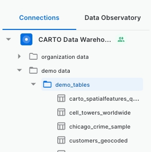
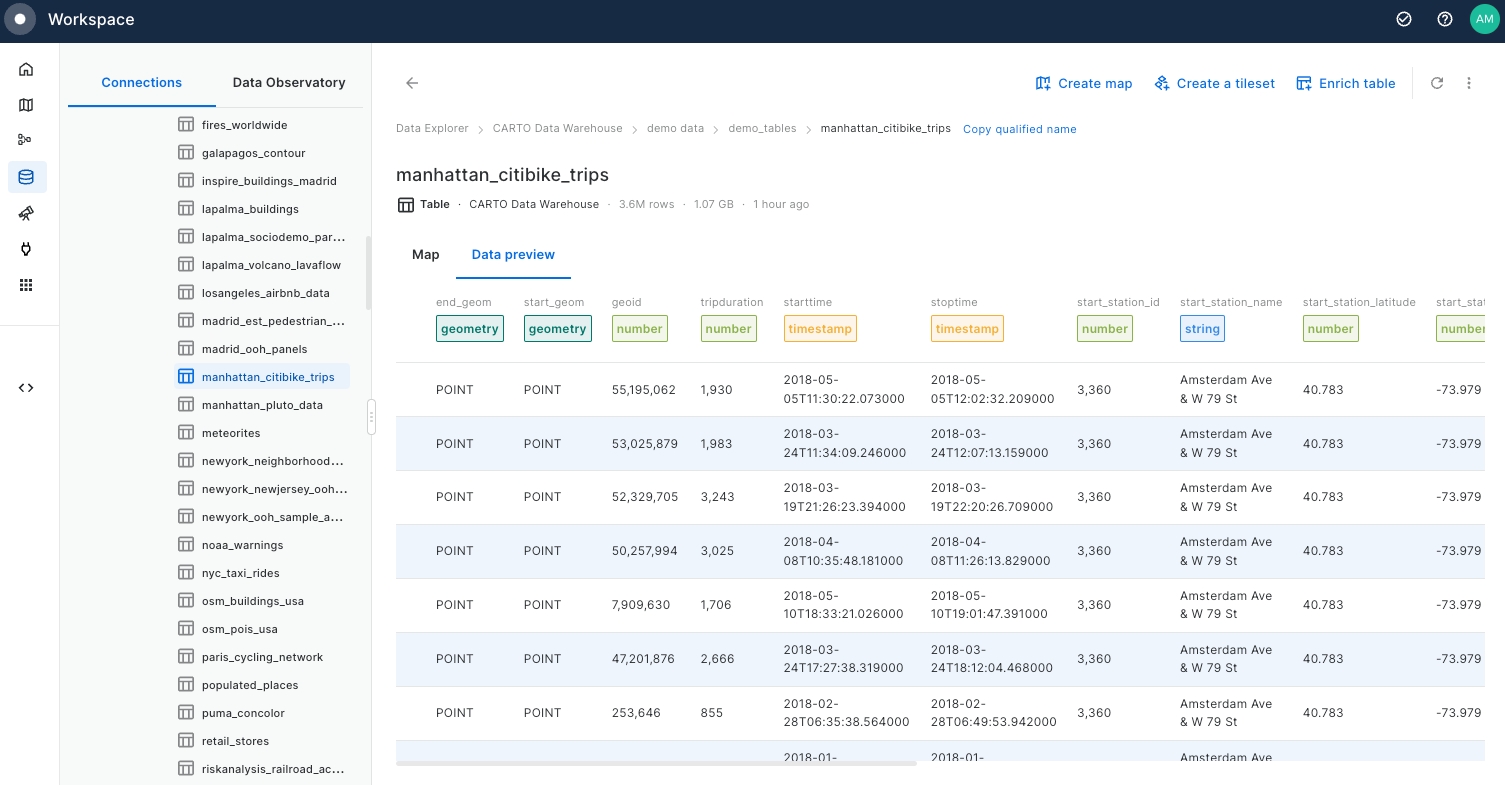
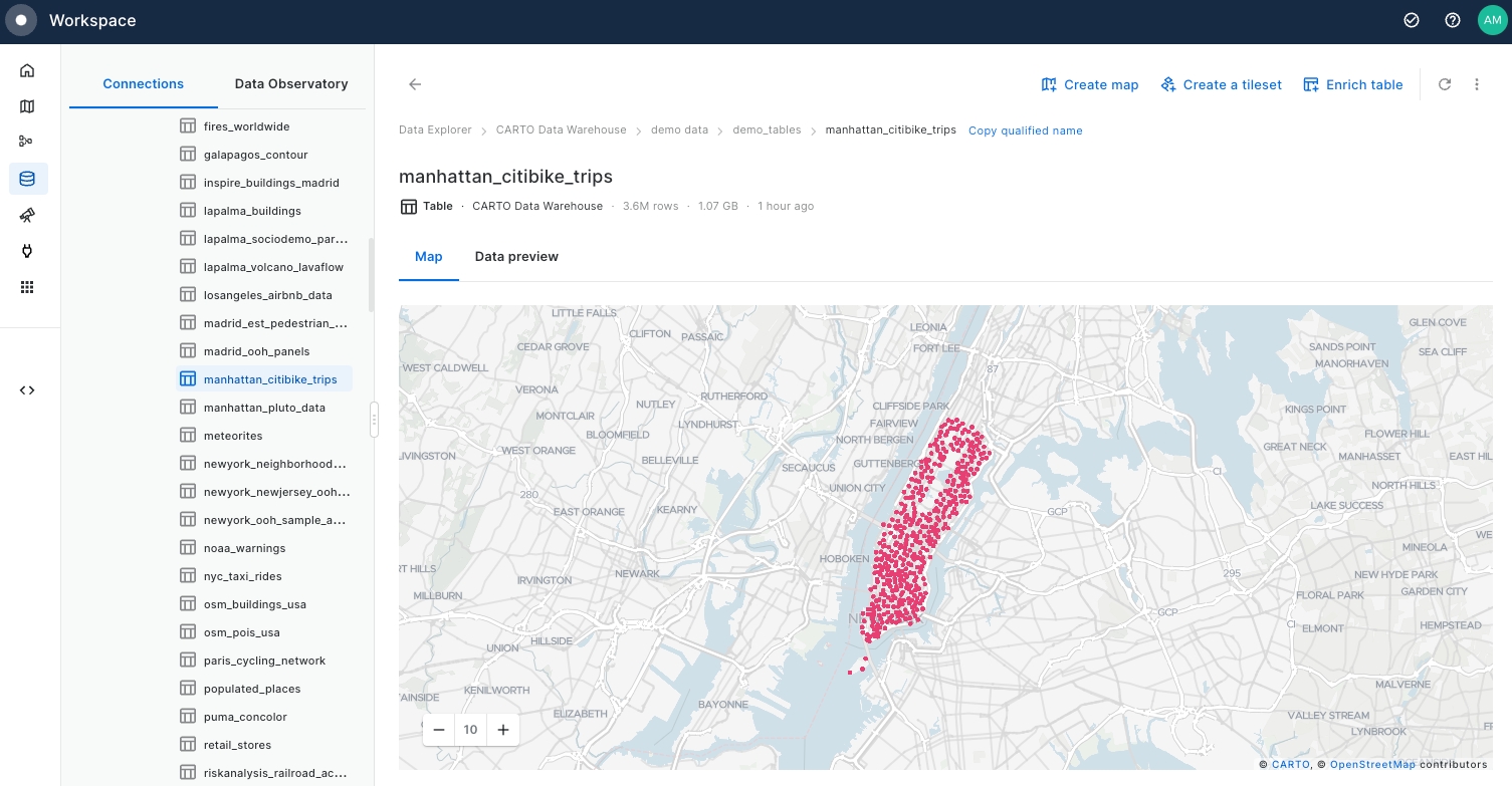
Search for the demo_data > demo_tables within the CARTO Data Warehouse and select “manhattan_citibike_trips”.
Examine "manhattan_citibike_trips" Map and Data preview, focusing on the geometry columns (
start_geomandend_geom) that correspond to trip start and end bike station points.
Return to the Navigation Menu, select Maps, and create a "New map".
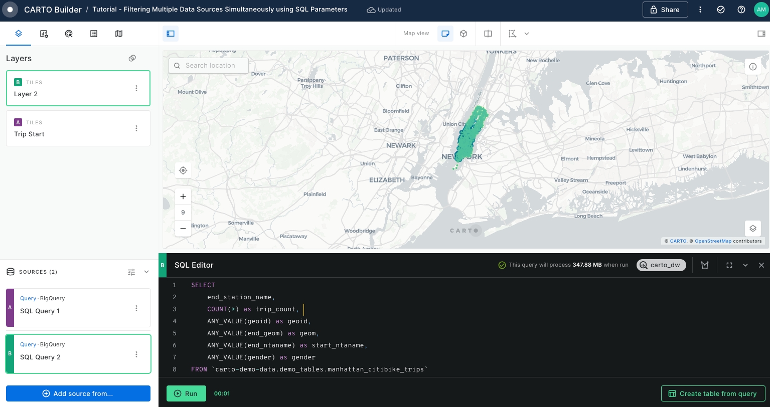
Begin by adding the start station locations of Citi Bike Trips as the first data source.
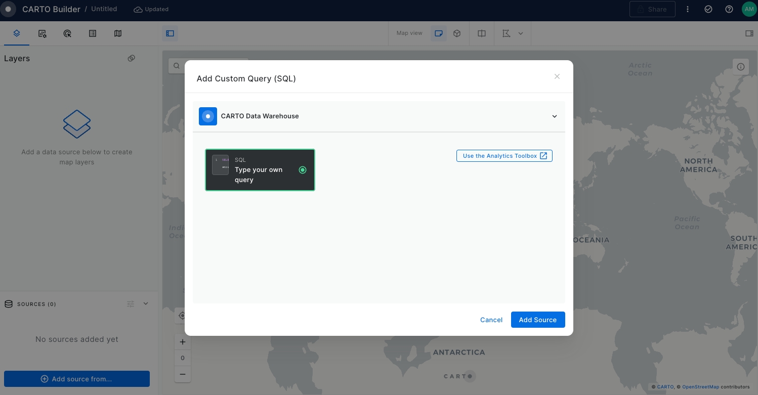
Select the Add source from button at the bottom left on the page.
Click on the CARTO Data Warehouse connection.
Select Type your own query.
Click on the Add Source button.
The SQL Editor panel will be opened.
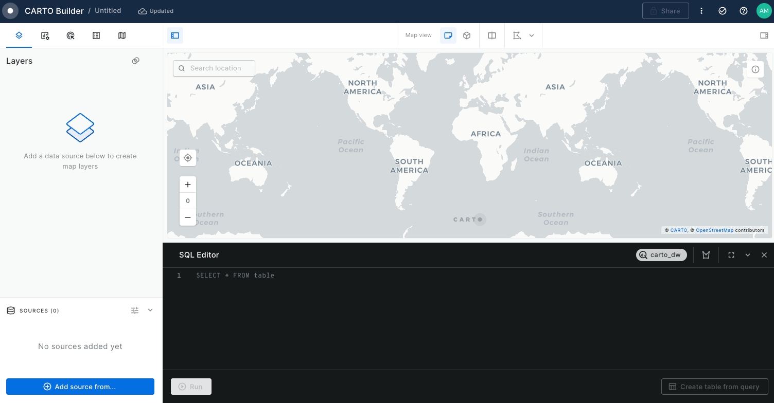
Extract the bike stations of the start of the Citi bike trips grouping by the
start_station_namewhile obtaining theCOUNT()of all the trips starting at that specific location. For that, run the query below:
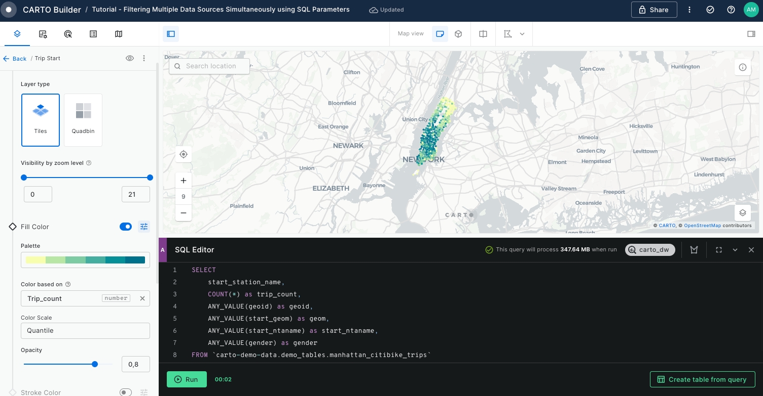
SELECT
start_station_name,
COUNT(*) as trip_count,
ANY_VALUE(geoid) as geoid,
ANY_VALUE(start_geom) as geom,
ANY_VALUE(start_ntaname) as start_ntaname
FROM `carto-demo-data.demo_tables.manhattan_citibike_trips`
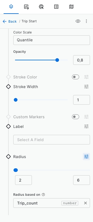
GROUP BY start_station_nameRename the layer to "Trip Start" and style it by
Trip_countusing Color based on option and set the radius size by the sameTrip_countvariable using 2 to 6 range.
Extract the bike stations of the end of the trips. We will repeat Step 7 and Step 8, this time retrieving the end station variables. For that, execute the following query.
SELECT
end_station_name,
COUNT(*) as trip_count,
ANY_VALUE(geoid) as geoid,
ANY_VALUE(end_geom) as geom,
ANY_VALUE(end_ntaname) as end_ntaname
FROM `carto-demo-data.demo_tables.manhattan_citibike_trips`
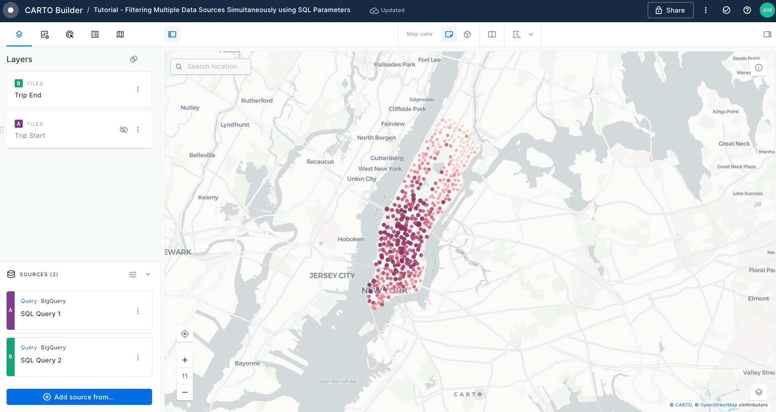
GROUP BY end_station_nameOnce the data has been added to the map display, you will notice that is overlaying with the 'Trip Start' layer.
Edit the name, style of the new layer and update the visualisation of 'Trip Start' layer as follows:
Disable 'Trip Start' layer visibility by clicking over the eye located right on the layer tab.
Rename "Layer 2" to "Trip End".
Style 'Trip End' layer by
trip_countusing a different color palette.
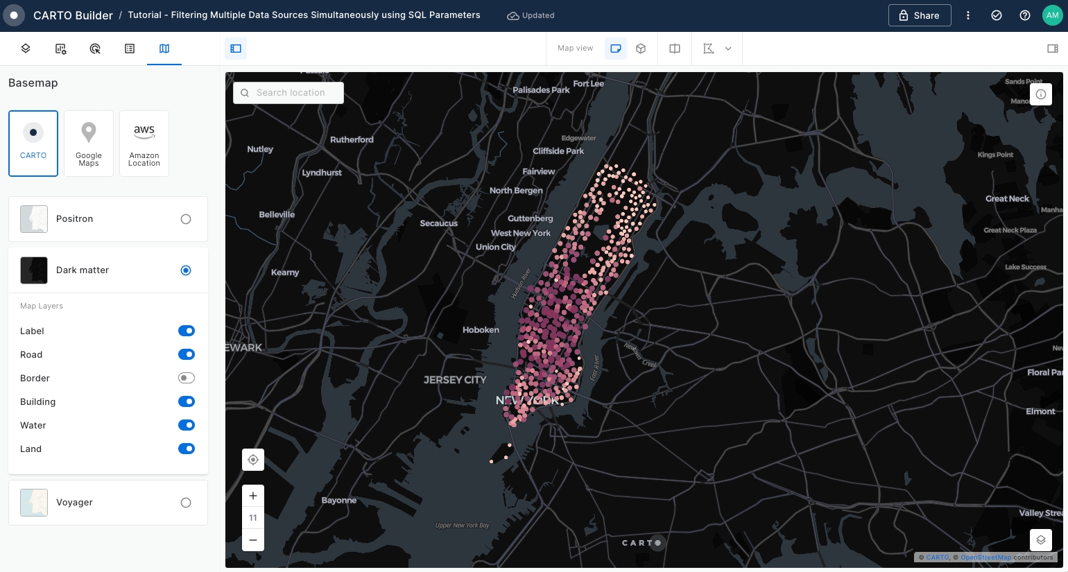
Change the Basemap to
Dark Matterfor better visibility.
Enable the Layer selector and Open when loading the map options within Legend > More Legend Options.
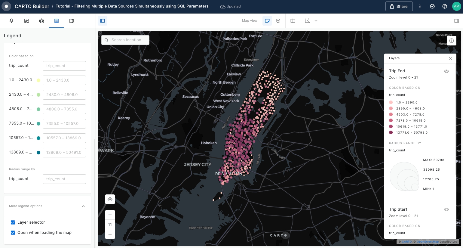
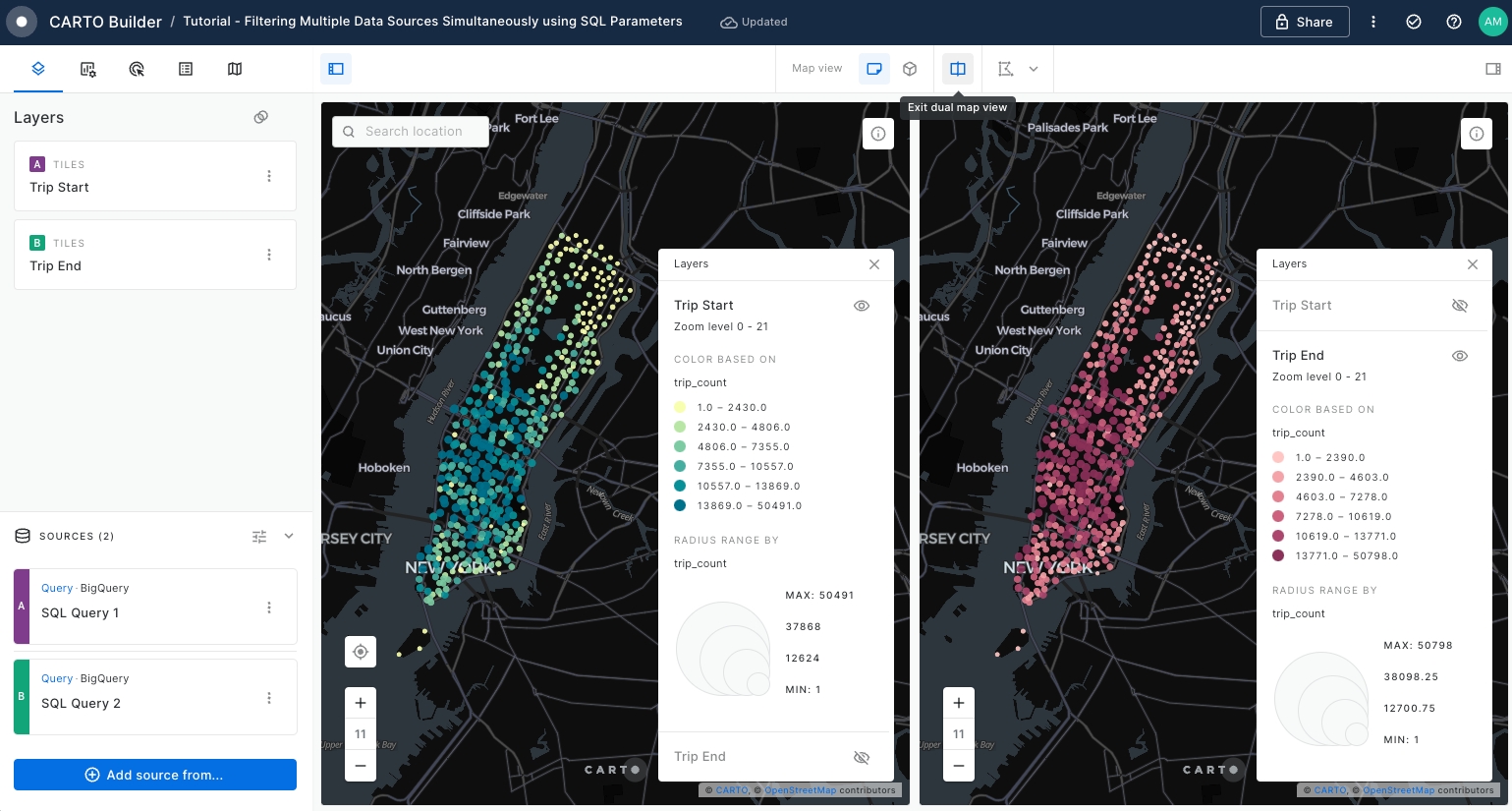
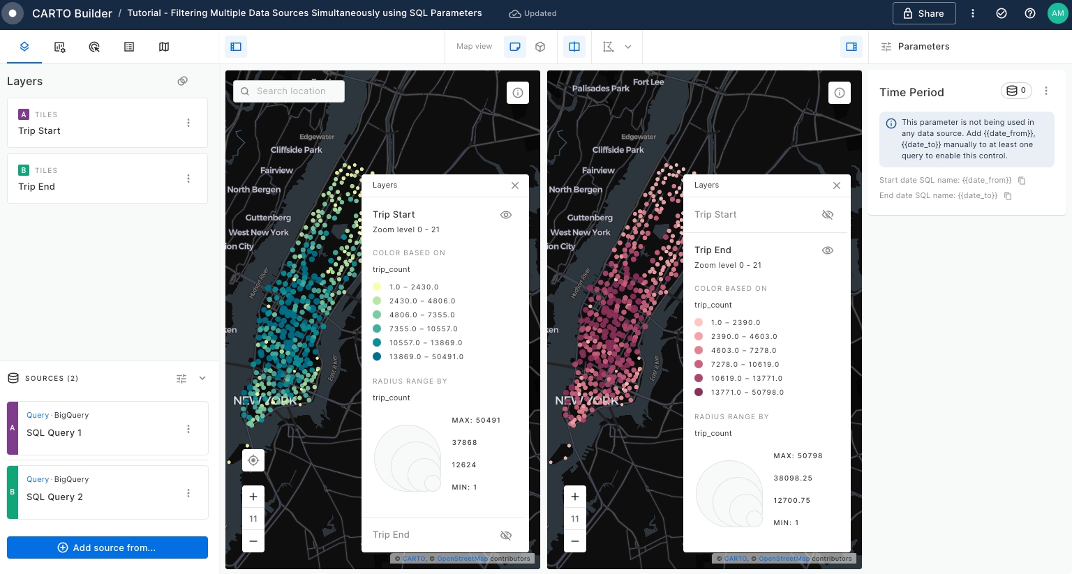
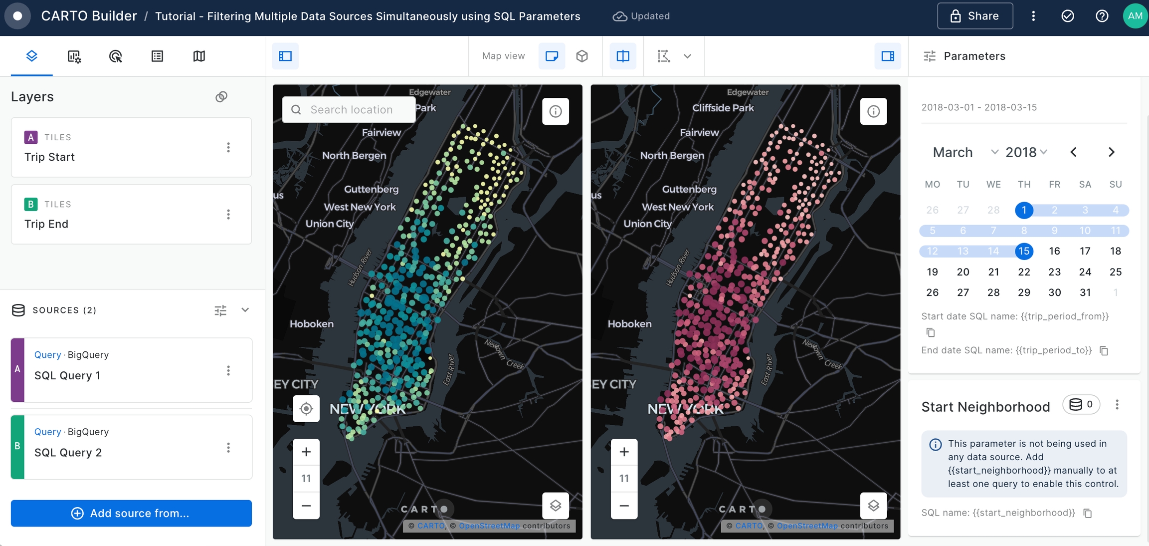
Use the Split View mode to examine the 'Trip Start' and 'Trip End' layers before creating SQL Parameters.
Ensure that the 'Trip Start' layer is positioned above the 'Trip End' layer. You can adjust layer visibility by toggling the eye icon in the Legend.
As per below screenshot, the left panel is dedicated to showcasing the 'Trip Start' layer, while the right panel displays the 'Trip End' layer. Split View mode is highly beneficial for comparison purposes.
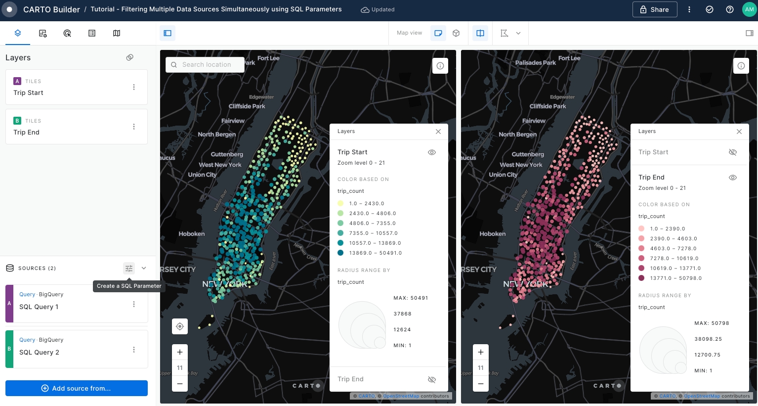
Now we are ready to start using SQL Parameters over both SQL Query sources.
SQL Parameters are a powerful feature in Builder that serve as placeholders in SQL Query data sources. They provide flexibility and ease in performing data analysis by allowing dynamic input and customization of queries.
Create a SQL Parameter by clicking over Create a SQL Parameter icon located on the top right of your Sources panel.
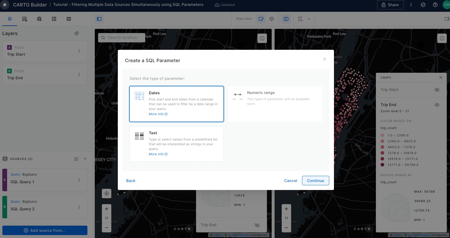
A pop-up window will be opened where you can extract further information about SQL Parameters and select the SQL Parameter type you would like to use.
Click Continue to jump into the next page where you can choose the parameter type.
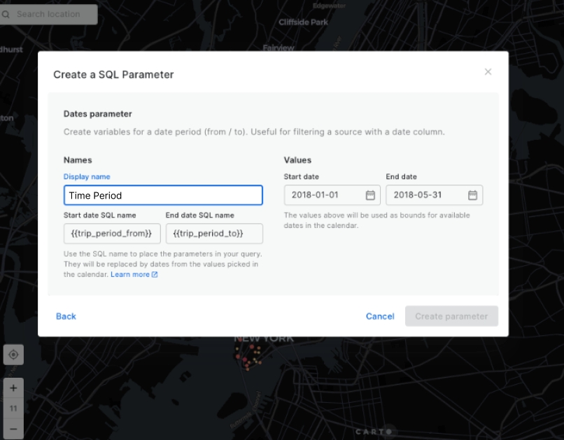
Select Dates as the parameter type and click Continue.
Navigate to the configuration page for the Dates parameter and set the parameters as indicated in the following screenshot and click Create parameter.
Please note that the dataset for Manhattan Citi Bike Trips only includes data from January until May 2018. Please ensure your date selection falls within this range.
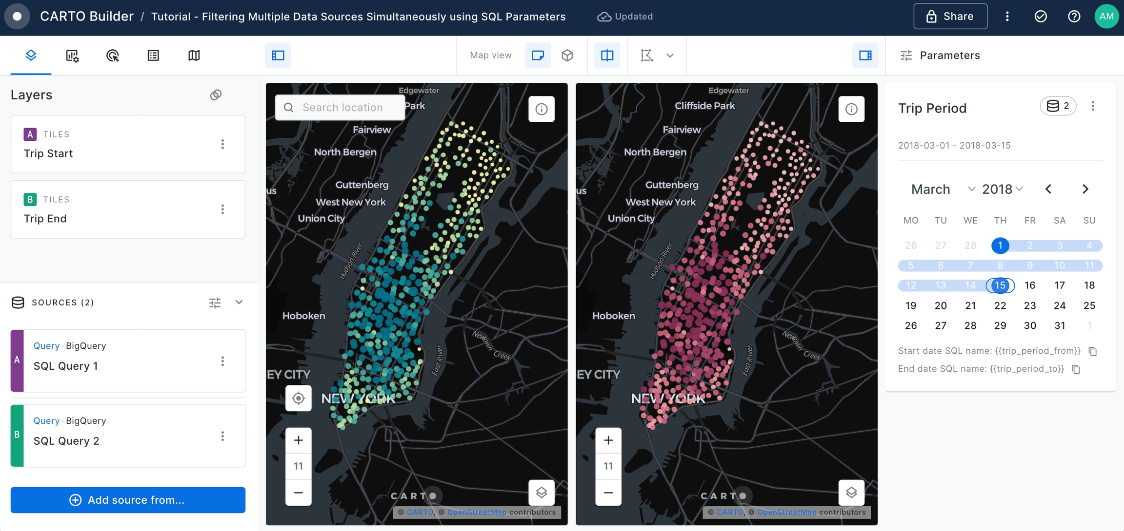
A new parameter named Time Period appears on the left panel.
Edit the SQL Query for both 'SQL Query 1' and 'SQL Query 2' data sources to include the WHERE statement that will filter
starttimecolumn by the input Time Period date range and execute the queries.
WHERE starttime >= {{trip_period_from}} AND starttime <= {{trip_period_to}}The output query for 'SQL Query 1' linked to 'Trip Start' layer should be as follows:
SELECT
    start_station_name,
    COUNT(*) as trip_count,
    ANY_VALUE(geoid) as geoid,
    ANY_VALUE(start_geom) as geom,
    ANY_VALUE(start_ntaname) as start_ntaname
FROM `carto-demo-data.demo_tables.manhattan_citibike_trips`
WHERE starttime >= {{trip_period_from}} AND starttime <= {{trip_period_to}}
GROUP BY start_station_name
The output query for 'SQL Query 2' linked to 'Trip End' layer should be as below, as we are interested on the start time of the trip for both sources:
SELECT
    end_station_name,
    COUNT(*) as trip_count,
    ANY_VALUE(geoid) as geoid,
    ANY_VALUE(end_geom) as geom,
    ANY_VALUE(end_ntaname) as end_ntaname
FROM `carto-demo-data.demo_tables.manhattan_citibike_trips`
WHERE starttime >= {{trip_period_from}} AND starttime <= {{trip_period_to}}
GROUP BY end_station_name
Once you have executed the SQL Queries, a calendar will appear within Trip Period parameter.
Users will have the flexibility to alter the time frame using the provided calendar. This allows you to filter the underlying data sources to suit your needs, affecting both the 'Trip Start' and 'Trip End' data sources.
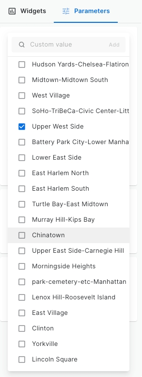
Create a new SQL Parameter. This time, select the Text parameter type and set the configuration as below, using
start_ntanamecolumn from 'SQL Query 1' source to add Manhattan neighborhoods. Once complete, click on Create Parameter button.
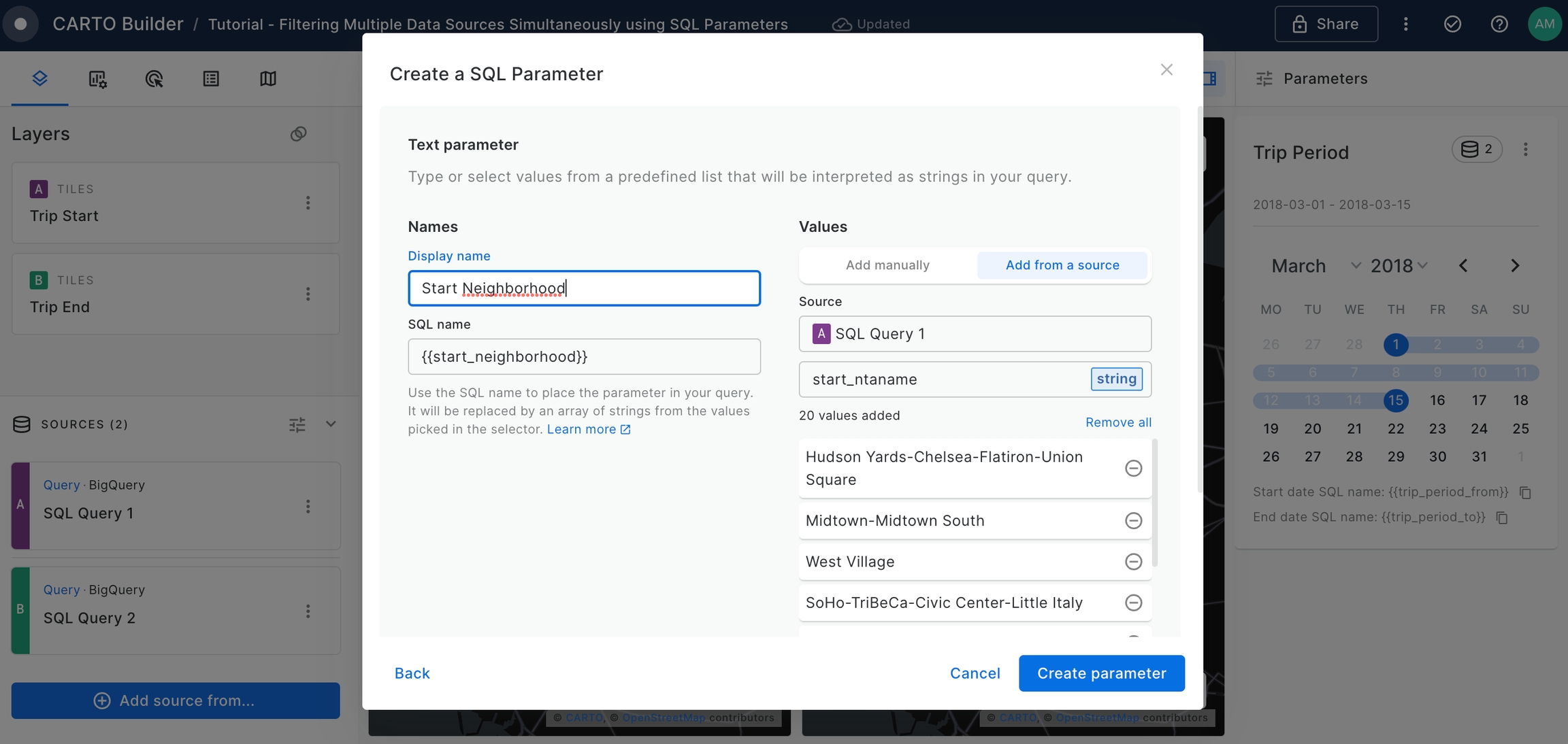
A new parameter named Start Neighborhood will be added to the Map.
Edit the SQL Query for both 'SQL Query 1' and 'SQL Query 2' to include the WHERE statement that will filter
start_ntanamecolumn by the input of Start Neighborhood parameter and execute the queries.
start_ntaname IN {{start_neighborhood}}The output query for 'SQL Query 1' linked to 'Trip Start layer' should be as follows:
SELECT
    start_station_name,
    COUNT(*) as trip_count,
    ANY_VALUE(geoid) as geoid,
    ANY_VALUE(start_geom) as geom,
    ANY_VALUE(start_ntaname) as start_ntaname
FROM `carto-demo-data.demo_tables.manhattan_citibike_trips`
WHERE starttime >= {{trip_period_from}} AND starttime <= {{trip_period_to}}
AND start_ntaname IN {{start_neighborhood}}
GROUP BY start_station_name
The output query for 'SQL Query 2' linked to 'Trip End' layer should be as below, as we are interested on the start time of the trip for both sources.
SELECT
    end_station_name,
    COUNT(*) as trip_count,
    ANY_VALUE(geoid) as geoid,
    ANY_VALUE(end_geom) as geom,
    ANY_VALUE(end_ntaname) as end_ntaname
FROM `carto-demo-data.demo_tables.manhattan_citibike_trips`
WHERE starttime >= {{trip_period_from}} AND starttime <= {{trip_period_to}}
AND start_ntaname IN {{start_neighborhood}}
GROUP BY end_station_name
After executing the SQL Queries, a drop-down list of start trip neighborhoods will populate. This interactive element allows users to selectively choose which neighborhood(s) serve as the starting point of their trip.
Repeat Step 20 and Step 21 to create a SQL Parameter, but this time we will filter the end trip neighborhoods.
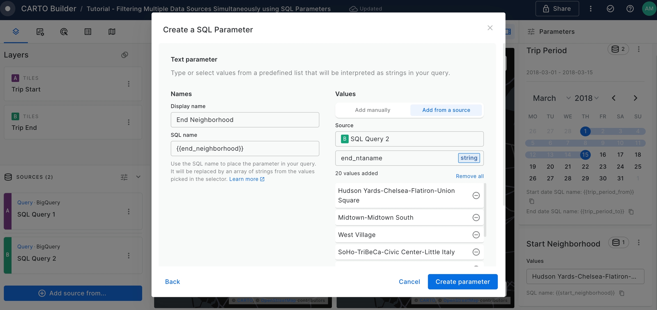
The output query for 'SQL Query 1' linked to Trip Start layer should be as follows:
SELECT
    start_station_name,
    COUNT(*) as trip_count,
    ANY_VALUE(geoid) as geoid,
    ANY_VALUE(start_geom) as geom,
    ANY_VALUE(start_ntaname) as start_ntaname
FROM `carto-demo-data.demo_tables.manhattan_citibike_trips`
WHERE starttime >= {{trip_period_from}} AND starttime <= {{trip_period_to}}
AND start_ntaname IN {{start_neighborhood}} AND end_ntaname IN {{end_neighborhood}}
GROUP BY start_station_name
The output query for 'SQL Query 2' linked to 'Trip Start' layer should be as follows:
SELECT
    end_station_name,
    COUNT(*) as trip_count,
    ANY_VALUE(geoid) as geoid,
    ANY_VALUE(end_geom) as geom,
    ANY_VALUE(end_ntaname) as end_ntaname
FROM `carto-demo-data.demo_tables.manhattan_citibike_trips`
WHERE starttime >= {{trip_period_from}} AND starttime <= {{trip_period_to}}
AND start_ntaname IN {{start_neighborhood}} AND end_ntaname IN {{end_neighborhood}}
GROUP BY end_station_name
Disable Split View Mode, make both 'Trip Start' and 'Trip Layer' visible using the Legend eye icons and compare the bike trips between two different neighborhoods. For that, set the Start Neighborhood parameter to be "Upper West Side" and the End Neighborhood parameter to be "Chinatown".
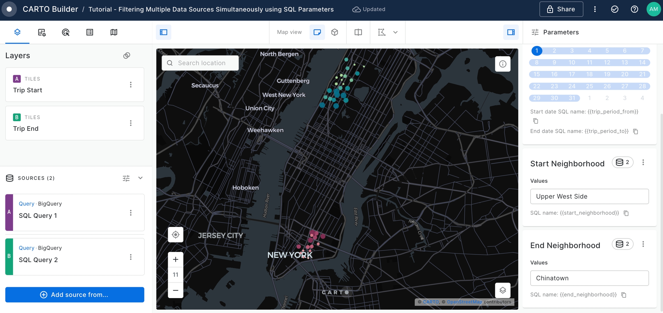
We can clearly see which are the start and end stations which are gathering most of the bike trips for this neighborhood combination.
Create a Formula Widget to represent the
Total Tripssetting the configuration as below.
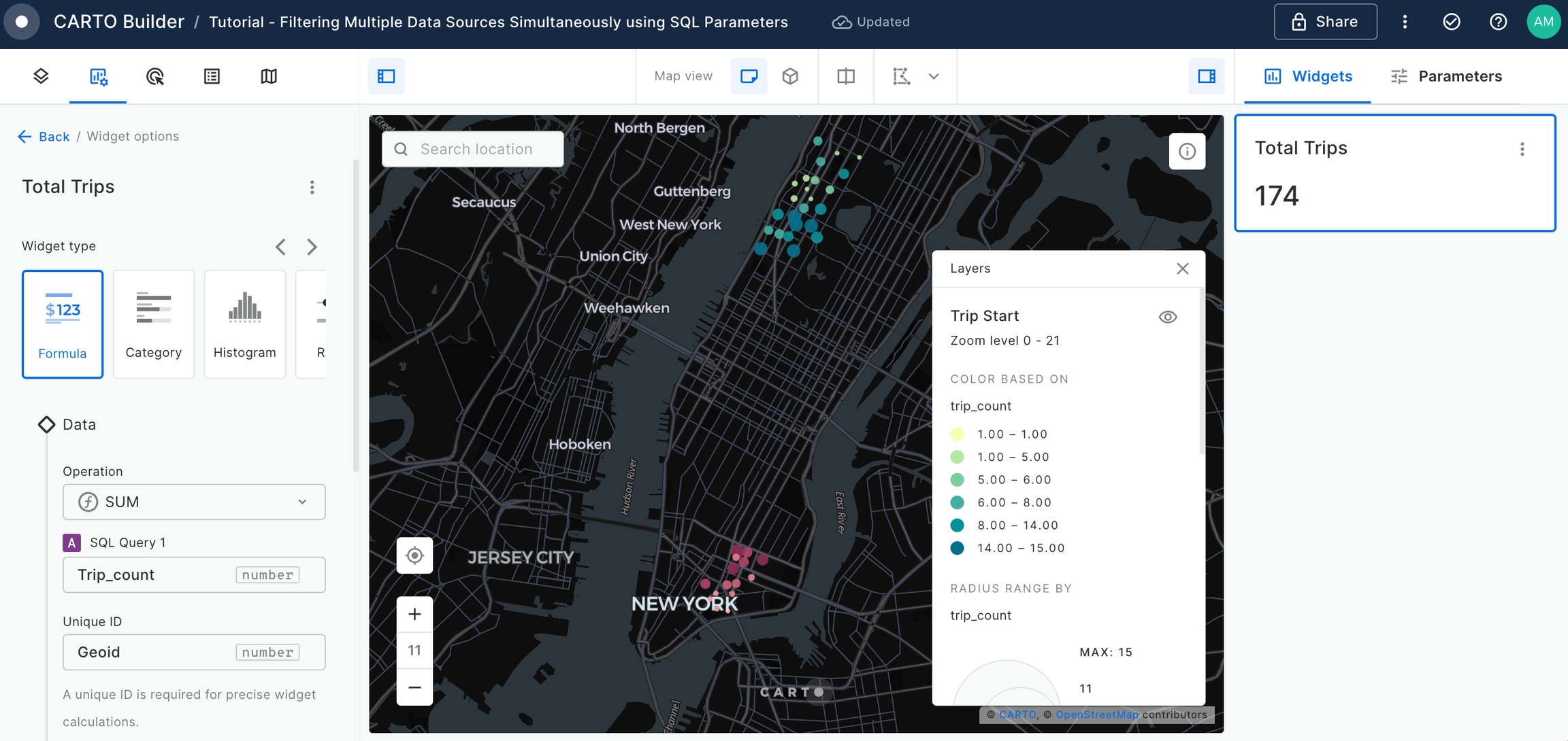
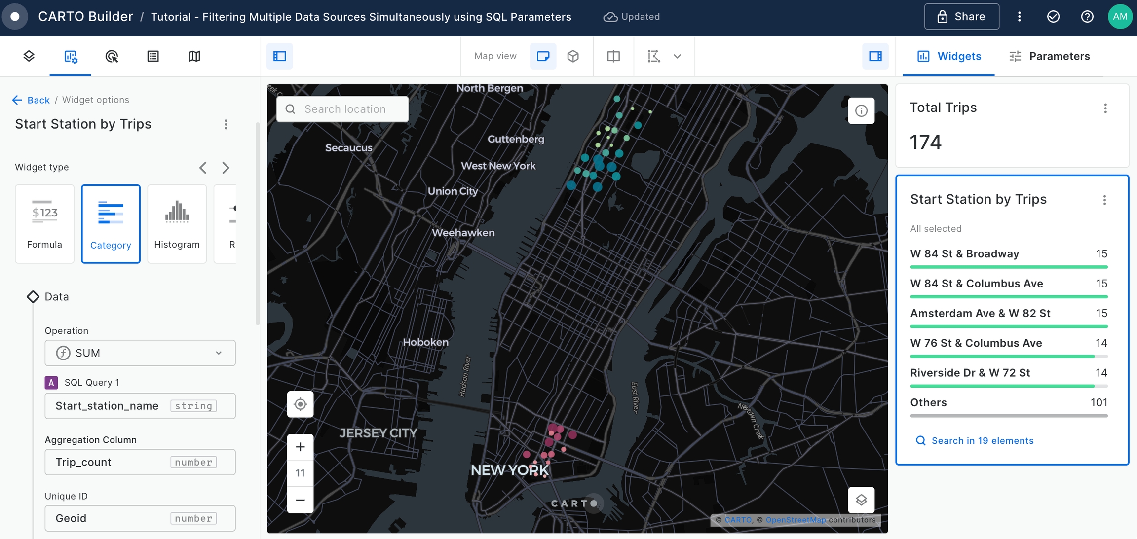
Add a Category Widget to display the
Start Stationsordered by theTotal Trips.
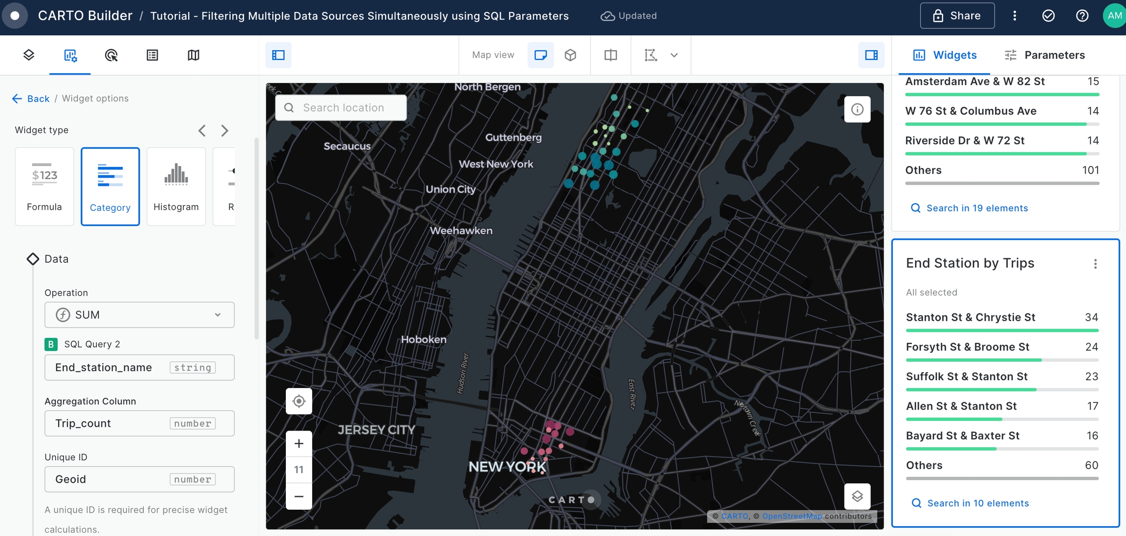
Add a Category Widget to display the
End Stationsordered by theTotal Trips.
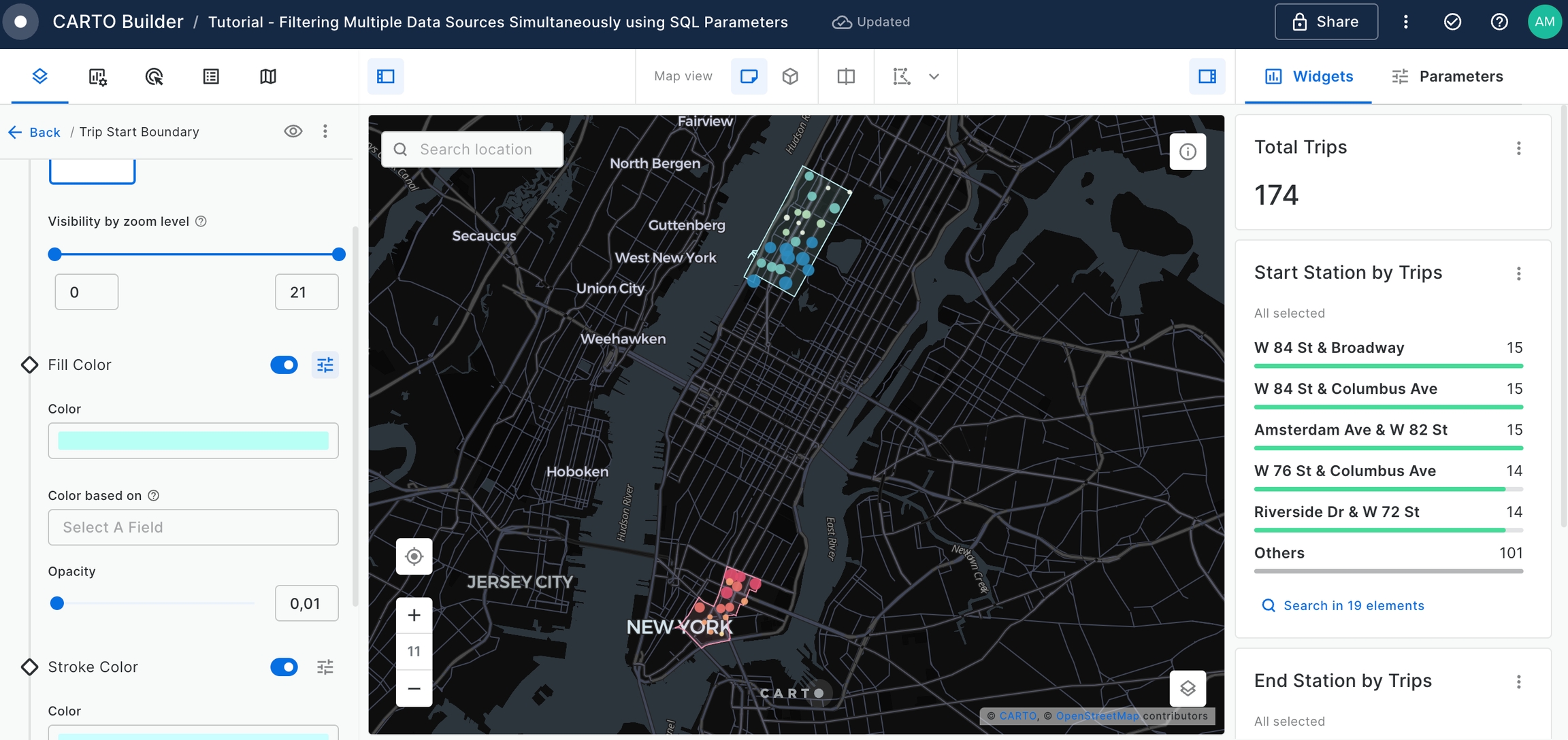
The Builder Map provides user with an interactive application to gather insights about New York Citi Trips and the patterns between the different neighborhoods. However, it is difficult to visualize the boundary limits between both the start trips and the end trips.
For that, let's use "newyork_neighborhood_tabulation_areas" table, available on CARTO Data Warehouse within demo_data > demo_tables.
Add a new SQL Query as the data source using the following query which aggregates geometry of the start trip neighborhood(s).
SELECT
    ST_UNION_AGG(geom) as geom
FROM `carto-demo-data.demo_tables.newyork_neighborhood_tabulation_areas`
WHERE ntaname IN {{start_neighborhood}}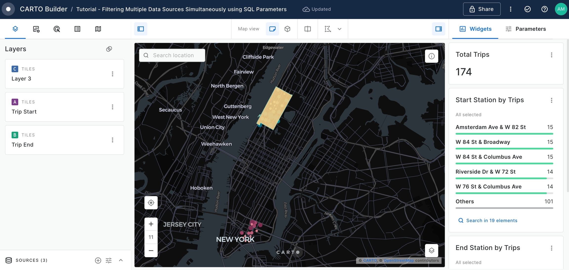
Add a new SQL Query as the data source using the following query. This time the aggregated geometry will be for the end trip neighborhood(s).
SELECT
    ST_UNION_AGG(geom) as geom
FROM `carto-demo-data.demo_tables.newyork_neighborhood_tabulation_areas`
WHERE ntaname IN {{end_neighborhood}}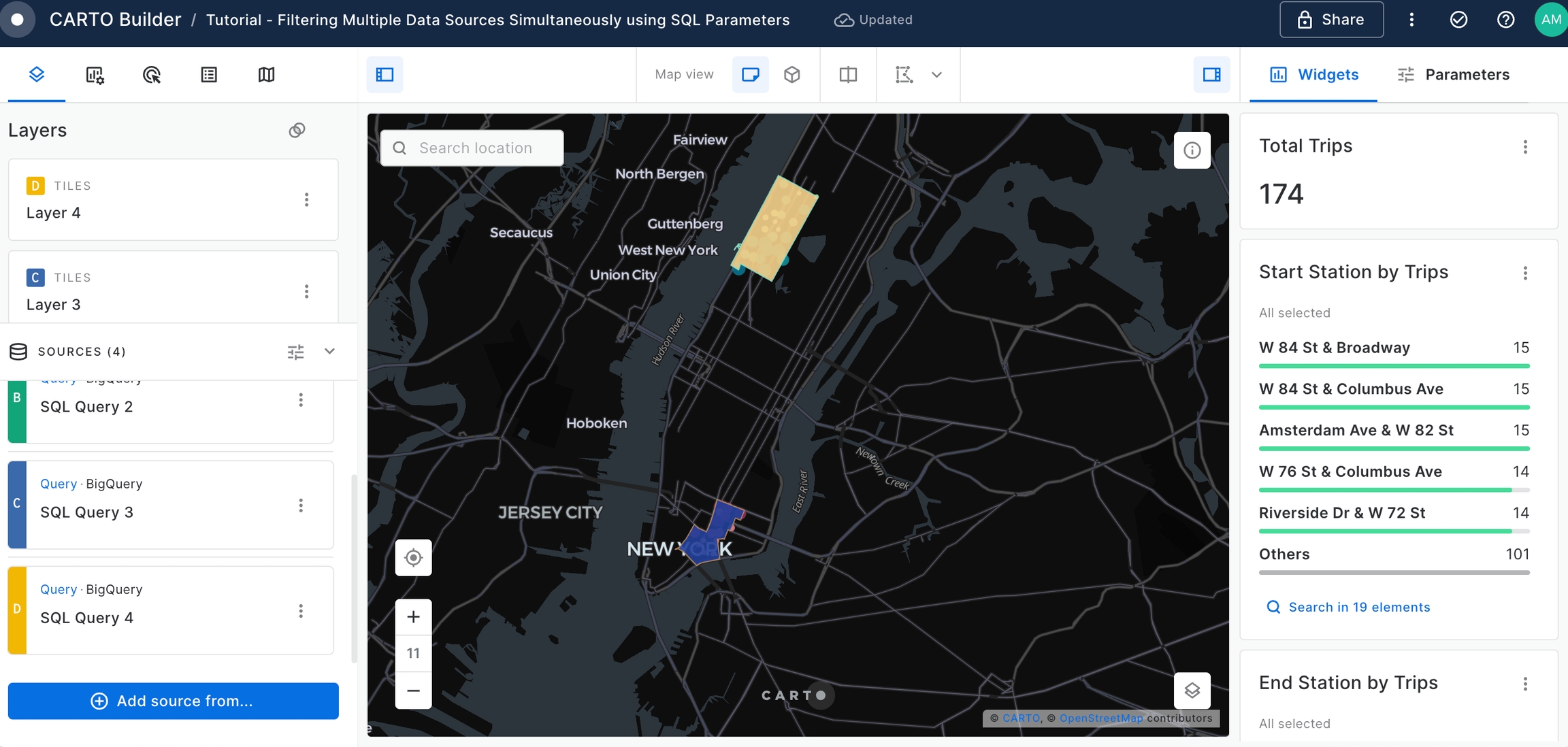
Rename the recently added layers, and position them beneath the 'Trip Start' and 'Trip End' layers for better visibility.
Feel free to experiment with styling options - adjusting layer opacity, trying out different color palettes, until you achieve the optimal visual representation.
Change the name of the map to "New York Citi Bike Trips".
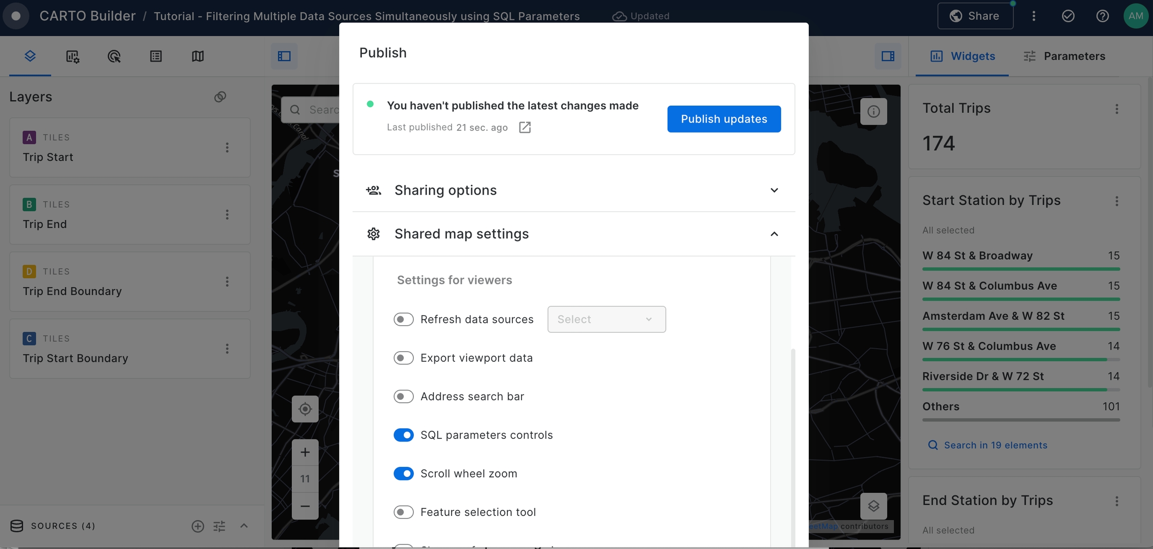
Finally we can make the map public and share the link to anybody.
For that you should go to Share section on the top right corner and set the map as Public.
Activate SQL parameters controls options so that Viewer users can control the exposed parameters.
Finally, we can visualize the results!
By the end of this tutorial, you should have a clear understanding of how to utilize SQL Parameters to filter multiple data sources, particularly in the context of Citi Bike trips in New York City.
Generate a dynamic index based on user-defined weighted variables
Context
In this tutorial, we'll explore how to create a versatile web map application using Builder, focusing on the dynamic customization of index scores through SQL Parameters. You'll learn how to normalize variables using Workflows and how to craft an index based on these normalized variables. We'll guide you through dynamically applying specific weights to these variables, enabling the index to flexibly align with various user scenarios.
Whether it's for optimizing location-based services, fine-tuning geomarketing strategies, or diving deep into trend analysis, this tutorial provides you with the essential tools and knowledge. You'll gain the ability to draw significant and tailored insights from intricate geospatial data, making your mapping application a powerful asset for a wide range of scenarios.
Step-by-Step Guide:
In this guide, we'll walk you through:
Creating normalized variables with Workflows
Access Workflows from your CARTO Workspace using the Navigation menu.

Select the data warehouse where you have the data accessible. We'll be using the CARTO Data Warehouse, which should be available to all users.

In the Sources section location on the left panel, navigate to demo_data > demo tables within CARTO Data Warehouse. Drag and drop the below sources to the canvas.
usa_states_boundariesderived_spatialfeatures_usa_h3res8_v1_yearly_v2cell_towers_worldwide

We are going to focus our analysis in California. To extract California boundary, we add the Simple Filter component into the canvas and we connect USA States Boundary source to its input. Then, in the node configuration panel we select 'name' as column, 'equal to' as the operation, and 'California' as the value. We click on "Run". You can use the Map Preview to visualize the output.

We are going to leverage spatial indexes, specifically H3 at resolution level 8, to generate our dynamic, weighted index. After isolating the California state boundary, our next step is to transform it into H3 cells. Add the H3 Polyfill component to the canvas and set the resolution to level 8 in the node. Then, proceed by clicking 'Run' to complete the transformation.

Now that we have California H3 cells, we can use the Join component to select Derived Spatial Features source located in California. Add the component to the canvas, link both sources and select 'Inner' as the join type in the node. Then, click on "Run".

Now we can begin normalizing our key variables. Normalizing a variable involves adjusting its values to a common scale, making it easier to compare across different datasets.
Prior to normalizing, we will use the Select component to keep only the necessary columns using the below expression:
h3,
population_joined as population,
retail_joined as retail,
transportation_joined as transport,
leisure_joined as leisure
Now, let's normalize our desired variables. To do so, add the Normalize component to the canvas. In the node, select one of the desired variables such
population. Click on "Run". Once completed, you can visualizes the result in the Data Preview. By inspecting it you can reveal a new column namedpopulation_normwith data varying from 0 to 1.

Repeat the above process by adding the Normalize compoment for each of the remaining variables:
retail,leisureandtransport.

After finishing with the variables from Derived Spatial Features, we can start analyzing the distance between each H3 cell and the closest cell tower location. The first step of this analysis is to extract the cell towers located within California state boundary. To do so, we will use the Spatial Filter component adding Cell Towers Worldwide source as the main input and California state as the secondary input. In the node, select 'Intersect' as the spatial predicate.

Then, we need to extract the centroid geometry from the H3 cells so we can perform a point-to-point distance operation. To do so, add the H3 Center component to the canvas and link it with H3 Polyfill output as we are only interested on the H3 ids.

Add a unique id to the filtered Cell Tower locations by using Row Number component that will add a new column to your table with the row count on it.

We can now add the Distance to nearest component to calculate the closest distance between each H3 cell to the nearest cell tower location in California. Link the H3 Center output as the main source and add the filtered cell tower locations as the secondary input. In the node, set the configuration as per below image with the distance set to 500 meters. You can use the Data Preview to visualise the resulted columns.

With the distance calculated, we can normalize our variable. As on previous steps, we will use the Normalize compoment to achieve that specifying the column as the
nearest_distance.

Given that in our case, a higher distance to a cell tower location is considered less favorable, we need to invert our scale so that higher values are interpreted positively. To achieve this, utilize the Select component and apply the following statement to reverse the scale, thereby assigning higher values a more positive significance.
h3,
1 - nearest_distance_norm as nearest_distance_norm,
nearest_distance
Let's join the normalized variables using the Join component. In the node, set the join type to 'Inner', as we are only interested on those locations where there is a cell tower location with a minimum distance of 500 meters.

The final step in our analysis is to save our output results as a table. We will use the Save as Table component to generate a table from the normalized variables using H3 spatial index and the California state boundary so we can visualize the analysis location. Save both tables within CARTO Data Warehouse > Organization > Private and name them as following:
California State Boundary:
california_boundaryNormalized variables:
california_normalized_variables


Now that the Workflows is done, you can add Annotations, edit the component names and organize it so that the analysis is easy to read and share.

Creating an Index Score using normalized variables
In Workflows, preview the map result of Save as Table component to generate the California Boundary source. Click on "Create map".

A map opens with California Boundary added as table source. Change the Map Title to "Create index score using normalized variables" and rename the layer to "Search Area".

Access the Layer panel,
disablethe Fill Color and set the Stroke Color tored, setting the Stroke Width to1.5.

Now, we will add the normalized variables sources.
Select the Add source from button at the bottom left on the page.
Click on the CARTO Data Warehouse connection.
Select Type your own query.
Click on the Add Source button.

The SQL query panel will be opened.

Enter the following query replacing the qualified table name by your output table created in Step 15. You can find this name in the Data Explorer by the navigating to the recently created table. Once the query is updated, make sure the Spatial Data Type selected is H3. Then, click on "Run".
SELECT * FROM carto-dw-ac-dp1glsh.private_atena_onboardingdemomaps_ca2c4d8c.califoria_normalized_variables
Now, rename let's modify the query creating an index score based on the normalized variables we previously generated in Workflows. Update the SQL query as per below and click on "Run". Then, rename the Layer to 'Index Score'.
WITH index AS (
 SELECT
  	h3,
    population_norm + retail_norm + leisure_norm + transport_norm + nearest_distance_norm_joined as index_score
  FROM carto-dw-ac-dp1glsh.private_atena_onboardingdemomaps_ca2c4d8c.califoria_normalized_variables)

SELECT h3,ML.MIN_MAX_SCALER(index_score) OVER() as index_score FROM index
After running the SQL query, the data source is updated. Then, you can style your H3 layer by index_score, an index that has been calculated considering all variables as equal weights.

While indexes with equal weights offer valuable insights, we'll also explore custom weighting for each variable. This approach caters to diverse user scenarios, particularly in identifying optimal business locations. In Builder, you can apply weights to variables in two ways:
Static Weights: Here, specific weights are applied directly in the SQL query. These weights are fixed and can only be changed by the Editor. This method is straightforward and useful for standard analyses.
Dynamic Weights: This more flexible approach involves using SQL Parameters. It allows Viewer users to adjust weights for each variable, tailoring the analysis to their specific business needs.
Let's begin with the static method:
Edit your SQL query to include static weights for each normalized variable. Experiment with different weights to observe how they impact the index score. Each time you modify and re-run the query, you'll see how these adjustments influence the overall results.
WITH data_ AS (
  SELECT
  	h3,
  	population_norm * 1 as population_norm,
  	retail_norm * 0.2 as retail_norm,
  	leisure_norm * 0.2 as leisure_norm,
  	transport_norm * 0.6 as transport_norm,
  	nearest_distance_norm_joined * 1 as nearest_distance_norm
  FROM carto-dw-ac-dp1glsh.private_atena_onboardingdemomaps_ca2c4d8c.califoria_normalized_variables),

index AS (
 SELECT
  	h3,
    population_norm + retail_norm + leisure_norm + transport_norm + nearest_distance_norm as index_score
  FROM data_)

SELECT h3,ML.MIN_MAX_SCALER(index_score) OVER() as index_score FROM index
Enabling SQL Parameters for user-defined index customization
SQL parameters are placeholders that you can add in your SQL Query source and can be replaced by input values set by users. In this tutorial, we will learn how you can use them to dynamically update the weights of normalized variables.
The first step in this section is to create a SQL Numeric Parameter. You can access this by clicking on the top right icon in the Sources Panel.

Set the SQL Numeric Parameter configuration as follows:
Slider Type:
Simple SliderMin Value:
0Default Value:
0.5Max Value:
1Display name:
Population WeightSQL name:
{{population_weight}}

Once you create a parameter, a parameter control is added to the right panel. From there, you can copy the parameter SQL name to add it to your query. In this case, we will add it as the weight to our
population_normcolumn.

Repeat Step 26 to add a SQL Numeric Parameter and update the SQL Query for each of the normalized variables:
leisure_norm,retail_norm,transport_normandnearest_distance_normThe output SQL query and parameter panel should look similar to the below.

WITH data_ AS (
  SELECT
  	h3,
  	population_norm * {{population_weight}} as population_norm,
  	retail_norm * {{retail_weight}} as retail_norm,
  	leisure_norm * {{leisure_weight}} as leisure_norm,
  	transport_norm * {{transport_weight}} as transport_norm,
  	nearest_distance_norm_joined * {{cell_tower_distance_weight}} as nearest_distance_norm
  FROM carto-dw-ac-dp1glsh.private_atena_onboardingdemomaps_ca2c4d8c.califoria_normalized_variables),

index AS (
 SELECT
  	h3,
    population_norm + retail_norm + leisure_norm + transport_norm + nearest_distance_norm as index_score
  FROM data_)

SELECT h3,ML.MIN_MAX_SCALER(index_score) OVER() as index_score FROM index
Now, style your map as desired. We will be setting up our Fill Color palette to
ColorBrewer RdPu 4with color based onindex_socreand changing the basemap toCARTO Dark Matter. You can test the parameter controls to see how the index is updated dynamically taking into account the input weight values.

Let's add a description to our map that can provide viewer users with further context about this map and how to use it.

In the Legend tab, set the legend to open when the map is first loaded.

Finally we can make the map public and share the link to anybody.
For that you should go to Share section on the top right corner and set the map as Public.
Activate SQL parameters controls options so that Viewer users can control the exposed parameters.

Copy the public share link and access the map as a Viewer. The end result should look similar to the below:
Create a dashboard with user-defined analysis using SQL Parameters
Context
In this tutorial, we'll explore the power of Builder in creating web map applications that adapt to user-defined inputs. Our focus will be on demonstrating how SQL Parameters can be used to dynamically update analyses based on user input. You'll learn to implement these parameters effectively, allowing for real-time adjustments in your geospatial analysis.
Although our case study revolves around assessing the risk on Bristol's cycle network, the techniques and methodologies you'll learn are broadly applicable. This tutorial will equip you with the skills to apply similar dynamic analysis strategies across various scenarios, be it urban planning, environmental studies, or any field requiring user input for analytical updates.
Step-by-Step Guide:
Access the Maps section from your CARTO Workspace using the Navigation menu.

Click on "New map". A new Builder map will open in a new tab.

In this tutorial, we will undertake a detailed analysis of accident risks on Bristol's cycle network. Our objective is to identify and assess the safest and riskiest segments of the network.
So first, let's add
bristol_cycle_networkdata source following below steps:Click on "Add sources from..." and select "Data Explorer"
Navigate to CARTO Data Warehouse > demo_data > demo_tables
Select
bristol_cycle_networktable and click "Add source"

A new layer appears once the source is added to the map. Rename the layer to "Cycle Network" and change the title of the map to "Analyzing risk on Bristol cycle routes".

Then, we will add
bristol_traffic_accidentsdata source following below steps:Click on "Add sources from..." and select "Data Explorer"
Navigate to CARTO Data Warehouse > demo_data > demo_tables
Select
bristol_traffic_accidentstable and click "Add source"

A new layer is added. Rename it to 'Traffic Accidents'.

Using Traffic Accidents source, we are going to generate an influence area using ST_BUFFER() function whose radius will be updated by users depending on the scenario they are looking to analyse. To do so, we will add again the Traffic Accidents data source, but this time, we will add it as a SQL Query following these steps:
Click on "Add sources from..." and select "Custom Query (SQL)"
Click on the CARTO Data Warehouse connection.
Select Type your own query.
Click on the "Add Source button".

The SQL Editor panel will be opened.

Enter the following query, with the buffer radius distance set to
50and click on "Run".
SELECT * EXCEPT(geom), ST_BUFFER(geom,50) as geom FROM carto-demo-data.demo_tables.bristol_traffic_accidents
Rename the layer to 'Traffic Influence Area', move it just below Traffic Accidents existing layer. Access the Layer panel and within Fill Color section, reduce its opacity to
0.3and set the color tored. Just below,disablethe Stroke Color using the toggle button.

Now, we'll transform
bristol_cycle_networksource table to a query. To do so, you can click on the three dots located in the source card and click on "Query this table".

Click "Continue" on the warning modal highlighting that the styling of this layer will be lost.

The SQL Editor panel is displayed with a
SELECT *statement. Click on "Run" to execute the query.

Repeat Step 10, Step 11 and Step 12 to generate a query, this time from
bristol_traffic_accidentssource table.

To easily distinguish each data source, you can rename them using the 'Rename' function. Simply click on the three dots located on the data source card and select 'Rename' to update their names accordingly to match the layer name.


The Traffic Accidents source contains attributes which spans from 2017-01-03 to 2021-12-31. To allow users interact and obtain insights for the desired time period, we will add to the dashboard:
A Time Series Widget
A SQL Date Parameter
First, we'll incorporate a Time Series Widget into our map. To do this, head over to the 'Widgets' tab and click on 'Add new widget'. In the Data section, use the 'Split by' functionality to add multiple series by selecting the
severity_descriptioncolumn. Also, make sure to rename the widget appropriately to "Accidents by Severity". Once you've configured it, the Time Series Widget will appear at the bottom of the interface, displaying essential information relevant to each severity category.

Now, let's add a SQL Date Parameter that will allow users to select their desired time period by accessing to a calendar interface. To do so, access "Create a SQL Parameter" functionality located at the top right corner of the data sources panel.

Then, select SQL Date Parameter type in the modal and set the configuration as per below. details Once the configuration is filled, click on "Create parameter".
Start date:
2017-01-03End date:
2021-12-31Display name:
Event DateStart date SQL name:
{{event_date_from}}End date SQL name:
{{event_date_to}}

A parameter control placeholder will appear in the right panel in Builder. Now let's add the parameter in our Traffic Accident SQL Query using the start and end date SQL name as per below. Once executed, a calendar UI will appear where users can select the desired time period.
SELECT * FROM `carto-demo-data.demo_tables.bristol_traffic_accidents`
WHERE date_ >= {{event_date_from}} AND date_ <= {{event_date_to}}
As you might know, SQL Parameters can be used with multiple sources at the same time. This is perfect for our approach as we are looking to filter and dynamically update an analysis that affect to different sources.
For instance, we will now add the same WHERE statement to filter also the Accident Influence Area source to make sure that both sources and layers are on sync. To do so, open the SQL Query of Accident Influence Area source and update it as per below query:
SELECT * EXCEPT(geom), ST_BUFFER(geom,50) as geom FROM carto-demo-data.demo_tables.bristol_traffic_accidents
WHERE date_ >= {{event_date_from}} AND date_ <= {{event_date_to}}
Then click run to execute it.

Now when using Event Date parameter, both sources, Traffic Accidents and Accident Influence Area are filtered to the specified time period.

Now, we are going to add a new SQL Parameter that will allow users to define their desired radius to calculate the Accident Influence Area. This parameter will be added as a placeholder to our ST_BUFFER() function already added to our Accident Influence Area SQL query. First, create a SQL Numeric Parameter and configure it as per below:
Slider Type:
SimpleMin Value:
0Default Value:
30Max Value:
100Scale type:
DiscreteStep increment:
10Parameter Name:
Accident Influence RadiusParameter SQL Name:
{{accident_influence_radius}}

Once the parameter is added as a control placeholder, you can use the SQL name in your Accident Influence Area SQL Query. You just need to replace the
50value in the ST_BUFFER() function by{{accident_influence_radius}}.

The output query should look as per below:
SELECT * EXCEPT(geom), ST_BUFFER(geom,{{accident_influence_radius}}) as geom FROM carto-demo-data.demo_tables.bristol_traffic_accidents
WHERE date_ >= {{event_date_from}} AND date_ <= {{event_date_to}}
Now, users can leverage Accident Influence Radius parameter control to dynamically update the accident influence area.
Now we can update Cycle Network source to count the number of accident regions that intersect with each segment to understand its risk. As you can see, the query takes into account the SQL parameters to calculate the risk according to the user-defined parameters.
-- Extract the accident influence area
WITH accident_area AS (
  SELECT
    ST_BUFFER(geom, {{accident_influence_radius}}) as buffered_geom,
    *
  FROM
    `carto-demo-data.demo_tables.bristol_traffic_accidents`
  WHERE date_ >= {{event_date_from}} AND date_ <= {{event_date_to}}
),
-- Count the accident areas that intersect with a cycle network
network_with_risk AS (
  SELECT
    h.geoid,
    ANY_VALUE(h.geom) AS geom,
    COUNT(a.buffered_geom) AS accident_count
  FROM
    `carto-demo-data.demo_tables.bristol_cycle_network` h
  LEFT JOIN
    accident_area a
  ON
    ST_INTERSECTS(h.geom, a.buffered_geom)
  GROUP BY h.geoid
)
-- Join the risk network with those were no accidents occurred
SELECT
  IFNULL(a.accident_count,0) as accident_count, b.*
 FROM `carto-demo-data.demo_tables.bristol_cycle_network` b
 LEFT JOIN network_with_risk a
 ON a.geoid = b.geoid
Access Cycle Network layer panel and in the Stroke Color section select
accident_countas the 'Color based on' column. In the Palette, set the Step Number to 4, select 'Custom' as the palette type and assign the following colors:Color 1:
#40B560Color 2:
#FFB011Color 3:
#DA5838Color 4:
#83170C
Then, set the Data Classification Method to Quantize and set the Stroke Width to 2.
Now, the Cycle Network layer displays cycle network by accident count, so users can easily extract risk insights on it.

Now we will add some Widgets linked to Cycle Network source. First, we will add a Pie Widget that displays accidents by route type. Navigate to the Widgets tab, select Pie Widget and set the configuration as follows:
Operation:
SUMSource Category:
NewroutetyAggregation Column:
Accident_count
Once the configuration is set, the widget is displayed in the right panel.

Then, we'll add a Histogram widget to display the network accident risk. Go back and click on the
 icon to add a new widget and select Cycle Network source. Afterwards, select Histogram as the widget type. In the configuration, select
 Accident_countin the Data section and set the number of buckets in the Display options to5.

Finally, we will add a Category widget displaying the number of accidents by route status. To do so, add a new Category widget and set the configuration as below:
Operation:
SUMSource category:
R_statusAggregation column:
Accident_count

After setting the widgets, we are going to add a new parameter to our dashboard that will allow users filter those networks and accidents by their desired route type(s). To do so, we'll click on 'Create a SQL Parameter' and select Text Parameter. Set the configuration as below, adding the values from Cycle Network source using
newroutetycolumn.

A parameter control placeholder will be added to the parameter panel. Now, let's update the SQL Query sources to include this WHERE statement
WHERE newroutety IN {{route_type}}to filter both accidents and network by the route type. The final SQL queries for the three sources should look as below:
Cycle Network SQL Query:
-- Extract the accident influence area
WITH accident_area AS (
  SELECT
    ST_BUFFER(geom, {{accident_influence_radius}}) as buffered_geom,
    *
  FROM
    `carto-demo-data.demo_tables.bristol_traffic_accidents`
  WHERE date_ >= {{event_date_from}} AND date_ <= {{event_date_to}}
),
-- Count the accident areas that intersect with a cycle network
network_with_risk AS (
  SELECT
    h.geoid,
    ANY_VALUE(h.geom) AS geom,
    COUNT(a.buffered_geom) AS accident_count
  FROM
    `carto-demo-data.demo_tables.bristol_cycle_network` h
  LEFT JOIN
    accident_area a
  ON
    ST_INTERSECTS(h.geom, a.buffered_geom)
  GROUP BY h.geoid
)
-- Join the risk network with those were no accidents occurred
SELECT
  IFNULL(a.accident_count,0) as accident_count, b.*
 FROM `carto-demo-data.demo_tables.bristol_cycle_network` b
 LEFT JOIN network_with_risk a
 ON a.geoid = b.geoid
 WHERE newroutety IN {{route_type}}
Traffic Accidents SQL Query
WITH buffer AS (
   SELECT
       ST_BUFFER(geom,{{accident_influence_radius}}) as buffer_geom,
       *
   FROM `carto-demo-data.demo_tables.bristol_traffic_accidents`
   WHERE date_ >= {{event_date_from}} AND date_ <= {{event_date_to}})

SELECT
    a.* EXCEPT(buffer_geom)
FROM buffer a,
`carto-demo-data.demo_tables.bristol_cycle_network` h
WHERE  ST_INTERSECTS(h.geom, a.buffer_geom)
AND newroutety IN {{route_type}}
Accident Influence Area SQL Query
WITH buffer AS (
SELECT ST_BUFFER(geom,{{accident_influence_radius}}) as geom,
* EXCEPT(geom)
FROM `carto-demo-data.demo_tables.bristol_traffic_accidents`
WHERE date_ >= {{event_date_from}} AND date_ <= {{event_date_to}})


  SELECT
    a.*
  FROM buffer a,
  `carto-demo-data.demo_tables.bristol_cycle_network` h
  WHERE  ST_INTERSECTS(h.geom, a.geom)
  AND newroutety IN {{route_type}}
Once you execute the updated SQL queries you will be able to filter the accidents and network by the route type.

Change the style of Traffic Accidents layer, setting the Fill Color to red and the Radius to 2. Disable the Stroke Color.

Interactions allow users to extract insights from specific features by clicking or hoovering over them. Navigate to the Interactions tab and enable Click interaction for Cycle Network layer, setting below attributes and providing a user-friendly name.

In the Legend tab, change the text label of the first step of Cycle Network layer to
NO ACCIDENTSand rename the title toAccidents Count.

Add a map description to your dashboard to provide further context to the viewer users. To do so, access the map description functionality by clicking on the
 icon located at the top right corner of the header. You can add your own description or copy the below. Remember map description ad widget notes support markdown syntax.
### Cycle Routes Safety Analysis

This map is designed to promote safer cycling experiences in Bristol and assist in efficient transport planning.
#### What You'll Discover:
- **Historical Insight into Accidents**: Filter accidents by specific date ranges to identify temporal patterns, perhaps finding times where increased safety measures could be beneficial.
- **Adjustable Influence Area**: Adjust the accident influence radius to dynamically identify affected cycle routes based on different scenarios.
- **Cycle Route Analysis**: By analyzing specific route types, we can make data-driven decisions for optimization of cycle route network.
- **Temporal Accident Trends**: Utilize our time series widget to recognize patterns. Are some months riskier than others? These insights can inform seasonal safety campaigns or infrastructure adjustments.
We are ready to publish and share our map. To do so, click on the Share button located at the top right corner and set the permission to Public. In the 'Shared Map Settings', enable SQL Parameter. Copy the URL link to seamlessly share this interactive web map app with others.

Finally, we can visualize the results!
Analyzing multiple drive-time catchment areas dynamically
Context
In this tutorial, discover how to harness CARTO Builder for analyzing multiple drive time catchment areas at specific times of the day, tailored to various business needs. We'll demonstrate how to create five distinct catchments at 10, 15, 30, 45, and 60 minutes of driving time for a chosen time - 8:00 AM local time, using CARTO Workflows. You'll then learn to craft an interactive dashboard in Builder, employing SQL Parameters to enable users to select and focus on a catchment area that aligns with their specific interests or business objectives.
Step-by-Step Guide:
In this guide, we'll walk you through:
Generate drive-time catchment areas with Workflows
Access Workflows from your CARTO Workspace using the Navigation menu.

Select the data warehouse where you have the data accessible. We'll be using the CARTO Data Warehouse, which should be available to all users.

In the Sources section location on the left panel, navigate to demo_data > demo tables within CARTO Data Warehouse. Drag and drop the
retail_storessource to the canvas.

We are going to focus our analysis in two states: Montana and Wyoming. Luckily,
retail_storessource contains a column namedstatewith each state's abbreviation. First, add one Simple Filter component to extract stores whose state column is equal toMT. Then click on "Run".

To filter those stores in Wyoming, repeat Step 4 by adding another Simple Filter to the canvas and setting the node configuration to filter those equal to
WY. Then click on "Run".

Then, add a Union All component to the canvas and add both Simple Filter output to combine both into a single table again.

To do a quick verification, click the Union All component to activate it, expand the results panel at the bottom of the Workflows canvas, click the Data Preview tab, and then on the state field click the "Show column stats" button. After that, the stats should now show the counts for only stores available for MT and WY.

In the Components tab, search for the Create Isolines component and drag 5 of them into the canvas, connecting each to the Union component from the steps prior. You can edit the component description by double-clicking the text reading "Create Isolines" under each component's icon in the canvas and edit the component name to be more descriptive.

Now, set up the Create Isolines components, which will create the catchment areas. Using the example given below for 10 minute drive time for a car, add the proper settings to each respective component. We will be adding an Isoline Option for custom departure time, which will allow each component to mimic driving conditions at that date & time. For that, make sure to enter the following JSON structure in the Isoline Options:
{"departure_time":"2023-12-27T08:00:00"}. Once the configuration is set, click on "Run".

Now, we will create a new column to store the drive time category, so we can later use it to filter the different catchment areas using a parameter control in Builder. To do so, drag 5 Create column components into the canvas and connect each of them with a Create isoline output. In the configuration, set the 'Name for new column' value as "drive_time" and set the expression to the appropriate distance given for each component such as
10.

Add a Union all component and connect all 5 of the Create Column components to it to merge all of these into one single table.
Finally, let's save our output as a table by using Save as table component. Add the component to the canvas and connect it to the Union All component. Set the destination to CARTO Data Warehouse > organization > private and save the table as
catchment_regions. Then, click "Run" to execute the last part of the Workflows.

Before closing the Workflows, set a suitable name to the Workflows such as "Generating multiple drive time regions" and add Annotations to facilitate readability.

Before moving to Builder, for the visualization part, we can review the output of the saved table from Map Preview of Workflows itself, when the Save as table component is empty, or we can review it in the Data Explorer. To do so, navigate to Data Explorer section, using the Navigation panel.

In the Data Explorer section, navigate to CARTO Data Warehouse > organization data > private and look for catchment_regions table. Click and inspect the source using the Data and Map Preview. Then, click on "Copy qualified name" as we will be using in the next Steps of our tutorial.

Create an interactive map with Builder
In the CARTO Workspace, access the "Maps" sections from the navigation panel.

Click on "New map". A new Builder map is opened in a new tab.

Name your Builder map to "Analyzing multiple drive-time catchment areas"

Now, we will add our source as a SQL Query. To do so, follow these steps:
Click on "Add sources from..." and select "Custom Query (SQL)"
Click on the CARTO Data Warehouse connection.
Select Type your own query.
Click on the "Add Source button".

The SQL Editor panel appears.

Add the resulted table to your map. To do so, the following SQL query in the Editor replacing the qualified table name by yours in Step 13. and click on "Run".
SELECT * FROM carto-dw-ac-dp1glsh.private_atena_onboardingdemomaps_ca2c4d8c.catchment_regions
Once successfully executed, a map layer is added to the map.
Rename the layer to "Catchment regions". Then, access the layer panel and within Fill Color section, color based on
travel_timecolumn. Just below,disablethe Stroke Color using the toggle button.

Now, let's add a SQL Text Parameter that will allow users to select their desired drive time to analyse the catchment areas around the store locations. To do so, access "Create a SQL Parameter" functionality located at the top right corner of the data sources panel.

Once the SQL Parameter modal is opened, select Text Parameter type and fill the configuration as per below. Please note you should enter the values manually to provide users with a friendly name to pick the drive time of their choice.

Once the parameter is configured, click on "Create parameter". After that, a parameter control is added to the right panel. Copy the SQL name so you can add it to the SQL query source.
Now, let's open the SQL Editor of our
catchment_regionssource. As thetravel_timecolumn is a numeric one, we will be using a regex to select the correct drive time value to filter by the SQL parameter. Update your SQL Query using the below and click on "Run".
SELECT * FROM carto-dw-ac-dp1glsh.private_atena_onboardingdemomaps_ca2c4d8c.catchment_regions
WHERE travel_time IN (SELECT CAST(REGEXP_EXTRACT(t, r'\d*') AS NUMERIC) FROM {{drive_time}} AS t)
Once successfully executed, the layer will be reinstantiated and the parameter control will displayed the selectable values. Now, users can dynamically filter their interested drive time according to their needs.

We are ready to publish and share our map. To do so, click on the Share button located at the top right corner and set the permission to Public. In the 'Shared Map Settings', enable SQL Parameter. Copy the URL link to seamlessly share this interactive web map app with others.

Finally, we can visualize the results!
Extract insights from your maps with AI Agents
With CARTO Builder, you can effortlessly create AI Agents that empower end-users to explore and extract valuable insights from your maps. In this tutorial, you’ll learn how to enable AI Agents in your CARTO platform, configure them using best practices, and interact with them effectively. We’ll also provide example prompts and highlight the current capabilities of AI Agents to help you get the most out of this feature.
Steps:
Enable AI Agents in your organization
Create a map using PLUTO data in Builder
Set up an AI Agent in Builder
Accessing AI Agents as end-user
Enable AI Agents in your organization
Login to your CARTO organization and navigate to Settings > Customizations section and choose AI Agents tab.
Use the toggle button to enable AI Agents in your CARTO platfrom. Once enabled, Editor users in your organization can add an AI Agent to any Builder map.

Create a map using PLUTO data in Builder
In this section, we will create a Builder map showcasing the PLUTO dataset for Manhattan and demonstrate how to create an AI Agent that allows end-users to extract information effortlessly. This AI Agent will enable users to explore land use, zoning details, building attributes, and other key insights from the map.
Access the Maps section from your CARTO Workspace using the navigation menu and create a new map using the button at the top right of the page. This will open the Builder in a new tab.

Name your Builder map "Exploring Manhattan buildings" and using Add Source button navigate to CARTO Data Warehouse > carto-demo-data > demo_tables and add
manhattan_pluto_datatable.

Rename your layer "Buildings" and style the Fill Color using
yearbuiltproperty usingsunsetpalette. Set the Stroke Color todark purpleand the Stroke Weight fixed to0,5 pixels.

Now, we will add Widgets to empower users and the AI Agent to dynamically extract insights from your source. They also serve to filter data based on the map viewport and interconnected widgets.
First, add a Formula Widget to display the total number of buildings in the entire dataset. To do so, navigate to the Widgets tab, select Formula Widget, and set the configuration as follows:
Operation:
COUNTBehaviour:
Global
Add another Formula Widget, this time to display the total number of buildings in the map extent (known as viewport) and set the configuration as follows:
Operation:
COUNTBehaviour:
Filter by viewport
To display the distribution of buildings' number of floors, add a Histogram Widget and set the configuration as follows:
Column:
numfloorsBehaviour:
Global
Add another Histogram Widget to display the distribution of buildings' total units in the viewport. Set the configuration as follows:
Column:
yearbuiltBehaviour:
Global
Finally, add a Category Widget to display the buildings grouped by land use type and configure this widget as follows:
Column:
landuseBehaviour:
Global
Your map should look similar to the example below. When configuring widgets, make sure to set up the appropriate formatting to enhance readability and add notes or descriptions to provide context for end-users. This will help users and the AI Agent extract valuable insights and interact with the map effortlessly.

Set up an AI Agent in Builder
Learn how to configure an AI Agent in Builder to enhance your map’s interactivity. By linking it to your map, you enable end-users to ask questions, extract insights, and explore data effortlessly.
First, enable the AI Agent by toggling the switch located at the top of the AI panel.

Provide the AI Agent with additional context of the map using the Map Context section.
Using Map Context section, you have the flexibility to provide additional instructions to enhance the AI Agent's responses. While the AI Agent already has access to your map's configuration—such as layer styling, widget settings, and other components—it uses this information to deliver relevant answers to end-users.
This section is optional, but adding custom instructions allows you to tailor the AI Agent’s behavior to align more closely with your specific use case. These inputs will help the AI Agent offer more precise, insightful interactions when engaging with end-users.
For this example, we will include the following:
Styling guidelines to ensure a consistent and visually coherent map presentation.
A detailed description of the Land Use classification, based on the NYC Department of City Planning, as this information is not directly included in the dataset.
You can use the sample text provided below or customize it to suit your specific requirements, ensuring the AI Agent meets the unique needs of your map.
This map allows end-users to explore the PLUTO dataset for Manhattan and understand the distribution of buildings across the borough.

The Land Use in the dataset is specified by numerical codes. Use the following descriptions to provide answers and interact with the map effectively:

01 - One & Two Family Buildings
02 - Multi-Family Walk-Up Buildings
03 - Multi-Family Elevator Buildings
04 - Mixed Residential & Commercial Buildings
05 - Commercial & Office Buildings
06 - Industrial Buildings
07 - Transportation & Utility
08 - Public Facilities & Institutions
09 - Open Space & Outdoor Recreation
10 - Parking Facilities
11 - Vacant Land
The Conversation Starters provide end-users with common prompts that the AI Agent can respond to, making interactions more intuitive and engaging. In our case, we will include the following four questions as conversation starters:
What is this map?Show open spaces on the map.Highlight residential areas in Manhattan.Display all commercial buildings in Times Square.
Finally, you have the option to include a User Guide to customize the explanation displayed when the Agent greets your end-users. In our case, we'll add the following explanation:
This agent can help you explore and analyze the map using the PLUTO dataset for Manhattan.
Before publishing the map, we'll define Map settings for viewers, enabling the following functionalities:
Feature selection tool
Export viewport data
Search location bar
Measure tool
Scroll wheel zoom (enabled by default)
Basemap selector

To publish the map, click on the Share button and share the map with your organization.

Accessing AI Agent as end-user
AI Agents are not yet supported in Public maps.
To access the AI Agent, copy the map link from the Share window or the Copy link option in the Share quick actions and open it in a new tab. Ensure the link contains
/viewer/to confirm you’re accessing the map in the correct mode.

Once the map loads, the AI Agent will appear at the bottom center of your screen. Click on it to initiate a conversation. The Agent will greet users by displaying the user guide and conversational starter prompts, making it easy to start exploring the map.

In addition to providing text-based answers, the AI Agent has access to several capabilities for interacting with the map and helping users extract insights:
Search and zoom to specific locations.
Extract insights from widgets.
Filter data through widget interactions.
Switch layers on and off.
Retrieve the latitude and longitude of current map position.
For more information on the AI Agent's capabilities, please refer to this section of the documentation.
In the example below, adding the prompt “Display all commercial buildings near Times Square older than 1920” from the interface will instruct the AI Agent to:
Search for and zoom to Times Square.
Filter the map’s buildings to the commercial type, using the land use descriptions provided in the map context and applying the Category widget.
Filter the map’s buildings to those older than 1920, using the available slots in the Histogram widget.
This showcases how the AI Agent dynamically combines map context and widget functionality to provide targeted insights and interactions.

Note: AI Agent responses are generated in real time and may vary slightly depending on the context.
And that's it! You've successfully set up your map with an AI Agent, enabling powerful insights and seamless exploration for your end-users. With AI capabilities integrated into the CARTO platform, you can empower users to extract meaningful information effortlessly.
Stay tuned for upcoming iterations and enhancements to this feature—we're excited to bring even more possibilities to your mapping experience!